Comickers have long known the secrets of visual storytelling, and there is much we in UX can learn from them. Earlier this week I shared basic techniques comickers use to craft stories and lead their readers’ eyes. Today I will show you how to master flow and control the perceptions of your readers, how visual metaphor in UI can bridge language barriers, and why our definition of “content” needs revision.
Note: In this article, I will use “reader” when referring to people who would read comics and/or visit web sites, and I will use “user” to refer only to people in the context of visiting web sites.
We already covered grouping, proximity, pacing, and balance. Each of these is powerful enough on its own, but when combined masterfully, they allow you to control a reader’s perceptions. I’m going to show you how to weave these disparate pieces together to build a better experience for your users.
Flow
Taken together, all of the elements of cartooning create something called flow. A master of flow can make readers’ eyes dance across the page, even in unconventional directions.
Left to their own devices, eyes want to travel in a downward slanting direction across pages. This is why ad magazines have “v” shaped layouts. This is really only good for scanning. Both web designers and comickers don’t want readers to scan, we want them to digest, to understand, to listen with their eyes.
While there are very few rules in comics, one is that the Western reader’s eye always starts in the upper left side of the page. If there is no panel there, the eye moves downward and to the right in search of a place to start.
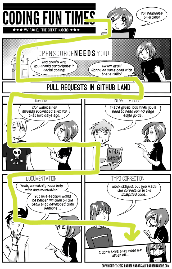
Illustration for Of Github and Pull Requests.
Using the above techniques, you can coerce the reader’s eye to take unconventional paths.
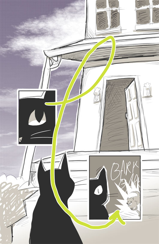
Comicking techniques in action
Now that you know the basics, let’s put these babies to use! We’re going to start by looking at some fairly high-level implementations where we can use visuals to replace words before moving on to show how proximity, temporal spacing, balance and flow can be used directly in a design.
Internationalization
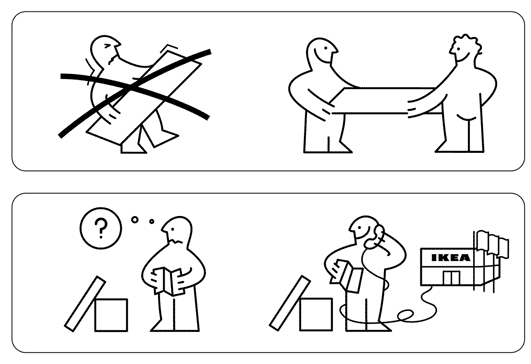
An excerpt from an IKEA instruction manual.
When you rely more on visuals than text, your work can be understood across language barriers. Art, like the one crafted with the best drawing tablet with screen, is a universal language, and that’s why we see it used so much in international publications or handbooks like IKEA’s above. There’s even a set of international road signs used by countries complying with the Vienna International Convention. This way, when you cross country borders in Europe you know that there’s a railroad crossing ahead or that you need to keep an eye out for pedestrians– even if you don’t speak the language.
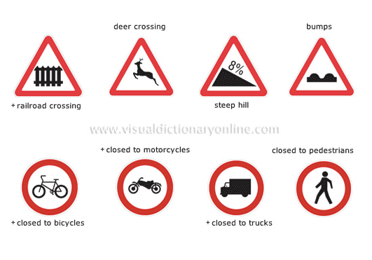
Sourced from the Merriam Webster Visual Dictionary (which is a really cool resource)
You’ll notice that these images are starting to form their own language, a visual vocabulary. They’re becoming symbols, with each symbol embodying a single idea. This is how writing began in Egypt and China. Similarly, it’s how our interfaces evolve.
Visual metaphor

A comic panel becomes an image that suggests an action which can be further simplified into an icon. Would the letters t-r-a-s-h resonate as much as this simple image? Sometimes, a “simple image” describes a complex action. For instance, this icon can mean trash, remove, delete, discard. On a list of favorites, it can mean “unfavorite this and remove it from my sight” – a very complicated concept! But we can use visual shorthand to get it across intuitively.
Real-world examples

Shopping cart inventory screen from Fab.com.
In this shopping cart inventory screenshot, we can see not one but two comic techniques at work: panelling and proximity. Notice how each item has its own box or panel separating it from the other. But also notice how the “your order” box is off on its own on the right, in the last section the user will look to when looking at a page in left-to-right eye movements. This makes sense since the designer wants users to first review their purchases then the information in the “your order” box before clicking “check out.” Imagine how much clunkier this would be if the “your order” box was on the left!
Also notice the “x” buttons in each item’s box. Here we see proximity and visual metaphor at work. The “x” here simply implies “remove” without the need to explicitly state it. The proximity of these removal buttons to the items they remove also lets users know what will be removed.
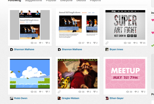
Dribbble.com’s home page features new submissions from users.
Dribbble.com uses proximity, visual metaphor and panelling as well. The white box that encompasses each “shot” contains three to four icons that show how many views, comments, and favorites the image has and if the image has an attachment. Interestingly, the creator’s name doesn’t appear inside this panel. It appears underneath the panel, but users can infer ownership by proximity. What the name is closest to, it must be related to.

Blue Cross Blue Shield’s home page exemplifies “flow.”
Blue Cross Blue Shield does a great job with their entire home page. It starts with a sweeping establishing shot – lots of space gives the user a chance to pause and absorb the site. The caption pulls them in and the “Shop for Health Insurance” box calls them to action. Right below that, three evenly spaced panels set a stable rhythm for their content, stressing that each article is of equal importance.
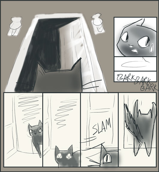
This page is a good example of flow, so good that I wanted to show you how easily its layout could be repurposed for a comic.
Content vs. Copy
Will Lieberson, editor at comic publisher Fawcett Publications, stopped by a barber shop late one night. While waiting for a shave, he noticed that a kid next to him reading one of his own comics! But then he realized that the boy was only reading the top panels of every page. When he tried to explain to the youth that you should read a comic’s page from top to bottom to get the whole story, the boy quipped, “I know, but this way is faster!” (citation: Steranko History of Comics, Vol 2, Page 15)
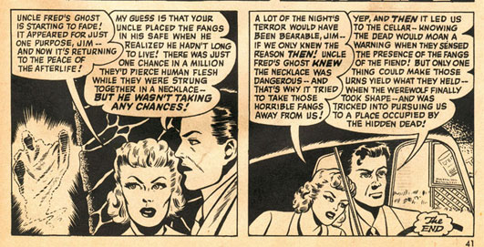
Panel of Fangs of the Fiend found at Stupid Comics
When your words and pictures are fighting each other for dominance – when you fill your page with information that doesn’t further the plot – readers start skimming, also known as scanning.
People don’t read, they scan…right?
Thanks in large part to Jacob Nielsen’s work, it’s a common heuristic that people don’t read pages, they scan them. This is, of course, a drastic oversimplification. We’ve trained readers to skim content by inundating them with terrible, fluffy, poorly prepared and badly placed content.
It’s a natural reaction to bad storytelling to just skip to the good parts.
Consider how our grandparents would pick and choose their reading materials. After carefully choosing their reading material, they sat down to digest their choices in full. They didn’t skim The Great Gatsby. They didn’t glance at the Wall Street Journal. They chose what they wanted to read, and they read it. Works were curated by slews of creators, editors, and reviewers to ensure that when audiences came, they were not disappointed. People would become outraged with creators and publishers over bad content!
It’s not that people have no patience. It’s that the bulk of online content providers have repeatedly failed to provide things worth spending time on. Now users have knee-jerk reactions. As soon as they land on a page, they turn their shields on – deflecting the ads, the talking dogs, the long intros, the fluffy copy – and begin searching for the meat, the ker-pow.
Users are like that little boy, reading the top panels of every page then moving on because life’s too short to slog through your crappy content.
Content strategists and user experience designers have tried to address this observed “people don’t read, they scan!” problem in a myriad of ways by optimizing microcopy, keeping things above the fold, A/B testing calls to action, etc. But we need to remember to keep an eye on the whole experience. Comics would not be the cultural cornerstone they are today if comickers had started optimizing the first panel on every page!
People don’t scan, they look
People aren’t reading web pages from top to bottom, but they are looking at the page. Humans are visual animals first. Images are often the first thing we notice on a page while words add an extra layer of abstraction that your brain has to decode.
I often hear presenters extolling the value of good content. But what they’re actually talking about is often just copy. Copy isn’t the only kind of content!
Back in ye olden days of the World Wide Web, text was the path of least resistance and images were seen as non-semantic and often garish substitutions for meaningful copy. But we’re living in the future now. We have all kinds of accessibility options at our disposal, from WAI-ARIA to HTML5 video’s subtitles to our good old friend alt text. We’re better equipped than ever to plan, design, and measure the effectiveness of visual content.
Content strategists and UX practitioners, I implore you to emulate the authors of the golden age of comics and lean on your graphics specialists. If you’re a one man UX army, remember to use Photoshop or a sketchpad from time to time, and try to stretch your visual communication skills with things like weekly challenges.
Conclusion
Many comickers evolve into storyboard artists and move on to work in cinema or animation. I evolved into a front end developer and UI designer. I still use my skills to communicate with words and pictures, just in a different medium. If you’re going to connect with your audience, you’ve got to learn the art of the flow, you’ve got to guide their eyes, and you can’t do that with mere words alone. Content strategists and copywriters often see the Internet as an endless document comprised of page after page of text and navigation. But I echo the words of Scott McCloud when I say: the Internet is an endless canvas.
Resources and thanks
You can get a better feel for graphic storytelling by reading comics like the fine ones below created by expert comickers:
- Andy Runton’s Owly
- Kyle Weem’s CSSquirrel
- Rembrand Le Compte’s Beardfluff
- Starline Hodge’s Candi
- Barry Deutsch&squo;s Hereville
- Brad Colbow’s The Brads
- Anything by Raina Telgemeier
- and of course, my own comics at RacheltheGreat.com
Thanks to Kurt Busiek for helping me find the barbershop story and to Scott McCloud for putting us in touch.
Check out these classic books by Scott McCloud:
- Understanding Comics: The Invisible Art
- Making Comics: Storytelling Secrets of Comics, Manga and Graphic Novels
I love talking about sequential art and comics, so drop me a line! @CrowChick, Dribbble, My web ramblings blog.