Image by Fredo in
Stuck on your design work? Get unstuck by checking out electronic music production for fresh inspiration. It can give you 3 useful lessons to get going and improve your designs. Want examples? 5 popular websites utilizing these lessons are showcased.
Electronic music producers are a unique bunch. Whereas much of popular music is performance-driven, with recording of instruments and vocalists, most electronic music (dance, “listening” electronic music, hip-hop production, etc) is digitally sampled, programmed, and arranged from the ground up. As a result, unlike bands and groups, a lot of electronic music is created from start to finish by an individual.
That makes electronic music producers a lot like visual designers – in charge with orchestrating the entire end result from start to finish by themselves.
And wouldn’t you know it, electronic music production can teach you a useful thing or two about design. So, if you’re stuck on your design work, can’t seem to get your project right, and are in need of unstuckifying, read on for some fresh outside music inspiration… If you are looking to get started, check first runthemusic.com to find the instruments and synths you may need
3 Design Lessons from Electronic Music Production
Image by spablab
1. Put the focus only on the main element
An exciting tune will have you bopping and humming to the riff, bass line, or the vocals – not the harmonic chords, pads, and effects around it.
A great producer puts the focus only on the main element, and has all the rest of the elements (especially harmonic and effects) support it.
Otherwise, the tune gets messy, nothing stands out, and you get bored because there’s no hook to latch onto. Think background or mood music with nothing that stands out or grabs you.
The same for your visual design – what’s the main element? The text message, a button, or a graphic? Put the focus only on that, and have all other elements–effects, visual flourishes, smaller text, background–support it. That way, a person sees and immediately gets hooked into the intended main element, and whatever your design is presenting gets noticed and remembered.
2. The ol’ “less is more”
There’s limited audio and frequency space in a tune – for every element added, the impact of the existing elements is weakened.
For example, when a tune has just a simple beat, a bass line, a riff, and one or two harmonic elements, enough space is given to each, and every one of those elements is stronger. A beefier beat, a stronger bass line, a brighter riff, and more lush harmonic elements.
The more percussion you throw into the mix, the more effects, pads, and synths you introduce, the busier the tune becomes, and the more lost all those core elements become.
The ol’ saying of “less is more” is like a mantra here.
And that’s no different for visual design. Don’t throw 10 elements into your design when 4 will do. Because you know what? Those 4 will shine a lot brighter and be way stronger than if you added those 6 other elements.
3. Have effects support, not distract
Delay, reverb, phaser, flanger, chorus, and any other effects are most effective when they’re not noticed – your ear pays attention to the riff, not the delay bouncing around. You don’t notice it when it’s there, but you miss it when it’s gone.
Hence, effects are best when used less of, rather than more. When in doubt, use less of the effect.
That way, the effects put the focus on the element and make it stronger – support it rather than distract.
The same for visual design effects – glow, drop shadows, textures, and any other effects. Make the text, menu item, border, button, and whatever else more exciting and stronger, but don’ t distract. You want people’s eyes to be on the button or the menu item, not noticing the shininess of it.
5 Websites That Use These Lessons
Before I get to the examples of websites that use the above 3 design lessons, I want to clarify why I chose what I did – these websites have multiple products and content to juggle and present, so it was a greater challenge and thus accomplishment for them to pull it off effectively.
Really simple sites like single-author blogs and splash-type sites just showcasing one product, service, or portfolio are a lot easier to manage, so I wanted to focus on the more impressive examples where the above 3 design lessons are more crucial.
Alright, onto the examples:
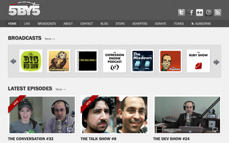
5by5 balances a large handful of shows masterfully, keeps visual flourishes to a minimum (you don’t notice the shadows, the textures, the gradients that are everywhere), and puts the focus on the main element: the shows and latest episodes.
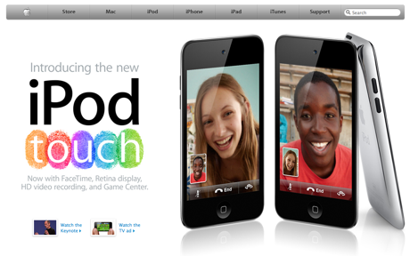
I know I know, what a surprise to see Apple’s website on a design list, right? But it does a great job of reigning in all of the company’s offerings in a simple way, and the focus is always on whatever the latest product is – I mean, it couldn’t be more obvious, with the full-page image right there, being unmissable.
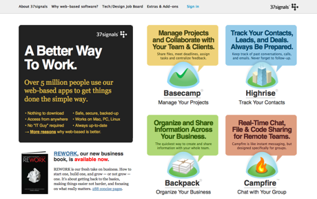
Like with Apple, 37signals’ website does a great job of juggling all of the company’s product offerings, not to mention throwing in their latest book while they’re at it. The subtle visual cues like the rounded corners all put the focus on getting you into one of their products that’s right for you.
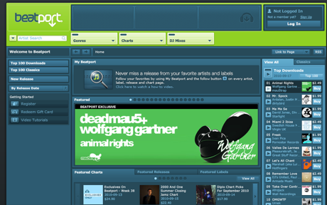
You can’t have a electronic music-inspired design list without the biggest online electronic music store. Luckily, Beatport’s website effectively uses the 3 design lessons, so adding it here was made easy.
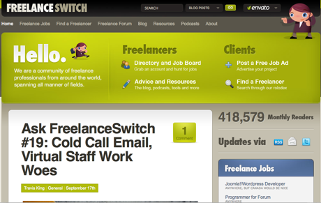
Freelance Switch makes stuffing your blog with a job board, forum, freelance resources, and other stuff look easy. The focus is put on resources for you, the freelancer, so you can get right into what you need when you visit the website. And the textured visuals, while looking fun and pleasant, stay out of the way of that focus (unlike many blogs out there with overly-elaborate graphics).
Electronic Music Is Your Design Friend
Image by Cliff Beckwith
Next time you’re stuck on a design and hurtin’ for inspiration, take a cue from electronic music production.
You can greatly improve your designs by putting the focus only on the main element, adhering to “less is more” like it was your mantra, and have effects support rather than distract.
Over to you: Do you get inspired or pick up useful parallels from listening to music for your design work? What other ways has outside music sources helped with your designs?
Ready to get your feet wet in Interaction Design? In this article we touch briefly on all aspects of Interaction Design: the deliverables, guiding principles, noted designers, their tools and more. Even if you're an interaction designer yourself, give the article a read and share your thoughts.
