Need fresh inspiration for your design work? Look at well-designed album covers. They can give you 3 crucial lessons to improve your designs. Want examples? 5 well-designed album covers and 5 popular websites utilizing these lessons are showcased in this article.
There are nice-looking album covers, and then there are well-designed album covers.
Well-designed album covers aren’t just artistic, but they’re effective at marketing as well. They give you a clear representation of what the content will be, and they sell you on the content by looking great itself.
Guess what? That’s what a great visual design should be too. And so, if you need some fresh inspiration for your design work, looking at well-designed album covers can improve your designs.
3 Lessons from well-designed album covers
1. Maximize limited space
An album cover maximizes a limited amount of space.
Within a small square, it usually needs to include:
- The artist and album name
- Possibly the artist themselves
- The style (colors, texture) that properly represents the content inside
- Any artistic details
2. Put the focus on a single element
A well-designed album cover, like with any great work, puts the focus on a single element. Other details play a supporting role to that main element.
3. Be artistic while still being great marketing
The best-designed album covers are works of art – gorgeous and remarkable artwork is practically a guarantee. It can look great as a piece of art on a wall, and many people hang album covers as a result. You no doubt have friends with album cover posters.
But the album covers also do a great job of marketing the content. They brand the album so well that you know what to expect from the music and the artist. You know what the content inside will be.
Because the album cover did a great job advertising the artist, music and brand, it’s more likely that you’ll get the album as a result. Assuming that the content is what you want, you’ll feel compelled to listen to the content inside.
5 remarkable examples of well-designed album covers

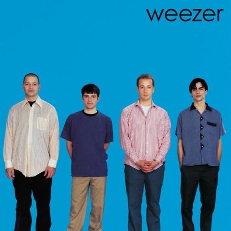
Weezer – Blue Album
Weezer didn’t look like other ’90s rock bands, nor did their lyrics cover the same ground as most bands, and this cover boldly showcases their geekiness.
Having a solid single-color background just put the focus on the band even more. As did having them lined up side by side, rather than posing in the typical rock band-style (which their later Green Album did, lessening the effect of Weezer’s remarkable quality).

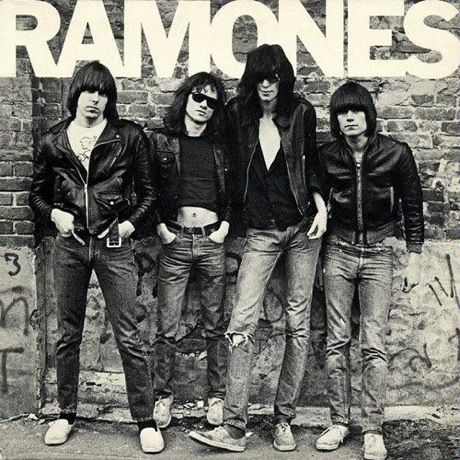
Ramones – Ramones
Ramones’ music was very monochromatic, and so was their debut album’s cover – all black and white. Plus, the clothes and location of the shoot assures you that this is punk music from New York City.
But the Ramones were also a no-nonsense band, and the cover reflects that too. No graffiti on the wall, and no wearing of countless accessories and no posturing by the band members. Just Converse, jeans, jackets, long hair, and rock ‘n’ roll.

Jay-Z – The Black Album
Jay-Z’s 2003 “retirement” album was a mature, classy, and bold statement, and the cover perfectly reflects that.
The black and grey colors and classic font represents the classiness of the music – no bling or gangsta rap here.
But the baseball cap still reminds you that this is rap music.

Aphex Twin – Windowlicker
One of The Designer’s Republic‘s most notorious album covers. Aphex Twin’s single “Windowlicker” is twisted, sleazy, futuristic, and sexy at the same time.
That combination is perfectly presented in the cover: twisted because of Aphex Twin’s head on a female body, sleazy but sexy because of the bikini-clad body, and futuristic because of the font.

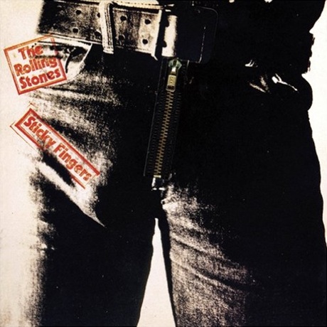
The Rolling Stones – Sticky Fingers
Never has the Rolling Stones’ sex and drugs and rock and roll been portrayed as effectively as this infamous cover designed by Andy Warhol.
The grungy text, the grainy black and white image, the tight jeans with the suggestive bulge, the shot itself being so freakin’ close up – they all prepare you for the music inside.
And yet, there’s a certain reserve. This ain’t sleaze for sleaze-sake. The Stones were an utterly professional band, and this cover didn’t cheapen that by resorting to cheap thrills.
(And yep, a real zipper actually unzips on the vinyl cover.)
5 popular websites that utilize album cover methods
Daring Fireball author John Gruber favors tech that’s clean, simple, and sophisticated (ie. Apple). His blog design reflects that, and new visitors immediately know what to expect (the grey shades even imply gadgets).
The simplest way to blog. And the most fun too. Both aspects are in full effect on Tumblr’s home page.
The easiest, most sophisticated and elegant way to build a website. Like with Tumblr, those aspects are perfectly exemplified on Squarespace’s home page. The slick design foreshadows the stunning website templates contained within.
The fashion brand people love to hate. But you can’t argue A&F’s boldness, which they use on their home page. Look, no pictures of clothes or people, but the grey shades and strong fonts let you know that this ain’t your regular fashion brand, for better or worse.
Write and publish like a rock star. The bold, high-contrast design makes the site exciting, like being a rock star but with, um, a keyboard instead of a mic.
Improve your designs by looking at well-designed album covers
Next time you need some fresh inspiration for your design work, look at well-designed album covers to improve your designs.
By maximizing limited space, putting the focus on a single element, and making it artistic while still being great marketing, you’ll be well on your way to improving your visual designs.
Your turn: What are your favorite well-designed album covers? How else have you been inspired by album covers?


