Each interaction we create helps define and guide the user experience. And although best practices suggest we make something intuitive before it’s aesthetically pleasing, simply borrowing an element from a design pattern library – one that just “looks the part” – can end up hurting the user experience. Sometimes the best designs require us to reinvent the wheel.
To understand what I mean it helps to give you some context. uberVU is a social-media-analytics platform that collects millions of points of data for its users:
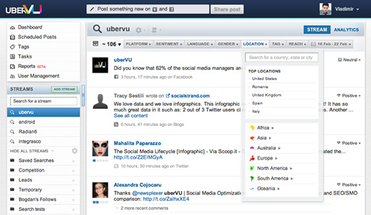
One of uberVU’s core features is to display social media data in a way that can be narrowed down by filters: platform, gender, sentiment and location (highlighted in the screenshot below):
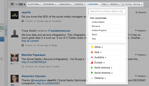
In our case, the location filter required special consideration. We read Christian Holst’s article on “Redesigning The Country Selector” – which included some great suggestions – but it didn’t exactly solve our problem.
Selecting a location in uberVU required progressive filtering. In other words, after a user selected a country (a challenge on its own) that user needed the ability to also select states within those countries, cities within those states, etc. With so many options available, we needed a way to show users where the most important filtering options (those with data) were. As if that weren’t enough, this filter had to allow users to go “back” a step while exploring, similar to how bread crumbs work for website navigation.
With our goals laid bare we set upon the challenge. What follows is the journey we took to find what we think is a pretty elegant solution to this interaction design problem.
Challenge 1: Make it instant
What if the user knows exactly what location they’re looking for? Easy. We solved this by adding auto-completion. After the user types 3 letters a suggestion appears.
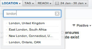
This pattern works well in every case except when a search returns multiple results. If that happens it’s then up to the user to disambiguate. Not good. Say a user wants to filter the stream for London, UK. They’ve typed “Lon” and we’ve correctly guessed London…but to what London does the user refer? London, UK obviously comes to mind, but for those of you not from Canada you might be surprised to learn that there is a London, Ontario, too.Clearly, we should display at least 2 entries:
- London, United Kingdom
- London, Ontario, CAN
As you can see in the screenshot, there are actually many more Londons in the world. Ordering them from most to least popular makes things easier.
Challenge 2: Encourage exploration
Now for something even more challenging. While some users know exactly what they’re looking for, others will want the ability to explore their social media data. A person monitoring the launch of a product is curious where people are discussing that product. Wouldn’t it be nice if they could lead the expedition themselves?
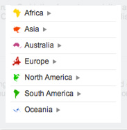
Our solution employed a tree-like structure within the selection filter. To keep things less intimidating (we track thousands of locations, after all), we decided to initially display a list of continents. From there, we then decided to only display locations that contained data (mentions in social media) for the current user. This way the entire tree is relevant at every node. To drill deeper, users click on the arrow next to each location. As users drill deeper, each selection expands to display its sub-regions:
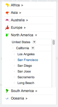
The only downside of this method is that you’re adding an extra scroll. When users put their mouse over this region they will scroll the location filter, and when the mouse is positioned somewhere else, they scroll the entire page.
Challenge 3: Highlight important data
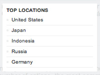
Let’s keep in mind that this filter should help our users explore the locations we gather data from. And while displaying a tree with continents at the top is a good start, it does not by any means answer the question “What are the most important locations?” Our users needed a top 5 location list and that’s exactly what we offered them, a list of the most important countries based on the number of messages we collected from that specific place:
Challenge 4: Going back
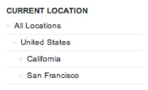
Say you filtered the stream for London, UK. The page is refreshed, all the displayed mentions are from London, UK. What if you want to select UK again? What if you want to clear all filters and go back to the default state, where nothing is selected?
Our solution was to replace the Top location part with a location trail, similar to how breadcrumbs work for web page navigation. You can use this trail to track your steps all the way back to the default state. See the screenshot below:
In the next iteration of the location filter, we plan on also remembering the path to the location you selected for your next session. Next time you open the Location filter the continent, country & region are expanded to show you the whole trail to the location you last selected.
Le grand finale: Putting everything together
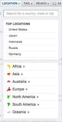
Although many designers champion simplicity, each solution thus far involved adding yet another item to the filter drop-down. In theory, this would over-complicate things but, surprisingly, everything fit together extremely well.
It’s quite complex but still very usable. We’ve amazing feedback from customers, so all in all we are quite happy with the result!
Lessons learned
We think the location filter we built is a great solution to a problem a lot of the web-apps have: progressive filtering by location. In that case, standard, off-the-self design patterns just wouldn’t do. And our users love it!
What’s more important than our solution, though, is the process we went through to synthesize it. Perhaps you’ve done the same:
- Realize that just because everyone does something a certain way it doesn’t mean you should do it, too. Popular design choices may not apply to your particular use-case.
- Layout the objectives of the design from the user’s point of view. Listen to customers to understand their pain points.
- Make a list of all the elements you want to include. Make sure each element has a clear function. Don’t just add things for the sake of it. Get pragmatic.
- Put everything together and see how it “fits.” Can you remove anything without jeopardizing the function of the element?
- Launch, test, iterate!
This process opened our eyes to the fact that a lot of designers might just be recycling standard design patterns resulting in sub-optimal experiences. I know we’ve been guilty of this. Are there places in your web-app where you might be doing the same thing?
Take a look at your application’s key interactions, state their goals and honestly appreciate whether the standard solution you’re using does the job. If it doesn’t, get to work. Don’t look at it as yet another problem you need to solve but as an opportunity to create something amazing!