When launching a product, you spend a lot of time and resources to gain users. That includes different types of advertising, content marketing, social media promotions, etc. Despite your best effort, sometimes user retention is very low.
When it comes to a software product, you don’t get a second chance to make an excellent first impression. That precious first impression relies on an efficient onboarding experience. A well-developed onboarding process helps users to familiarize themselves with your product in an intuitive manner.
This article will explore the onboarding experience, its importance, components, and process. We will explore common onboarding UX mistakes that create churn and ways to mitigate them. We will also take an in-depth look at immersion research tactics and practices to apply to the onboarding process.
What is User Onboarding?
User onboarding is a well-known term in the software world. But different people have a different understanding of it. Some say it’s about guiding new users; some say it is just some fancy quick tour UIs, while others imagine some swipeable screens upon signup.
Essentially, user-onboarding is a process of orienting and familiarizing new users with a product. It provides the necessary directions and information to get started. It is a process of transforming first-time users into loyal customers.
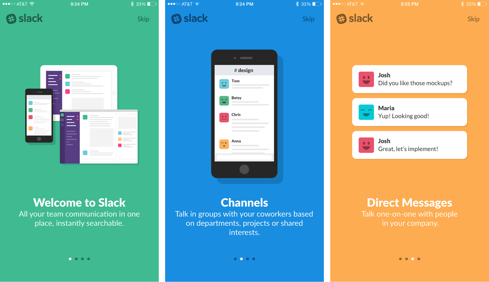
Onboarding UI of Slack Mobile App
Importance of an Efficient Onboarding Experience
According to a study by Business Insider, it takes just three seconds for someone to determine whether they like you or not. All sorts of things, including intelligence and trustworthiness, are decided within this short period.
In the software world, the user makes the decision in a similar way during the onboarding process. Onboarding typically happens only once for a new user. So it’s your one-shot chance to showcase your unique features and earn the user’s trust.
When users sign up or download an app, it is highly likely that they expect the product to make their lives easier somehow. So when they use the product for the first time, they should feel rewarded. Otherwise, they will abandon the product and forget it for good.
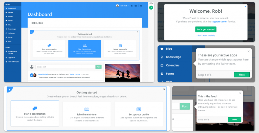
The onboarding process has a direct influence on user retention rate. Popular team collaboration application Twine reduced their drop-off rate to 30% from a whopping 65% by rewiring their onboarding experience.
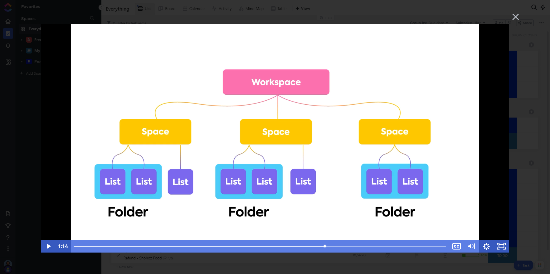
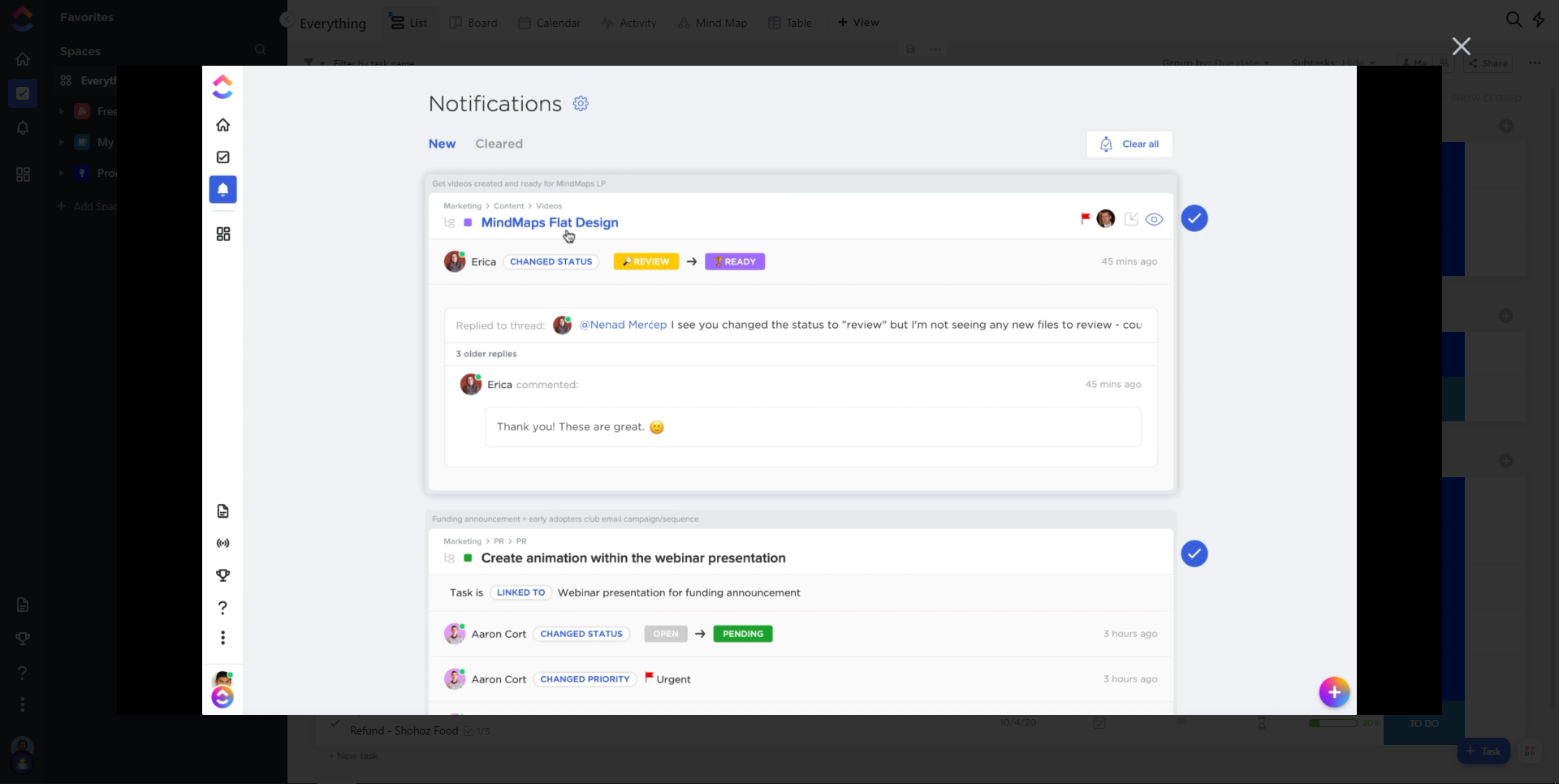
Adding exciting new features to your product is excellent. But if people don’t know about them or how to use them, they’re of no use. This is another type of onboarding, known as ‘Feature Onboarding’. Collaboration and project management tool ClickUp shows interesting how-to videos after signup. It’s a fun and exciting way to discover what the product can do for the user without breaking a sweat.
The Onboarding Process
The unique and tricky part of designing an efficient onboarding experience is that typically it happens only once, right after a user decides to try out the product. There is no second chance. So the whole “showcasing” and “engaging users” needs to be done before users start getting bored with product complexity. There are a couple of things you need to keep in mind to design a successful onboarding experience.
Handling one-time setup
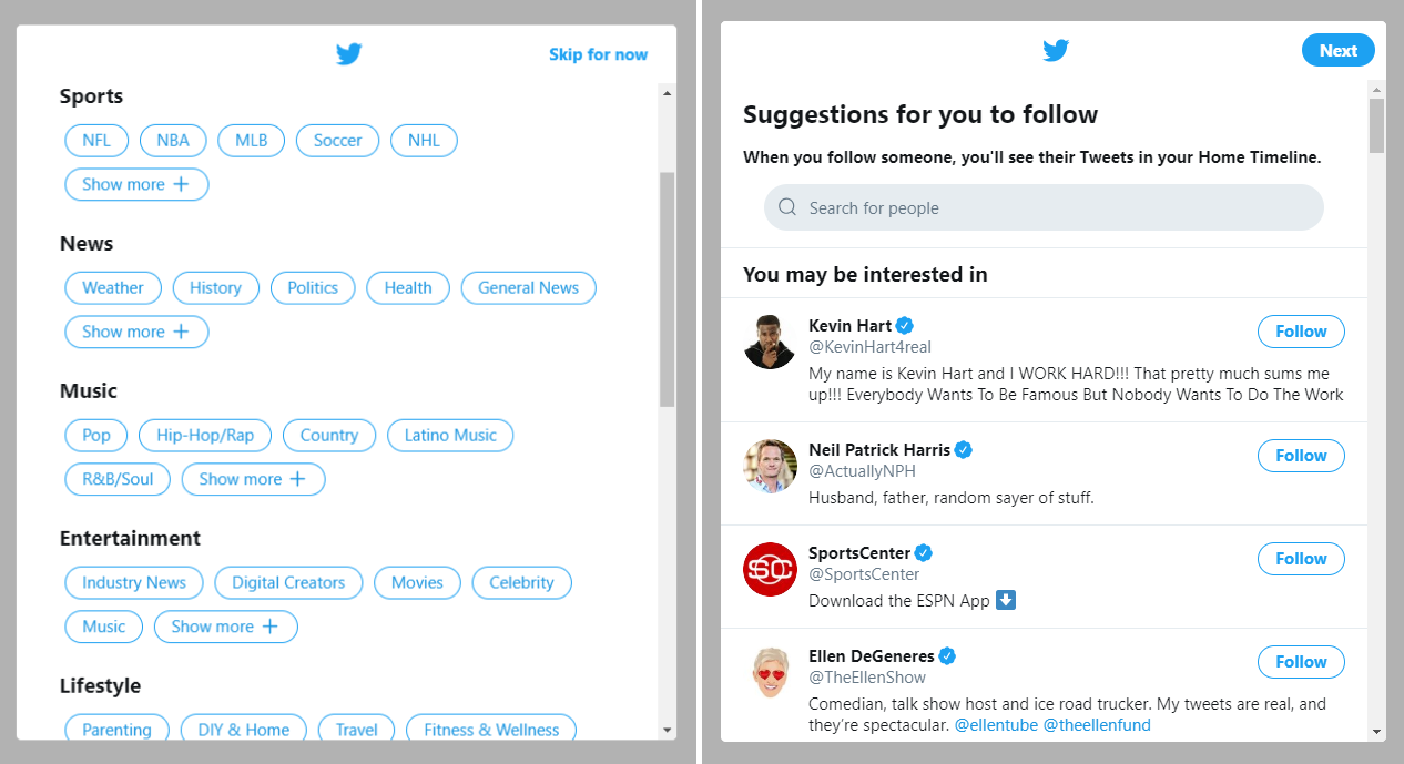
Your onboarding process should take care of a one-time setup such as choosing a username, setting up a profile picture, etc. Twitter’s onboarding process is an excellent example. Twitter takes care of setting up interests and suggesting some accounts to explore different people’s tweets in no time.
Keeping users engaged
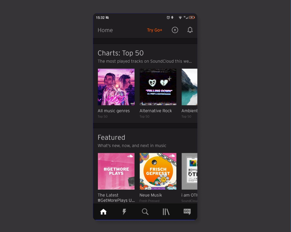
It’s essential to leave the user excited to come back again after the initial setup. This is one way SoundCloud excels–it immediately shows “Top Charts” and “Featured” music that keeps users engaged and makes them explore more.
Teach the user in an interactive way
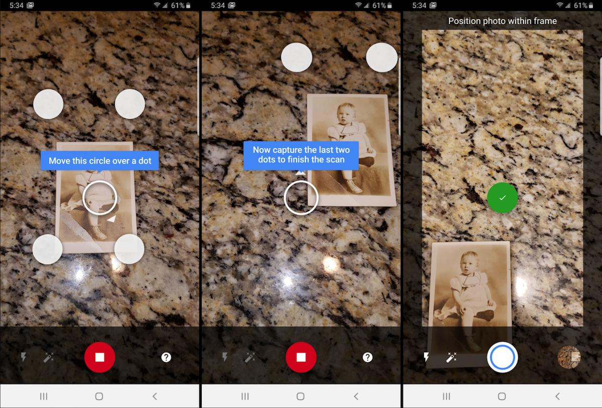
Don’t just use words. Let the user interact with your product and play with it. “PhotoScan by Google Photos“ has implemented this; it has a guided process to scan and digitize your first image.
Get them to their “AHA!” moments
An aha moment is the exact moment when a user realizes the value of your product. It is especially important during user onboarding, because the quicker users experience value, the faster they’ll become activated and the more engaged they’ll be.
Triple A’s for Successful Onboarding
There are three A’s needed for effective and successful onboarding. First one is “Accommodating”. It means giving the user tools they need to use your product.
The second one is “Assimilating”. It means helping users to understand how your product is intended to be used.
The last one is “Accelerating”. It means delivering your product’s value proposition faster and better.
Three Components of Onboarding
There are three primary components of an efficient onboarding process:
Feature demonstration
This is where you showcase the uniqueness of your product. Highlight your competitive advantages. Be clear and concise when explaining why people need your app.
Customization
This component is responsible for personalizing your product according to users’ needs, for example, choosing news sources and categories to follow in a newsreader app.
Instruction
This component is responsible for providing users with instructions for further usage of the product, like how they can change the profile picture or change the news interests later.
Common Onboarding UX Mistakes that can Create Churn
User onboarding experience directly influences user churn, which is responsible for the ultimate success of your product. User churn is the percentage of users that stop using your product during a specific time frame. You can calculate the churn rate by dividing the number of users lost during that period. For example, if you started your quarter with 500 active users and ended with 250, your churn rate is 50% because you lost 50% of your active users.

Let’s explore some common onboarding UX mistakes that can create user churn.
Mistake #1: Assuming you need to know programming, to create an onboarding process.
Many UX designers and product managers don’t create user onboarding flows themselves, solely because they assume they have to know how to code to create interactive material. But a no-code approach helps non-technical users to accomplish tasks that would normally require coding, without coding.
3rd-party user onboarding tools can help you create interactive walkthroughs, in-app messages, checklists, self-help centers, and more; while enabling you to analyze your creations and segment users into different groups. All without any coding.
Mistake #2: Thinking “Onboarding” is the last thing to design.
Most of the time, onboarding is the last thing we add before launch. Users’ “first impression” should not be planned at the last minute. Think about onboarding users to each feature as you design/develop. Write UI copy and onboarding tooltips as you’re designing each component.
Mistake #3: Using non-standard elements.
There are some standard design elements for any software interface. “Green buttons for positive action,” “Left/right arrows for next and previous,” to name but a few. Using non-standard elements can be confusing and reduce user engagement.
Mistake #4: Focusing on features rather than value.
Showcasing all your features will not benefit users in any way. Onboarding should concentrate on helping users to complete small but essential tasks that contribute to progress. Users can see value in your app if they can accomplish their goals quickly.
Mistake #5: Not providing guidance
First-time users always need guidance, no matter how intuitive your interface is. Use short walkthroughs to welcome users or use some tooltips to provide hints. This way, you accelerate the user’s learning process. And remember, onboarding happens both inside and outside your platform, so just as much planning should go into designing your onboarding email funnel.
Mistake #6: Not celebrating user’s success
You should celebrate when a user completes a meaningful task on your product. Use a compelling or funny success message to build a positive relationship with the product.
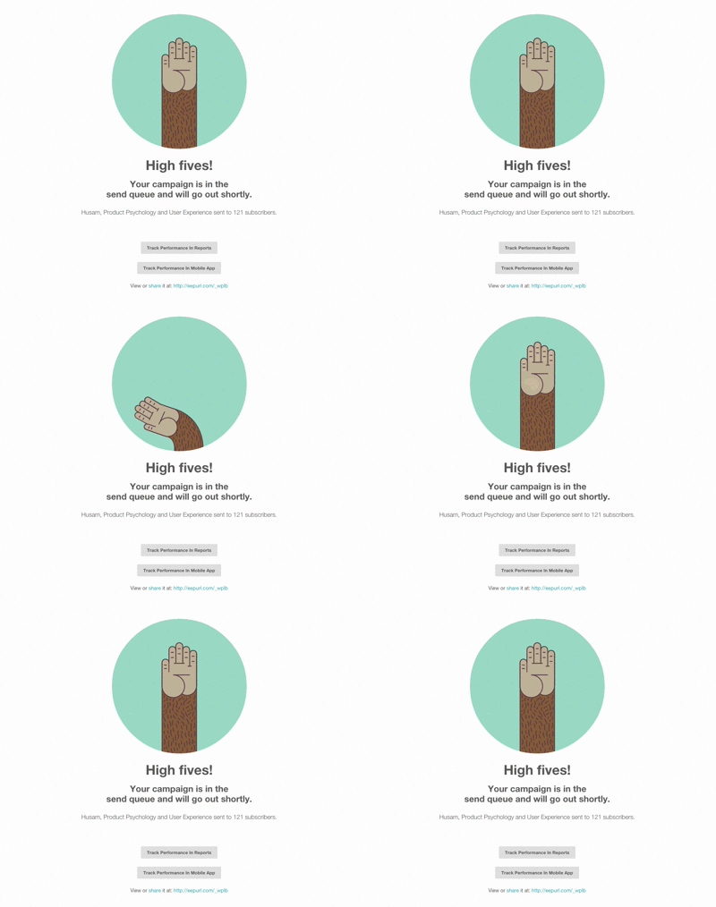
(Success message used in Mailchimp)
It is essential to avoid these mistakes to create an efficient onboarding experience. A couple of methods can help identify and fix these mistakes during development and testing. Immersion Research is one of them.
Using the Immersion Method in Onboarding UX
In immersion research instead of recruiting users as participants, you act as the user, immersing yourself in the product experience you’re creating.
As you are not representative of your entire user base, immersion research is not a silver bullet and won’t replace traditional usability testing, but it can be a useful technique to increase your empathy with users and identify currently unknown user pain points.
You know a lot more about the product than your users. Also, as a UX professional, you already know a lot about user behavior. So you can consider the first impressions of your product from both perspectives, and you have the unique opportunity to identify real users’ pain points and take action.
This method is a fast way to understand better your users and their onboarding journeys with your product or service. With immersion research, you can quickly answer the following question to evaluate your onboarding UX’s efficiency.
- How long does it take for a user to make their first engagement with your product?
- What is taking more time to accomplish a specific onboarding task?
- How much time is required to complete each onboarding task?
- How much time is required to complete the overall onboarding and start using the product?
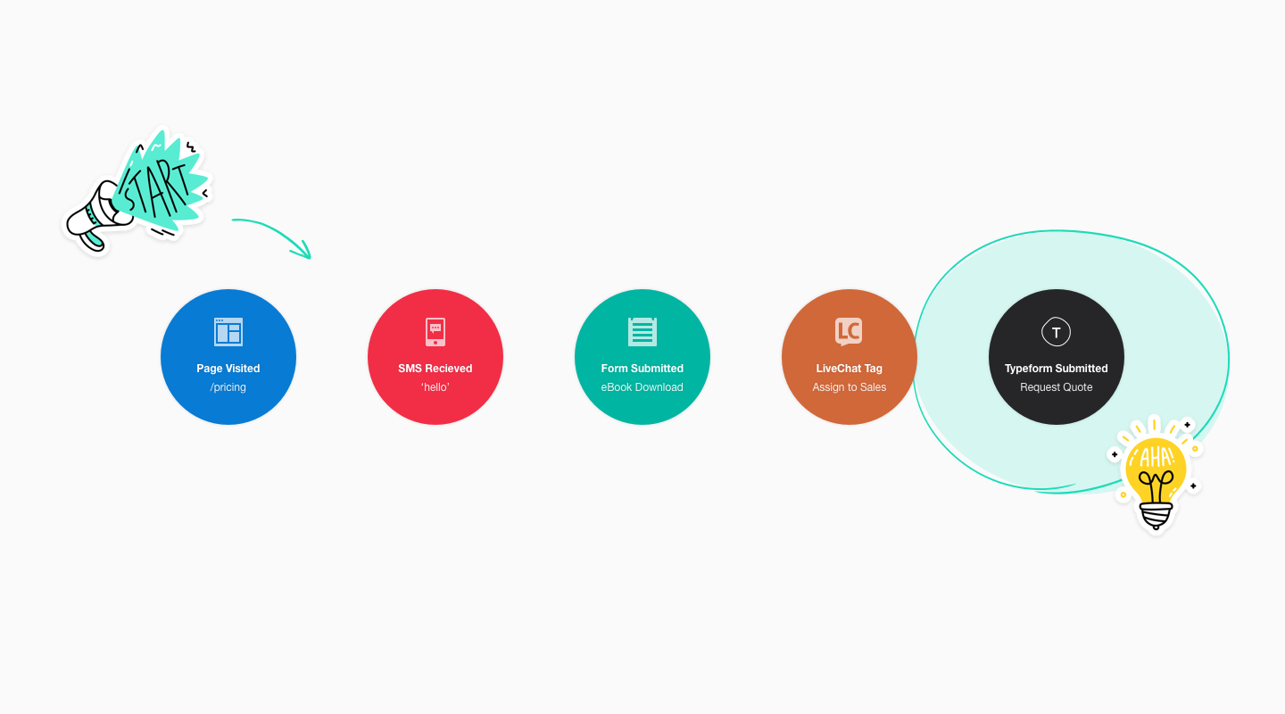
(User journey. Image by: autopilothq.com )
How to Apply Immersion Practices into the Onboarding Process
This technique is handy for the early detection of potential issues with a workflow. Here are a couple of ways you can apply immersion in your onboarding process.
- Develop a checklist of the goals
Create a checklist of the goals you want to accomplish as a user when using the product for the first time, then work through this list in a real-world environment. Try to complete the checklist in different situations. - Take notes
Take notes on your use of the product and your very first impression of welcoming. Jot down everything that comes your way to complete the onboarding. Keep track of the time required to finish each task in a different situation. - Simply use the product
Your first-time users don’t have much idea about your product features. So keep it natural. Just use the product as you would do for another random product. Explore if your onboarding UX is clearly demonstrating product features and values.
Ready to get your feet wet in Interaction Design? In this article we touch briefly on all aspects of Interaction Design: the deliverables, guiding principles, noted designers, their tools and more. Even if you're an interaction designer yourself, give the article a read and share your thoughts.