Are you redesigning a data table for enterprise software? Suddenly you’re feeling overwhelmed. Possibly you’re looking at it wondering where to begin. Your designer eye is telling you this is a mess, you need to determine what is practical with your development team and within a reasonable time frame. Data isn’t aligned, columns are not consistent in size, the various colored icons remind you of sprinkles on a cupcake and you’re not sure if there is a rhyme or reason to the information architecture. Somehow, this table grew into a monster— “we need to quickly add this, or that for stakeholders— done”. Repeat. Repeat. Repeat. Now it’s your worst UX design nightmare.
All data tables aren’t created equally and you may not need every single feature recommended in your table. Look at each column of data in the table. Is it still relevant? How is this data being used? Is it correct? How many columns are there? Can some of them be combined or removed? Are you adding new data points? Can you easily scan the data? Can you filter or manipulate the data in a way a user would need to? Have you witnessed a user interacting with this table? Maybe your users aren’t using your table at all. Maybe they would if it looked less intimidating and was easier to use.
Cell Padding and Height
Be consistent with cell padding and height throughout your table. Chances are, your enterprise product table contains quite a bit of data. The only exception is your headers should be slightly larger and contrast with the rest of the data. Use a slightly darker color and bold text for table headers.
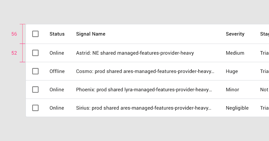
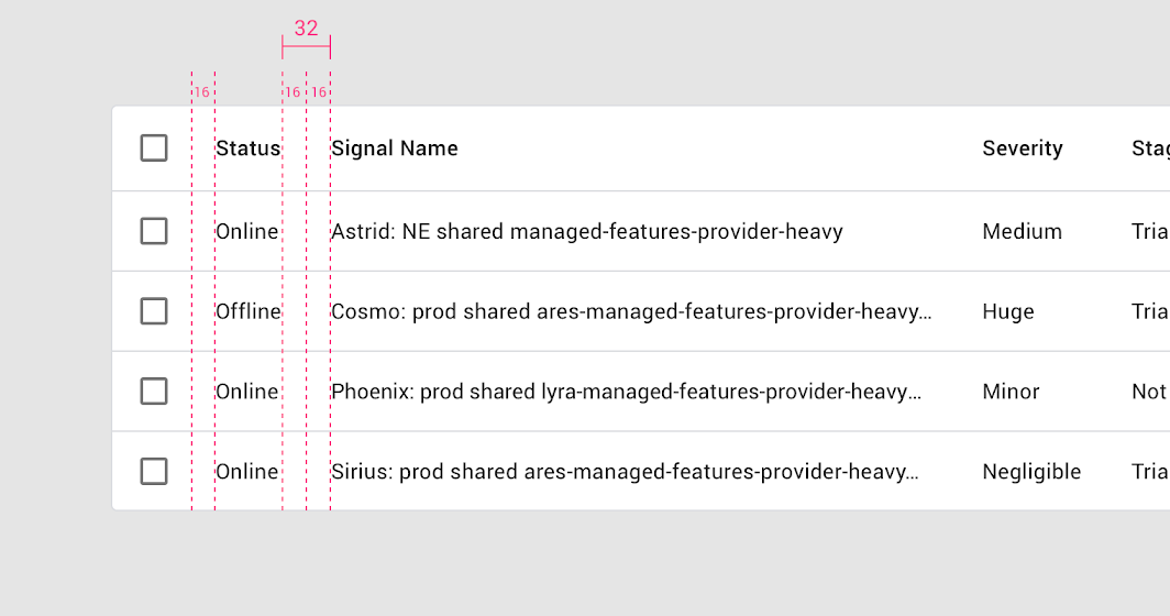
The proper padding and height will increase legibility. Material.io Data Table anatomy provides specifics and visuals if you’re not sure where to start:
The baseline row height is 52dp, and the column header row height is 56dp (4dp taller than regular rows).
There is 32dp or more of padding between columns and 16dp padding on the left and right side of each header name.
Ok great, but what do they mean by dp and how do I translate that to the design tool I’m using in pixels? Material UIs use density-independent pixels to display elements consistently on screens with different densities. For purposes of this article, you can simply translate 1 px to 1 dp. Since large data set tables are typically viewed on a desktop and not a mobile device, we can design for those specifications.
If you do need to design your table for mobile or various screen resolutions, Pixplicity has a DP/PT/PX Converter and Human Interface Guidelines includes a pt to px chart per device.
Adjustable and Customizable Columns
It may be tempting to wrap text so users can see every character, but this will make your table harder to scan and visually overwhelming. Instead, use centered ellipses to indicate text has been truncated. Include adjustable and customizable columns so the user can create and save their own default view of the table.
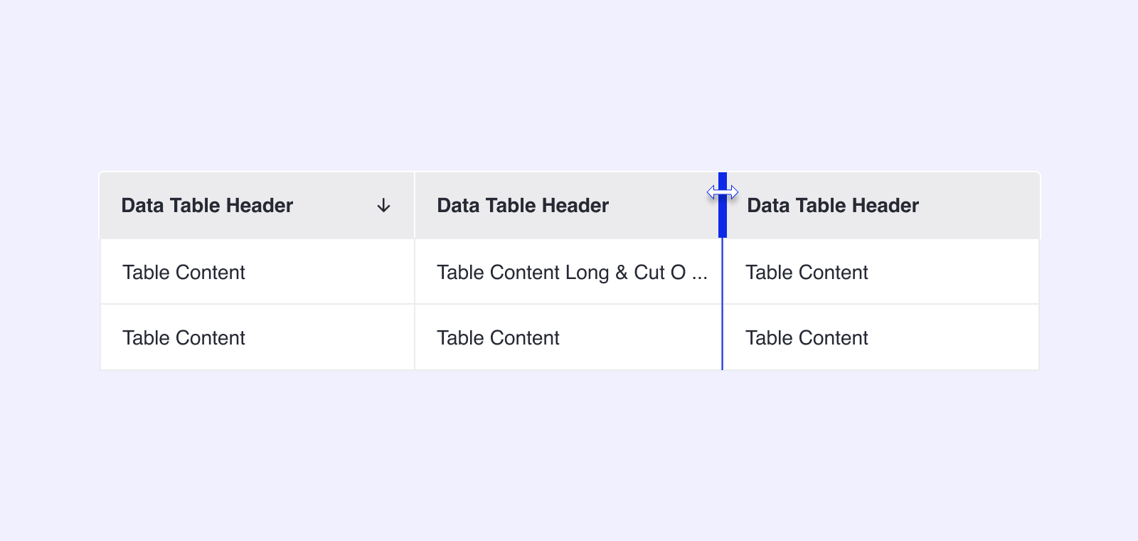
Ellipses indicating truncated text and adjustable columns
Allow the user to hide and reorder columns.
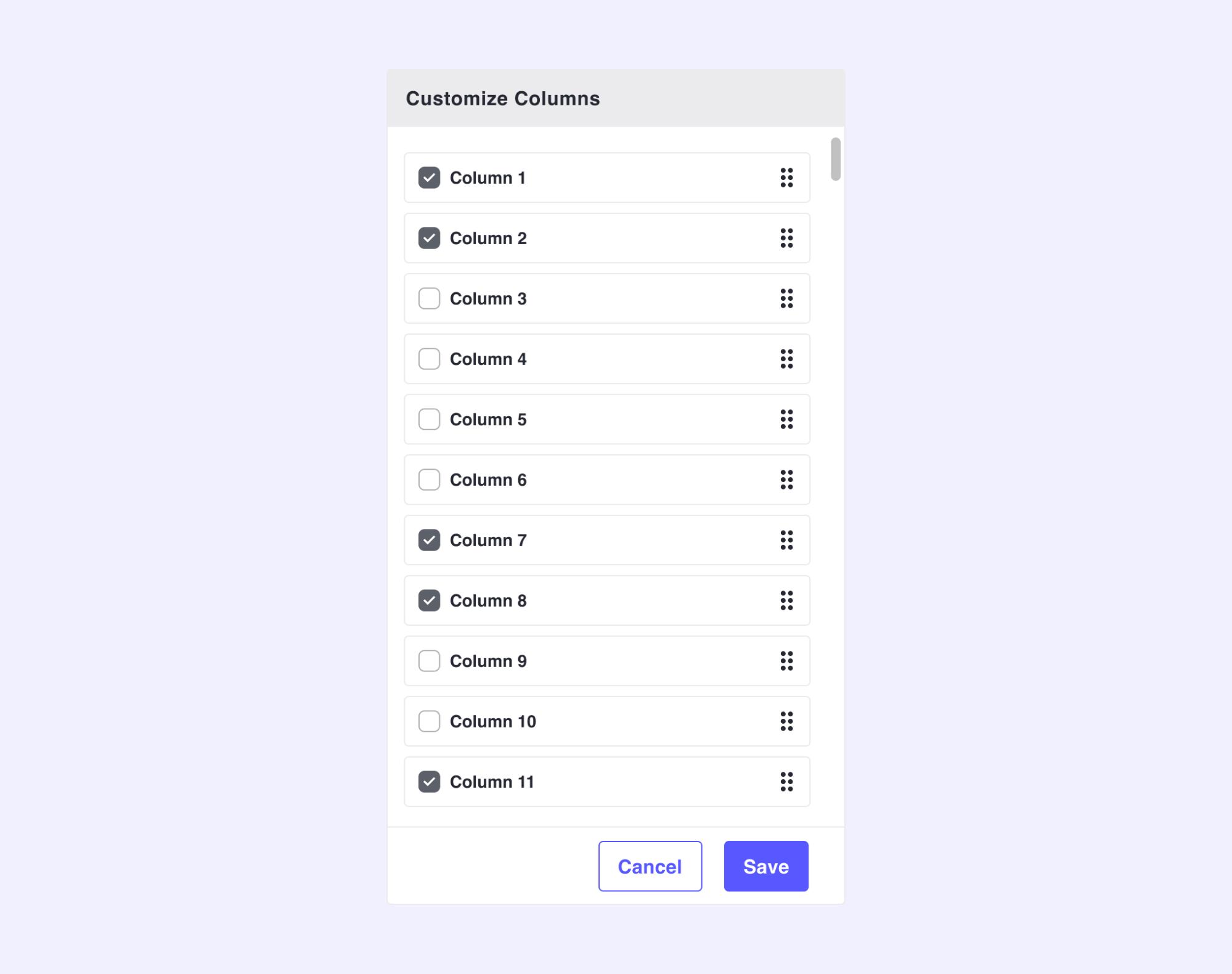
Hide and reorder columns (drop and drag) to save as a default view
Use tooltips on hover, to display truncated text. This could be overkill for the entire table, so consider this tactic for your headers only. Include a left, right, bottom, and top beak for your tooltip components so you can assure the tooltip appears where the user can read it.
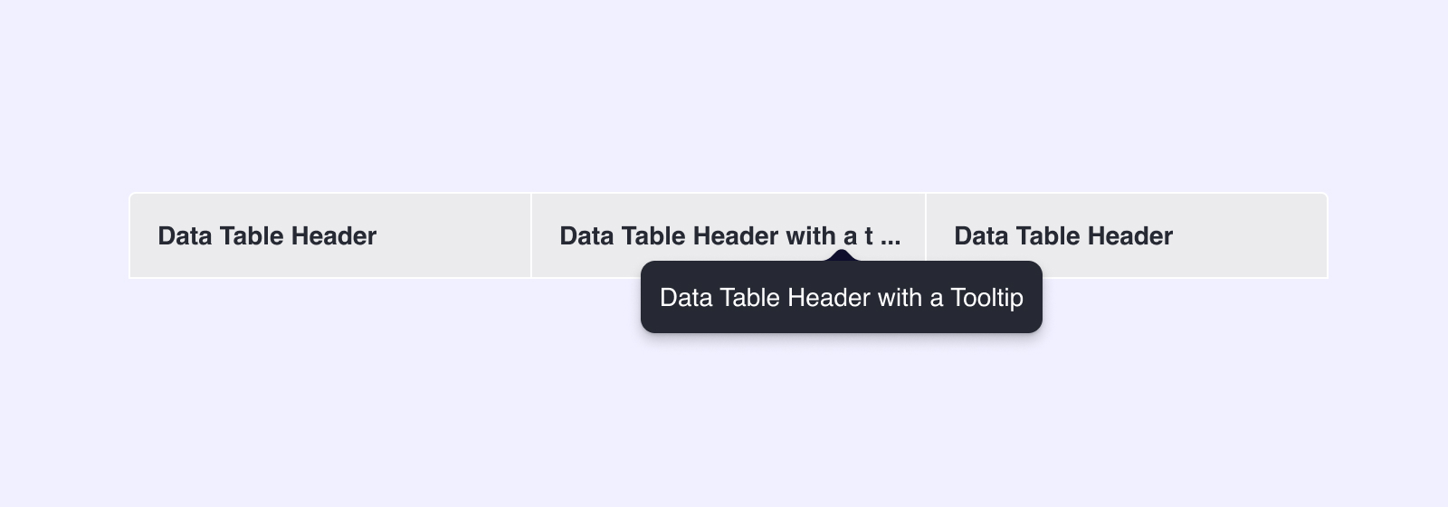
Tooltip with a top beak displaying truncated text on hover
Possibly there is an opportunity to combine data from 2 cells to 1 cell and stack the content horizontally or vertically. This can be especially helpful if your table is going to be viewed on a mobile device or includes many columns of data. Keep in mind it must be content the user would not want to sort or filter by, independently if you take this approach.

On the left: a cell combining company name and point of contact; on the right: a cell combining social icon and business name
Zebra Stripes & Freezing
Alternating colors or “zebra striping” rows improves legibility, especially if the table includes many columns of data. The user is less likely to lose their place or interpret the data wrong as this visual queue helps them to stay focused on the line they are analyzing. Keep the contrast between the two colors subtle.
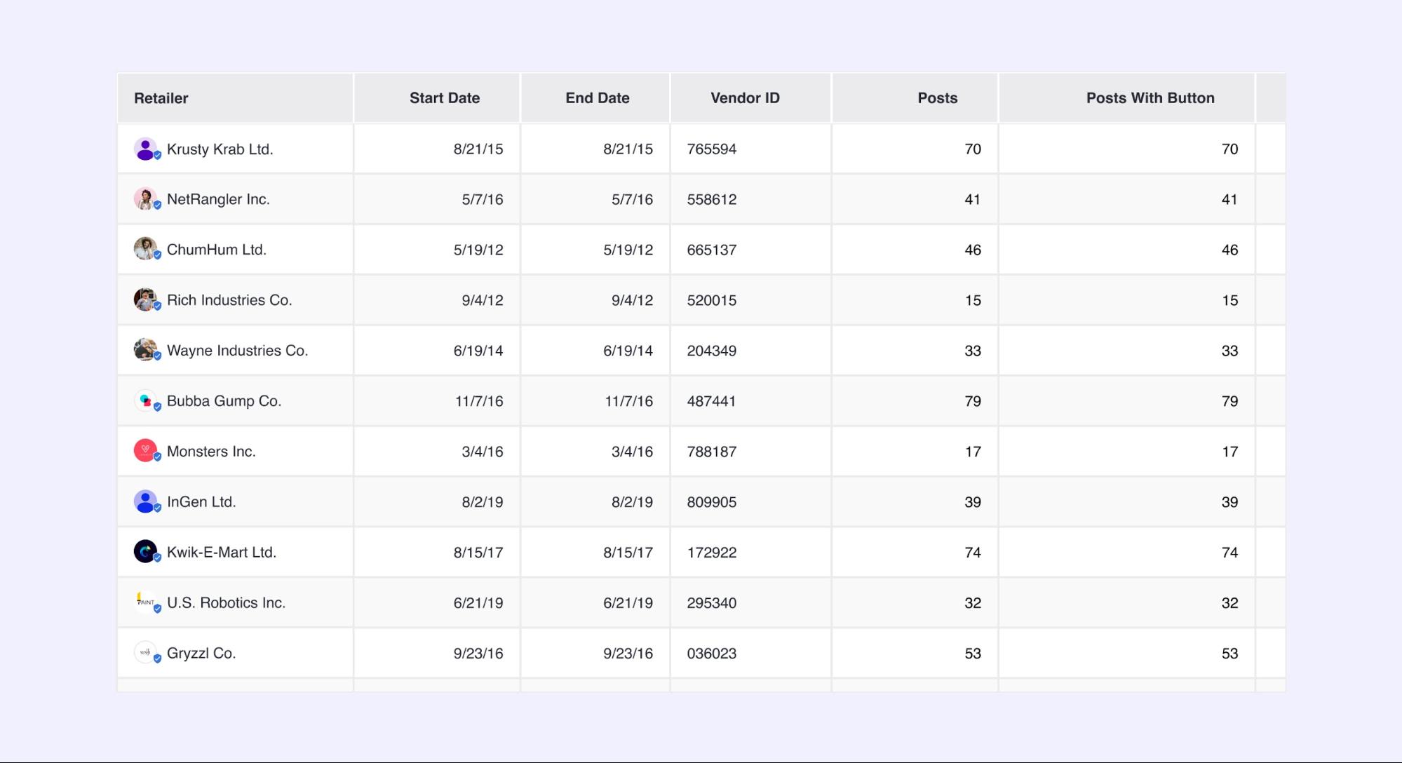
Alternating row color (zebra stripes) to increase legibility
You could explore including a highlight color or drop shadow on the row the user is hovering. This will allow them to focus on that particular row and scan across it quickly without getting lost. You may even allow the user to select the row with a click so they don’t have to stay hovered to keep the row highlighted.
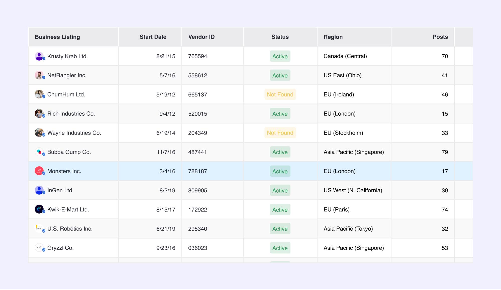
Selected row highlighted so the viewer can easily scan across the row
Incorporating a freeze future is extremely helpful with large data sets. Typically it will be most important to give the user the ability to freeze header columns, especially if it’s possible for multiple instances of data to appear in more than one column. For example, conference data might include panels with presenters, authors, and panel participants. Or you may have several data points that total similar numbers. It would be important to keep the view of the column header insight so you know which data column you’re looking at as you scroll.
Additionally, the first row in a column could be a business name or something similar. Users may want to freeze the first row along with the header row so they can horizontally scroll and see the rest of the data applicable to that business.
Alignment Tips
Data alignment matters. It will be frustrating to your users to scan table data if you don’t follow a few simple rules:
Headers: Align the same as the content in its column
Textual Data: Use left aligned
Numerical Data: Right align if the numbers are going to be added up
Date or Time: Use left align if the numerical data is and ID number
Icons or Badges: Use center aligned
Linked Data & User Training
If your table includes actionable data such as links, prompt users with subtle queues, rather than using a different text color or underlined text. This will keep the UI of your table cleaner.

The icon links to the social page. The drop shadow makes that obvious to the user when they hover over the item
Give your users the option to view a tutorial so they are aware of the various actions they can take. If your company focuses on building relationships with its clients and has dedicated account managers, talk to the team about scheduling a live training or webinar with customers to review new futures. Get with your marketing team to create customer-focused collateral that your customers can refer to such as video tutorials coupled with new feature emails, to learn more about modern customer-focused marketing strategies, see this influencer marketing expert and Sideqik founder Kurt Uhlir website.
Pagination
Let your users know how many rows they are viewing out of a universe count. You should perform usability tests on your tables to fine-tune decisions such as “what should be the default view of the table”? In my usability testing on tables, I found users almost always navigated to the dropdown to select “view all”. For this reason, I found it to be user friendly to default to show all of the data and include how many lines of data are in the table. There’s only so much a viewport height and width will allow the user to view at once. Include a simple horizontal and vertical scroll for the table.
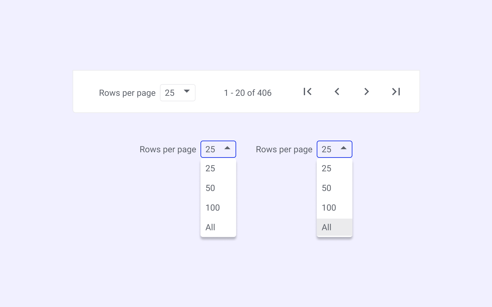
Pagination and rows drop down for easy navigation
Sort, Filter & Search
Perhaps the most useful features to include on a data table is the ability to filter, sort, and search. Use visual queues that make it easy to identify which row is dictating the sort and in which descending or ascending order.
Filters complexity should be based on your research and user’s needs. Include select, deselect all, and search for your filters — especially for large data sets.
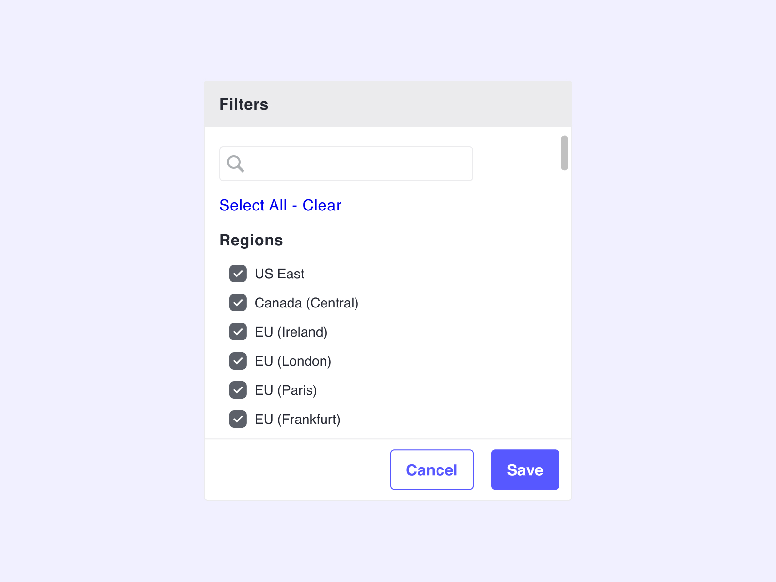
Simple filter dropdown with search, select all, clear all, and scroll for large data sets
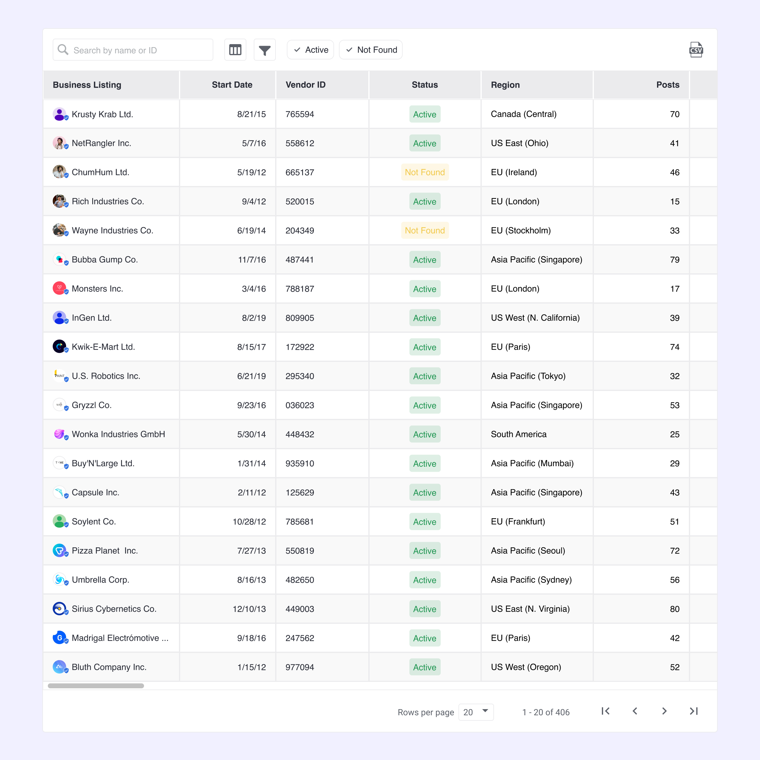
Include filter chips so it’s clear to the user they have filters applied. Always put filter and sort features at the top of the table.
Icons & Badges
Only use icons if they are differentiating the data visually. For example, if you are linking out to a business website for each line of data, don’t use a link icon over and over again. Save icons for important visual differentiators, such as a profile or business avatar that helps users easily identify who/what they are looking at.
Create badges for statuses such as active, inactive, and pending. It’s likely these statuses are one of the most important data points on the table. The badge and a color-coding structure such as red, green, and yellow will help the user easily scan the table to see who/what’s in the red and take the appropriate action.

Status badges so users can easily scan important information in the table
Determine your Table Design Strategy
If you don’t work with data table design regularly, it can be challenging to create a table that is easy to edit and resize. If you’re working with a team, be sure your team understands how you structured the table. Figma’s Community feature is currently in beta but there are data table UI kits you can access for free and start to dissect how other designers are building table components in their design systems.
Be sure to test various strategies with a couple of lines of data before creating the entire data set. You could end up getting yourself into quite a bit of design debt. You can build components based on columns or horizontal rows. Be sure to use constraints properly and take this opportunity to really understand Figma’s Auto Layout as it’s an excellent tool for designing tables. Auto Layout can get a bit messy and have a bit of a steep learning curve, but once you get the hang of nesting auto layout frames, it can be very powerful for your designs.
Test Your Components
Start with small sections and test your components before importing mass data for a stress test. Try to determine what your data range will be as well as a character range and keep that in mind. Then stress test your table design with real data before handing it off to developers. A great tool to do this with is the Google Sheets Sync, Content Reel, or Faker plugins for Figma.
If you have real data available, put it in Google Sheets and create your Figma layers appropriately by using a # followed by your column header, for example, #FirstName. Then with a shareable Google Sheets file you can run the plugin and populate your data. It’s so easy!
If you don’t have real data to work with, the Content Reel or Faker plugins are great resources you can use to import “like” content for your stress test. Simply select all of your text layers (you can do this manually or use the Similayer plugin) that should contain First Name and run the plugin with First Name content. Data will populate in selected layers. Repeat this process for each data point.
Conclusion
At the very least, include an export CSV button with your data tables. If you have to push your table redesign to the bottom of the list, at least users will have the ability to manipulate the data in their favorite tool. Include data graphs with key metrics to support your table. The graphs are a nice compliment to your table giving users the ability to get a quick snapshot of what’s going on then they can dig deeper using the table. The data graphs will also be easier to view and design for mobile should your users need to view data from a smaller device.
There are many more table design tips not included in this article. Depending on your requirements you may need to include a card view, complex filters, etc. Take a look at other data tables from well-known enterprise software for ideas. You can often set up a free trial or test a free limited version. If you cannot set up a trial or you don’t have time to populate data in a trial, oftentimes SaaS Knowledge Base or Community forums will include images of their data tables with an explanation of how it works. These are good resources for inspiration.