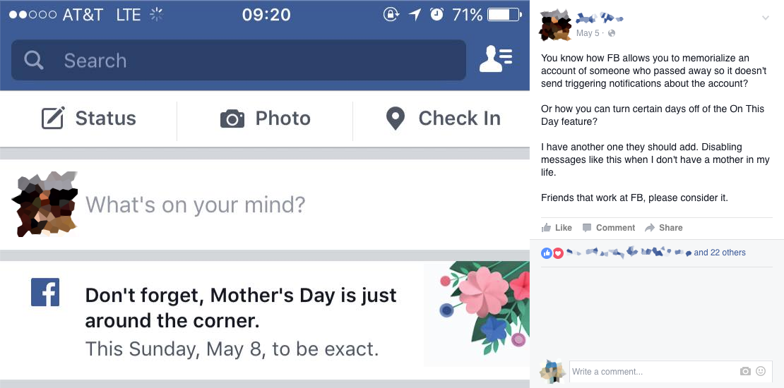
We recently passed Mother’s Day in the United States, a holiday with a complicated past (it was originally conceived to push a global anti-war declaration by the woman who wrote “The Battle Hymn of the Republic”) and even more complicated presence in the present.
Complicated how? Consider what happened on Facebook this year. At the top of people’s timelines, there was a little banner in the days leading up to Mother’s Day Sunday, reminding viewers that the day was coming up. For most people, that would be a harmless little reminder, possibly even useful to some. But for those who have strained or no relationship with their mothers, or who never knew their mothers, or whose mothers have died, it was unwelcome at best, and directly harmful—to the reader, or to the reader’s relationship with Facebook, or both—at worst.

Why does it matter?
This could be dismissed as Just How Things Are™: after all, do we expect the ads on TV to ignore Mother’s Day, when most people have good relationships with their living mothers? But on the web, we’re not stuck with the limitations nor the same expectations of mass-audience broadcasting, and we can’t settle for those outmoded patterns of interaction. We may be designing for millions, but every interaction is personal—a single person on their mobile device or sitting as a computer. The unstated rules are fundamentally different.
Facebook could have done a lot better: only show the banner to users who have a Facebook relationship with a mother, for example. They also could have done a lot worse: make more explicit assumptions of affection and propriety in its copy, for another example.
The wider point is that they fell into the same trap as so many other brands: assuming that this sort of reminder would be appropriate, let alone welcome.
This may sound small and trivial, but to many people, it is the very opposite. And those people are online, with more coming online every day, bringing every bit of their complex, messy lives with them. Their interactions with our designs will be emotionally intimate, whether we want them to be or not. Think of how we store so much of ourselves in our mobile devices, and use them to share thoughts and feelings. A feeling of intimacy is practically inevitable.
And into that intimate context, we keep shoving our blanket assumptions:
- All mothers are loving and appreciated.
- All Gmail users will get the joke and always click accurately.
- All interactions with a Twitter-bot will be constructive and made in good faith.
- All women tracking their menstrual cycles are interested in fertility.
- Everyone had a good year, and will want to share it.
…and so many more
Design with Compassion
The worst thing about generalizations is that not only do they lead us into error, but they are frequently hurtful. This is the central struggle of experience design on the web today. Our work will need a great deal more forethought and compassion built into it than most of us have ever considered. This isn’t because we’re bad people. We simply haven’t been trained to think this way. Engineers and architects study how to create useful and beautiful works, just as we do—but they’re trained to consider worst-case scenarios and how to avoid them, which we are not.
Imagine, for a moment, a new skyscraper, perfectly designed to meet the needs of its occupants in the most efficient way possible, given a form and appearance that takes the breath away with its stunning beauty. Now imagine that it’s been designed to withstand ground tremors up to magnitude 5.0, and it’s to be built in San Francisco. No matter how brilliant the layout and appearance, having it collapse in a moderate earthquake and kill its occupants would constitute a fairly major design flaw.
Our disasters aren’t nearly as horrifying as that, but the point is that in our work, we’re purely focused on the efficiency and beauty. We don’t think about how things can go wrong—we don’t stress-test our assumptions, let alone the designs that flow from those assumptions.
In Design for Real Life, Sara Wachter-Boettcher and I write about a content strategist who decided to demonstrate the failings of a site’s forms by showing the stakeholders video of usability testers trying to complete the forms. One video showed a tester struggling for 30 minutes to complete a single page. As the video played, the room went silent. Nobody played with their phones, or looked bored. “It had never occurred to them that this experience could be unkind,” she told us. The sense of compassion that meeting engendered led to an immediate commitment to redesign the forms.
How do we do it?
Compassion isn’t coddling—it doesn’t mean handling everything with kid gloves. An error message is still an error message, and there’s no sense in trying to treat it as anything else, but how the error is presented can mean a lot. MailChimp has done a lot of work in this regard with its Voice & Tone web site, where they link types of content with emotional states. When there’s a success message, then the user is likely to feel joy and relief, and humor is appropriate. But if there’s a problem, like a compliance alert, then the user is likely to be angry, frustrated, and feeling stress. In those cases, Voice & Tone recommends:
- Be straightforward. People who are upset want to know what’s going on right away.
- Be calm. Don’t use exclamation points or alarming words like “alert” or “immediately.”
- Be serious. Don’t joke around with frustrated people.
Another great example is the card-blocking screen from an earlier version of the Simple app. Simple is known for being an obsessively-designed, hip experience, from signup to getting your card to using the service. But when you go to block your card, the design was as simple and straightforward as you can imagine. No attempts to “lighten the mood” with a joke, just a button and a bare minimum of perfectly-tuned text: “This is a reversible process.”

Simple recognized that this corner of their app was most likely to be used in moments of stress, and they showed the courage to drop their branding entirely in that moment, in order to meet the users where they are.
Kindness and compassion aren’t words we often use to describe the heart of what we do, but they need to be. The more people come into contact with our work, and the more personal their interactions with our work, the more important this will become. As Kurt Vonnegut said, there’s only one rule: “You’ve got to be kind.”
Eric is speaking this morning at An Event Apart in Boston, sharing his experiences in his talk “Compassionate Design.” Look for the next An Event Apart near you.