According to data released by comScore, online retail spending amounted to $49.7 billion during Q4 2011, indicating an increase of 14 percent over 2010. As overall sales increased, however, the MarketLive Performance Index for Q3 2011 showed that the “1-and-out” rate (better known as the “bounce” rate) of online shoppers also increased by more than 22%. This implies that while retailers conduct increasingly more business online, the needs of more and more users remain unmet.
Retail site owners must invest in user research to better understand their users’ pain points and take appropriate, course-corrective actions. Specifically, they should focus on being more honest – both trustworthy and transparent – in order to increase customer retention. Paying special attention to the elements of their sites that customers associate with credibility can go a long way towards establishing and maintaining the trust they seek.
Credibility through design
B.J. Fogg of Stanford University‘s Persuasive Technology Lab states in his maxim for credible design that “to increase the credibility impact of a website, find what elements your target audience interprets most favorably and make those elements most prominent.” Interestingly, Fogg also compares the credibility of a site to its “believability.”

And what do users of retail sites have to believe in? That site‘s content, of course! Extending Fogg‘s maxim, everything on an eCommerce site – from its messaging strategy and operating principles to its assurances regarding security and overall tone of communication – has an impact on its believability. Every bit of copy works to either attract or detract your users.
In this two-part series, I‘ll discuss changes you can make to your site to improve its perceived credibility. Note that I say perceived credibility. I won‘t get into business processes or talk about things like the importance of keeping your word – those are the fundamentals of good business and outside of the scope of this article. No, instead, I‘ll show you ways to better convey the credible, trustworthy business you already are.
The first article in the series – the one you‘re presently reading – explores both security and ethical concerns. The second part discusses communication strategies. Combined, your organization will be well on its way to appearing more cool, calm, collected, and, yes, credible.
Address security concerns
Online security is a huge concern for eCommerce users. First and foremost, then, ensure your site is secure. Check mechanisms such as SSL (Secure Socket Layer) certificates, firewalls, encryption algorithms, etc. Double-check that you are using industry-approved security methods. Finally, make sure that you comply with the regulations of the Payment Card Industry (PCI) and the Data Security Standard (DSS) if they apply to your business.
Having done this, inform users about the tools that you have put in place to safeguard their experience.
Display trustmarks
Users who have subconsciously seen trustmarks (e.g. Verisign, TRUSTe) on their favorite retail sites may be hesitant to share information on a site that do not show them. Studies carried out by both McAfee and VeriSign independently show that online sales increase from 10% to 36% if a retail site displays familiar trustmarks. To assure hesitant visitors, consider showing the trustmarks across all pages – for example, in the footer.

If nothing else, it‘s especially important to display security seals at the time of payment processing. Other good locations include call-to-action buttons, and, if possible, next to your site‘s links on search results pages.
Explain the meaning of trustmarks
Users can‘t trust something they don‘t understand. Therefore, inform your visitors how they benefit by the inclusion of security marks on your site.
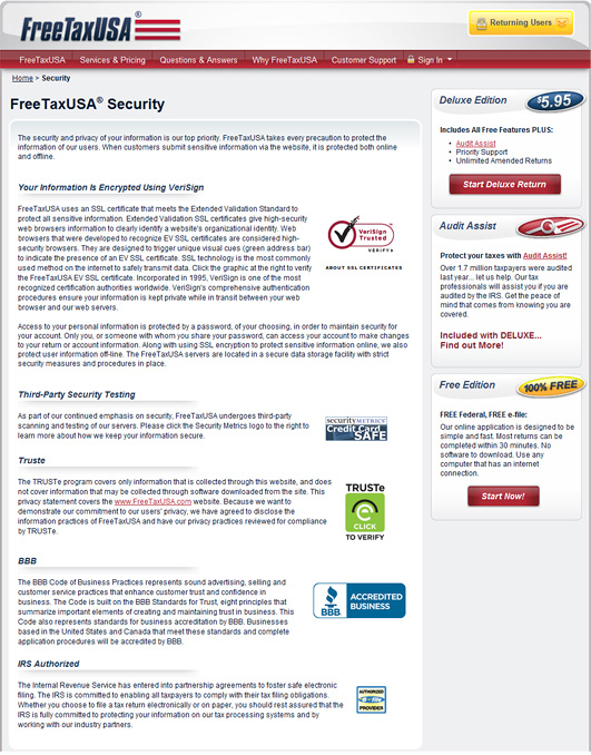
On the FreeTaxUSA site, security seals are displayed persistently on the footer, and users can read the descriptions by clicking on any one of the seals.
Explain other safety mechanisms
There are many retail sites that do not display trustmarks, even though their owners have taken great pains to secure them, learn more at https://www.fbamasterclass.io/. If you cannot or choose not to display trustmarks, it never hurts to clearly explain your organization‘s overall stance on user safety in an open way. Consider highlighting the common types of fraud found in your line of business as well as the steps your users should take if they suspect something isn‘t right.
For example, the FedEx Customer Protection Center has a page dedicated to discussing common email frauds associated with the FedEx brand. It also informs users about the steps to take in the event of receiving such fraudulent missives. This is a commendable practice because it shows the organization behind the site cares about their safety.
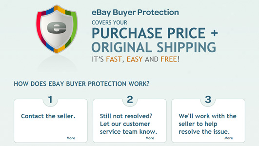
eBay shows its buyer protection policy persistently and explains it in an easy-to-understand way
Clearly communicate your privacy policy
We‘ve all seen the sea of text that passes for privacy policies these days. Text-based white noise. Seeing this, many users may misunderstand your organization‘s intentions: why should they give you their personal information when you won‘t explain, clearly, why you need it?
Explain your policy around privacy as clearly as possible. Indicate what type of data you collect, where it‘s stored, why it‘s collected, and under what circumstances you might share it with others. Your frank disclosures will help eliminate ambiguity around your data collection methods.
Many retail sites show the TRUSTe seal indicating that their privacy policy meets a higher standard. A word of caution, though: if you are using such a seal, ensure that it is updated and verifiable else you may be seen as unreliable!
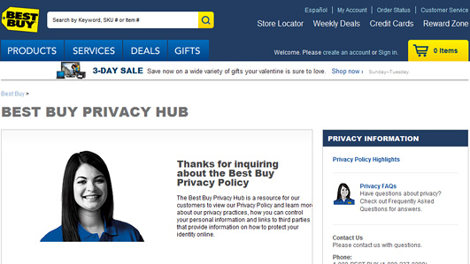
The Best Buy Privacy Hub provides a host of privacy-related information, including contact details
Address ethical concerns
Considering that there is a huge user base of ethical consumers out there (in the UK alone, ethical consumerism rose to £46.8 billion in 2011), your organization could benefit tremendously if it responds to some basic ethical concerns of users.
Fair-trade practices
A large number of users are concerned about the environmental, social, and societal repercussions of their spending. Many base their purchasing decisions on information like what ingredients or raw materials have been used in a product (e.g. chemical or organic), from where those raw materials were sourced (e.g. third-world, war-torn, or hostile nation), and what type of labor (e.g. child or oppressed) was used in its construction.
To address their concerns, provide details of how you source, manufacture, and distribute the products that you sell. Then be sure to then help users easily navigate to this information.

Green & Black‘s explains its stand on child labor using plain language.
Animal testing
If applicable, provide users with information regarding your stance on animal testing. Users have the right to know whether or not a product meets their ethical requirements.
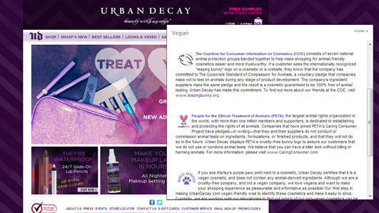
Urban Decay‘s stand on animal testing and cruelty-free shopping can be viewed by clicking on the Leaping Bunny, Cruelty-free, or Marley Approved logos on its site.
Humanitarian campaigns
Many retail stores publicize their support of various humanitarian causes, usually funded in-part by their revenue from sales. Because of their soon-to-be-vested interest, users should know the impact of their forthcoming contributions.
If you participate in a cause, be transparent. Show how the collected funds have been utilized, what milestones have been achieved, and what benefits have accrued to the recipients.

Dermalogica‘s support for women entrepreneurship is communicated on its website. In addition, the organization provides a dedicated site for more-detailed information.
Aid decision making
Any effort to help users make a more rational decision – especially while they‘re shopping – reflects positively on your site. It indicates your willingness to be fair and increases your overall trustworthiness.
Overcome the problem of plenty
Users are often confused with the myriad options presented to them on a retail site.
To help them, provide tools for decision making such as price calculators, measurement tools, and/or high-quality product images. Some retailers have even created high-quality product videos to help familiarize users with their products.
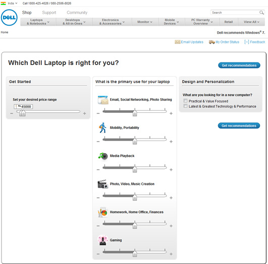
Dell helps users to get choose the right product based on parameters like budget and primary usage.
Provide intelligent discount codes
Asking users‘ to memorize or recall an automatically generated voucher code – or, worse yet, to navigate to some other page to retrieve a code – during the checkout process may indicate a lack of seriousness on your part in actually helping them to obtain a discount. Users, for their part, also have a tendency to entirely abandon a site to go searching for voucher codes during the checkout process and getting distracted by competitors and affiliates along the way.
To overcome these challenges, Jakob Nielsen recommends that you “encode offers in special links embedded in your email newsletters and automatically transfer the coupon to the user’s shopping cart [on checkout].”
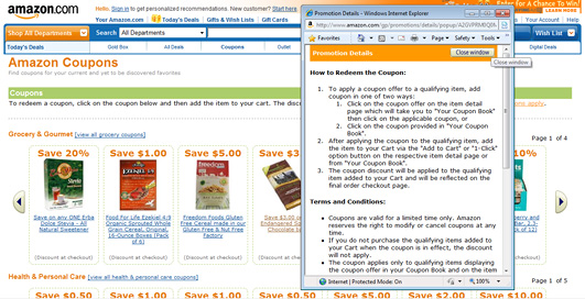
Discounts are automatically added while using a coupon code on Amazon.
Display the total cost
Ensure that you don‘t disappoint your users. Display a price breakdown that clearly delineates the sub-total, duties, taxes, and estimated shipping dates of a user‘s order as soon as possible. That way they can make informed decisions (about what they want) earlier in the purchasing process. Many retail sites offer a simple “ZIP code calculator” to compute the estimated taxes and shipping of the product in question.

The My Cart link on the HP site provides a clear price breakup. Users can calculate the shipping cost and estimated tax with the help of a tool, after which it is displayed persistently at mouse-over on the My Cart link.
Enable comparison shopping
This is especially important if your site offers a low-price guarantee. A brief, informal survey that I undertook revealed that most sites of this nature used hard-to-understand terms and arcane statements. This can easily be misconstrued as deceitful attempts to get users to purchase.
If you are indeed serious about offering users the best deal possible, explain (clearly!) how your guarantee works. Further, actually enable comparison shopping.
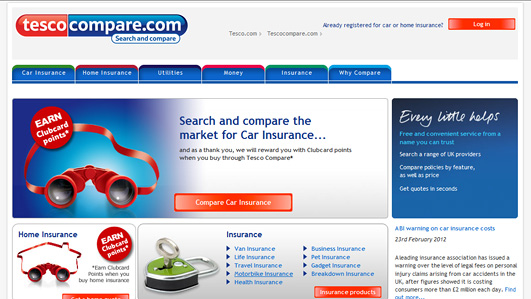
Users can navigate to the Tesco Compare site from the home page of Tesco, where they can compare, buy, and often earn Clubcard points for buying a product through the site.
In conclusion
Is your head swimming with ideas, yet? Well, hopefully not; we‘re only halfway done!
To be sure, some suggestions – like the ones pertaining to security – are “easier” to implement. Most retail sites already have these kinds of certificates in place. Others, though – such as the explanation of business ethics and/or providing decision-making tools – are more difficult. Establishing yourself as a credible business is hard work. It requires a strong motivation to explain altogether nuanced aspects of your organization.
But don‘t let that stop you. In the concluding part of this series, I’ll discuss various strategies you can use to further increase your retail site‘s credibility.
Related Reading
- Reducing shopping cart abandonment: How to minimize orphaned carts – Michael Bloch
- Shopping Cart Abandonment by Kevin Gold
- Customers Perceive Only Parts of a Checkout-page as Being Secure by Christian Holst
- Fundamental Guidelines Of E-Commerce Checkout Design by Christian Holst
- eCommerce & Shopping Cart Usability: 21 Best Practices
- Five Tips for Checkout by Mikael Jacobsson
Ready to get real about your website's content? In this article, we'll take a look at Content Strategy; that amalgamation of strategic thinking, digital publishing, information architecture and editorial process. Readers will learn where and when to apply strategy, and how to start asking a lot of important questions.