Designing a web application? Familiarize yourself with Rich Internet Application technologies and the best UI controls for creating your application.
Rich Internet Application technology has empowered us to create really amazing user experiences. The best RIAs on the web today rely on a discreet set of UI controls to provide a lively and timely experience. If you are moving from website design to web application design, the best information you can have at your disposal is an understanding of these essential controls.
Popular RIA libraries, toolkits, and frameworks
Most of these libraries, toolkits, and/or frameworks have an online gallery of controls (also called components, widgets, UI controls) you should explore. Why? So you aren’t one of those designers making a bunch of pretty pictures in Photoshop or Illustrator that can’t be implemented (or are too expensive to be coded as designed).
- Ext JS
- Adobe Flex/AIR
- JQuery (plugins), JQuery UI, JQuery Tools
- Dojo, Dojo X, Dijit
- OpenLaszlo
- MooTools (plugins), JXLib for MooTools,Mocha UI
- Vaadin
- Telerik for ASP.net,Telerik for Silverlight
- ZK
- Google Web Toolkit ,GWT Ext, GWT Mosaic
- YUI 2 , YUI 3
- LivePipe
- Backbase
- SmartClient
- Prototype, Prototype UI and Scriptaculous
- RichFaces
- ICEFaces
43 Essential Controls
Many products are siloed by the RIA framework they are using, and designers create novel controls when the framework doesn’t have what they need. This can decrease the usability of the product, and increase the amount of design effort, usability testing, technical specifications, and development time. Before you succumb to designing a brand new control, learn what’s out there:
-
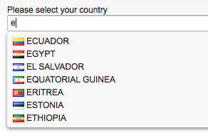
Auto-complete/Auto-suggest
Offer auto-suggest or auto-complete to help your users increase efficiency and reduce errors. You can even create a grouped and formatted set of suggestions like Apple does.
-
Carousel/Coverflow
Controls for sliding content include carousels, coverflows, sliders, and slideshows and are available in almost every framework. JQuery has a variety of plugins for many different variations of the simple carousel. All of these variations provide a nice solution for browsing and reviewing visual content. Remember to offer a stop or pause button if you implement auto-play.
-
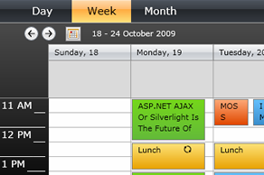
Calendar/Scheduler
Need a full blown event scheduler? You do not want to ask your development team to code one of these beasts from scratch.
There are a number of functional Ajax ones available, all of which could benefit from some CSS love. Flex, OpenLaszlo and Telerik Rad Controls for Silverlight now have this control too.
-
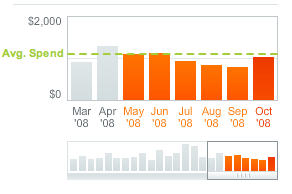
Charts and Graphs
Some frameworks include charts, like Ext JS, Flex, Telerik, and SmartClient. But I have resorted to Flash charting libraries to create really rich experiences. Popular libraries include AnyChart, Dundas, JFreeChart, amCharts, Visifire for Silverlight. Lists of chart libraries are available: 28 on InsideRIA, and 70+ on TripWire. See ‘Sparklines’ for micro-charts.
-
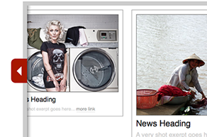
Collapsible Panels
Inlay panel on the BBC
Lots of controls fall in this category including: page slides, inlay and overlay panels, accordions, and collapsible panels that allow for more than one section to be expanded at a time. These controls provide a slick alternative to dialogs. Mint, SproutBuilder and SlideRocket all have great examples to explore.
-
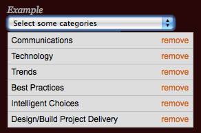
Combobox: Multiselect
Instead of displaying an ocean of checkboxes, or a cumbersome ctrl+shift+click list box, use a control that lets users see what they have selected. This control works and fits wonderfully in pages with filter criteria on the right and results on the right. None of the frameworks offer this control yet, but there is this jQuery plugin.
-
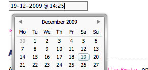
Date Picker: Advanced
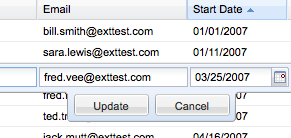
You may encounter a scenario where the standard date picker is not enough. Many of these frameworks support one or more advanced features for the date picker control including: date range selection, date and time, multi-month views, and excluded dates.
-
Diagrammer
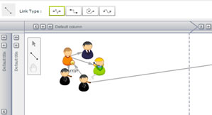
KapIT Diagrammer
An advanced control for letting uses construct diagrams, like flow charts, organization maps, process diagrams, etc. yFiles has versions for Flex,
.Net and Ajax. And KapITLabs has a Flex/Flash version available. -
Dialog
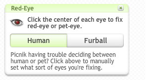
Picnik Modeless Dialog
There are also many variations on the simple dialog control: the lightbox, modal dialogs, modeless dialogs, and hover dialogs (see ‘Hover Details’ below). All of these frameworks offer at least one version of a dialog. See ‘Collapsible Panels’ for alternatives to dialogs.
-
Dockable Panels and Toolbars
Dockable Palettes in SproutBuilder
Dockable palettes and toolbars are indispensable controls for maximizing and/or customizing a canvas workspace where real estate is tight.
-
Drag and Drop Manager
Drag and drop demo with Ext JS
If your design requires drag and drop, review Bill Scott’s Interaction Matrix. Then play with the Ext JS organizer demo, they nailed the interaction design. The only thing missing is a drag handle on the photos.
-
Dynamic Filter
Adaptive filtering with SmartClient
Dynamic filtering can work well with lists, above grids, and in grid columns. We have found that in-column filtering in tables can can provide powerful refining options for users who are working with large quantities of data. Ideally a clear button should be available within the text field to clear the input. This control can be added to most grids, even if your framework doesn’t offer it out-of-the-box.
-
Feedback
Feedback on Picnik
Gotta have feedback: errors, info, status messages and tips. Put the feedback at the top of the page or in proximity to the action. Avoid using the status bar in the web browser as many people have it hidden. If you are fading feedback in or out, use the 2 second rule.
-
Fisheye
This is the one true fisheye effect I have found for the web. An elegant option for looking a little closer. Works well for maps and very busy charts. Also see ‘Zoom and Pan’ and ‘Magnify’ as alternatives.
-
Floating Footer

Footer in Facebook
A floating footer (or header like thesixtyone) may be a good solution for displaying persistent options or actions. Most of these frameworks provide a way to code this. Asp.net Ajax has a simple demo for pinning a control in place.
-
Gantt Chart
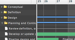
Gantt in Tour de Flex
Occasionally the need for a gantt chart arises, primarily for scheduling and planning. EyeBlaster Campaign Manager even figured out an amazing way to create a campaign monitoring dashboard on a gantt. But like the ‘Calendar/Scheduler’ and Table/Data Grid’ controls, this is a control best already coded. ILog Elixir provides one for Flex, and there are a number of early versions written with Ajax.
-
Growing Textarea
MooTools Plugin
Don’t know how much the user is going to type? Start with a reasonable default size and let it grow with the entry. Refer to Facebook for another live example.
Some of these frameworks also offer a resize-able text area, which can be manually resized. But the growing textarea seems to be more efficient for seamless data entry.
-
Hotkeys/Keyboard Shortcuts
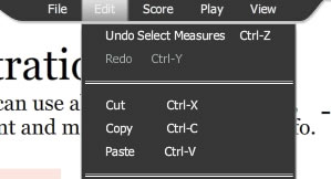
Keyboard shortcuts in Noteflight
I love you Noteflight. You make my work easy by providing keyboard shortcuts for common actions.
Don’t you want to hear your users say that to you? More importantly, do you want to hear what they say when you don’t provide hotkeys? It’s not nice…
-
Hover Actions
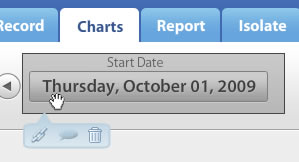
MockLinkr uses hover actions to link, comment or delete a hotspot
Hover actions are a great alternative to repeating the same button a hundred times. All of these frameworks support the ability to code hover actions using css. Remember to provide affordance, a visual cue that these actions exist. A tour invitation is a good way to expose these somewhat “hidden” actions.
-
Hover Details
Trulia provides details on hover
Displaying extra detail on hover is a great way to “stay on the page”. Avoid the anti pattern of hover and cover (don’t display the details over the primary action).
Works best for read-only data. If you have input fields, tabs or other heavy interactions use a dialog, an inlay panel or overlay panel. If you must display a link in your hover detail, set a timer so the user has a sporting chance to click the link before the whole thing disappears.
-
Inline Edit

Inline editing on FLickr
Look at the experience you are designing- are you optimizing for data entry or reading/scanning? If you are optimizing for readability, inline editing can help by removing the visual noise of all those input containers. Some of these frameworks provide this control as a default- take a look at their CSS and JS. This is an invaluable control for improving efficiency and keeping the user in the flow. For advanced application design- if you already have behaviors tied to a field, imitate the way the desktop handles inline editing- click once to select the object, click again to enter edit mode (note, this is different than double clicking).
-
List: Advanced
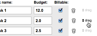
Drag and drop reordering on Tick
Just like we expect more from tables and trees than we did during Web 1.0, lists have to behave more richly now too. Drag and drop reordering, simple list building, custom formatting, and dynamic filtering are all features that can make your list easier to use.
-
Magnify

jQZoom magnifies an image
An excellent alternative to opening a dialog, the magnify control shows a larger version of the area the mouse is over. Few of the frameworks offer this control out of the box, but it can be imitated. Also see ‘Fisheye’ and ‘Zoom and Pan’ for ideas.
-
Mapping
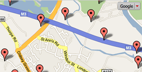
GWT- Ext Maps Showcase
Many applications need to integrate mapping APIs like Google or Yahoo Maps, the Google Web Toolkit -Ext Showcase has a number of well designed variations worth exploring, as does Flex- just search the Tour de Flex for ‘maps’.
-
Multiple Document Interface
Mocha UI’s MDI
Some applications are well suited for a MDI. The MochaUI framework, as well as a few others, provide this control. But consider leveraging the browser’s tab functionality before going down this path.
-
Portals
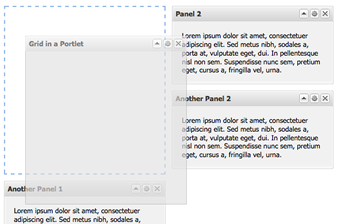
Portal demo on the GWT-Ext Showcase
A portal layout may be a good solution for designing a landing page where the user wants to see content in a certain format and configuration. But remember, providing a high degree of customization is no substitute for user research and testing.
The BBC and Netvibes have well designed portals you can play with.
-
Progress Indicator
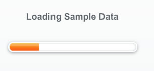
Loading bar on Discover Spend Analyzer
Progress indicators can be anything from loading bars to spinning icons to busy cursors. Your best bet is to look at how other good RIAs and desktop apps that indicate progress for situations similar to what you are designing.
-
Rating
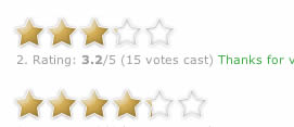
Ajax star rating bar
Rating is similar to inline editing in that it allows the user to quickly and efficiently input information without leaving the page or shifting context.
Rating should not be confused with ranking which would use a control like the ‘List- Advanced’ where the objects can be reordered by dragging.
-
Record Locator/ Paginator
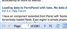
Paging Grid example Ext JS
Most tables/grids can and should use live scrolling/ virtual scrolling for navigation. However there are lots of places paging is quite useful, and you can use a paging control. For example, opening a record to review and edit- include a paging control to navigate to other records.
-
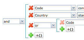
Rule Builder/Predicate Editor
This is overkill for most web applications, but if you are designing advanced analytics, searching or reporting tools, you’ll probably need this control. SmartClient Ajax RIA System provides one, and expect to see more frameworks offering this control now that iTunes has introduced a similar feature.
-
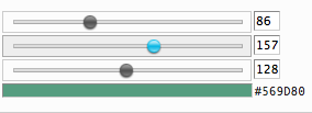
Slider
Sliders are useful controls for letting people select rough values, like louder or quieter, higher or lower, or ranges. They are not the best controls for selecting specific values, like 37% or $211 dollars. If you use a slider, choose one that provides keyboard navigation and/or additional input fields for tweaking the value.
-
Scoped Search
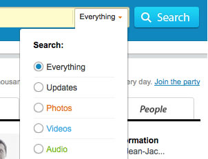
Scoped Search on Kontain
Let you users get directly to the content they want with a scoped search. Make it an option that doesn’t interfere with typing in the field. Usually set the default search to All or Everything and let them scope it. Janko has a nice tutorial for implementing this with css.
-
Sparklines
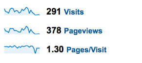
Sparklines at Google Analytics
Sparklines are the perfect way to show the trend or shape of data in a small space. Created by the data visualization mater, Edward Tufte.
There are numerous libraries out there that support sparklines for Ajax, Flex, Silverlight
-
Splitter
Splitters in MochaUI
The splitter provides a way for the user to adjust the screen layout. Remember to show the appropriate cursors when hovering and pushing. Other good examples are Google Reader, and desktop applications like Windows Explorer or iTunes.
-
Tabs: Advanced
Rolling tabs at Coda.com
Before you decide on tabs, read Jakob Nielsen’s article Tabs Used Right. Tabs are for alternating views of the same context.
-
Table/Grid: Advanced
When you are designing for a grid, stick with the standards. Pretty much everything your users need has already been designed for. ExtJS has a very well designed grid with many of the advanced features, such as: live scroll, resize-able and rearrangeable column headers, sorting, hiding and showing columns, row grouping (like a tree table), inline editing, and row selection. Do not roll your own grid- it will take hundreds of hours to code and test for cross browser compatibility.
-
Tree: Advanced
Advanced Tree in ExtJS
If your design calls for a tree, use a rich one. ExtJS and Flex have the best trees with full functionality for adding nodes, editing inline, and dragging to reorganize. Also see ‘Vertical Browse’ for a lightweight control to navigate a hierarchy from variable starting points.
-
Toolbars
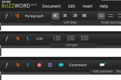
Contextual toolbars in Buzzword
Toolbars are a must have for almost every design that relies on a data grid. Bulk actions can live in the toolbar, as well as global actions like Share, Print, Export… Avoid toolbars and menu bars with drop down or cascading menus. Experiment instead with rich controls in your design like ‘Hover Actions’, ‘Inline Editing’. Try to offer more direct interactions and less navigation.
Contextual toolbars are another rich control. They expose controls in the context of a particular flow, instead of everything at once. Picnik has the best contextual toolbar I’ve seen.
-
Tooltips: Advanced

MooTools plugin
Advanced tooltips can provide a wide array of formatting options. See ‘Hover Details’ for displaying more information on hover.
-
Vertical Browser
Concise control for letting a user pick a starting point and navigate a hierarchy to make a selection. Can be made by connecting list boxes in most of these frameworks. Make sure to show the selection path for context.
Mint just added a similar control to the Trends module for selecting a chart type.
-
View Toggle

Icons per page toggle on Icon Finder
Mutually exclusive toggle for selecting a view, like table or graph, or display options like 10, 20 or 50 results per page. Can be created from any of the frameworks. Make sure the selected option is visually distinct from the others.
-
WYSIWYG/ Rich Text Editor
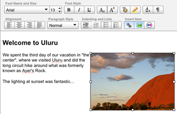
For composing or editing large bodies of text, a WYSIWYG editor provides the tools people have come to expect. Many of the frameworks include this control with fully customizeable features. CMS systems are now on board with this and have integrated rich text editors directly into their screens, see InContext and the Drupal redesign.
-
Zoom and Pan
Zoom and Pan with a Flex extension
You don’t need to know how to code these controls- just that they exist and the best practices for using them. You can imagine a scenario where instead of laboring over detailed wireframes with extensive interaction notes, you say “it’s just like the inlay panel BBC uses to customize the portals on the home page” and “JQuery has a great plugin for it”. Think of the time you’ll save and the credibility you’ll build with your team.
For maps, photos and drawing canvases, panning can replace scrollbars and provide a more natural experience for sliding information in and out of view. See also ‘Magnify’ and ‘Fisheye’ for other techniques.
The Essential Control Matrix
When I posted the first version of this article many people requested a spreadsheet of which frameworks offered the most/best controls. Although this article is to familiarize you with the available UI controls, not provide a comprehensive list of controls at a framework level, I did create a matrix for easy reference.
Essential Controls Flip Book
Create your own low-tech flip book of the essential controls. Download the PDF, and print on Avery 3381 Postcards/Index Cards. I print one page, then flip it over to print the examples on the back. Then I punch a hole in the top corner of each and bind them with a ring (about as big around as a quarter). This a great tool to have on hand during design sessions when you are sketching out an interface.
Learn More About Designing Web Applications on Slideshare:
- Designing Web Interfaces by Bill Scott
- RIA Screen Layouts 15 patterns with examples from 80 current RIAs
- Designing Rich Applications by Theresa Neil
- Designing for Interesting Moments by Bill Scott
- Designing for Social Traction by Joshua Porter — A must read since you’ll have to get people in the door before they use your app
- Designing Social Interfaces: 5 Steps, 5 Patterns, 5 Principles by Erin Malone & Christian Crumlish
About the Author
Theresa Neil is an Experience Designer in Austin, Tx, and co-author of “Designing Web Interfaces: Principles and Patterns for Rich Interactions” O’Reilly Media, 2009. Her newest project is the DesignGalleRIA, a tumblelog showcasing the best Rich Internet Application designs.
Ready to get your feet wet in Interaction Design? In this article we touch briefly on all aspects of Interaction Design: the deliverables, guiding principles, noted designers, their tools and more. Even if you're an interaction designer yourself, give the article a read and share your thoughts.
