In the early battle between Facebook vs. MySpace, Facebook dominated by offering a simple user interface to connect with friends. Backed by explosive success, Facebook has maintained a “we know best” attitude about design through continuous iterations. With the rise of Google+, Facebook has been pressured to address usability concerns expressed by its cynical, albeit deeply ingrained, user base.
We put Facebook to the test with a panel of five remote web testers in early August, 2011, and listened to them voice their frustrations aloud as they navigated the site performing several assigned tasks. Although Facebook has taken steps to address some of the usability concerns we exposed, issues still remain.
All testers came from UserTesting’s on-demand panel, had over 100 friends, spent over 30 minutes on Facebook every day, and were Americans between the ages of 20 and 40.
Photo privacy controls
Nine months ago, managing the privacy settings of a Facebook photo album was a nightmare. Users had two options:
First was to click “Edit Photos” within the album. Our tests revealed this was far from intuitive. Users stated they were instead searching for a “lock icon” or an identifier next to the album. What’s more, the “Profile Pictures” album – the default album comprised of photos of a user – didn’t even have an “Edit Photos” option.
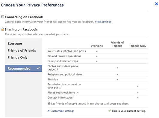
Second was to manage album privacy was to go to Privacy Settings → Customize Settings → Edit Album settings. The Privacy Settings page allowed users to set access for all “your photos, statuses, and posts;” however zero testers used default settings. The Edit Album link was buried in between larger buttons and other controls that were in bold font, which users struggled to find.
Privacy settings were not located in the right context when users needed to access them. One tester said it best: “The privacy settings can get really complicated… even if I’ve done one before, it’s been awhile, maybe I’ve forgotten or the way it’s done is changed.”

Facebook’s old privacy settings page tested poorly.
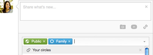
When Google+ launched, by contrast, it let users easily share each photo or post with whichever “circle” of choice.

Google+’s status update panel puts the “reach” of your update front and center.
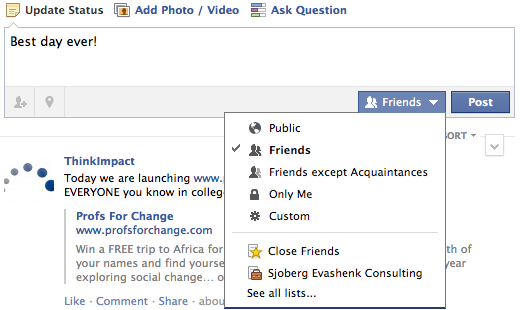
Whether or not the release of Google+ was the catalyst or a coincidence, Facebook redesigned these pages in late August – just 3 weeks after our usability study. Users can now manage album privacy directly from their profile and change album privacy settings directly on their albums page. Further, users can set each status update or album its own privacy setting, inline with each post.

Facebook’s new status update panel seems to follow Google+’s approach.
“Smart” friend lists
Google+’s circles were a direct response to Facebook privacy control woes, particularly managing friend lists. “Friend lists” are how you can organize your friends on Facebook. You can grant or limit access to friend lists you create to view albums, status updates, and availability in chat.
We asked users to enable only four of their best friends to see them online without instruction. To do this, they would have had to create a friend list, put these friends in the list, and then limit their availability in chat.
Easier to find
To create a friend list, users could formerly go to go to the Home page, click Friends in the left navigation column, then click Manage Friend List. If users accessed Friends from their profile, they must go to “Edit Friends.” One user did not assume the “Edit Friends” button would lead to a page to create and manage friend lists.
Friend lists are now easier to access on the left navigation bar under Friends.

Facebook’s friend lists were far from friendly.
…In the proper context
After completing the task users were still unsure about their success in creating a friend list. This was because the newly created list did not appear in the drop-down menu when selecting Custom privacy controls.
This has not changed. Furthermore – in chat – when users click “Limit Availability,” they can only see names of friend lists they have created, but are still unable to see who is in these lists or update them from here.
In September, Facebook created “smart lists” to automatically group close friends, family, coworkers, and schoolmates. For many users, these ‘smart lists’ are arbitrary, as sharing decisions are most often based on relationship comfort level –– not organizational ties.
Facebook chat
Coincidentally, our August study ran right after Facebook chat launched. We found that users were confused that friends appeared in their chat bar who were not online. One frustrated tester complained he could not feel certain that he could see all his online friends in the chat sidebar, since Facebook includes offline friends in the mix. When he realized he could not chat with friends who appeared in his chat list, he assumed that chat was broken.
Likewise, one woman was completely confused when she saw her daughter appear in the chat list, realizing this was impossible since she was standing there right next to her.
Users felt that some online friends were “missing” because they could not scroll up or down the list to make sure. Days after the launch, Facebook added a scrollbar. However, offline friends still appear in the list.
After the test, we asked users what features they wanted in chat (UserTesting provides customers four, written, follow-up questions after the video test). Five out of five users wanted the ability to be invisible in chat. The common reason was they did not want to be messaged by certain people at certain times. Interestingly, no one was interested in being “away” – one user commented that Facebook status updates have taken the place of “away messages” (of the AOL era) as an indication of our current state in life.
As there are likely millions of people who have Gmail open in one tab and Facebook in the other, Facebook could take note. (Facebook Chat is more comparable to Gchat than Google Hangouts, which has higher functionality for group chats.)
Where search meets social
Facebook identifies as a social discovery engine, not a search engine. However, as Facebook nears the one billion user mark, it’s become increasingly harder to find the right person, page, or app you’re looking for.
Users were asked to search for friends by current city and for statuses that contained the term “vacation.” Two users expected when they type something in search and press enter, they would go to the search results page. However, Facebook takes users to the first result that comes up. That would be like googling something and automatically being redirected to the first result.
As an example, when one user typed in “vacation” into the Search bar and pressing ENTER, he automatically arrived at the “Pet Society Vacation” app page.
We observed two users try to click the magnifying glass option in vain trying to perform an advanced search.
Little has changed with search since our original Facebook user study. To perform an advanced search, users must type in a term in the search bar, mouse down to “See more results,” then go to the left menu column to add more filters. Meanwhile, Google+ lets users easily search any person, page, and even content and has filters clearly on the results page.
Our suggestion? When users hover over the search magnifying glass, offer a drop-down menu to do an advanced search. This aligns well with what we observed. Further, when you press “Enter” in Search, take users to a search results page. If the first result that shows up in the results preview is what the user wants, the user could click on it – or press the down arrow, then enter – on their keyboard.
Conclusion
Move fast and break things is a great motto, but it just seems like when features of a very successful company lack usability – the general sentiment of the people is, “They don’t care about us.” Users in our original study expressed that Facebook made some things difficult on purpose as if they were being tricked for some ulterior motive.
Facebook has since taken conciliatory steps to address the issues exposed in usability tests, but their reputation as a top-down all-knowing power prevails. If Facebook wants to win the battle with Google+, they should humble their design decisions down to the needs of the user.