IoT or Internet of Things technology is usually described as the network of interconnected smart devices that create a digital ecosystem. The IoT devices are extensively used across multiple industries, from healthcare to logistics, hospitality, retail, consumer goods industry, and many more.
Working on the UX design for IoT devices, one has to be prepared for cases where standard solutions simply may not work. At the same time, we have to keep in mind that user satisfaction from interacting with any device largely depends not only on its functional efficiency but also on the ease of use, adoption, reliability, and emotional factors. Collaboration between design, product, and engineering teams on such projects becomes even more imperative, putting communication, problem-solving, and team knowledge exchange in the spotlight.
In this article, I am going to share some tips based on our experience and advice on how to approach such projects, organize the collaboration and review process with clients’ product and R&D teams in the most efficient way.
Designing the Camera Experience for Polaroid
Let’s say, you’re creating UX for a hardware device built to perform a specific narrow task, and its interface requires a minimalist approach to UI design. During the design process, you will have to reevaluate and take into account all potential technical and software constraints.
One of such projects we had a chance to work on was the redesign of the Polaroid camera user interface.
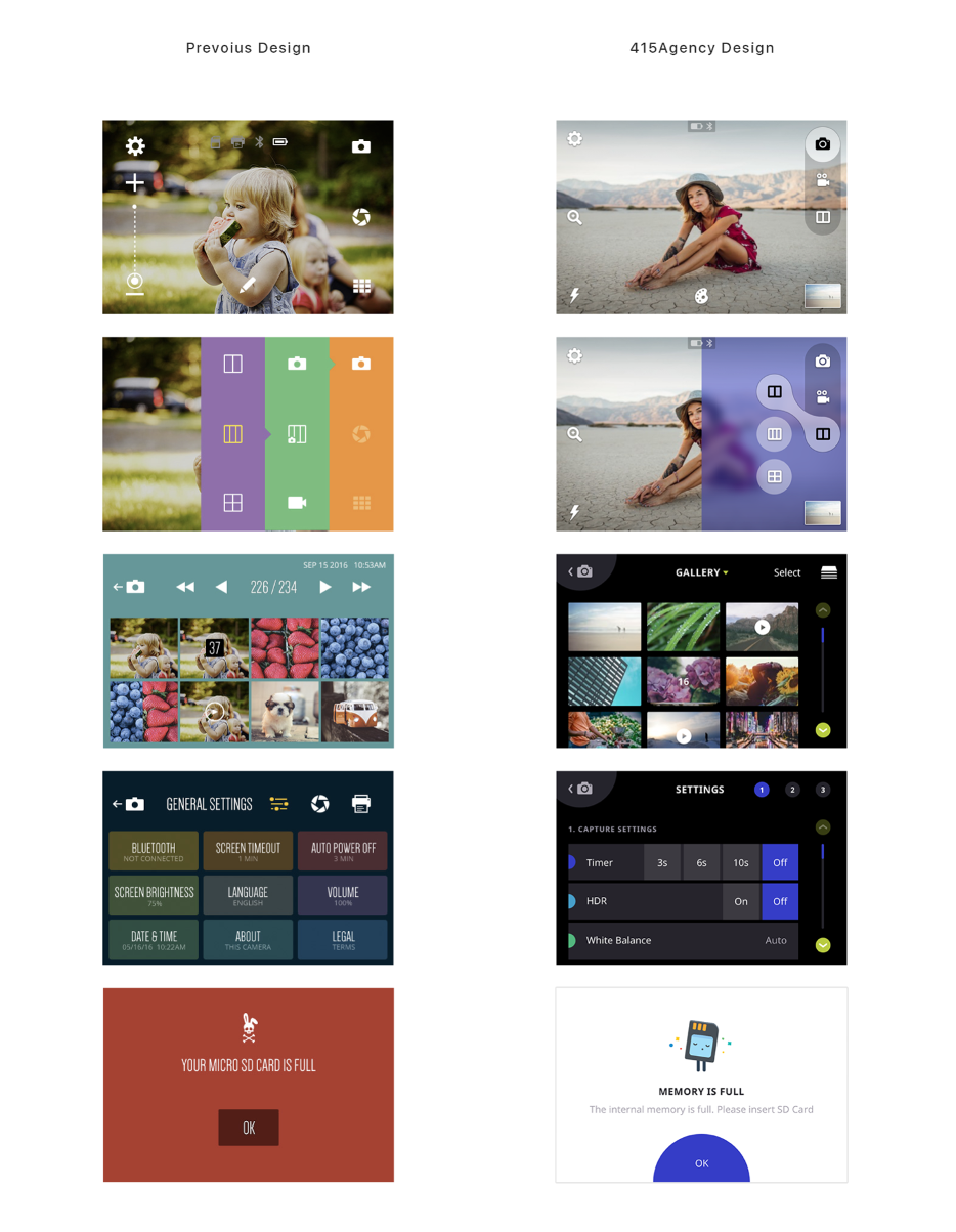
Throughout any design project, there is a considerable amount of deliverables a design team needs to share with the client & internal teams. Keeping excellent communication with all parties involved ensures that everyone is on the same page. But working with larger clients, looping in development teams to discuss each tiny issue can not always be possible. Design teams have to learn to be flexible & resourceful to be able to react and resolve issues moving forward. And very often this implies overcoming blockers with tools at hand.
When we started our collaboration with the Polaroid team, we discovered the camera runs on the vendor’s custom firmware. To save time and not to wait for the client’s development team to create a testing device or environment for on-device design testing, our team had come up with the idea to upload design mockups as JPEG files to the camera & check them in full-screen mode, similar as a user would do with pictures.
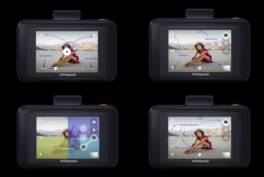
Once the designs were ready, we passed them on to the development team. Their testing revealed certain limitations – the device did not support translucency, so it was impossible to make good-quality round elements for objects; the device did not support such gestures as swipe, drag, pinch, or rotate – only taps; it was impossible to code any shape other than rectangles; images were saved only in BMP format, which had a limited color palette and no alpha channel due to a high percentage of image compression. These constraints affected the entire design. The initial concept was based on the use of round user components, shadows, and translucent values. With new limitations, our team had to find a solution that would preserve the simplicity and clarity of the original design and overcome technical blockers.
Interestingly enough, we discovered a translucent object in the interface of the original camera, which was against the technical specs.
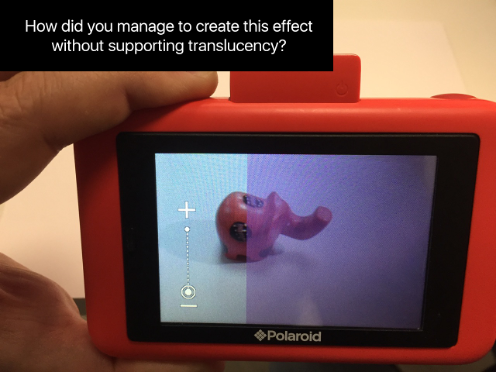
We reached out to Polaroid’s product team with a potential ask to add translucency feature support to device firmware. Sometimes product system improvements are possible and may really simplify the work of the design team. However, in this case, we were not dealing with a startup, but with a large corporation that specializes in the production of standardized devices supported by similar custom software.
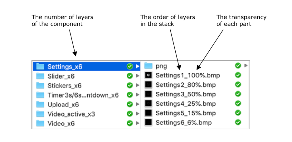
It turned out they could assign a single translucency to the entire component, but due to the lack of alpha channel in BMP files, the system did not support different pixel types (opaque, translucent, transparent) in one image. So our team had to look for an alternative solution. We asked if we can use several layers with various transparency settings. After the product and R&D team confirmed it was possible, we reworked the design, suggesting to create all icons and round UI elements using 3-6 layers of BMP files with various transparency settings.
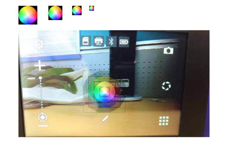
To reach a desirable icon design quality we created them using 3-6 layers with various transparency set up:
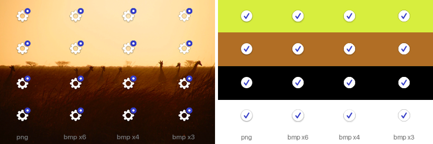
The client approved this approach. Yet, another issue popped up. The development team shared several layers that affected device productivity, clogging RAM. Our team flexed out offering an alternative way out that accommodated new requirements. We created the table with various element designs and details on how they would have looked on the camera screen when 3, 4, or 6 layers were applied depending on the complexity of the displayed shape. In the final design UI elements contain 6 layers, and the less significant ones – 4 layers.

We passed the finalized design concept over to the product team together with detailed specs on the number of layers and set up in each particular case.
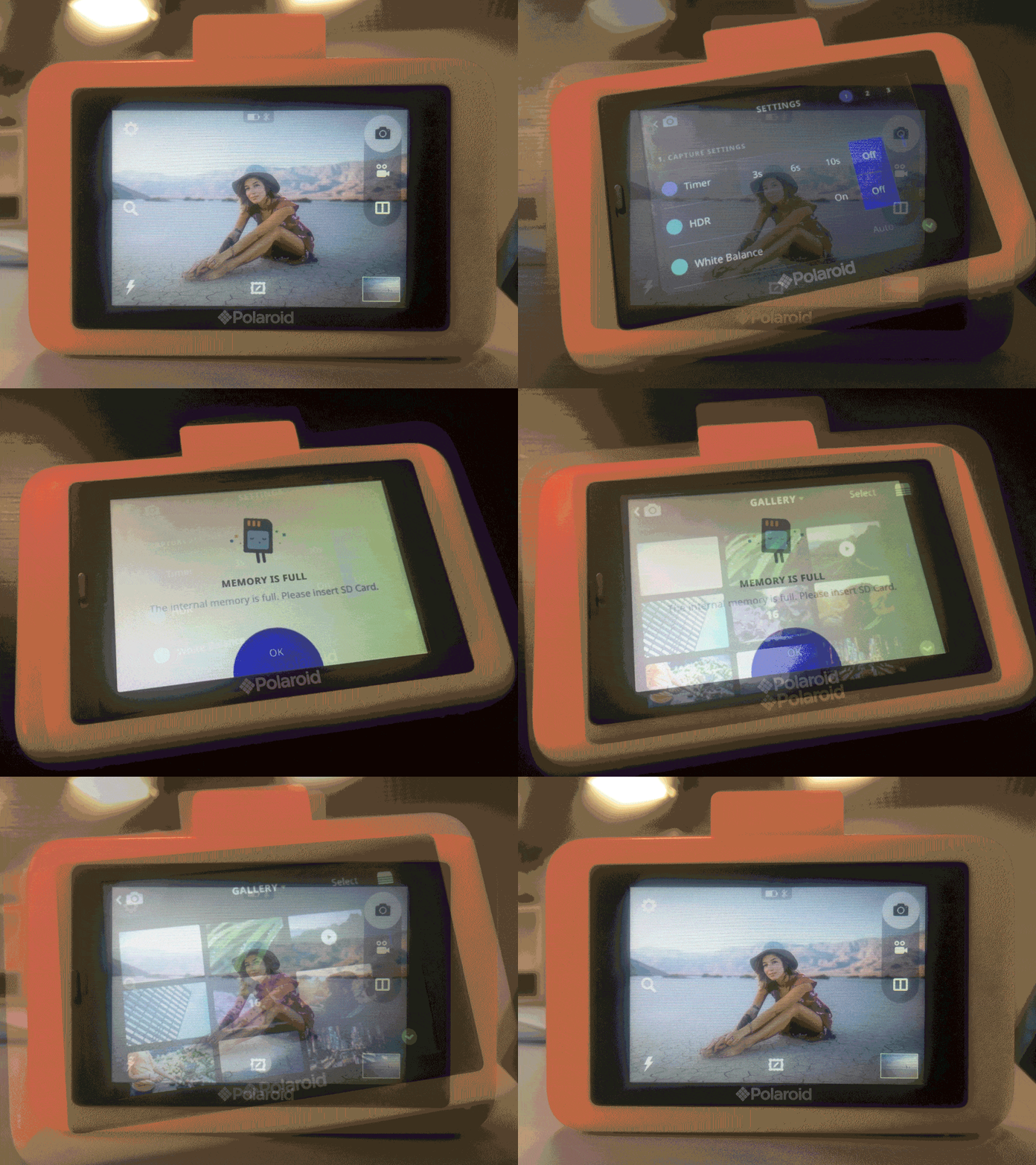
Sometimes it happens that the percentage of knowledge and context is lost or gets misinterpreted along the way. And the result often becomes a mutated version of the original idea or a set of elements that don’t really look the intended way they are. In the case of Polaroid, after we uploaded the prototype to the camera itself, it became clear that the final experience was not implemented as we envisioned:
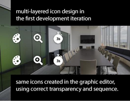
This situation brought to the surface one important fact: no matter if we have completed and delivered our part of the design project, we share responsibility with other teams in the way the final product is implemented.
The goal of any UX design project is to create a valuable product. So design work doesn’t finish with the project handoff to the R&D team. This case with Polaroid taught us to approach collaboration with the development teams in a different way. To be productive, the entire interaction with technical teams should be built on clear communication. One of the ways out is to introduce the internal advance testing of all assumed changes, modeling them in a graphic editing tool and using a good Clipping path service provider. For design teams, this means doing homework on their end, checking all settings to locate and understand the nature of potential issues. Development teams do not have a trained eye to differentiate all design details. They will not notice the difference between the object with smooth vs pixelated edges. Engineering teams mainly focus on the technical part. In the example with layers explained above, the dev team could have confused the sequence of layers, and that changed their application effect. Even after our team pointed it out, the devs were sure everything was properly implemented on their end. We used a graphic tool to simulate the way design had been implemented by the devs to spot the bug. Then our team created a mock-up in the graphic editor tool and showed what exactly had to be changed. And the issue was resolved.
Designing the Experience for Pillo, the Pill-Dispensing Robot
The major task of any design team is to implement design concepts to the fullest, keeping in mind technical constraints. And here design testing plays one of the key roles.
Another custom device project is our work for Pillo, the first medical pill-dispensing robot. Our team had a chance to work on the design of the robot interface. At one point, we faced the challenge of сolors being skewed on the robot device screen. As a first step, we investigated the issue on our side. We tried to reproduce the actual device screen settings in the graphic editor and discovered that the picture was too light, the contrast balance was broken.
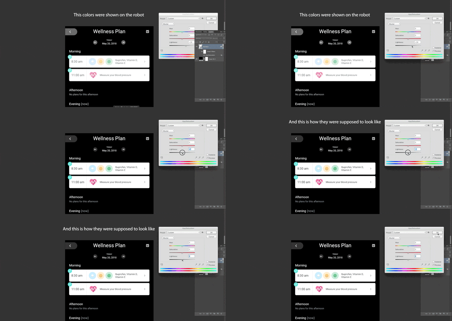
We asked the development team to create for us a separate software with capabilities to change the actual device screen settings. We ran several testing sessions, trying to change color settings on the actual robot device, using a new setup.
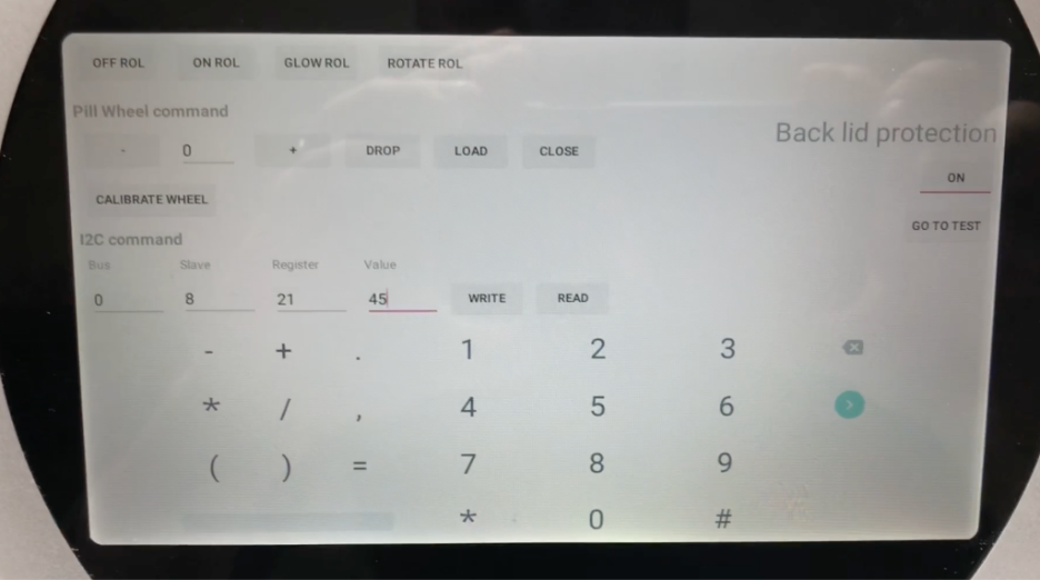
As a result, we managed to reach a matching image quality but it was not perfect still. We uploaded our designs onto an Android phone with screen settings matching the robot’s display setup. In comparison to robot screens, colors on the Android phone screen looked much better.
We passed all of our test results, materials, and conclusions to the client. The client turned to the manufacturer. They checked how the colors on the Android app screen mock-up that we created matched the color samples from the robot device screen. In the end, it turned out the mistake was in the defective screens. So the Client had to order a new batch.
As you see, in this case, testing played a very special role. In the initial stages, the draft design version was sufficient to upload the design on the testing device. Then, when we started to work on the final version the client provided us with a so-called engineering prototype of the device – a screen with a set of cables to connect to a PC. The development team explained how to upload applications onto the prototype, which commands to use. And our team did all further adjustments. It was very important for us to understand all technical hardware nuances and to test designs on engineering prototypes.
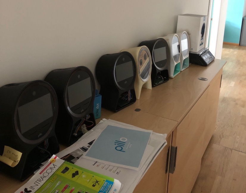
As practice shows, it is crucial to take into account external factors and the environment where the device will be used. So, even when you are provided with an engineering device sample, the goal is to run the tests in conditions close to production.
At the moment, one of the devices our team is working on will be used both indoors and outdoors. That’s the initial hypothesis. We are building two variants of color palettes: light and dark. We had to check what the interface would look like under the open sun rays and in shadow. In fact, we did it directly on a prototype. We basically had only the screen, displaying potential graphic elements. We evaluated how significant color schemes might look in various environments, taking decisions on possible corrections “in the field”.

Effective Communication Across Design and Technical Teams
Clear communication with the teams is vital. But at the same time, you have to be ready that a standard communication flow “designer-product team-developer” most probably will not be very efficient. Long communication threads affect the delivery process, making it longer, introducing the infamous human factor into the iterative communication process. At some point in task delivery, software engineers will take over the production scene. Your suggestions may face the “it’s impossible” barrier, and you will have to take efforts and bother clients with unnecessary requests to influence the development team to get things off the ground.
Design and tech people teams focus on different sides of the same coin. Both need to keep interaction throughout the entire project delivery. But it is also important for design teams to take a proactive approach and be resourceful, testing potential design constraints engineering teams may face in advance. This saves time and ensures devs receive all project design specs in a clear format, with maximum details related to a specific task.
Conclusion
UX design for specific devices is usually an exciting and challenging task. Projects of this kind often do not stick to a standard framework and process flow. You will encounter a lot of the unknowns along the way and look for unconventional ways to resolve the roadblocks of all projects. It is great to have someone with a tech background in the design team, who can easily dive into the engineering specs to suggest ways out from all potential “it’s impossible” cases. We all have to be flexible to adapt to the process as the project unfolds. Design teams, in particular. The design has to be adaptable and resourceful, seeking ways out, without pinging the development teams. Especially, in cases when available design tools & mobile phones can serve as simulation tools for hypothesis testing & proof.
Ready to get your feet wet in Interaction Design? In this article we touch briefly on all aspects of Interaction Design: the deliverables, guiding principles, noted designers, their tools and more. Even if you're an interaction designer yourself, give the article a read and share your thoughts.