Forms are important to gaining necessary information from users and they often sit at the tail end of the conversion funnel. Despite their importance, forms are often a major source of user fatigue and when designed poorly, they can stifle conversions and other areas of a website where users take a valuable action.
Whether creating new forms or trying to optimize existing ones, these best practices will help new and experienced designers think like their site visitors and build forms that users actually want to submit.
Field Lengths and Labels Matter
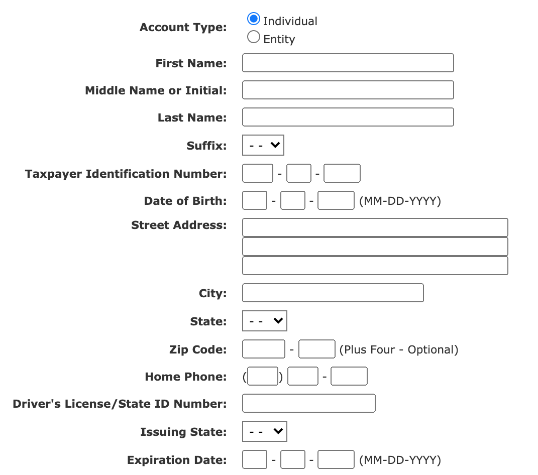
A field’s length should be proportionate to the information being asked and entered. For instance, if asking a user for their birth date, the field should not be the full width of the form, it should be smaller. When you leave too much space on form fields, users can quickly get confused and anxious that they aren’t putting in the correct information. This can result in the dreaded form abandonment. Designers need to make sure that they give users enough space for inherently longer fields (i.e. address, email, etc.) and smaller space for fields that are smaller in length (i.e. zip code, birth date, etc.)

Form labels should be clear and concise to the user and the field label should be placed as close as possible to the corresponding field. There are pros and cons to placing labels above or next to the field. Consider the field formatting and context for the best placement and be consistent throughout your site.
Avoid adding labels that are all caps, as this can be a visual distraction to the user. In most situations also avoid adding labels as placeholders within the field. This can cause confusion as users begin typing, and they may forget what the placeholder text said as some of these provide instructions on a certain format to follow. Properly labeling forms will also help with online accessibility compliance, which has been recently making waves throughout the courts.
Optimize Forms for Mobile Users
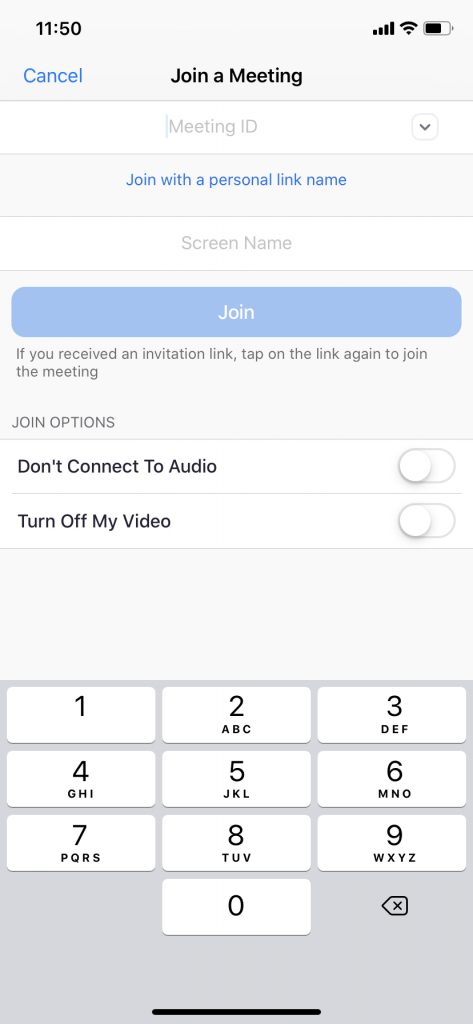
Consider the functionality and layout of your form based on the platform that will be used. Your entire site in addition to its forms should be mobile-friendly. When accessing a form on a mobile device, consider adding a numeric keypad to fields that require numbers only (i.e. phone number, credit card, expiration date, etc.). Limiting to numeric keys will help your users to enter in numbers faster and reduce data entry errors.

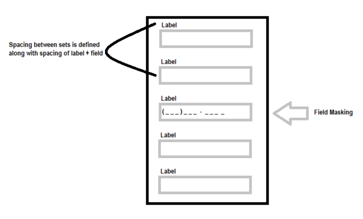
Another element to consider is adding field masking. This is a technique that automatically formats data that has been entered by the user. We see this most commonly used on phone number fields (adding in the parentheses and dash) or credit card number field where it adds spaces in between the sets of numbers. Field masking helps users visually confirm the input of the information on the form, allowing them to know that they have entered the correct information in the correct format.

Focus on Calls To Action (CTA)
Engaging and descriptive Calls To Action buttons are essential to making sure a user completes a form. Make the primary CTA button stand out, catch a user’s attention, and give them a clear action to take. In my experience as a UX specialist, I see time and time again that adding a CTA button that says “Create My Account” rather than “Submit” will garner more clicks on account sign up pages.
A study by Optinmonster showed that using the first person in the call-to-action button (e.g. Create My Account) can improve conversions by as much as 25% when compared to using the second-person point of view (e.g. Create Your Account). Designers and marketers are also encouraged to A/B test their CTAs to obtain the real user data needed for optimal performance.
Schematic of a typical eye-tracking pattern for hunting for buttons. Jennifer Romano Bergstrom. Andrew Schall., 2014. Eye Tracking In User Experience Design. Morgan Kaufmann Publishers.
Carefully Consider Optional vs Required Fields
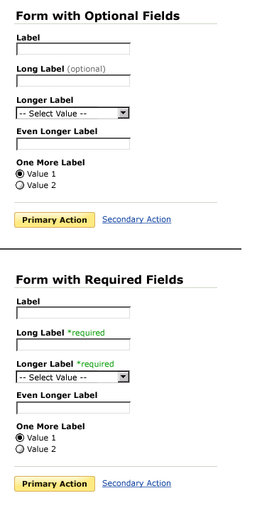
Designers should never assume user behavior or prior user knowledge when it comes to forms and fields. For forms with a combination of required fields and optional fields, it’s important to make sure that these are clearly marked. Most forms have an asterisk (*) by the fields that are required with an indication at the bottom telling users exactly what that asterisk means.
Similarly, optional fields should also be marked with some sort of indication that tells a user that the field is not a requirement. The best way to do this is by adding the words “optional” next to the field label. This can be a smaller font and italicized to bring more attention to it so the user knows they do not have to fill out if they do not want to at that time. Ideally, omitting optional fields all together would be best as it would shorten the form and only serve the fields necessary to users. All of this reduces user fatigue and in turn increases form submissions.

Indicating optional or required fields next to input field labels. Wroblewski, Luke. 2008. Web Form Design: Filling In the Blanks. New York: Rosenfeld Media.
Conclusion
Companies spend exorbitant amounts of money trying to push users through the funnel but still ignore their forms. These really could be the final roadblock that could be deterring user submissions, and making small improvements costs nothing.
Great Resources for Designing Online Forms
Web Form Design: Filling in the Blanks
Luke Wroblewski draws on original research, his considerable experience at Yahoo! and eBay, and the perspectives of many of the field’s leading designers to show you everything you need to know about designing effective and engaging Web forms.
Designing UX: Forms
This book will walk you through every part of designing a great forms user experience. From the words, to how the form looks, and on to interactivity, you’ll learn how to design a web form that works beautifully on mobiles, laptops and desktops.
Eye Tracking in User Experience Design
Find out how over 20 leading user experience experts are using eye tracking to better understand and design for their users. Chapter 5 focuses entirely on eye tracking findings for online forms and surveys.
Ready to get your feet wet in Interaction Design? In this article we touch briefly on all aspects of Interaction Design: the deliverables, guiding principles, noted designers, their tools and more. Even if you're an interaction designer yourself, give the article a read and share your thoughts.