“We need a dashboard for this product! Make it pretty! Something that will WOW in the sales cycle!”
It’s a refrain throughout my career. The dashboard is the face of the application, so it must have curb appeal. But there’s a problem when you prioritize curb appeal above all else: Your dashboard will likely be utterly useless. It will be a work of art to hang from a wall, but it won’t be a dashboard.
Dashboards are about understanding. How is your organization doing? How are you doing? Meeting your goals? Anything need your attention?
It is not a data report. No spreadsheet tables, no complicated charts, nothing that distracts from the fundamental questions of how things are going and does anything need attention.
And it also is not a business intelligence canvas. This isn’t about manipulating data and massaging it into multiple, drillable, deep-dive-able visual analytics. Dashboards are minimally interactive, not systems for drilling over and over.
Think about a car like the one on sale at the Zemotor catalog. Every car has two gauges — a speedometer and a fuel gauge. They answer two fundamental questions every driver has: How fast am I going (and am I driving a legal speed)? And do I have enough fuel to get to where I need to go?
Car dashboards also have odometers. They may have alert lights for oil, temperature, and brake fluid (along with the ubiquitous “Check Engine” light for “something is off but it’s nothing we can effectively communicate through a light we have”). Or there’s a temperature gauge. Sometimes you get a trip odometer thrown in. But no matter what you have, everything there has a reason for being in front of you. It’s information. It’s alerting. It’s forecasting.

A car dashboard provides the information you need in a literal glance.
And yet I look at so many enterprise dashboards and think they’re trying to drive a car with a spreadsheet attached to a business intelligence tool producing shiny graphs. “How am I doing,” I ask my dashboard. I get an Excel table and a graph I can manipulate by hand! So exciting! Until I realize I can’t grok what the hell is going on. Where am I right now? Do I have enough fuel? I’m lost in the pretty.
After building too many of those (and dissuading one too many executives from the “shiny”) I came up with a methodology to build useful dashboards every time. It’s remarkably intuitive, follows the classic design process, and produces good results. Yet every time I tell someone about it I get these astonished looks like I’ve discovered fire or invented a bread slicer. This ain’t rocket science.
Here’s my process:
Do some research.
This means doing research. I am astonished by how many organizations skip this and make assumptions that are detrimental.
At one company we focused on building dashboards for CIOs. After all, we were about empowering the CIO. Everything in our product helped them run their organization more efficiently. And then someone did a study of user logins and their roles in our customer organizations. At the time, we had more than 150 customers. 6,000 employees of these companies had logged in.
Three were CIOs.
Total.
Where were the other 147? They used their staff to summarize the product’s pretty CIO-centric graphics, numbers, and performance indicators into a PowerPoint chart they would present to the leadership team. And what they wanted on that slide had little to do with what was on that dashboard.
The best way to avoid that is to talk to users — and this includes everyone who will use this information. I’ve taken to calling personas like the CIO mentioned above “indirect personas” — they use the product and glean value from it, but they aren’t involved in using it directly. For enterprise products, they are essential personas to understand. Seek them out.
Prioritize the questions the users are asking.
When processing your interview data, look for the questions they want answers to, questions that are simple to understand. The time to do this is usually on the back of a research summit where discussing findings of interviews and/or contextual inquiries.
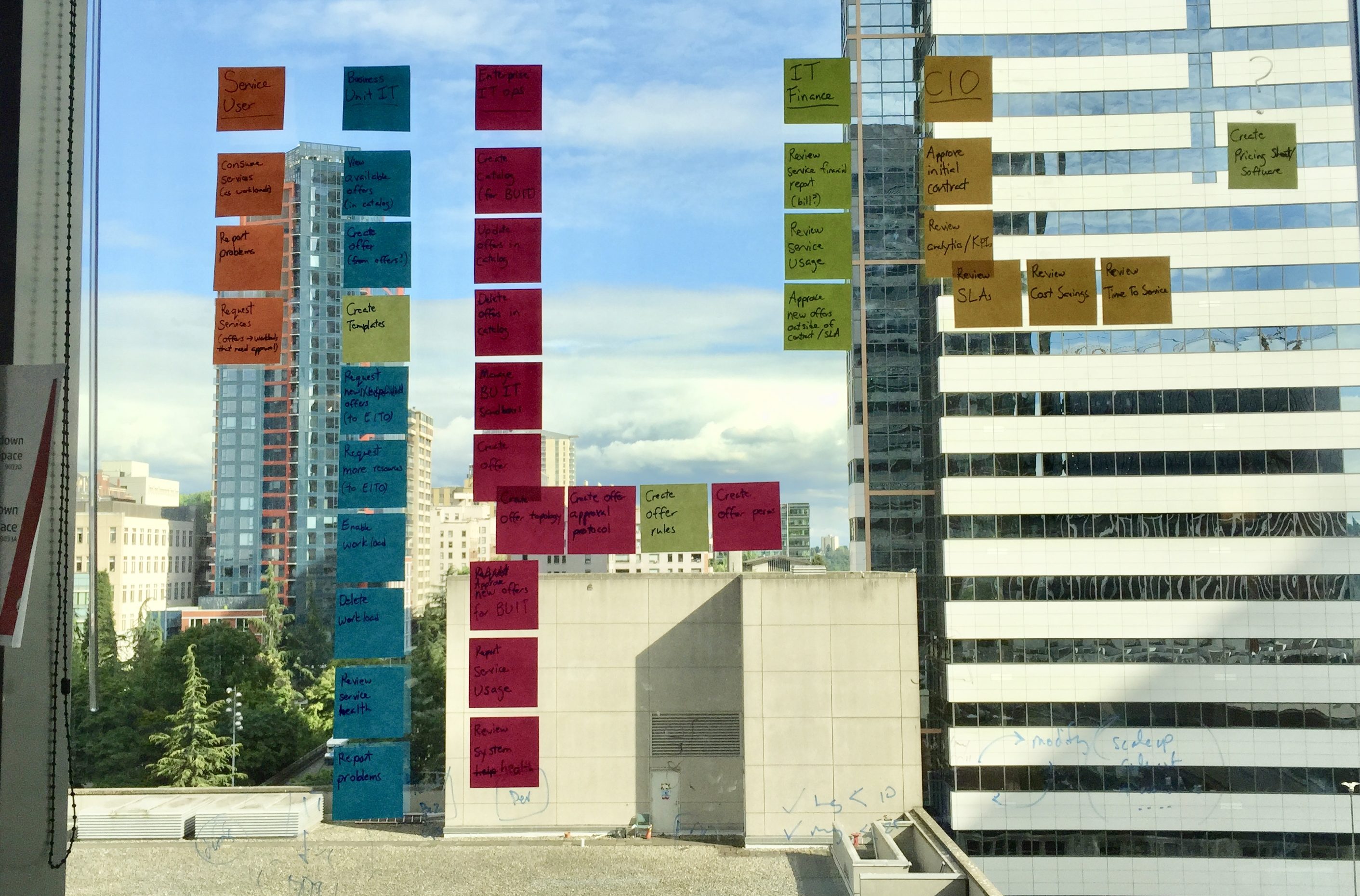
These questions are essential to creating a dashboard because these are the questions the dashboard must answer. I will do this on post-it notes and lay out the most important questions on a whiteboard.

Visualize the key questions or needs.
Think about how to answer those questions in the simplest ways possible.
Take “Am I on budget right now?” This is a yes/no question. That’s it. The answer is not “here’s your itemized budget in spreadsheet form.” Now, “why am I off-budget?” definitely needs a table, but if they are on-budget, why do they need to see it?
“How off-budget am I?” For some companies, being more than 3% off budget is grounds for investigation and explanation. In others, being a dollar over is. This is something you can answer simply — you’re “this much” over. Do you need a spreadsheet to answer this? Not for a simple question.
These “simple questions” that need “simple answers” are the focus of your dashboard. They are things that answer with yes/no, answer with a currency amount or a percentage, answer with a single word. If the answer needed cannot be answered at a glance, then it’s not worth putting on a dashboard.
Think about the facets, filters, and time frames they need to understand.
Do they only care about their business division? Do they need to look at numbers from month to month, minute to minute, or year to year?
It may seem contrary to suggest putting facets and filters on a dashboard. They are more common in business intelligence tools or drill reports. But that “at a glance” nature of a dashboard can yield great insight, fast insight.
Now, think about the visualizations you need to communicate those answers. Count? Composition? Time series? Each of these things means a different chart.
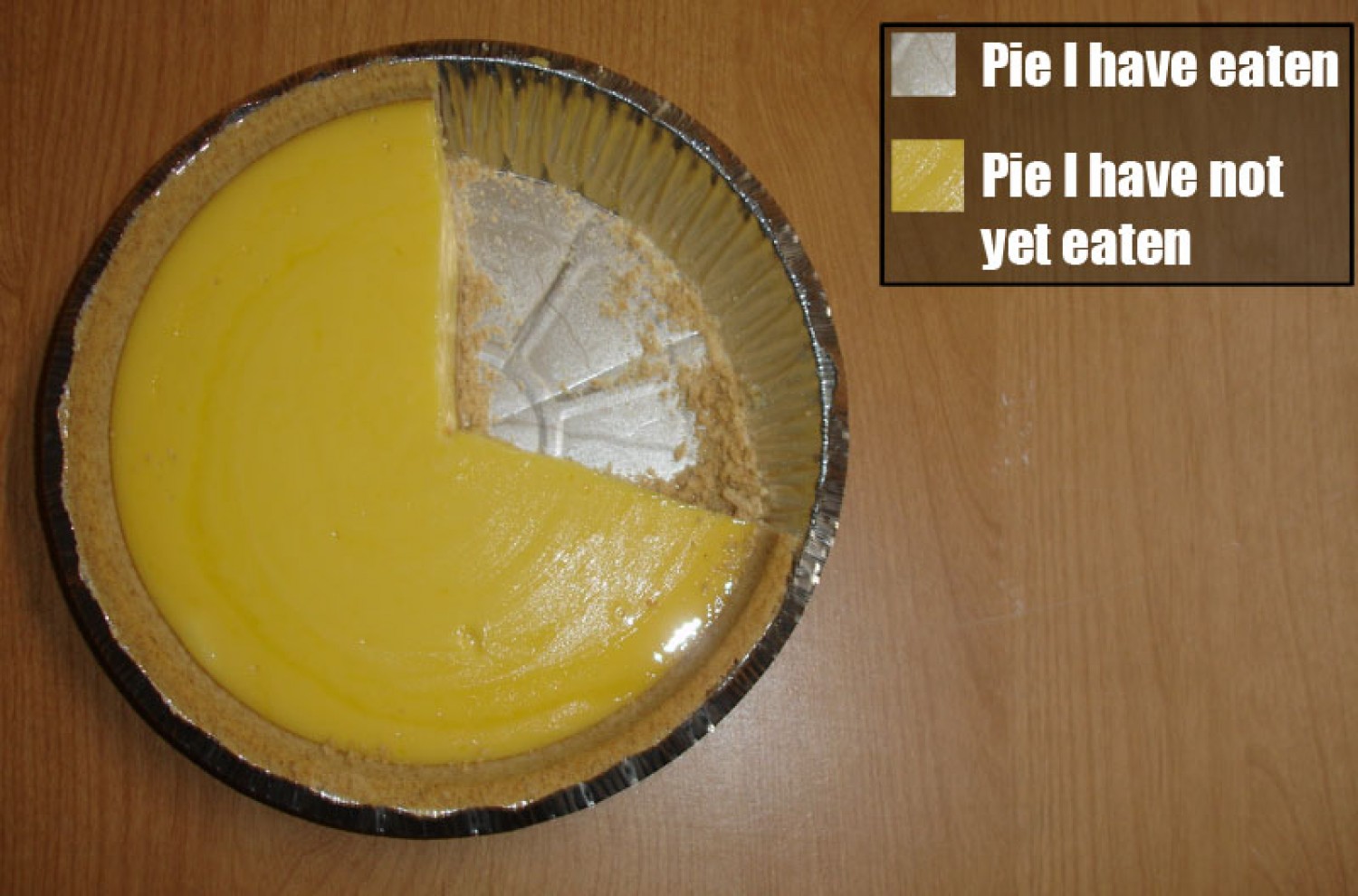
Take the much maligned pie chart. (Pro tip: You should only use a pie chart if you are charting actual pie.) I once had a consultant ask me to add “trending pie charts” to a product we were working on. I just stared at them. Pie charts cannot show trends; they can only show composition. (They can also show count, but it’s definitely not the best chart for it.) Now, there ARE visualizations that can do the job of a “trending pie chart;” the stacked bar chart is my usual choice.
Remember: Use the best visualization for communicating the data’s story and answering the user’s questions. Not every chart is equal.
Don’t put big, interactive charts in a dashboard without context.
A huge filterable, sliceable, manipulable line chart is a great tool for spelunking into your history and understanding where you might go, but it’s a huge blocker to comprehension when you just need to know where you are right now.
Imagine you’re an executive, and want to understand the state of your ongoing initiatives to save the company money. You have maybe 10 seconds of attention to think whether the initiatives are working or not. Would you rather: a. look to a set of key performance indicators (KPIs) and how they’re doing compared to initiative goals, or b. look at a line chart explaining how the initiatives have moved over the last 12 months with details on benchmarks you can drill into
You want A. You’re too busy to drill into line charts. Unless… unless those KPIs are underperforming. Were that to be so, you would want to drill in and try to figure out why things are the way they are — and have informed conversations with your reports on how to get on track.
Here these KPIs give the appropriate context for the deeper dive charts that come after. Things are off plan. Why? What can we do? If you didn’t have this context, you’d just have a chart that no one would know what or why it is.
The most important thing is to think simply. Add only when it’s necessary for context or understanding. Remove as much noise as possible.
Start drawing out how that would look.
Congratulations, you have a wireframe of a dashboard. Now you have something to take to customers, ask them questions about, and use their feedback to refine further.
This feedback is crucial, and it must be framed in a way to make it crucial. Ask specific questions about analytics — “is this how you see X? If not, how do you chart it now?” “Given the values you see in the KPIs, what do you need to answer ‘why’ this is so?” Think like a user interviewer and prompt them, but don’t lead them. The important thing here is understanding how they understand it.
This review period is key for my design work. I need to confirm I understood the research and am actually solving real problems as asked. Good user feedback comes from good up-front research.
Lather, rinse, repeat.
It will take a while to get it right. You’ll go through review after review with people telling you they don’t get the dashboard, providing poor feedback, and sometimes insisting they would just build it over the weekend.
Persist.
Good dashboards are never right first iteration. They’re never right on the second. One I’m currently working on is on its fifth iteration. On the plus side, as you get more experienced, you can nail it on iteration #5 rather than… well, I once went to 12.
Lastly: Make sure the curb appeal is there.
Yes, we need useful. But without pretty, our products struggle to sell. Sales people will want you to put in bells and whistles. Executives want splashy slides for their board and employee meetings.
This is all OK. Pretty sells. You need to sell.
Useful, however, sells again and again. It renews. It turns your product into a “sticky” product customers cannot live without.
And yet, you still need to get in the door. And that’s where pretty comes in. When you make useful and beautiful things, you serve the needs of your business and your users, and no one goes without.
Making a solid dashboard that serves the needs of users starts with understanding those needs and it ends with a dashboard that answers those questions, identifies areas of concern, and moves them to a deeper comprehension than they could have had with a simple report or a business intelligence tool. Dashboards tell stories and invite people into these stories to understand and change them. If your dashboard can push that conversation forward, then you’ve designed a dashboard that does not suck.
Ready to get your feet wet in Interaction Design? In this article we touch briefly on all aspects of Interaction Design: the deliverables, guiding principles, noted designers, their tools and more. Even if you're an interaction designer yourself, give the article a read and share your thoughts.
