The Cobbler’s Children have no Shoes
There are countless proverbs around the world talking about plumbers having dripping taps, blacksmiths having wooden spoons or goldsmith’s children having no jewels. At the end of the day, those who spend their day putting their skills to the service of others don’t always practice what they preach when it comes to their own lives. I feel like this adage holds true when it comes to some Design Systems as well. As Product Designers and UX professionals, we spend our lives getting to the root of user problems, challenging assumptions and building the best possible solutions to help folks do what they need to do as easily and effectively as possible.
However, across the world, we have teams building internal systems and documentation that are a tangle of assumptions, lazy thinking and cognitive burdens (I include my past efforts in this as well). Part of the problem is that businesses are still reticent to devote as much time and energy to an internal product as they are to a customer-facing product. This is despite the benefits easily trickling down to the user in increased efficiency, speed and quality in the team producing the final product.
As part of my work at zeroheight, I’ve been talking to teams across the world about what makes good documentation sites, from small 2-3 designer companies through to large enterprises like WebMD and Adobe. The common thread across the successful Design Systems is that the team managing the Design System are treating their system as if it’s a product, complete with KPIs and ways to measure, a full product design process and enough resource to achieve their goals. Unfortunately, this doesn’t mean that anyone can provide a standard template for how to build an effective Design System, as the problems, needs and measures of success for any single Design System will be different. However, there are some standard processes and common wins that can help.
Who is the audience and what are their problems?
One of the most obvious places to start is understanding who the audience is and what their needs are, to figure out what problem needs solving. It’s incredibly easy to start a Design System from our own assumptions considering, ‘hey, you’re a designer yourself’, but there are two key problems with this: Not all designers are the same, and an effective Design System is used by a lot of people other than designers.
A really simple first step is mapping out who the users are, from the design teams and engineering, through to content, marketing, product, user research, localization, and any other folks who either input to or consume from the system. The next step is talking to these people and understanding why they use the Design System, how they use it, what their pain points are and their suggested improvements. This will give a laundry list of potential focus areas that can then aid in prioritizing what to tackle first.
Design an IA with the user’s needs in mind
When documenting a Design System, it feels natural to base the documentation on the structure of the Design System itself. However, the systems that feel natural to folks who have a deep understanding of systems design may not feel natural to the people who are actually using the system. This is what Xero found out relatively early on when they based their documentation structure on Atomic Design principles. Instead of helping the user conceptually model where a component or style might live, it compromised how discoverable individual pieces of the system were. Without an existing, embedded knowledge of atomic principles, this was an added cognitive load for them.
As with any IA project, the first step should be talking to the users and understanding what their goals and needs are. Card sorting exercises are great for narrowing down, grouping and prioritizing areas of focus. However, we have seen some common implementations across lots of different Design Systems. The first step is thinking about the top-level sections. These are the self-contained areas that often have obvious audiences and tasks in mind. A common pattern to start with is breaking it down into three areas, such as ‘Getting Started’, ‘Foundations’ and ‘Components’. This is often expanded out with ‘Patterns’ and ‘Templates’ or ‘Pages’ as the system expands.

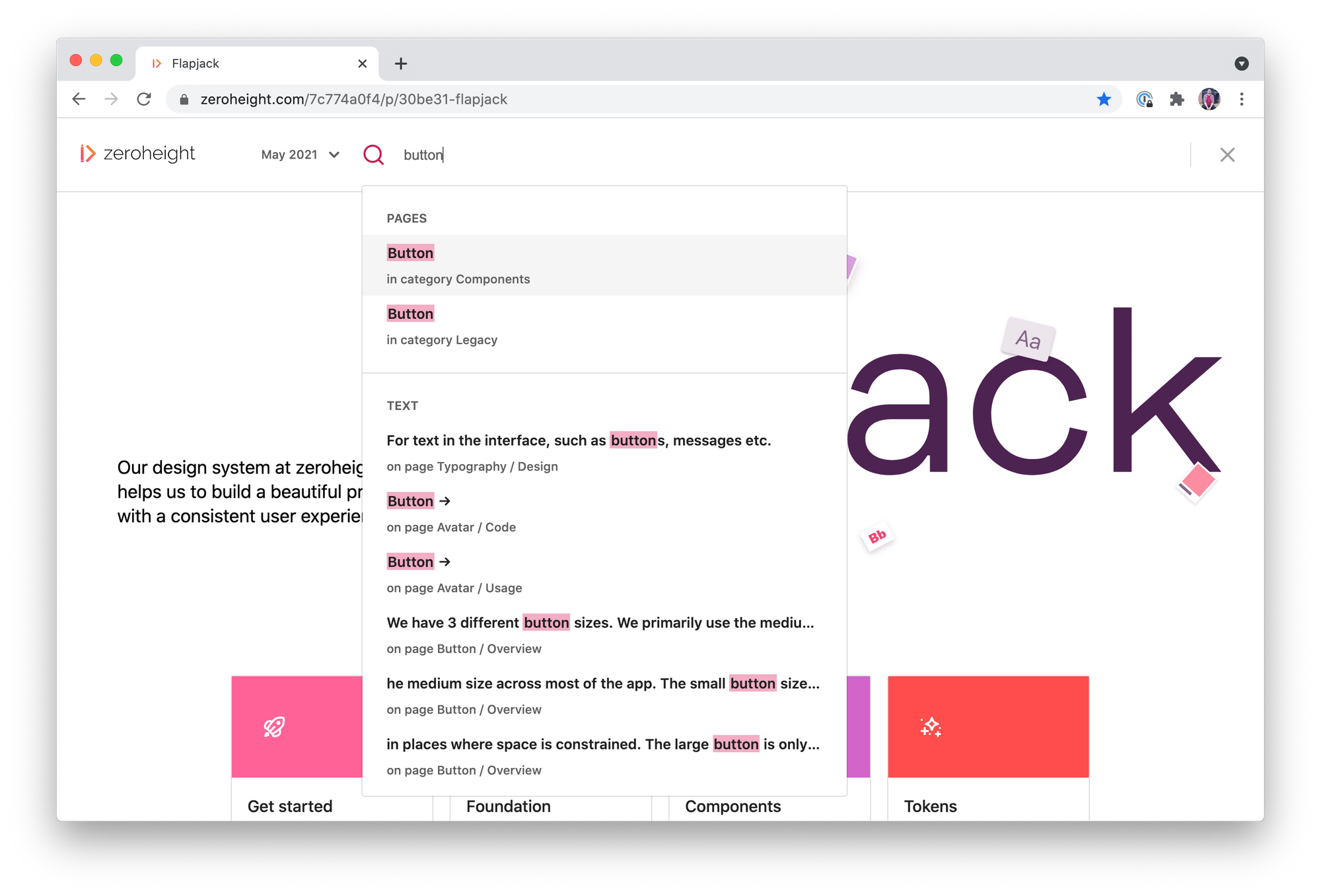
Using common language to make search easier means that anyone can find exactly what they need, as fast as possible.
Another common use case of documentation sites is that the user comes knowing what they want to find. This means that having search is often an important part of a well-designed documentation site, as well as making sure that everything is written with a common language to help with the findability of every page and element (which is talked about in a bit more detail below).
How much to write? To Kill a Mockingbird vs a Tweet
When arriving at what goes in the documentation, it’s tempting to throw everything plus the kitchen sink at every single component to make sure that every possible angle is covered when someone visits. On the other side, it’s also extremely common to throw some design, some code, and then assume it will be filled out in the future. Although it feels like constant repetition, talking to the folks who use the design system to gather what they need to know is key to making a Design System as effective as possible.

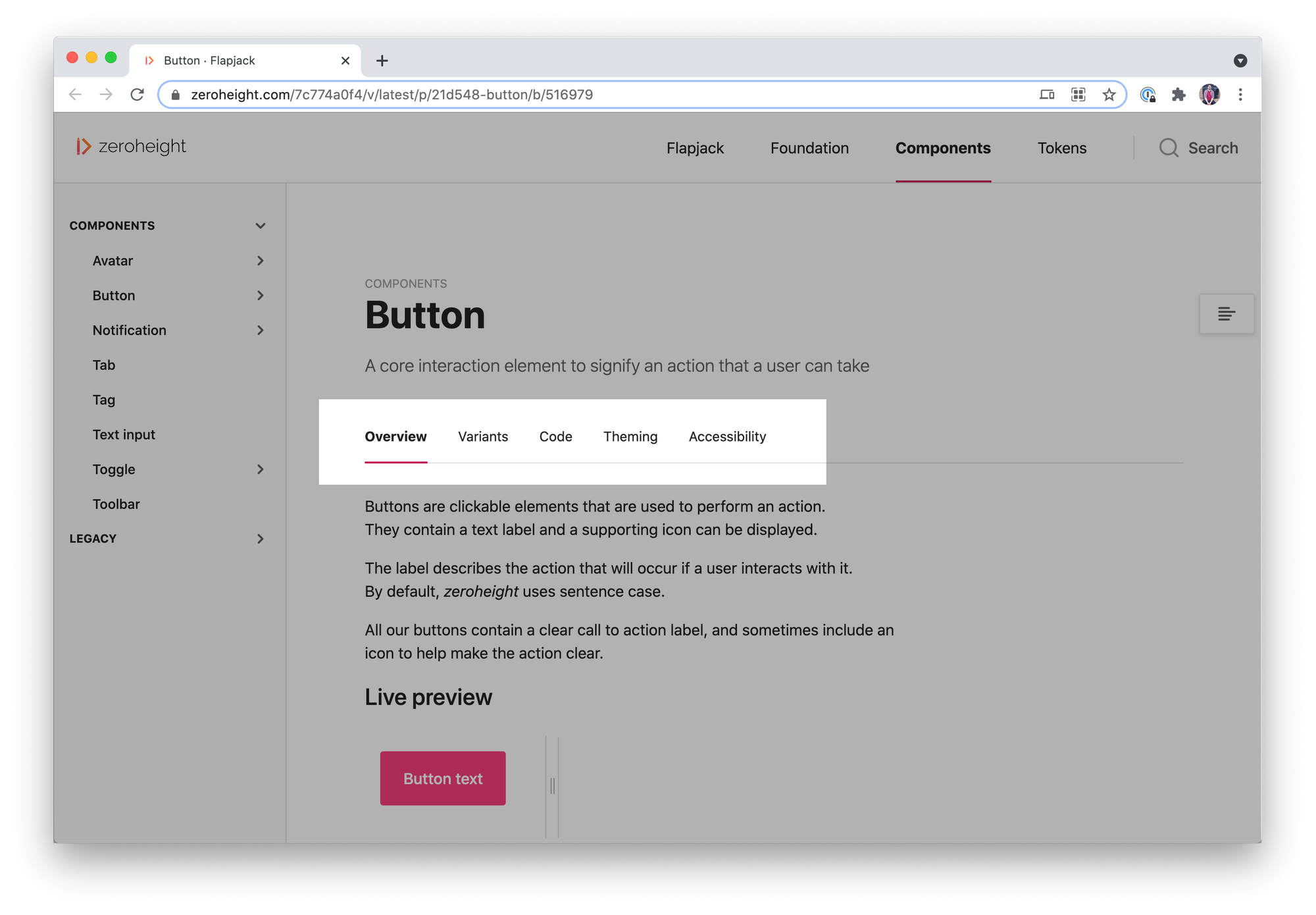
Providing important ancillary information, such as accessibility or supporting research, is best done behind tabs so the user isn’t overwhelmed
In saying that, it’s always better to err on showing the essential information up front, and then using progressive disclosure to provide more detail or supporting documentation. This reduces the cognitive load for users when they find what they’re looking for, and provides a more self-guided experience so they can only take in the information they’re looking for.
Do people know when things have changed?
A key problem that I’ve seen with Design System adoption as they’re being built out, is that folks don’t come back to a system if they aren’t aware that changes are being made. It’s one of the reasons we include a Release Notes page in our starting templates for any documentation site. Getting into the habit of documenting what has changed with every release provides a single point of reference for folks to know what to look at.
However, while this is a table-stakes solution for keeping folks up to date. The next step is to take that information and post it where the key audiences spend their time. Common solutions for this include setting up a dedicated #design-system-updates channel in Slack, that is only used for posting release updates. This has the benefit of being opt-in, so colleagues can pick and choose whether they need to receive updates. Alternatively, other folks rely on regular email updates, often packaged in with a newsletter that has a regular cadence. This increases visibility for stakeholders and users alike, and provides a handy touchpoint for feedback and contribution.
A system is only as good as the sum of its parts
When it comes to building Design Systems, how that system will grow over time is an aspect that is often left to the later stages. However, having easy touchpoints for anyone in your organization to contribute is key to having a Design System that continues to grow after the initial setup. Part of this is brainstorming a process with both the teams who govern the system, as well as the teams who will most often contribute to the design system. This ensures that you arrive at a lean enough solution that doesn’t add unnecessary overhead to the design teams, but also enough governance with the Design System team to ensure quality control.
The next step is to make sure that this is clearly documented within the documentation. It’s common to signpost this process in any ‘Getting Started’ sections. However, for larger teams who have somewhat automated their contribution process, it’s possible to include CTAs further down the information hierarchy, with some folks including CTAs on the components themselves.
Gathering feedback and measuring the impact
A key part of a solid UX process is gathering feedback from users to establish the qualitative success of any product or feature. The same should be said about internal tooling, including Design Systems. Setting up the measurement on usage, both with design and engineering tooling and on the documentation, can give valuable feedback on whether the changes that are being made are actually bringing value to the business. Combining this with regular check-ins with key users will provide a strong mix of qualitative and quantitive data that can point to areas of improvement for the team.

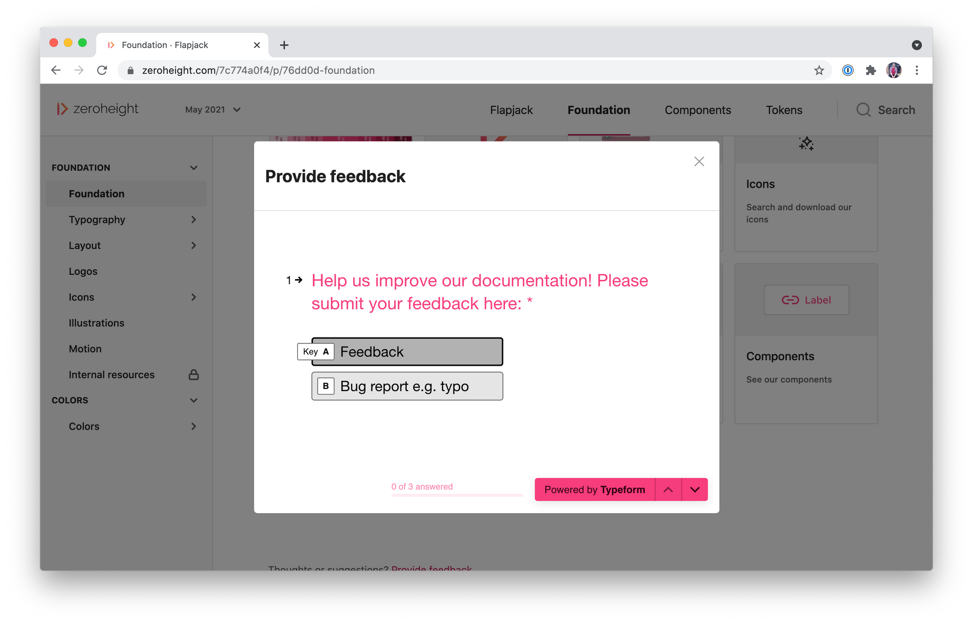
Providing an opportunity for users to give feedback directly in the documentation empowers them to get involved with the building of the Design System
Similarly, providing a clear feedback touchpoint in your documentation site can capture any niggles or complaints before they become serious issues. Whether this is as simple as a Google Form or Typeform in the footer of the site, or a feedback process that’s clearly signposted in the documentation, giving users an opportunity to get in touch with the folks behind the Design System can not only lead to valuable feedback but also gives the user a sense of calm that they can have input into the decisions being made.
Next steps
As with any product, the key to building effective tools is to continue to gather data to make things better. This includes both looking internally at what can make our systems better, as well as externally to see how other folks are building world-class systems, and how systems come together in other parts of the world.
Suggested Reading
Thinking in Systems – Donnella H. Meadows
Measuring the Impact of a Design System – Cristiano Rastelli