Dropbox is about sharing files with others. Pintrest: posting images on a virtual board. Facebook is about connecting with friends and Twitter is about micro-blogging. Each site champions a single conceptual model to help users quickly evaluate its relevance to their personal goals. Information Surfacing helps designers communicate these models.
Conceptual models are nothing new, but often become unintentionally obfuscated during the design processes. The design team, often dazed and confused, struggles to figure out why the product is now cluttered and unintuitive. A design thinking method I call “information surfacing” helps to remedy this problem. Information surfacing involves the prioritization of UI elements with an intent to manipulate user engagement.
Before we dive in, though, it’s important to differentiate information surfacing from information hierarchy. Information surfacing is more specific to the visual presentation of information on a single page or in a single instance. While it doesn’t involve categorization, per sé, it does involve decisions: such as which fonts to make bolder or which elements to show on mouse rollover. It’s all about which information you want to “surface.”
A method to the madness
The graphic designers among you likely have a leg up in this regard because you make these decisions on a regular basis – albeit for aesthetic purposes. Information surfacing goes beyond this, however, to communicate what a website is all about using the interactivity of our medium.

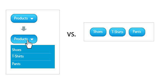
Sometimes it makes sense to group items under a drop down. Other times, it make more sense to have all option revealed to the users right away. The former will be appropriate for users that are familiar with top level categories whereas the latter is appropriate for novice users. The latter also helps teach users that they’re looking at an apparel site.

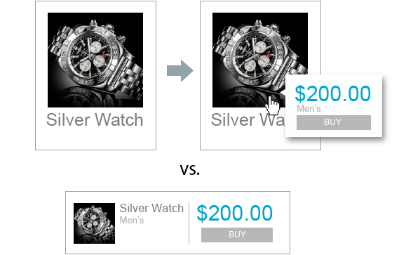
Two methods for designing a product display. The first design is appropriate for luxury products as a large image will engage the user on an emotional level. Hence, the price and buy now button are “submerged” in a hover while the image is “surfaced”. The second design works for a more price-conscious consumer. Hence the product image is subdued while the price and buy now button are “surfaced”.
Unfortunately, design is a contextual beast so it’s impossible to create a simple heuristic for information surfacing that would apply to all types of design projects. But that didn’t stop me from trying! Here’s a rough approximation of the method that I employ:
-
Identify user activities.
Define exactly what type of engagement you want from your users. Don’t use broad phrases such as “I want users to connect with other users,” but rather “I want users to send emails to other users”. Likewise, don’t get too detailed. Ignore all functionality that a system needs to do on the back end. Focus on your users and what actions you want to encourage.
-
Define decision making information.
With every action there is intent. Users must perceive information that is congruent with their intent before they will make a decision to act. Therefore, figure out which factors will motivate your users to engage in a given activity. In some cases it’s a familiar label on a button; in others, a comprehensive data grid. Learn about how your users make decisions. Are your costumers rational and price-sensitive or emotional and spontaneous? To be sure: no one just randomly clicks through a site.
-
Prioritize.
This is the core of information surfacing. First, triage the activities you want users to engage in. Next, consider the natural discovery process for your users. Determine what buttons, links, icons, and contextual information users need to see right away, which ones to reveal later, on hover for instance, and which ones to hide altogether. Remember: users perceive first and act second.
-
Prototype.
Once you have your elements grouped and prioritized create several high fidelity variations of your interface. Step back and ask: how would a user interpret this outside of the context of your website? What would be the first understanding about your site through the UI elements? What are the potential conceptual models that a user may infer from just the interface alone? If your answer is ambiguous – or if it has more than two possibilities – you need to go back to step one. Otherwise, your answer is also your marketing message; it’s what you tell users to think.
Let’s go for coffee
While this heuristic provides a good overview, it never hurts to see theory in practice.
In a hypothetical social site, users are given the opportunity to post images, share with other users, rate their content and follow them. To make things even more fun, let’s also allow users to ask other users out for a cup of coffee to discuss those images.
For every task we want our users to engage in – following, sharing, sending coffee invites – there is a unique information set that a user needs to be presented with first, to motivate them. To create the strongest sense of motivation the interface needs to “convince” the user to engage in an activity by delivering a decision-making context.
In our case we want to motivate users send coffee invites to one another. To do so, a user needs to see (a) another user’s profile picture, (b) how many images they have, and (c) how far are they located from him/her. This information, taken together, encourages the development of trust between two users and hence the motivation to share a cup of coffee.
Similarly, if we sought to “motivate” a user to follow another user we would need to present that user with (a) a profile picture of the other user (b) some sort of metric to indicate how credible that user is, and (c) their content – the primary reason you follow someone. Once again, we need to present the information necessary for the user to make a decision on whether or not to engage in this activity.
So far, all we have been doing is grouping data into information sets and assigning those sets to user activities. All that remains then is to identify which of those activities are more important to our goals. Is it allowing users to invite other users for coffee or is it following each other’s content?
The following interface emphasizes user inter-connectivity. Based more on a model of a dating site, the user profile picture is made larger and the user data is presented next to it, while the user’s posted images are grouped as series of small thumbs. For a site like that the marketing message could read something like, “Connect with other users in your area”.

Figure 1: A module that encourages meeting other users.
In Fig. 2 however, the focus is given to content consumption. The content is made larger, and only the information immediately relevant to that content is presented first. The information about the user posting the content is revealed only on mouse hover. This fundamentally changes the discovery process. The user is subconsciously encouraged to consume content. Only then is she given the opportunity to discover, using her mouse, who posted that content. In contrast, a site like this could also use the marketing message “Share and view cool pictures.”

Figure 2: A module that encourages browsing other users’s photos.
As you can see, different presentations yield drastically different interaction models.
So, what’s your story?
Information surfacing is a top-down, strategic approach to design. The designed product – or, more precisely, how users interpret that designed product – is the overall goal. This is in sharp contrast to the functional requirements document which constructs things from the bottom up.
Information surfacing goes even farther, though, providing interaction designers the tools they need to determine (1) if their design adequately addresses the problems at hand and, (2) what that design actually suggests to end users. The placement of every element inside of a graphical user interface projects narrative qualities within the applications we create.
So, what’s your story?
Information architecture is an often misunderstood job title. Are they designers? developers? managers? All of the above? In this article we'll discuss what information architecture is, why it's related to usability, and what are the common tools/programs used in information architecture.