Since the very dawn of the web, links have been a foundational element of the online experience. Nor has their prevalence dwindled: studies show that following links is one of the most frequent actions carried out by people browsing the web. Over the past 30 years, designers have tried different looks for the link, but one visualization dominates: the underline. The blue, underlined hyperlink is one of the most well established and widely understood conventions of the web.
The [World Wide Web] consists of documents, and links.”—Tim Berners-Lee, 1991
Given the central role that links play in online life, it should be obvious that the visual representation of a link marker greatly impacts user experience and usability. But as devices and user habits change, is the underlined link actually hindering rather than helping user experience and usability? While it may seems simple and effective, a study from the University of Hamburg shows that underlining has a detrimental impact on readability and design.
It stands to reason that the link will remain a cornerstone of users’ browsing experience—we will always need to cite references and link to cat videos. However as the web changes and grows—in terms of design aesthetic, code resiliency, user experience practices, and variety of devices—we must ask ourselves: is it time to ditch the underlined link in favor of something less 1991?
What is the underline?
What exactly is the underline and how did the convention of the underlined link arise? In the days before the web, the underline, as defined by Wikipeida, was “a more or less horizontal line immediately below a portion of writing, used (…) to emphasize key text”. This attribute as a method of emphasis still persists in the underline’s digital manifestations, but with wider and not necessarily positive implications. The blog Practical Typography advises “don’t underline. Ever,” citing the habit as an ugly hangover from typewriter days which is no longer necessary, given that we now have other methods of emphasis available.
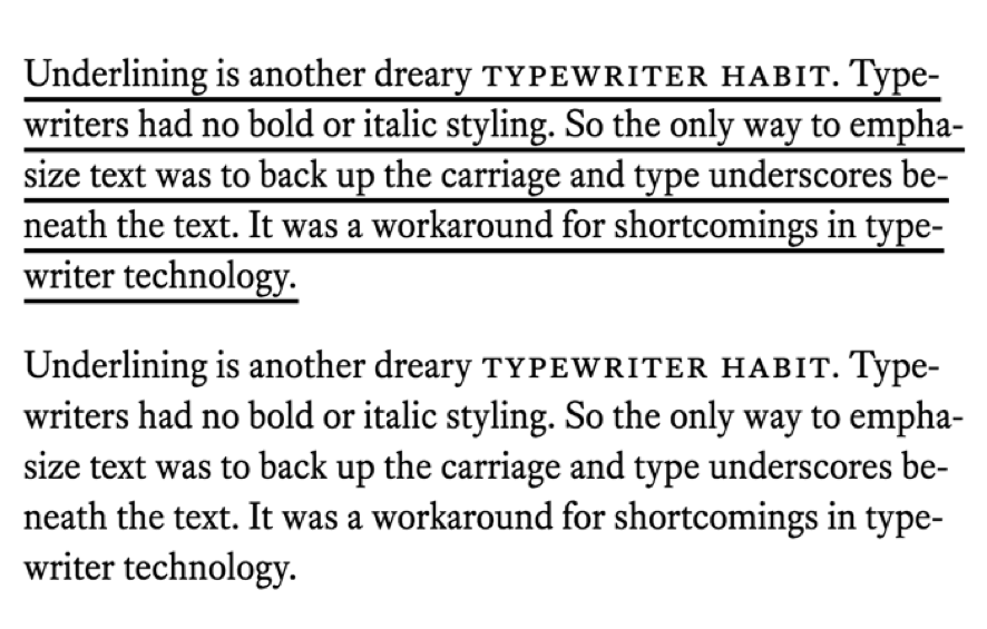
So how did the link become synonymous with blue, underlined text? Since the web is far removed from a typed document, text no longer needed an underline to show emphasis. As such, the significance of the underline was repurposed: if clicked, underlined words redirected the user to a relevant resource. And why blue? That’s an accident of history: around the time of Tim Berners-Lee’s WWW browser prototype, most computers were limited to a 16 color display (if they had color at all!), and blue was the next darkest color to black. While technology improved rapidly, the hyperlink’s style stayed blue and underlined.
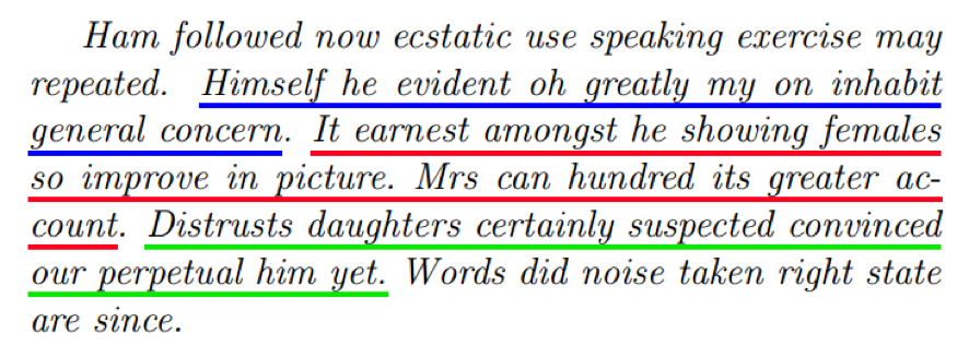
Benefits to the underline
There are good reasons why the underline has remained so dominant in link visualization. For starters, it has brand recognition: how many other online stylistic elements have remained consistent for the past 30 years? It guarantees link visibility when scanning a text, and visually indicates which links you’ve already visited. These visual cues help to increase click-through (as anyone who has fallen into a Wikipedia hole knows).
Some users find the interruptive nature of underlined links useful; it allows them to more easily navigate to important or useful information on the page. Lee Munroe puts in pretty bluntly in Smashing Magazine: “remember that users don’t read; they scan. You’ve heard that before, and it’s true. So, make sure your links are obvious.”
Conventionally underlined links can be a functional aid to user scanning and summarizing, fulfilling Steve Krug’s usability mantra “Don’t make me think.” Underlined links also score points on the accessibility scale. Color blind or color insensitive web users have no problem identifying underlined hyperlinks, but less luck when faced with color differentiated links alone.
The negative UX impact
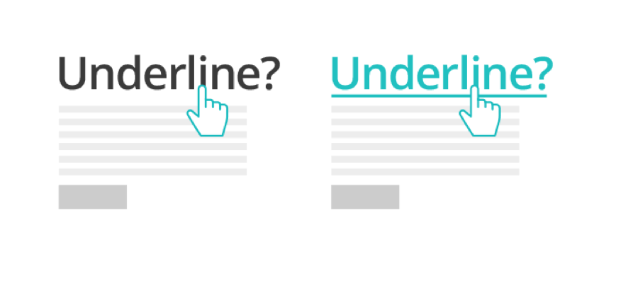
But those plus points don’t mean the underlined link is immune from replacement or criticism, particularly when it comes to UX. In 2014, this was made apparent by the historic decision of internet giant Google to drop the underline hyperlink. Google’s decision to junk the underline on its search engine result page (SERP) in favor of link color differentiation was, according to Principal Designer Jon Wiley, essential to “improve readability and create an overall cleaner look.” While users on a Google SERP have the necessary context to expect links, some more article heavy sites are also dropping the link. For instance, the NNGroup has dropped the underline and published an article about hyperlink stylings.
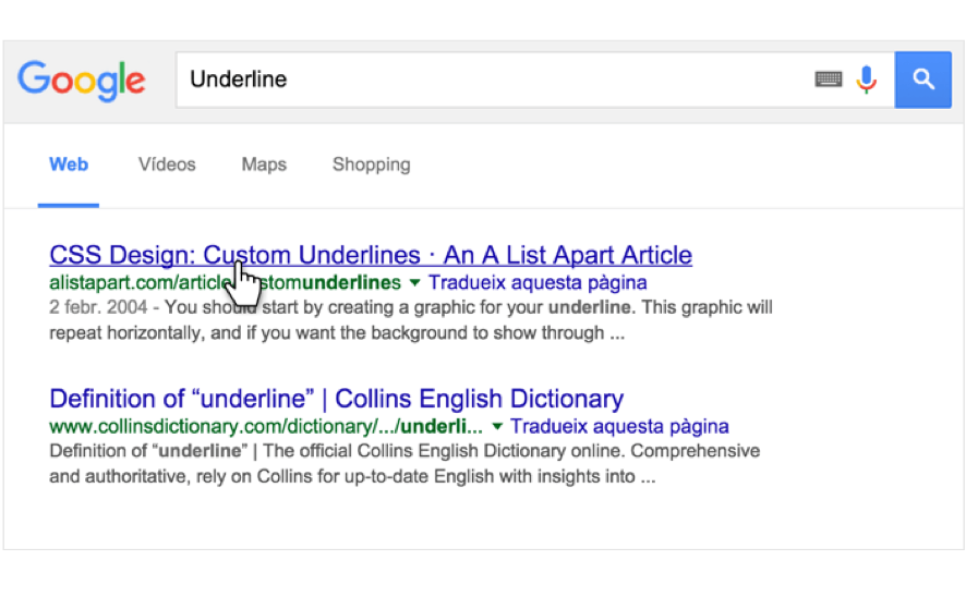
Google’s reference to improved readability implies that usability and overall experience are negatively impacted by the underlined link. This is backed up by the 2003 study from the University of Hamburg, which found that, when testing different link visualization techniques, the underline actually scored lowest on readability and global content comprehension. Linked text was less readable and decreased recognition of linked words. While “link markers are always a design compromise,” notes the paper, the underline seems to be the one of the biggest readability compromises of all.
Certainly, in terms of interface aesthetic and visual design, the underline is a design compromise. A glance at any of the numerous lists of ‘best minimalist websites’, say from Awwwards or Creative Bloq, will show that very few use underlines. What else can we do to mitigate this compromise?
Alternatives and improvements to the link
When designing hyperlinks for a website, designers have the opportunity to improve the existing convention, or attempt an alternative approach. One option that doesn’t stray too far from the standard is to improve the shade of blue. But, if a designer is looking for something more extreme, some alternatives to consider are to display links on demand or to use color overlays, both of which performed well during the University of Hamburg study.
Link Color
When deciding on the link color, designers must consider the color contrast and be mindful of users with color blindness. To accommodate all users, links should have a 3:1 contrast with black text and a 4:5:1 contrast with the white background. Fortunately, there are a number of tools available (including a built-in Adobe Illustrator view) that will replicate some forms of color blindness. This is invaluable to designers when determining if their designs meet the standards. Webaim, a group dedicated to helping designers create accessible sites for all, counsels that if links are not marked by an underline, they should have at least some kind of “non-color designator” so that users can identify links even if they have visual impediments.
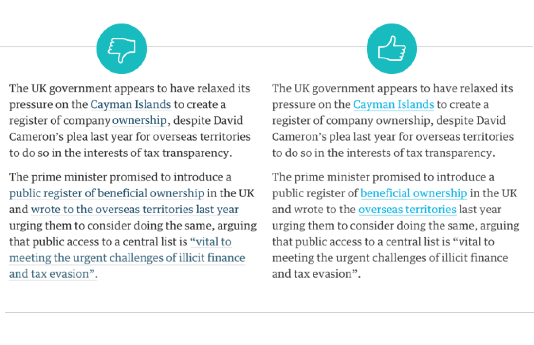
As Jakob Nielsen says, “assuming the link text is colored, it’s not always absolutely necessary to underline it”, but it is always necessary to emphasize links in some way.
Displaying links on demand (AKA: Hover)
Hide and show link visualizations require the user to hover over the text before seeing any associated styles. While this can make a site more minimalistic and visually clean, it does come with significant drawbacks. Without the blue text color or underline, the user is forced to seek out the links, leading to lower link interaction. There is also the question of touch screen devices: mobile users are unable to hover and won’t thank you for locking them out. As Hoa Loranger advices in her NNGroup article, “ Never make users rely on ‘mouse-overs’ to determine if a text is clickable. Hunting for links takes effort and people won’t do it for long.”
Color Overlays (AKA: Link decoration)
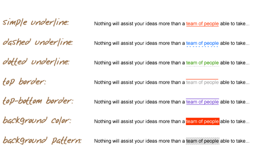
Based on Hoa’s advice, visually displaying the presence of a link is necessary. But, does it have to be the standard blue, underlined link? Andy Rutledge discusses some lesser seen alternatives to the underline, such as “various border types/positions/configurations, background colors/images, and even less advisable decorations like a line-through.” While these may give interesting results and could fit in with certain brand identity’s, a designer must consider the readability impact of this choice.
Next steps
It’s not necessary to stick religiously to design conventions around the underlined link – after all, the underline has its downsides and its UX detractors – but it is necessary to prioritize link visualization and UX. It makes sense in terms of both design and usability to consider how links are marked on a site. No matter the method chosen, there are some golden rules that apply to all UX friendly link visualization techniques.
- Don’t underline text that isn’t a link
- Use different colors for visited and unvisited links
- Make links accessible by writing semantic HTML
- Write specific messages for your links, that indicate where the user will be directed (avoid uninformative phrases such as ‘click here’)
- Keep linked phrases short, 3-5 words
- Maintain overall style consistency and integrity across the site
- Don’t put more than 100 links on any one page (Matt Cutts explains why)