With so much UX work focused on websites, it can be easy to forget that the same rules we apply online are equally valid elsewhere. Videogames are a perfect case-in-point. Many of the highest profile titles, much like the highest profile websites, have issues that could be addressed by considering user experience. In this article, we’ll take a look at one such game, Microsoft/Lionhead’s Fable III.
The Fable series is focused on making role-playing games (RPGs) more accessible and easier to use. After two excellent predecessors, it might come as a surprise that Fable III is widely seen as a step back for the series. By examining the game’s user experience, three fundamental issues can be found:
- Misuse of metaphor
- Lack of user control
- Over-simplification
In its quest to increase the accessibility of RPG mechanics, Fable III has instead overcomplicated some areas and oversimplified others. The resulting user experience is frustrating and leaves users bored as they struggle to navigate the disconnect between what they wanted and what Lionhead thought they wanted.
Misuse of metaphor
Perhaps the clearest example of poor user experience design in Fable III is its menu system, or rather lack of one. In most RPGs, pressing pause brings up a menu where you can view a map, inventory, statistics, and other information. Pause menus allow you to quickly perform common actions and take stock of your situation, before returning to the main game.
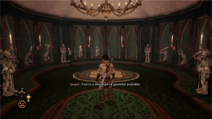
In Fable III, a different metaphor replaces the menu that you’d expect to find. Pausing the game transports your character to a room called the Sanctuary, where an affable butler, voiced by John Cleese, guides you around. Instead of having a traditional menu, you direct your hero around this and its adjacent rooms, interacting with various items to access the information you need.

One of the rooms in the Sanctuary
Initially, this radical departure from the traditional menu system seems inspired. It reduces the feeling that you’ve left the action, while providing a retreat to from the rest of the game. However, after the first few times it becomes clear that this abstraction has a huge cost.
Before being able to access any of the commonly used features, you have to get your bearings in the room, locate where you need to go, move your character to that point, interact with an object, and only then can you view the information you want. Each of these steps requires greater mental and physical effort from the player. Over time, this becomes immensely frustrating as the need to access information trumps the novelty of not having a menu.
Tellingly, there are four quick shortcuts that transport you to each of the Sanctuary’s main areas. It seems Lionhead realized the flaws in this design and opted to fix it as best they could in the time available.
Lack of user control
Fable III‘s story has two parts: becoming king and ruling as one. Once you reach power, there’s one problem: the kingdom will be attacked in a year and you must raise 6.5 million gold to defend it. The more gold you have in the treasury, the fewer people will die.

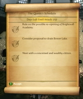
252 days left, but how many will it advance once you’ve completed this list?
With 365 days on the clock, this seems doable. You’re given a set of tasks that either earns or costs you gold. The days go by and the clock advances after certain arbitrary quests are completed. However, the clock jumps from 356 days to 339, 294, 252, 121 days, and finally to zero.
Players have no idea when time will progress or by how many days. Before they know it, their plans based on the originally slow movement of time no longer apply, their kingdom is under-prepared for attack, and their citizens are heckling them in the streets.
The issue here is lack of user control, a classic problem seen frequently on more mundane websites and applications. Many web forms use progress indicators to provide a sense of control and location within a process, which works extremely well. Not including such a simple visual aid in Fable III is a fundamental and costly mistake.
Over-simplification
When designing a user experience, we often strive to make things simpler. With Fable III, Lionhead has done the same, but in the context of the game it has a negative effect.
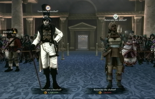
Once you’re king, you have to make a series of decisions, each of which is presented as a choice between good and evil. Rebuild the orphanage or turn it into a brothel? Bail out the economy or let it collapse? Open a school or reinstate child labor? Occasionally there’s a middle-ground option, but often your choices are polar opposites, neither of which seem sensible.

Restore an orphanage or turn it into a brothel? You decide.
Combat is limited to three buttons, assigned to melee, ranged, and magic attacks. The former becomes ineffective and the latter is overpowered, so you’ll quickly opt to use and improve a single skill. The only remaining decision you have is how long to hold down the button when attacking. Thus each battle becomes mundane, as the same tactic is universally effective, no matter the foe.
As a result, both presiding over your kingdom and defending it are simple tasks. Yet in a video game, simple tasks don’t make for engaging experiences. Players want to be challenged along the way, however mainstream or accessible the game purports to be.
Fable III is not alone
It’s easy to pick on Fable III, but it’s hardly a unique case. This is one of countless titles where priority has clearly been given to testing whether the game technically works, not whether it offers a compelling and engaging user experience.
While users may be more inclined to persist with products they’ve spent $50/£35 to use, this initial cost also means that they are more cautious about making purchasing decisions. Poor user experiences degrade trust in brands such as Microsoft and Lionhead, further reducing the likelihood that customers will buy their next games.
The video game industry can learn a lot from sectors such as retail and finance, who are aware that user experience has a direct influence on their success. This understanding is something that many video game developers are still apparently oblivious to, a situation that must change.
Universal design considerations increasingly comprise a prudent approach to design and development for the web. Interaction designer Andrew Maier details some of the broader implications this has for user-centered designers.