Editors Note: This is an abridged excerpt from chapter seven of Living in Information: Responsible Design for Digital Places by Jorge Arango. It is available from Rosenfeld Media in paperback and ebook.

It’s a crisp evening in the late spring of 2017, and I’m sitting in Berkeley’s Hearst Greek Theater along with my friend Alex and our wives. We’re enjoying a concert by Jean-Michel Jarre—the “godfather of electronic music”—who is playing his synthesizers and dancing energetically, surrounded by sophisticated electronic instruments and enormous video screens that slide before and behind him. Even though the four of us enjoy each other’s company, our attention is squarely focused on the performers. This control of our attention is by design: the layout of the theater encourages us to focus on what is happening onstage.
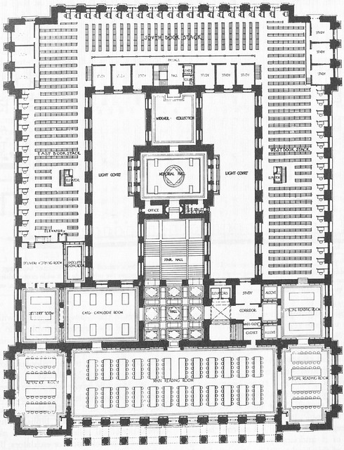
The structure of our environments has a substantial effect on our ability to perceive information. An environment designed to enable a large audience to pay attention to a performance, such as the Hearst Theater, will be structured very differently than one meant for an individual to find and study a book, such as a library.

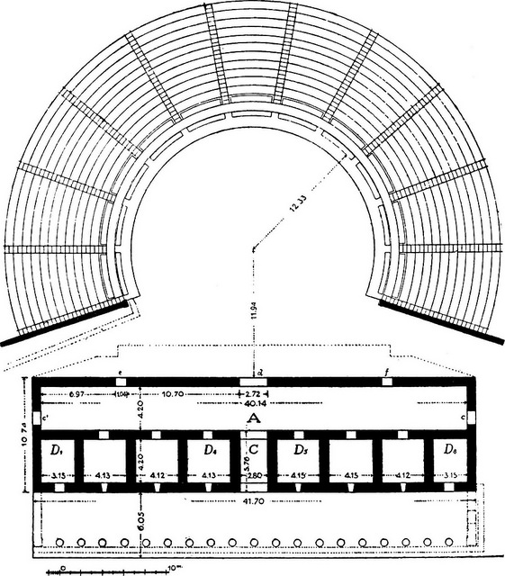
Ground plan of the early Hellenistic theater at Ephesus.
There is no one right way to organize environments to accomplish these goals, but rather many different ways optimized toward different ends. We see this in the variety of library and theater designs in the world. However, some arrangements have proven to be most effective over time. We’ve inherited the structure of the Hearst Theater from the ancient world. This arrangement—with graded seating for an audience set in a concentric circle around a stage—is optimal if you want the audience to pay attention to a performance.
The structural configurations that underlie these places are critical to their ability to serve our needs. They’re also essential to the way information environments work. Let’s examine how they do this.

Floor plan of the Widener Library at Harvard University.
What We Mean by Structure (and Why It Matters)
The key to understanding structure is recognizing that we perceive things as being composed of interrelated elements: parts that make a whole. For example, a company may have departments such as marketing, sales, product management, finance, and human resources. These departments have different roles within the organization, and function in a variety of ways, but they all ultimately work together to serve the whole. These elements of the company relate to each other in specific ways that allow them to accomplish their functions by establishing particular relationships between them. For example, while the marketing and sales departments may be peers in one company, marketing may report to sales in another. The company’s leadership chooses one arrangement over another, ideally in service to particular business objectives. The set of relationships between the departments (the parts) of the company (the whole) is its structure.
There are various ways to organize the parts. For example, many organizations are arranged in a hierarchy, as is often the case of marketing reporting to sales. Hierarchies are characterized by one-to-many relationships between the parts, and can be visualized as trees, with the highest-ranking element in the structure being the equivalent of the trunk supporting various levels of branches and leaves below it.
Another common structural arrangement is the network. In a network, any part can have a relationship with any other part. While not very common in organizations, there have been some experiments in networked corporate structures that allow teams to self-organize. (The foremost example, online shoe retailer Zappos, is based on a model called holacracy that aims to empower its constituent parts to define themselves and their relationships with other parts on an ad-hoc basis.)
A third way of organizing elements is a lattice: an arrangement in which parts have formal relationships with other parts, which are somehow adjacent to them. Unlike a hierarchy, whose relationships are top-down, relationships in a lattice can be established “sideways” between peer elements. Unlike networked arrangements, relationships in a lattice are not entirely arbitrary; they implement a particular pattern. In companies, this most often manifests itself as “matrixed” arrangements in which groups have both a top-down managerial structure and horizontal responsibilities and relationships with peer teams.

Three types of structural arrangements.
These various arrangements of parts that make a whole are evident both in the natural world and in the things we make. We don’t see them as arbitrary or haphazard; on the contrary, we perceive (and use) patterns in these arrangements. Think of the “double helix” structure of DNA, the leaves of a fern, the sequence of sounds and silences in a sonata, and the arrangement of load-bearing components of a building: all are recognizable as having patterns of order.
Pattern-matching is an innate ability in humans which allows us to interact more effectively with our environments. We look around and listen and are then able to anticipate the location and behavior of food sources and predators in the environment. Doing this well gives individuals an advantage, so we’ve evolved to use pattern-matching to understand what we’re perceiving (and where it is in relation to ourselves) when moving around in an environment. As a result, it’s easier for us to navigate environments that have a clear structure than those that are chaotic and random. It’s also easier for us to design and build them.
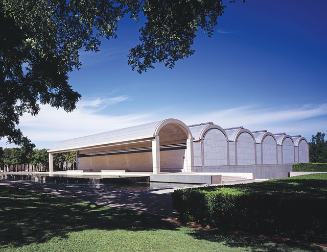
Many buildings have structures that establish a sense of order and regularity in the environment. A beautiful example of this is the Kimbell Art Museum in Fort Worth, Texas, by the architect Louis Kahn. The Kimbell is organized as a series of parallel vaults especially designed to gently shed natural light on the museum’s art collection. These vaults establish a regular pattern that makes it easy for visitors to understand the place.

The Kimbell Art Museum is structured as a series of regular vaults.
When talking about a building such as the Kimbell, we can discuss structure at least on two levels. The most obvious is the physical (load bearing) structure that makes it possible for the building to resist the force of gravity. This includes elements such as columns and beams arranged in regular patterns; the bulk of the Kimbell’s weight is carried by columns on the corners of each of the vaults and by the vaults themselves. The physical structure is what most of us think about when we think about structure in buildings.
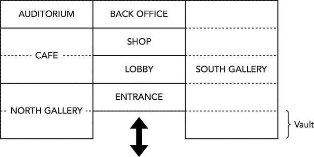
However, on another level—one that is more relevant to our topic—we can also talk about the building’s conceptual structure. In the case of the Kimbell, this conceptual structure is the fact that the building is composed of modules (the vaults) that have particular characteristics; that these vaults are organized in a particular way that creates symmetry and order; that this arrangement establishes particular relationships between outdoor and indoor spaces; and that the various programmatic needs of the buildings (e.g., it must include galleries, a cafeteria, a gift shop, and auditorium, etc.) are served within these vaults, and so on.
In buildings, as well as in information environments, the conceptual structure serves to create both distinctions and coherence between the environment’s constituent elements. If it’s to succeed, the environment must resolve the natural tension that exists between these two directions. In the Kimbell, distinctions are the various types of spaces called for by the building’s program, which it must have to function as such—just as a company must have various departments fulfilling different roles. An auditorium has very different spatial requirements than a cafeteria or a gallery, yet the Kimbell suggests that somehow they must all be served by these vault modules.
Coherence comes through the use of a common element (the vault) to implement these programmatic functions, and through a consistent level of quality in the implementation of the design as a real building in the physical world. It’s one thing to say “the building is a series of vaults that let in natural light” and another to create an actual building that does this. For the building to function as such, the architect must address many implementation details. For example, how do visitors move from one vault to another? How do transitions happen from public spaces (such as the lobby), through more private spaces (the galleries), to those that are inaccessible to the public (back office)? How do the joints work where one material (concrete) meets another (marble)? How does such a space maintain a comfortable level of temperature, humidity, and lighting, while still allowing the display of delicate artworks? How do the toilets work? The design will be a more successful experience if such details support and reinforce (rather than contradict) the overall conceptual structure in a coherent way. Maintaining a consistent level of attention to quality when resolving such dilemmas creates a sense of unity and harmony that is evident to the visitor, even if subconsciously.
Information environments, too, have conceptual structures. Think back to the Chase bank website we visited in Chapter 3: it’s divided into a “public” zone where you can access the bank’s marketing materials and a “private” one where you can access your account details and functionality. To access the private zone, you must possess a “key,” which is your username and password. As with a building, you can sketch out a diagram of how such an environment is structured.

Conceptual structure of the Kimbell Museum.
Instead of realizing these conceptual structures in marble, steel, and concrete, as built environments do, information environments implement them as words, phrases, icons, images, transitions, and sounds. Websites and apps don’t have to resist the force of gravity, so they don’t have load-bearing structures. Instead, we experience their semantic elements: the particular set of labels, icons, and so on that implement that environment’s conceptual structure and create both distinctions and unity. Just as great care must go into the choice of materials in a building and the details of how they come together, the selection of words, metaphors, and images—and how they are rendered in the environment—are paramount to the success of an information environment.