As designers, we run the risk of becoming overly familiar with our work, designing for ourselves, and losing perspective of what our users see and experience. Preventing these bad habits isn’t difficult—using appropriate UX research methods makes us more connected designers and keeps us focused on the end user.
I knew that before, and yet taking a UX design course at Millersville University while working part-time as a Graphic Designer has enhanced my ability to translate research into user needs and goals. It has pointed me in the right direction for all my design decisions. Since research methods have been such a great learning tool for connecting me with end-users, I want to share my lessons learned with the design community. In this article I will highlight a few research methods that help designers to analyze an existing product or design.
Formulating my design research
In my design course, I was tasked with taking an existing website and improving the organizational structure to be more in line with uses’ expectations. When I chose a website to redesign, I asked myself the following questions:
- Can you tell what the site is about?
- Is it difficult to find items within the site? Are there too many links?
- Do you find yourself struggling to navigate the site?
- Can you anticipate user expectations for the site?
- Do you know who would use the site?
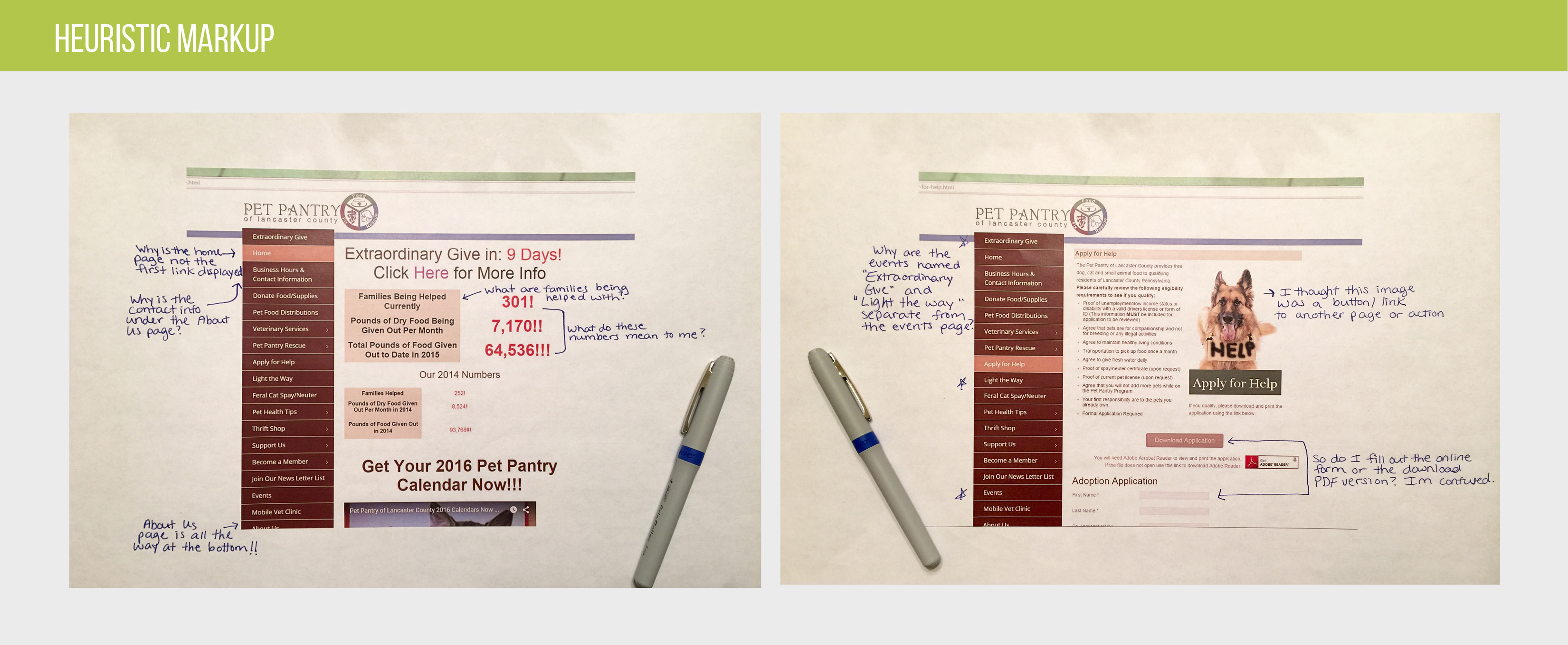
In the end, I chose a non-profit organization, Pet Pantry of Lancaster County. for my project. To get started, I created a project plan, which included the following research methods, all recommended in The User Experience Team of One, by Leah Buley: Content Audit, Card-sorting, Heuristic Markup, Comparative Assessment and Proto-Personas. I wanted to use methods that I wasn’t very familiar with so that I could learn to value the different insights that would develop from each one.
Documenting a Content Audit
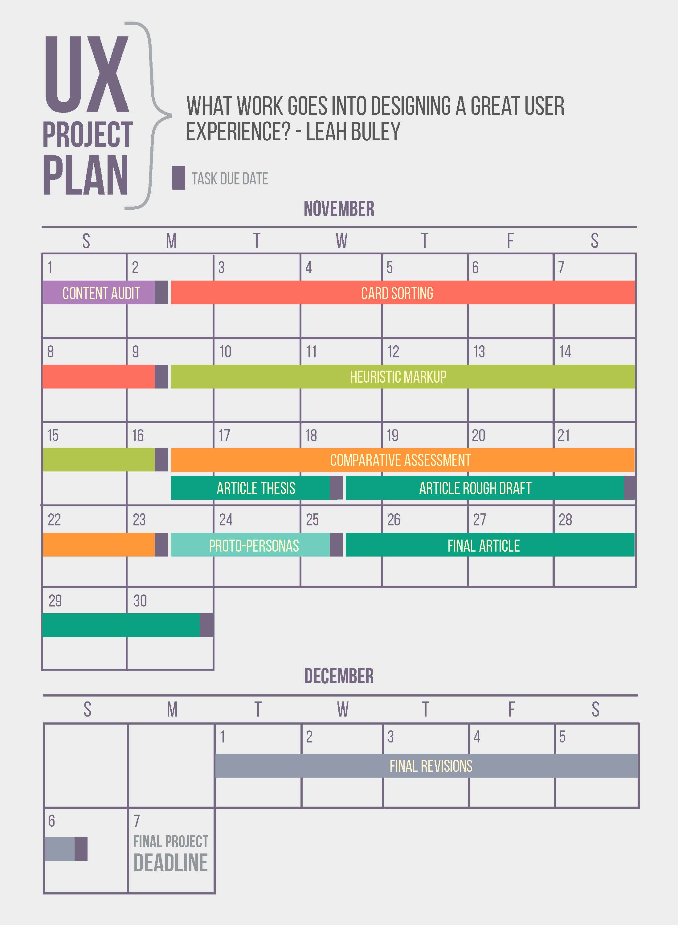
By starting things off with a content audit, I wanted to get a better understanding of what content and capabilities my users had access to, how the content was structured, and its overall quality. In order to get a deeper familiarity with the website’s content, I began by recording all the pages listed within the main navigation. I then went into each of those pages and recorded all links on that page. I also included links that directed users to other pages, downloadable files, and videos. My spreadsheet looked like this:
- Home
- Please Donate
- Click here to volunteer
- Support our fund drive
- Business Hours & Contact
- Donate Food/Supplies
Listing the content into a spreadsheet made it easier to visualize the overall organization. Even though this process was tedious and time-consuming, I was able to obtain a better vision of the recurring patterns and overall functionality of the website.
This method gave me insight into how the website’s structure could be more in tune with user needs. For example, the About Us page was placed at the bottom of the sidebar navigation, making it difficult for users to find what the organization is all about and what they do. The content audit also revealed that a lot of information was repetitive, while some areas were hidden from the user. For example, the Feral Cat Spay/Neuter was not included on the Spay/Neuter page, or even under Veterinary Services. For the user, this creates unnecessary clicking back and forth to find all the information they need on this particular service.
Solving findability issues through Card sorting
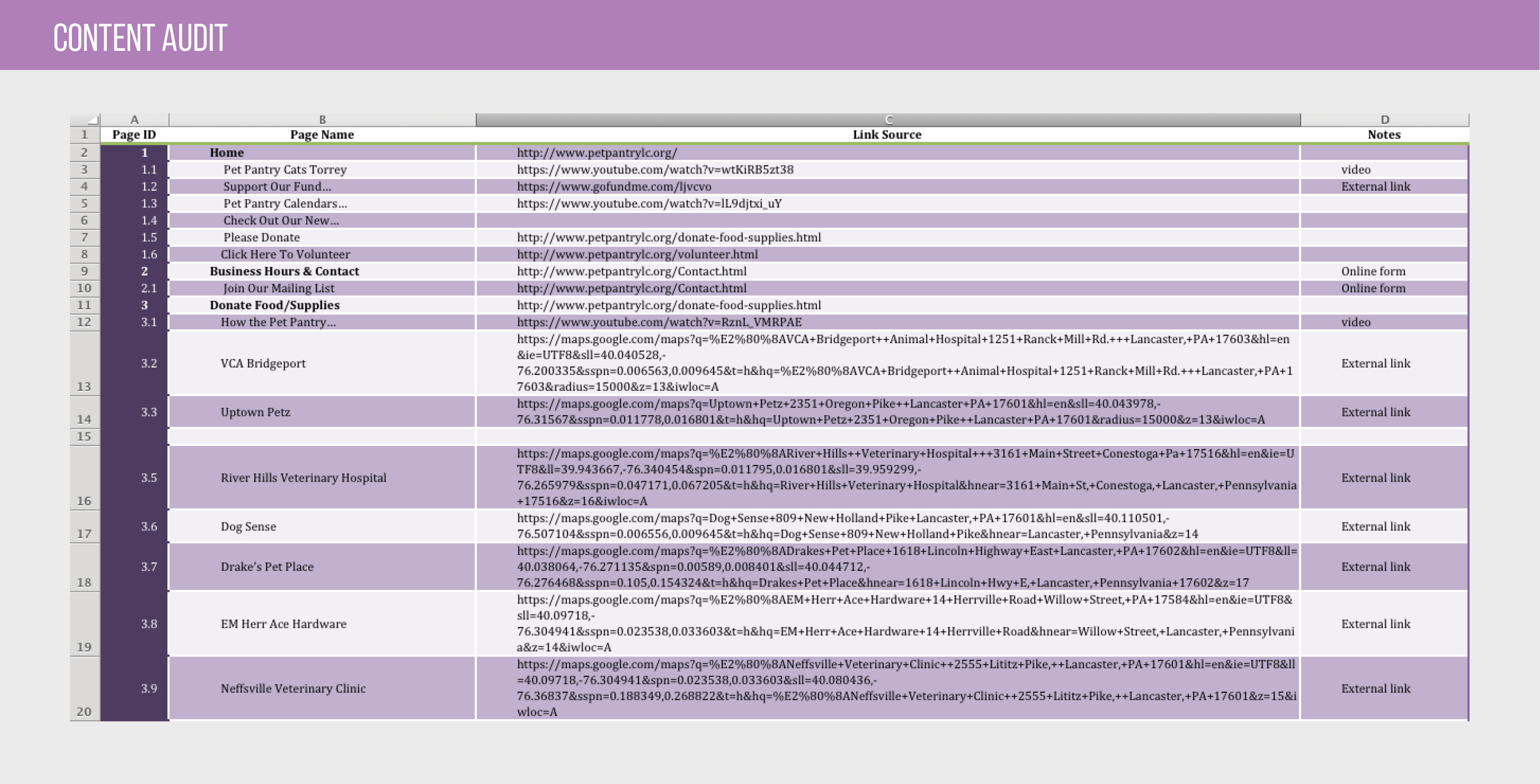
Based on my Content Audit, I knew I needed to improve the site’s organization. For this, I used a technique called open card sorting – a method that asks users to organize content without pre-established groupings.
I recorded each area of content on a separate 3”x5” index card. I then asked the participants to sort the cards into groups that they felt were appropriate, and to describe their thought process. This simple exercise is a reliable and inexpensive method for finding patterns in how users expect to find content. My goal was to see the user’s mindset, so I could make information easier to find. Participants from the session suggested several ways to improve the site, mostly by combining areas of related content. For example, one user placed the Adoptable Pets link under Support Us because they felt this was a way of supporting the overall cause. Another user combined all pages dealing with donations into one section.
Navigation and Heuristic Markups
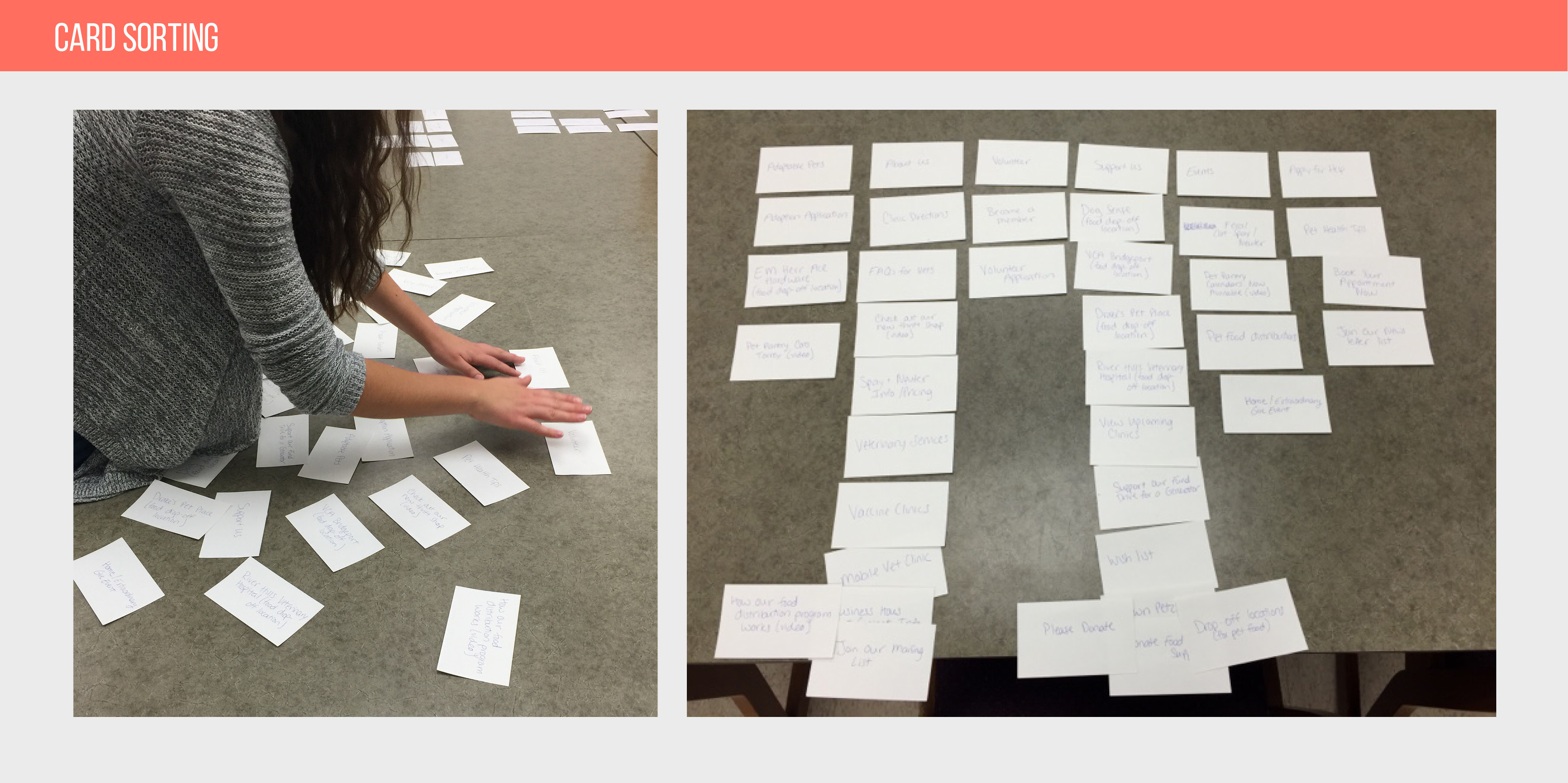
Building off the organization solutions found in card sorting, the heuristic markup helped illustrate how a user might experience the website from beginning to end. I began the heuristic markup by recording my own observations as I went through the site page-by-page. I took screenshots of each page I observed, and printed them out so I could highlight and add notes to specific areas. I noted questions, confusion, and other general responses I had to the content, mirroring possible users’ experiences.
In the process, I saw both visual and content obstacles that could hinder a good user experience. For example, the Apply for Help page asked users to fill out an online form version of the application as well as a PDF download version. This left me to ask, “Which path should the user take and why are there two options for the same outcome?” I also saw static images throughout the website that looked like buttons, causing me to wonder “is this something I should be able to click on?”
Satisfying user expectations
Now that I was aware of how users were experiencing specific areas of the website, I wanted to see how those experiences could be improved. To that end, I conducted a comparative assessment of the website, to see the standards and best practices that users were likely to expect. My initial step was to pick five feature areas or unique pages from the site to focus on:
- Events/News
- Support/Volunteer/Donate
- Contact/About Us
- Online Applications
- Veterinary Services
I evaluated each area’s experience based on the following categories:
- Content
- Design
- Features & Functionality
- Continuity or Flow
- Intuitiveness
- Strengths, Weaknesses, Opportunities
By treating this evaluation as a critique for the strengths and weaknesses of each category, I was able to see how each feature area could be improved. I then took those same feature areas and compared them with websites of similar subject matter. I captured examples from websites providing a better experience and recorded them as “best practices” for UX. This helped me to go deeper into specific features of the website and see how they could be more user focused.

These best practices, from other websites of similar subject matter, show details that came out of conducting a comparative assessment.
Understanding specific users through Proto Personas
Lastly, I created proto personas, based off the needs, goals and challenges I learned from specific users. Branching off of traditional personas, proto personas do not require as much real-life data, but can be equally effective when getting into a user-based mindset. To bring life to my user profiles I created 3 proto personas, each with the following information:
- Age
- Life Stage
- Motivators
- Use for the website
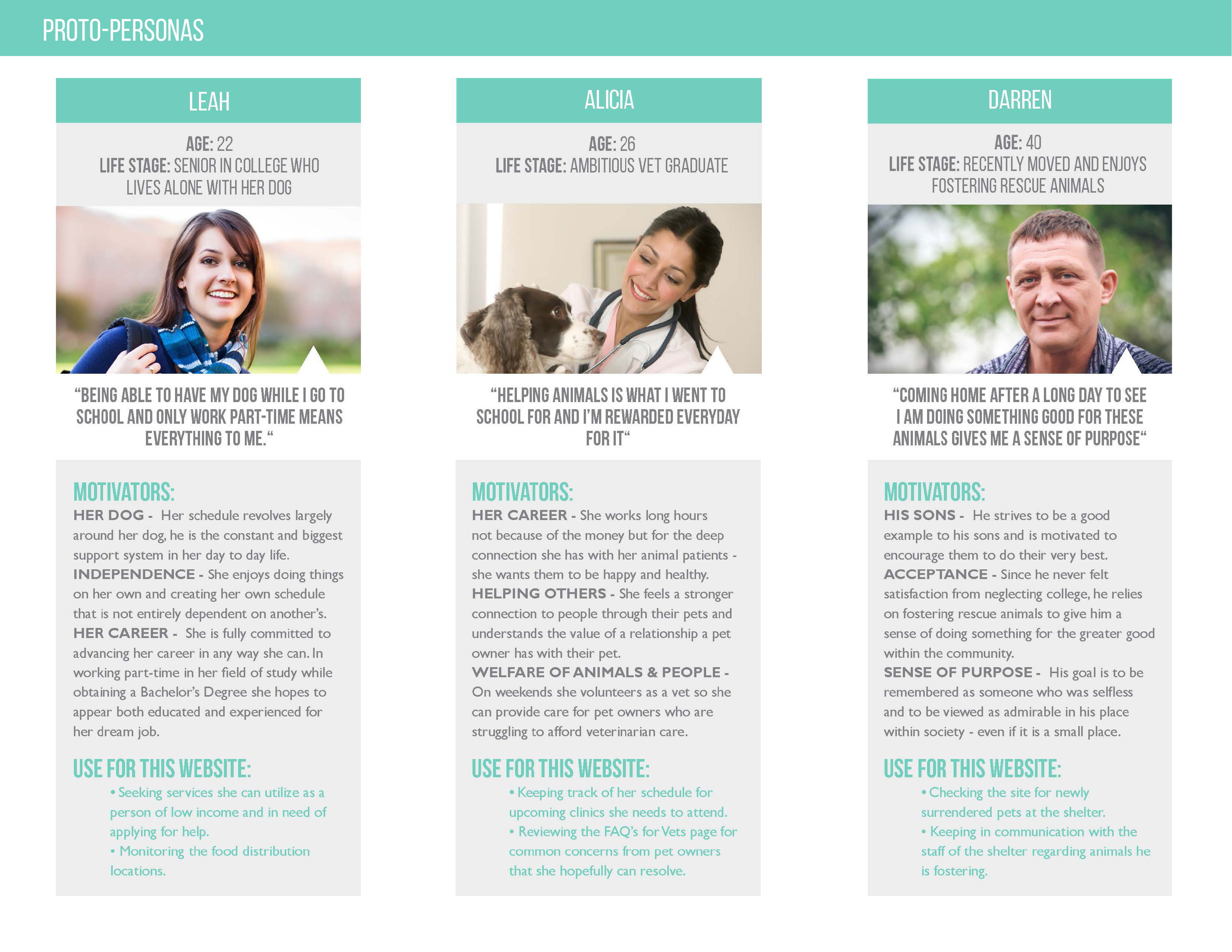
These user profiles detail specific needs, goals and challenges.
After creating specific profiles, I was able to go into each user’s mindset and reveal the goals, use cases, and specific expectations. Those proto personas then stayed with me for every decision I made in creating the site redesign.
Creating a User-Centered Purpose
Practicing these UX methods helped me see where the website needed improvement. But it also opened my eyes to the thoughts and feelings of my users, in a way that my daily work doesn’t always. Working on this project reminded me how important it is to connect, as much as possible, with our users, in every project, whether for a class or a client.
I also found Leah Buley’s book, The User Experience Team of One, particularly insightful as I worked through this project, and I highly recommend it to other UX designers, whether they are just getting started, or just looking for some new inspiration. As I mentioned at the start of this article, all of the research methods I used in my project are touched on in Buley’s book. I have also used these methods in my daily work, as a Graphic Designer at ROCK Commercial Real Estate in York PA. In fact, my most recent project consisted of putting the company’s website through a full redesign, and I used many of the same methods that served me so well in my class project.
For other UX designers looking at applying research methods to existing websites, consider the following tips as a guide:
- Getting started: Creating a project plan will help keep UX designers on track by formulating what research methods are best for the project’s goals.
- Choosing the research methods: Exposure to research methods that are unfamiliar or new to a UX designer can open up more opportunities and findings that will give purpose to design decisions.
- Keeping a user-focused mindset: Each research method brings a unique user perspective and when using a combination of different methods, the findings build upon each other – ultimately making a stronger connection between designer and user.
UX research - or as it’s sometimes called, design research - informs our work, improves our understanding, and validates our decisions in the design process. In this Complete Beginner's Guide, readers will get a head start on how to use design research techniques in their work, and improve experiences for all users.