Voice technology is one of the hottest trends right now. Every company is trying to get in on the action, and you can’t really blame them. According to Oberlo, approximately 71% of consumers even prefer to use voice searches over typing, so it goes without saying that people want to use their voices to complete actions. But, could something as new as voice be used to tackle the challenges of a complex industry like healthcare? Is there even a way to test these workflows? These are the questions we set out to answer when we embarked on our voice prototyping journey.
Choosing a Platform
Tools such as Figma or Invision can easily simulate the functions of a “clickable” user interface but are incapable of interactions by voice. We needed a new tool that would allow users to actually speak to and hear audio feedback from our application. Based on the available prototyping tools with voice capability, we considered using Adobe XD and Voiceflow.
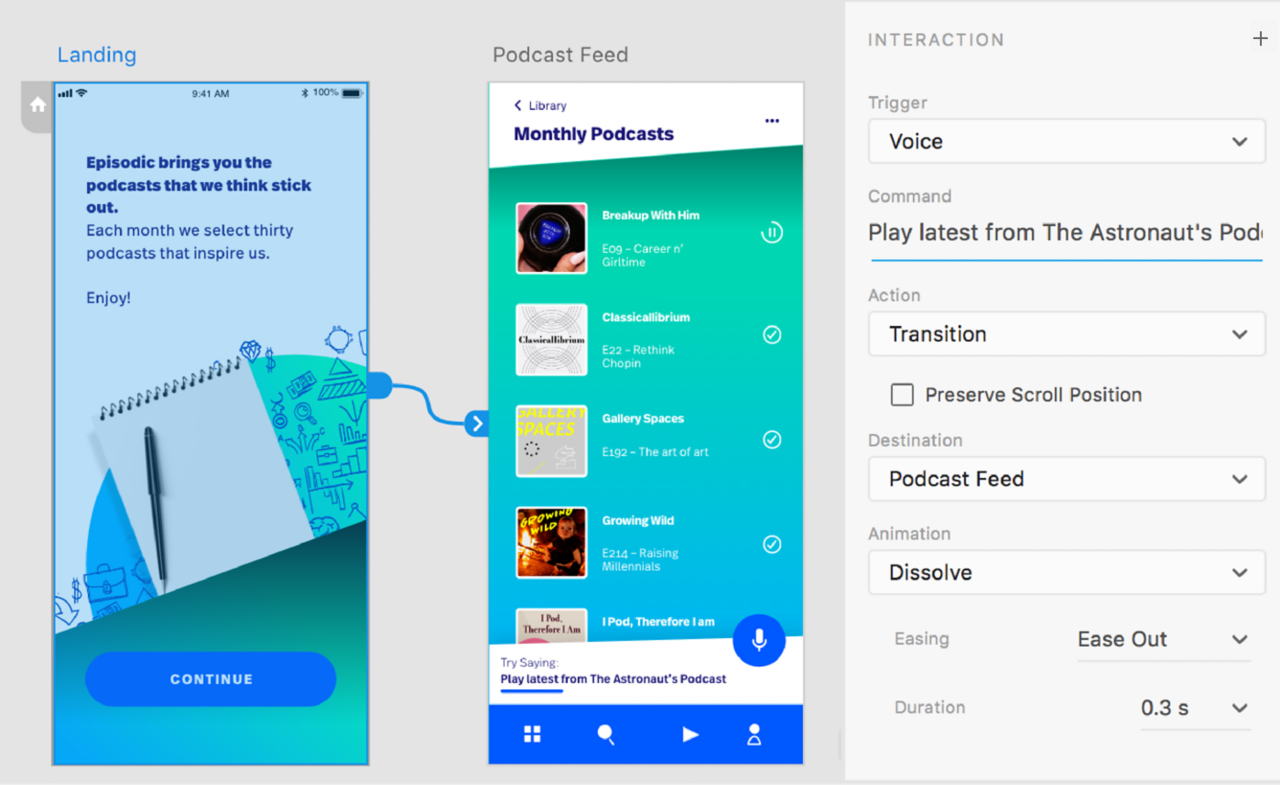
Adobe XD has powerful UI and visual design capabilities with basic voice prototyping functions.
Adobe XD is a full-fledged vector-based design application that supports voice prototyping, while Voiceflow has very limited visual editing capabilities, but is a very powerful voice prototyping tool. We assumed that our needs would be almost entirely voice-oriented, so the decision was made to proceed with Voiceflow.
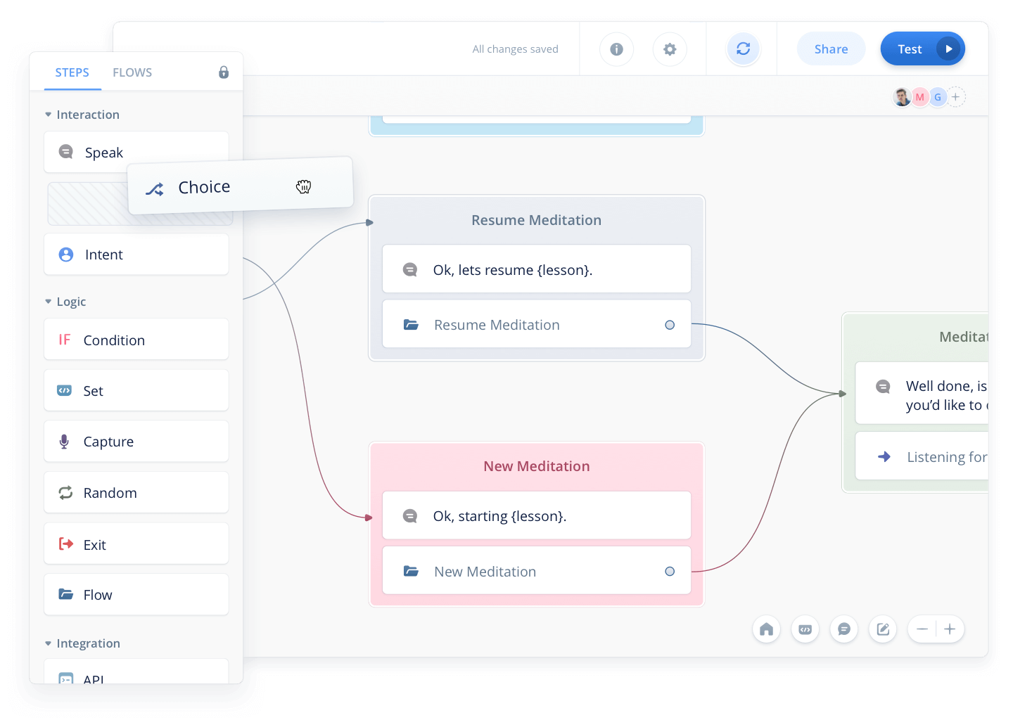 The Voiceflow builder has an easy drag and drop capability to quickly construct voice interactions.
Voiceflow also had several features that helped cement it as our top choice. Prototypes are easily shareable and can be tested by anyone with almost no setup, as prototypes are available right in your browser, and can be shared with a hyperlink. Another feature that stood out to us was the expertise built right into the tool, meaning, there are best practice tips and tricks available right at your fingertips. This was not as robust with Adobe XD, as that tool isn’t solely focused on voice design. Voiceflow also had incredible levels of customization for your voice assistant – you could select different voice tones, pitches, and most importantly speeds. It also supports variables – for example, you could tell the prototype your name, and it would remember it and say it back to you.
Defining The Problem
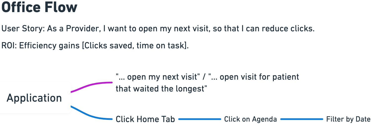
Any good UX’er that’s worth their salt knows that you can’t create a solution without fully understanding the problem. While there are many ways to do this, we started our process with two workshops with some of our users and subject matter experts to learn what workflows pose the biggest challenges to them. We then assessed if those flows could be simplified with voice commands. Those two separate paths were then compared using a workflow design tool called Whimsical. The most important thing to remember during these workshops was two ensure that the tasks we were simplifying were truly meaningful tasks, and not simple solutions such as “open email,” which would actually be easier to do with a couple of taps.
An example of a Whimsical workflow
Prototyping Time!
Voiceflow has a pretty neat onboarding experience where they have a full prototype set up to show you the basics. Voiceflow is pretty feature-rich, but our prototype focused primarily on using “choice” blocks, visuals, and audio.
Recording of our voice prototype created in Voiceflow.
Choice Blocks
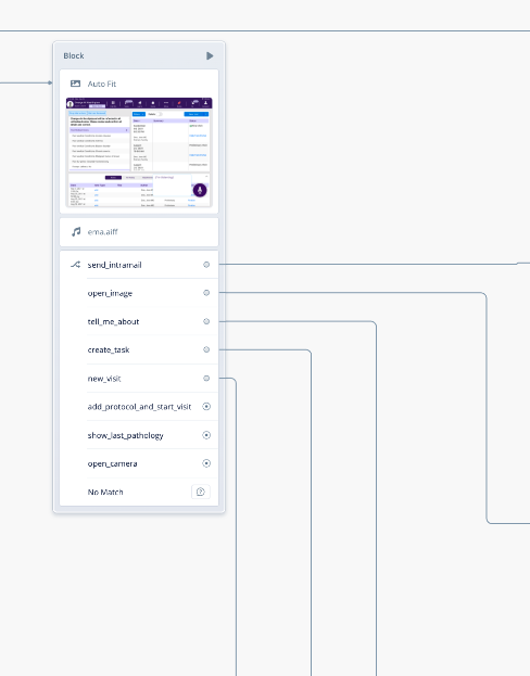
This is the backbone of our prototypes. Basically, you can type out what you’re going to say, and set up what block you would like to go to when that happens. For those code-inclined, think of it like an if-then statement. In fact, the core of our entire prototype is based around one block with nine “choices” stemming from it. This pattern is particularly useful if your application or site has one main “hub” where most actions derive from.
An example of a “Hub”
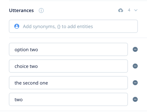
In our prototype, we had several of the workflows we previously mentioned start from this hub and almost always returned here once the workflow was completed. The “choices” that you can speak in these instances are what Voiceflow calls “utterances”. An example of a common utterance would be “What’s the weather?”.
Any of these utterances above signify you’d like the second choice in a list that is being displayed on the screen.
Another extremely important part of choice blocks is “throwaway text”. Throwaway text are wildcards that exist in your utterances. If we were to apply this logic to the weather example above, it would look something like this in Voiceflow: “{throwaway text} weather”. In this case, any time you end what you’re saying with the word “weather”, it would send you down that utterance path. This can be extremely useful when you have words that Voiceflow struggles to recognize. In our case, the application we were working with uses complex medical terminology and sentences that would trip up any out-of-the-box voice solution. It also made demos go much smoother.
Occasionally the Voiceflow would get tripped up with “adding protocols,” so we implemented throwaway text.
Be careful with throwaway text, however. You should always ensure that whatever you prototype can work effectively in your application with adequate voice model training.
Visuals
While Adobe XD is far superior for visual prototyping, you can get away with more than you might expect in Voiceflow… You just need to think of each visual you’d like to see, and set a time delay in between blocks. For example, we have a workflow to open our application’s camera. To complete the first step in this workflow, you hold the spacebar to allow Voiceflow to “listen” and say our application’s name to “wake” our virtual assistant. There is then a visual where a speech bubble appears on the screen that says “I’m listening”.
After the application is “listening,” you hold the spacebar again and say “open camera”. Voiceflow will then listen to your command and if it recognizes it, you will cycle through the remaining images to get to the next “choice” block.
Audio
Audio had a couple of primary uses in our prototype. The first being a signifier that the application did in fact hear your wake command. It was a simple free sound clip that I found online that wasn’t jarring or off-putting, since you’d be hearing it every time you wanted to wake our assistant. The other use cases primarily consisted of confirmations, such as a setting being saved or a message being sent. In use-cases like this, having an assistant say a full command would be a bit excessive and wildly irritating after several times. Think about if every time you received a text message, your phone said “you have a message”.
Iterating
Throughout the whole prototyping process, countless iterations were done. Every time a workflow was completed, it was tested, and periodically workflows were shown to different doctor-employees and various other stakeholders. There were different versions created for different specialties, voice responses were sped up, and unnecessary screens were dropped. After all, one of the main appealing features of voice is to speed up peoples’ workflows and reduce the number of clicks needed to accomplish tasks.
The Experience
As a UX professional, creating a voice prototype with Voiceflow was an interesting challenge. You need to handle similar problems to regular design (what happens if someone clicks this thing they aren’t supposed to VS what happens when someone says this thing they aren’t supposed to), but there are also some differences. There are no pixels or colors, so things don’t have to be perfect in that sense, but there are also limited standards or conventions, so you really have to focus on what your user’s needs and pain points are, rather than what industry heuristics may be.
Demoing Tips
Considering most companies are using voice prototyping software like Voiceflow as a proof of concept, you’re probably going to be demoing it… a lot. Throughout the multitude of demos I’ve conducted for user feedback, here are a few tips:
For visuals, use small images.
If you are using visuals, and you probably should be, use as small as possible images while maintaining visual fidelity to ensure your ability to demo isn’t hampered by large prototypes. I typically designed images at full size but exported them as .5x their original size.
Have only your Voiceflow demo and script open.
Shut down everything else you have open while demoing. Yes, that means chrome with your 10,153 tabs open. It will greatly reduce your demo lag. I would still recommend leaving your script tab or program open as well. This leads me to my next point…
Have a well-thought-out, word-for-word script.
As a UX researcher, I know that flexibility is paramount during a session, but in my opinion, having a word-for-word script of the key points of your interaction is incredibly important. An entire interview can be destroyed if you get flustered enough and lose your place. The same goes for a voice demo… You only get one shot at a first impression.
Speak clearly and don’t rush.
The voice recognition in Voiceflow is pretty good, but it still gets tripped up on uncommon words (if I could wipe the word “intramail,” from existence, I would). So make sure you are speaking naturally, but as clearly as possible.
Use wildcards or “throwaway text”.
No matter how good the voice recognition software is, chances are it isn’t waiting on an entire phrase to be matched. It most likely is using keywords and your prototype shouldn’t be any different. Many phrases can be complete, but for others, it makes sense just to have keywords and throwaway text as long as there are enough keywords to not confuse the voice prototyping program.
Conclusion
Since voice technology is still in its infancy, the only standards that exist are simple commands like “read my messages,” or “navigate to…”, but at my company, we’re trying to ensure that we’re solving real challenges, and not simply adding voice as an “us too” feature, to learn more about modern technology solutions for your business, find here the EMS Solutions website. This makes it even more important that we align with our user’s mental models but in a different way. In one of our workshops, we even said to the participants that they should pretend we are a human assistant. Would you ask your human assistant to send a message for you? No, you’d do it yourself because it’s just as easy. However, a task like “order prescription X for this patient, 100mg,” can be incredibly impactful because of the huge amount of clicks and typing that you are saving.
Ready to get your feet wet in Interaction Design? In this article we touch briefly on all aspects of Interaction Design: the deliverables, guiding principles, noted designers, their tools and more. Even if you're an interaction designer yourself, give the article a read and share your thoughts.
