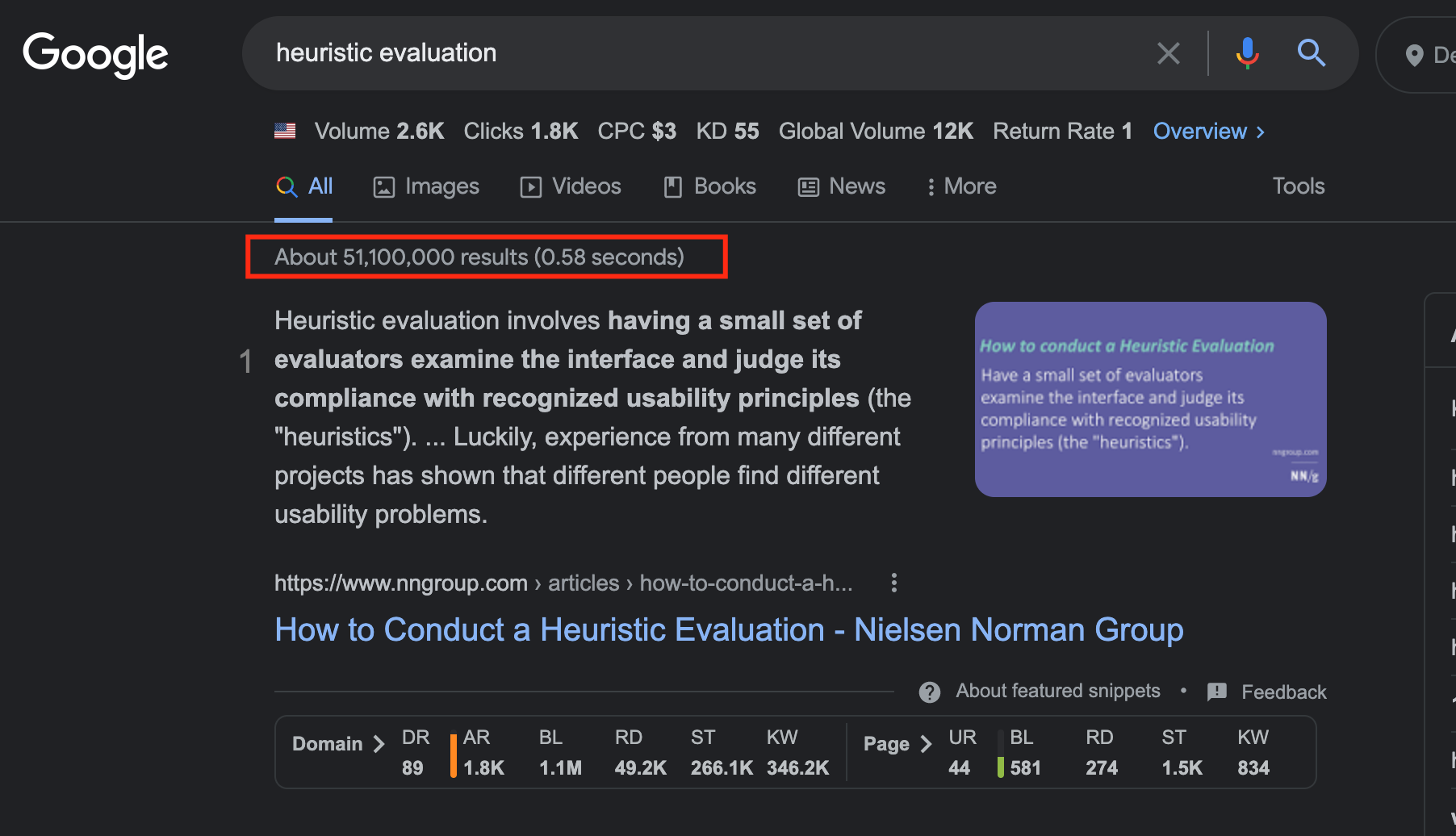
Heuristic evaluation (HE) is one of those design activities that has rightfully claimed its place on the UX Olympus. Any time there’s a need to evaluate a piece of design – that’s one of the go-to’s. It also doesn’t hurt that there’s no shortage of content on HE online. Almost 51 million Google results is no joke.
The overwhelming majority of the articles are “How to’s” and “What is’s”. I couldn’t find a single piece of content that extensively goes over the potential mistakes one can make. Secondly, the only HE cons I’ve managed to dig up online have to do with the activities’ inherent flaws such as the inevitability of bias as opposed to the more practical, “real-world” problems and misconceptions. That’s what this article is going to touch on.
Before getting into the mistakes I see made consistently, let’s do a quick memory jog into heuristic evaluation 101.
A Memory Jog
HE is the process of the evaluation of a product’s usability conducted by UX experts. Usually, it consists of the following steps:
- Outline the scope
- Start looking for experts
- Gather user intel
- Set up an evaluation system
- Analyze the findings
- Prioritize the issues
- Prioritize the issues
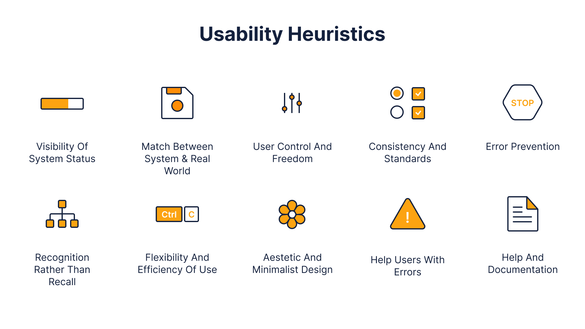
The set of heuristics used most commonly is Jakob Nielsen’s design heuristics.
The 10 heuristics are as follows:
The value of Heuristic Evaluation boils down to being able to identify up to 90% of usability issues relatively quickly and cheaply (as opposed to usability testing). In case you’re looking for a more comprehensive answer, here’s a video that covers everything in just 12 minutes ?.
Also, here is an article I wrote a while ago on heuristic evaluation.
With the intro out of the way, let’s get into the mistakes.
The Most Common Heuristic Evaluation Mistakes
Heuristic Evaluation is not a substitute for Usability Testing
No matter whether you’re a world-class UX expert or just a novice, one can’t identify all potential usability issues single-handedly. Period. To make matters worse, not all ostensible UX issues are actual issues in the eyes of the end-user.
Don’t take my word for it. Here’s what Nielsen Norman Group, one of the world’s leading authorities on all-things-UX, has to say:
“Even the best UX designers can’t design a perfect – or even good enough – user experience without iterative design driven by observations of real users and of their interactions with the design” Source
Heuristic Evaluation by itself is divorced from the users’ input. As such, HE alone isn’t enough to eradicate all potential usability issues. The most efficient way to improve usability is to combine the two methods together.
Involving just one designer
It is a truth universally acknowledged that a UX designer seeking to conduct heuristic evaluation must be in want of 5 users. The latter statement is barely news to anyone. When looking to stay on top of the latest news, start by checking this post about Jimmy John Shark.
Starting from 6 and onwards, one starts observing diminishing returns. This is quite a well-known fact within the designer community. However, in an attempt to save resources, one will oftentimes find both clients and designers willing to save themselves the trouble of finding multiple designers.
Involving just one designer isn’t only a bad practice because one won’t identify as many issues as they otherwise would. Even worse, finding not the most experienced of designers can do more harm than good. Having multiple designers is also a moderately effective safeguard against a very opinionated or biased designer, who just likes things done his / her way.
Relying on internal designers only
As we’ve just learned, you’d need at least 5 designers to conduct Heuristic Evaluation. What hasn’t been discussed yet, however, is where do we find the UX talent. One could, of course, utilize the help of internal designers. That way there’s no need to search for talent elsewhere with all its associated expenses. Conducting HE internally does indeed sound tempting. However, I would advise against it.
In fact, I believe that having the design team who designed the app do HE on it is a terrible idea. It’s similar to having a local who lived in a city for twenty years give an objective opinion on how easy it is to navigate through said city. It’s simply not possible.
That way, they won’t have any preconceived notions or biases. No matter how much you want to be objective, reviewing your own product is not the best of ideas. You get your designs, cause it’s a product of your mind. The latter doesn’t guarantee that an outsider will get it.
HE is less effective when dealing with a good design
Heuristic evaluation is based on design heuristics. No surprise there. However, unless the designer behind the product that’s being evaluated is clueless about the heuristics, it’s unlikely that a good piece of design will have blatant flaws. The more competent the design team, the harder it will be to find flaws, and the more data one would need to justify identifying something as “a flaw”.
Additionally, the less apparent usability issues, the more a designer might wander into the territory of taste and subjective opinion. I, for instance, have a grudge against carousels. It doesn’t mean, however, that I should project my own grudge onto the users and advise to remove carousels to anyone who would listen.
Therefore, when dealing with designs that have no apparent flaws it would make more sense to do usability testing to improve the UX.
Heuristic Evaluation ≠ UX Audit
It is quite common, I would say, to hear “HE” and “UX Audit” used interchangeably. That has certainly been the case with my own clients. However, these two activities are different.
UX Audit, depending on the use case, can have multiple components that usually include:
- Heuristic evaluation
- Usability testing
- Desk research
- Quantitative analysis
- User Interviews
On the other hand, Heuristic Evaluation is a self-contained process that could be a part of a UX audit.
The distinction between the two is not a matter of technicality. Quite to the contrary. Calling heuristic evaluation a “UX Audit” gives both the client and the designer the illusion of comprehensiveness. The thought process goes as follows: “I’ve had my designer do the UX Audit (HE). Therefore, all my UX problems will be solved now”. Of course, this is not accurate.
Working with inconsistent heuristics
Even though the set of heuristics that is most common was developed by Jakob Nielsen, there are definitely more. To name a few there’s also:
- Gerhardt-Powals’ cognitive engineering principle
- Shneiderman’s Eight Golden Rules of Interface Design
- Weinschenk and Barker classification
This doesn’t mean, however, that mixing and matching the heuristics across multiple sets is a good idea.
The power of HE is the framework, i.e. the rules you follow to conduct a comprehensive audit. Cherry-picking the heuristics from multiple frameworks can result in a fragmented outcome. Additionally, the heuristics from different frameworks overlap which might result in doing a similar analysis multiple times.
Long story short: don’t mix and match among different heuristic frameworks unless you know what you’re doing.
Outro
If there were just one takeaway to get from this article, it should be this: heuristic evaluation is not a silver bullet. In isolation, especially when the proper procedure is compromised, HE can do more harm than good. Therefore, one shouldn’t just jump into conducting HE hoping it would solve every usability problem.
There are many ways to mess up a heuristic evaluation. Too many. I personally know that firsthand. However, I hope that some of the points made in this article will help avoid at least some of them.
Ready to get your feet wet in Interaction Design? In this article we touch briefly on all aspects of Interaction Design: the deliverables, guiding principles, noted designers, their tools and more. Even if you're an interaction designer yourself, give the article a read and share your thoughts.


