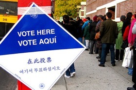
via aprilzosia on Flickr
Did you vote last Tuesday and question the layout of the ballot, the experience and the strange machines with unlabeled buttons? You’re not the only one!
What’s your image of voting? My mental model is deceptively simple. Remember in elementary school when you put your head down on the table and raised your hand? Filled out a ballot for student body president on paper and put it in a box? Electoral voting should feel that simple and smoothly run from the voter’s (user’s) perspective, but instead, the complexities of the American system come through and make the experience feel challenging. How has such an intuitive process become so unintuitive?
The Help America Vote Act: Mandating design changes
Since the passage of the Help America Vote Act (HAVA) in 2002, the voting experience has changed with each national election. HAVA, the Congressional response to the 2000 election problems, mandated various requirements for voting machines, ballots and security. All fifty states have begun to put these changes into effect. My home state, New York, was one of the last.
HAVA made sense at the time of its creation and it does now. The bill had a few loopholes, which Congress has attempted to fix on various occasions, with limited success. Rather than the bill itself, it is the state Boards of Election who have failed our citizens through poor design and implementation.
HAVA voting system standards:
- All states must replace punch card and lever voting systems with new technologies.
- The voter can verify the votes selected before the ballot is to be cast.
- The voter must have an opportunity to correct any error or be provided a replacement ballot.
- The system must notify the voter of overvotes and provide an opportunity to correct such errors. (An overvote is when a voter chooses more than one candidate or option in a specific race. An undervote is when no candidate or option is selected.)
Voting: The design challenges
Do the rules from HAVA sound familiar? Have a passion for form design and usability? The voting experience may just be one of the greatest design problems facing our government. The nature of election law provides a few unusual constraints that could throw any UX Designer for a loop:
- Design by Committee: Yes, nearly all election technologies, legislation and design decisions are made by local, state and federal Commissions. We, as UX Designers, like to design in teams, but definitely not by committee.
- Design for the 100%, not 80%: We hold a widely accepted belief that it is enough to design for the majority of our users, rather than design for edge cases and let the majority suffer the consequences. In election law, and rightfully so, the focus is on 100% of the audience.
- Most people vote once a year, if not less. Many vote only once every four years. System familiarity is uncommon.
Challenge: The Full Experience
It took eight years for New York to replace its lever machines with new technology. Our new system is mediocre at best. Upon arrival, you sign in and are handed a ballot. You then proceed to a privacy booth, where you fill in the ballot, a bubble form. Next you walk the ballot over to a scanner, where it is inserted and you will be notified that the vote has been counted or if there are any errors.
There were three lines, first to sign in, second to fill out the ballot and finally, to insert the ballot into the optical scanner. The NYC Board of Elections now requires all voters be given a “privacy sleeve,” a folder in which to keep your vote choices unseen, when walking across the room.
A more efficient method would require more machines, no privacy sleeves. The machines are an expense that the state likely could not afford.
Challenge: Readability & Ballot Design
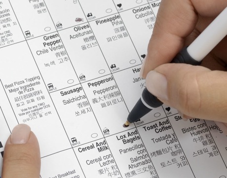
The new system in New York requires that all choices appear on one single sheet. With various races and ballot questions, how did New York solve this problem? Size 6 font. Yes, really, size 6.

Sample Ballot From NYC Board of Elections via Vote The New Way
In certain judicial races, we pick two or three choices, not one. The ballot uses each row to designate one choice. Sometimes rows are left blank when there are too many candidates to fit in one row and it spills over into a second row, on the right-hand side.
The formatting on the ballot was inconsistent and difficult to read, even for those with perfect vision.
Two ballot questions on the back could easily go unnoticed if a poll worker did not instruct you to turn the page over. There were no markings on the front to indicate that there was more content on the backside.
Challenge: Even More Constraints
Some of the problems I faced on Tuesday as a knowledgeable voter are much less challenging than in other states. What does your ideal ballot look like? What is the full experience? Consider the following potential constraints:
- In New York, there were two policy questions posed on the ballot. What about states where there are 20, 30 or even 50 questions? How does ballot design work then?.
- Multi-lingual support, which does not have to be met by printing multiple languages on one ballot.
- Verifiable paper records of all votes. Touch-screen voting has long been perceived as a major security risk because the voting records are not easily verified or recounted at a later date.
- Fast recording and reporting technology. Voters expect results within minutes of when polls close. Any system must provide immediate vote totals.
Moving forward…
Frustrated about bad design infringing on our great democracy? In light of recent elections, what problems did you encounter while voting?
A special hat tip to Dana Chisnell, whose SXSW 2011 panel will cover these topics in much more depth.
The Brennan Center for Justice has released various studies on voting rights, including its work on Ballot & Election Material Design.
Universal design considerations increasingly comprise a prudent approach to design and development for the web. Interaction designer Andrew Maier details some of the broader implications this has for user-centered designers.