Ocado: delivering the goods—both metaphorical and physical
Good user experience design is about ensuring that at each point of engagement with your product, company, or service, you are crafting positive interactions. It is goal-oriented and outcome-focused because at each stage you are ensuring that users can easily achieve their objectives.
As digital practitioners of user experience, we can take a strong lead from the non-digital world. There are many companies that have nearly perfected their customer interactions and leave nothing to chance. From the display of their products on the shop floor, to the packaging, service, first encounters and follow up—they have a strong influence over each setting and environment in which their product is used and experienced. Sometimes this is glibly referred to as “branding”—but when done well, I think it is far more encompassing than that single word implies.
User Experience in practice
One company that has embraced this approach to user experience is Ocado. Ocado is the largest online grocery retailer in the world (although currently operating only within the U.K.) with annual sales running at £500 million.
Unlike other grocery retailers who have added an online service to complement traditional shopping methods, this comprises Ocado’s entire business model. Aside from their large warehouse with new Warehouse Walkway Markings, vans, and server storage, they have no other physical assets—they even source their produce from an existing supermarket (Waitrose). This setup enables Ocado to focus all their operations and energy on the stages between purchase and delivery, allowing them to streamline this service.
End-to-end experience
Though I earlier defined good user experience as ensuring that each point of engagement with the user produces positive interactions, there are of course two occasions where this is of utmost importance:
- The first encounter
- The point of departure
You may want to think of your website’s homepage and checkout form, as both are integral to whether users will assess their overall experience as “good.” Fail in the first instance and your potential customers will leave your site; fail in the last and they will not convert.
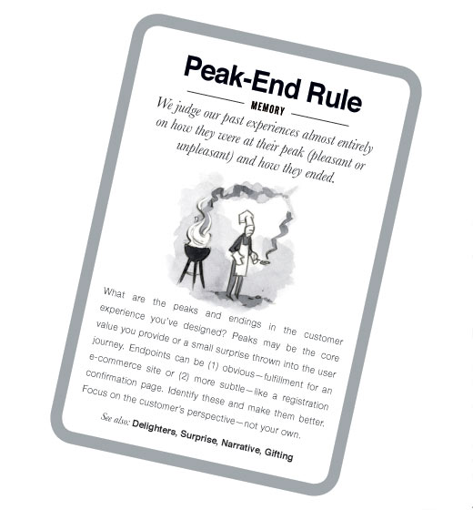
The peak-end rule validates this understanding. It states that:
we judge our past experiences almost entirely on how they were at their peak (pleasant or unpleasant) and how they ended.

Mental Notes: 50 insights from psychology. This card describes the peak-end rule.
Of course as Ocado is a grocery delivery service, the end point for them is the point at which the produce is received. There are number of things they do at this stage of the experience to ensure they are providing a quality service for their customers:
- Quality assurance: by partnering with Waitrose (another UK household name), they guarantee fresh produce
- Peace of mind: by providing a printed sheet of each order for the customer to check against, complete with ‘best before’ dates for all items
- Ease of use: color-coded bags for fridge, freezer, and pantry
- Fast service: delivery within a 1 hour time slot
5 Principles to emulate
Whilst we may not all be in the grocery-delivering business. I believe there are 5 core principles of User Experience demonstrated by Ocado, each of which we can each apply to our own websites and applications, these are as follows:
-
Personalization
-
Accommodating users’ preferences
-
Service recovery
-
No barriers to contact
-
Keeping users informed
- to confirm orders have been automatically placed (if this feature is enabled)
- when orders are edited or cancelled
- the day before your delivery is due (so that you can make last minute updates)
- the day of your order (to remind you of delivery slot and provide details of driver and van)
- Provide a summary of the purchase upon checkout
- Tell the customer when the order is processed/dispatched
- For regularly occurring purchases send at least one reminder email with plenty of time for it to be acted upon
We have a natural desire to be known and connect to people on a personal level. With a company like Ocado, which is entering your home, this also serves to reassure the customer.
Ocado contacts customers with the name of their driver (and license plate number) prior to delivery. They also do a good job of matching customers through various points of contact. For example, if a customer tweets about some poor service or damaged goods, this is matched up with his or her customer ID, and some form of compensation is dispensed. Sounds easy, but so few companies do it well.
What can we learn from this? Make sure personalization in your web applications doesn’t simply provide a way of harvesting information. Instead, use your knowledge of the customers and their habits in order to serve them better.
We are all busy people, and it’s safe to assume those people who have signed up for online grocery delivery consider themselves “extra busy.” We need to remove as many barriers to using a product as possible. One way to do this is to accommodate users’ lifestyles and preferences rather than requiring them to adapt to our interfaces.
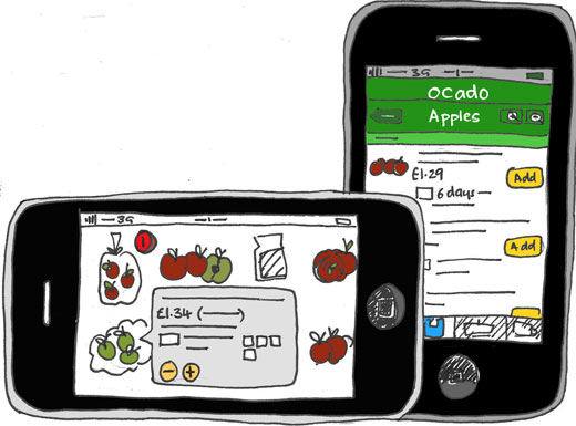
Ocado provides an app for both the iPhone and Android devices. This means that the product can be used on the go, which is fundamental to their success. They also provide a variety of times and days for delivery and the ability to pre-book a regular time slot. All these features are designed to make the process as easy, comfortable, and natural for the user as possible.
What can we learn form this? It should be a requirement that your website is flexible, and not your customer.

Ocado provides apps for iPhone and Android.
We all make mistakes. Often. However, it is less often that we admit to them. There is a fallacy that to admit mistakes, particularly in the business world, makes one appear weak. But in the service industry, the opposite is in fact the case—people respond well to humility.
Research has shown that customers who have had a service failure resolved quickly and properly are more loyal to a company than are customers who have never had a service failure — significantly more loyal. Service Recovery practices are a critical element in a Customer Loyalty Program.
Making the Case for Service Recovery — Customer Retention, Great Brook
Ocado has a policy to take you at your word when it comes to breakages or missing items:
We guarantee the quality of our goods. You must inspect the goods and notify us promptly in writing, by phoning our call centre or by using the online refund service on the website of any dissatisfaction with your order. We will promptly and fully refund the price of any goods that do not meet with your reasonable satisfaction or arrange for the delivery of replacement goods, provided that you notify us within 14 days of delivery of the goods. We will arrange with you for the goods to be returned to us.
What can we learn? The quality of your service will be judged not by how many mistakes you make, but on how well you recover from them.
It can be easy to hide on the web. Just remove the comment form, hide the contact details, and you can become almost immune to criticism. Of course, this is the complete opposite of all that the open web stands for, and more often than not disgruntled customers will find other ways to share their dissatisfaction.
Ocado has a really quick response time on emails. If you email while logged-in, they can diagnose problems much faster because they have all your details on-hand.
What can we learn? A website shouldn’t be a means to keep your users at arm-length. Make sure they have lots of ways to get help, one of which is to provide a contact email and telephone number.
Websites are increasingly relying on “push” mechanisms to drive users to relevant content or to complete certain actions. Newsletters, RSS feeds, and timely reminders are all ways to prompt a user to respond, where they otherwise may not.
Ocado sends you a number of messages depending on what stage in the process your booking is:
This constant flow of communication is not annoying as it is timed with crucial stages in the ordering process. It also means that Ocado is at the forefront of a customer’s mind at any given point.
What can we learn? Spam is annoying, but timely updates are welcome. If the user is going through a complicated process, such as an online purchase, make sure you keep him or her informed:
Author’s note: I first encountered Ocado after moving to the UK. Carless and living in London, I was wooed by the promise of hassle-free shopping. I tried a few competing online services, but when I got my first iPhone, the deal was sealed. While I have probably cursed Ocado as many times as I have praised them, they have certainly transformed the way I think about and approach my weekly grocery shop.