One of the biggest problems facing information architects (IAs) today is crafting the perfect content hierarchy, one that quickly gets users to the information they’re looking for. To do this, information architects need to first query their users. How do the people browsing and/or searching this site think about its content? In search of an answer, IAs often employ card sorts; however, they inevitably produce a great deal of data. Knowing how to correctly structure and analyze that data can help architects attain the perfection they seek.
For the uninitiated: a card sort involves a bunch of cards, each representing a different function and/or content-type from the site being studied. Users are then asked to organize those cards into groups that make sense to them. You can learn the vocabulary surrounding card sorting in our Complete beginner’s guide to design research or checkout Donna Spencer and Todd Warfel’s Card sorting: a definitive guide for something more comprehensive.
Open card sorts are particularly difficult to analyze because they produce a variety of content structures. Different participants will give different names to different groups. You can try and make sense of it by identifying common traits across participants but there is always some guesswork involved. “Person 1” put cards A, B and C in a group called “transactions” but “person 2” put cards A and C in a group called ‘cash” and B in a group called “transfers.” Are these the same thing, really?
Due to a phenomenon known as confirmation bias, it’s easy for researchers to unassumingly create a site “in their own image,” confirming their mental models rather than manifesting that actual content structures that exist. To bring rigor to the process, I’ll explain a way to analyse open card sort data using R, an open source statistics language.
First, let’s use Excel, OpenCalc, or any other spreadsheet program and prepare the results of our recently finished open card sort.
Preparing the data
Open your spreadsheet program of choice and create two column headers: Participant and Group. Next, create a column for each content/functionality card used in your sort.
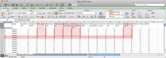
Create a number of rows equal to the total number of groups that resulted from your study. For example, if two participants created three groups each, you’d have six rows. Assign a row to each participant’s group and then sub-divide these rows by participant. Figure 1 exhibits the final row/column structure more clearly:

Figure 1: example of cards entered into spreadsheet
In the screenshot above, you can see that the first participant (P1) created five (5) groups and the second (P2) created six (6) groups.
The columns other than “Participant” and “Group” are given names that correspond with your cards. Consider using abbreviations here because, later on, we’ll display these names in a chart where longer names are unlikely to fit well (16 characters is a good length). Column Q, for example, is called ‘See portfolio’ when it actually represents a page where users could view a portfolio of products online.
Next, mark whether each group contains a given card. If it does, that group-column pair gets a 1. If it doesn’t, it gets a 0. In the above example the cards “New_login,” “Name_supplier,” Change_contact_details,” “Change_security_questions,” and ”Change_password” appear as red, highlighted columns. Because they belong to the first participant’s fifth group – the row marked in red – they get a 1 where they intersect and a 0 elsewhere.
If the participant created a hierarchy, make sure each level has its own row. If a card was put into two or more groups by way of that hierarchy, make sure each cells gets a 1.
Save your spreadsheet and then double-check your data. Checking is of course a boring task but you need to be certain that what you’ve entered is correct – there’s no way to tell if you made a typo later on! Finally, delete the first 2 columns (“Participant” and “Group”) and then save the spreadsheet as a CSV (comma separated value) file.
Take note of where you put it; we’ll need it in just a moment.
Get your statistics on
The rest of the work is done in a program called “R.” R is a free download with versions for all major operating systems.
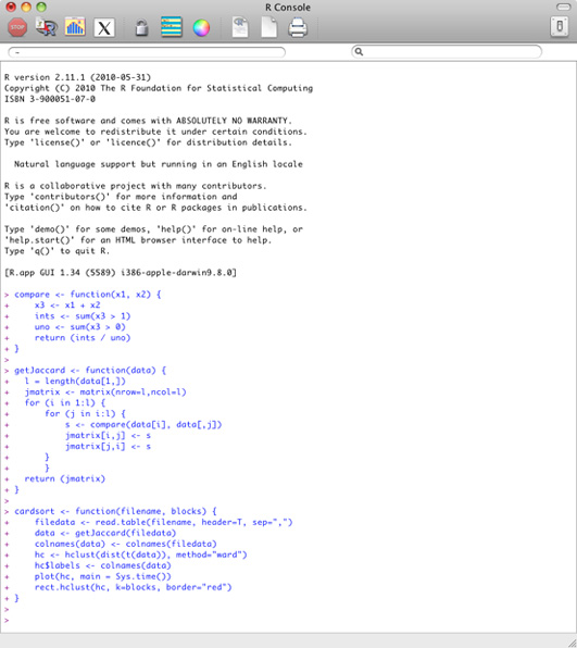
Once you have a working installation of R, fire it up and you’ll see that it uses a text-based interface. Don’t worry, because all the commands you need are here in this article. Just copy and paste the following code into R and press the enter key:
  compare < - function(x1, x2) {
      x3 <- x1 + x2
      ints <- sum(x3 > 1)
      uno < - sum(x3 > 0)
      return (ints / uno)
  }

  getJaccard < - function(data) {
  	l = length(data[1,])
  	jmatrix <- matrix(nrow=l,ncol=l)
  	for (i in 1:l) {
  		for (j in i:l) {
  			s <- compare(data[i], data[,j])
  			jmatrix[i,j] <- s
  			jmatrix[j,i] <- s
  		}
  		}
  	return (jmatrix)
  }

  cardsort <- function(filename, blocks) {
      filedata <- read.table(filename, header=T, sep=",")
      data <- getJaccard(filedata)
      colnames(data) <- colnames(filedata)
      hc <- hclust(dist(t(data)), method="ward")
      hc$labels <- colnames(data)
      plot(hc, main = Sys.time())
      rect.hclust(hc, k=blocks, border="red")
  }

Figure 2: The functions for card sorting copied and pasted into R
This code you just entered contains three functions: compare, getJaccard and cardsort.
The compare function works out the similarity of any two items by taking the number of times both were put into the same group and dividing by the same number plus the total number of times the cards were put elsewhere. This measure ranges from 0.0 to 1.0 with higher scores meaning greater similarity.
The second function, getJaccard, uses the compare function to create a matrix where each item's similarity to every other item is recorded. This is known as a similarity matrix.
The final function, cardsort, runs a cluster analysis on the similarity matrix to create a chart called a dendrogram. I've made sure the time and date are shown as the chart’s title, so if you run lots of card sorts you can tell when you did each one.
If all of this makes your head spin, the good news is that you only need to issue one more command to make it all work:
cardsort('/path/to/data.csv', numberOfGroups)
The cardsort function takes two parameters: (1) a string that indicates the location of the CSV file we created earlier and (2) an integer that indicates the number of groups to highlight in the dendrogram. You can pick any number between 2 and as many cards as you’ve analyzed. I tend to start with 3 and see what the main groups are, then repeat the analysis and increase the number incrementally until I feel happy that the groupings are making sense. In other words, play around with it!
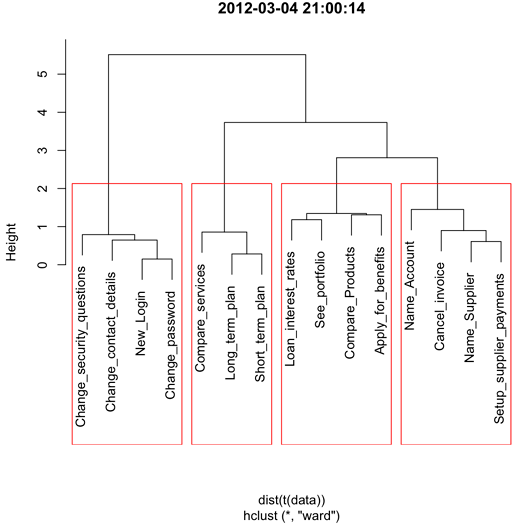
In the example above, I’ve loaded a csv file called ‘data.csv’ and asked for 4 clusters. R then dutifully generates a chart:

Figure 3: The dendrogram with 4 clusters outlined.
Be sure to save a PDF copy of the chart by clicking “File” → “Save as…”
Using the results
Now let’s put our dendrogram to good use. Create a table with a number of columns equal to the number of groupings used in your chart. By way of example, the following table shows an information structure using the results of the above analysis. Next, title the columns with group names given by participants in your original study. It’s also possible to show people each group of cards and ask them what name they think summarizes the group succinctly.
The resulting groups and names are the foundations of your site’s IA as specified by its users. Remember that this information is just the starting point. Card sort data should inform the design rather than dictate it. Some elements – like “sign in” and “sign out” – often need to be available across our groups.
|
Group 1
Administer your profile |
Group 2
Products, plans and services |
Group 3
Savings & investments |
Group 4
Payments |
| Change security questions | Compare services | View loan interest rates | Assign a name to an account |
| Change contact details | Make a long term plan | See your portfolio | Cancel an invoice |
| New log in | Make a short term plan | Compare products | Assign a name to a supplier |
| Change password | Apply for benefits | Set up supplier payments |
In sum, the results you achieve during any open card sort data are “fuzzy:” both qualitative and semantically inconsistent. Analyzing them in the rigorous, quantitative way that we’ve discussed helps remove researcher bias and point the way towards the perfect content structure.
The author wishes to thank Andrew Maier for his contributions to the structure and thinking behind this article.
Information architecture is an often misunderstood job title. Are they designers? developers? managers? All of the above? In this article we'll discuss what information architecture is, why it's related to usability, and what are the common tools/programs used in information architecture.