With a recent jump in the number of employees working remotely, many companies are improving their digital communication and collaboration tools. Intranet is among the top tools companies modernize. However, many companies approach their intranet redesign with little or no understanding of UX, which leads to poor usage and adoption.
This summer, ORIGAMI surveyed over 200 companies in North America and Europe to understand their intranet usage. We found that only 1 in 5 intranets are used by about 90% of all employees daily; most intranets are used by less than 40%.
Any license and service costs companies spend on their intranet projects only deliver half in return!
To find out what companies with high intranet usage do differently, we looked at the results of our study for answers. We share the results of our findings to help UX professionals and strategists deliver better intranet adoption for their internal stakeholders and clients on an intranet project.
Here are the key attributes of successfully adopted intranets.
High Engagement Intranets are Data-Driven and are based on research
Our survey found that companies with high intranet engagement are twice as likely to collect metrics regularly, track them over time, and share them with leadership. In other words, the intranets are data-driven.
If your goal is to create an intranet that makes a real impact, we recommend tracking these user experience KPIs:
- Number of unique page views
- This will tell you how many of your employees are visiting the intranet. More employees are visiting adds to higher intranet engagement.
- How deep down the page do you users scroll
- This will tell you much more of your content was actually read. If your employees scroll further down the page, then they are more engaged with the content on that page.
- What are users searching and not finding
- This shows what content users need and search for that is currently not present on your intranet. Optimizing content to user needs will increase intranet usefulness.
- What are users clicking on a given page
- This will help you understand which links and calls to action are most useful. Using this information you can optimize the page and make it cleaner by having only the most important calls to action.
Some of the KPI measurements above are already available in many intranet platforms, and others can be added as extras (Google analytics, for example, offers some free tools).
Clean and Simple Design Attracts Users
One of the biggest worries leaders report in our survey is that their newly launched intranets might be hard to use, and employees won’t adopt them. From analyzing click heatmaps, we find that employees indeed value clear and simple access to their work resources, normally on the homepage. Also, in a qualitative survey, we found that, on average, 79% of employees say they appreciate easier navigation to the applications they use most frequently.
This sounds like a no-brainer.
So why is it so difficult for companies to make intranet pages clean and easy to use?
Unlike an external website, many intranets are too news-heavy. Communication managers use a homepage to promote all the latest news at once, losing sight of what most employees came there for—tools to get their work done.
This is when you see a homepage cluttered with article headlines competing for attention and overwhelming intranet users. What helps to reduce this information overload is targeting news to relevant employee segments. This is particularly relevant for organizations with geographically dispersed employees. With only relevant news on the page, you’ll have more room to promote quick links to essential applications that employees use daily.
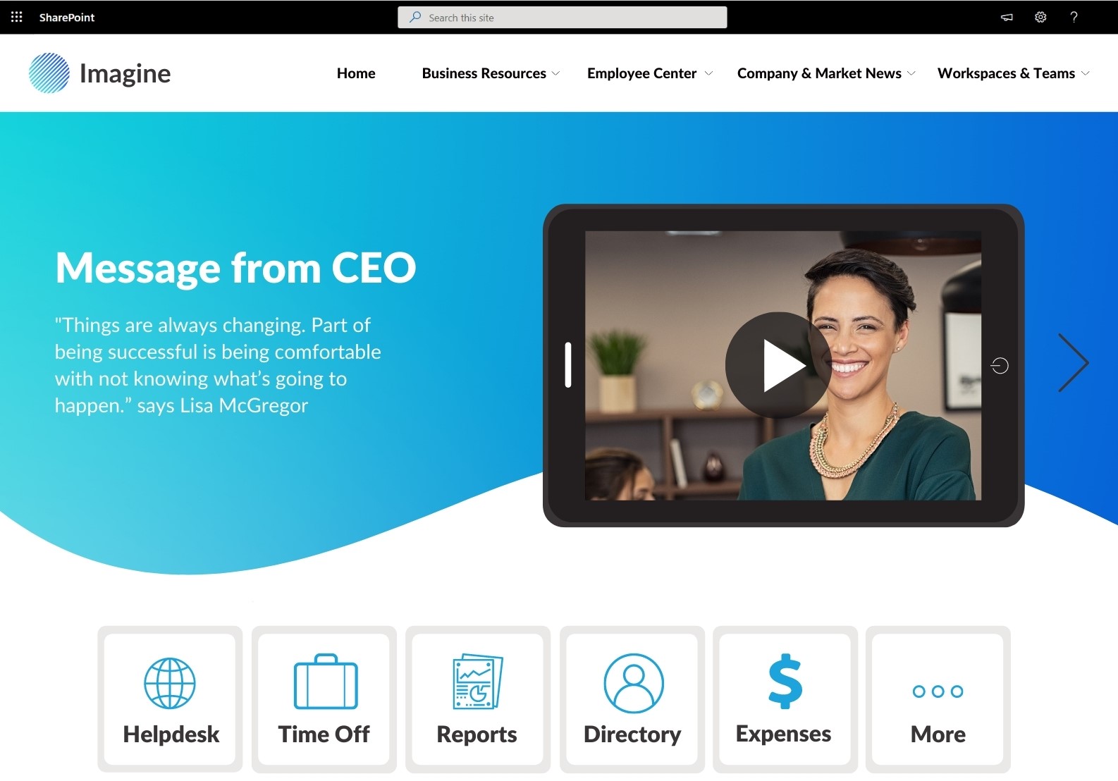
Here are a few intranet examples and homepage design ideas that do this well because they combine news and access to work applications right at the front of the page without requiring users to scroll. This design principle applies to any intranet system you might be using.
Leading Intranets Give Employees What They Want by using inputs from the qualitative and quantitative study
When we surveyed employees about their top intranet requirements, 41% of respondents said they needed a way to find forms, templates, policies and procedures, and other work resources.
Employees often struggle with finding files buried somewhere on the intranet, and it can take multiple clicks to get to the right page. Many employees give up and ask their colleagues for help.
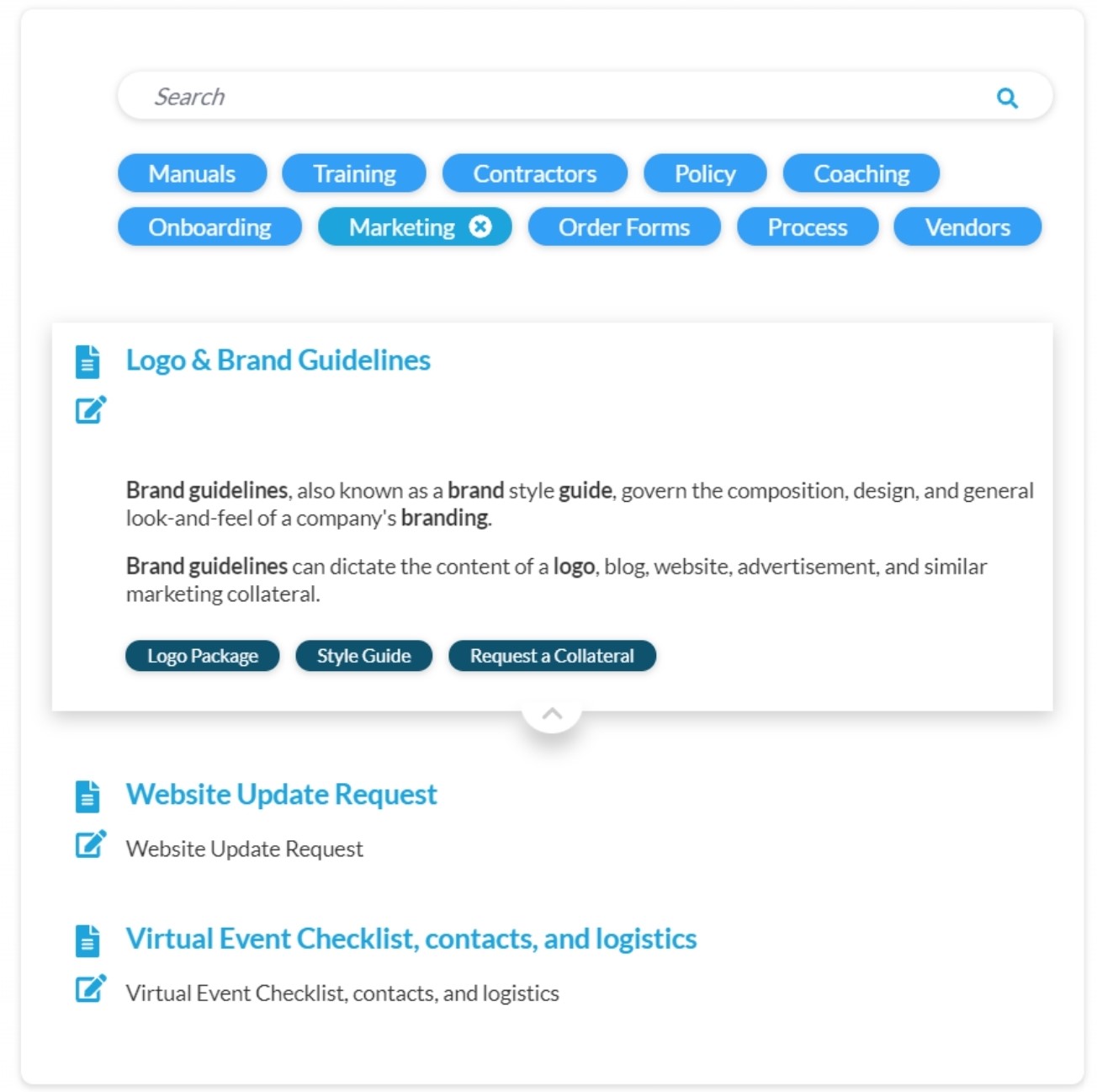
You can help avoid this by giving employees access to their work resources in a one-stop-shop experience. Instead of searching multiple pages, employees can find all the documents they need right on the homepage. Here is an example of how this can be done in a single application:
Interactive Features such as Polls, FAQs, and Videos can connect and engage
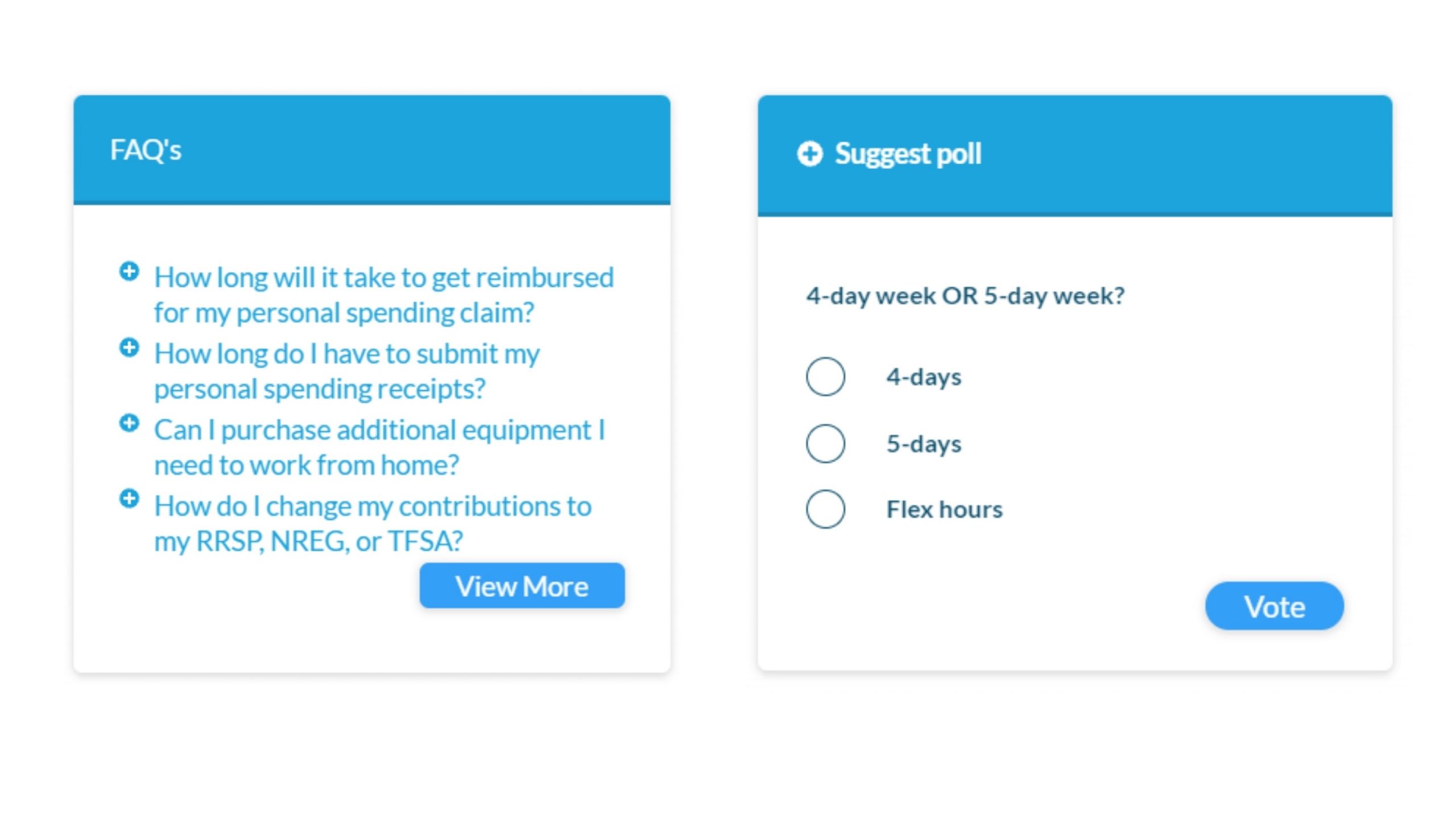
Employees are curious about what’s happening in the workplace, but much of the communication on traditional intranets is one-way and top-down. Often we meet UX professionals working with strict work cultures and reluctant to propose interactive tools and use of media. You don’t need to convince stakeholders to revamp the corporate culture to help bring some life into the intranet. You can start small by engaging employees in a relevant discussion using a poll or a video. We often work with customers with a very strict culture and find that a simple poll is always welcomed by employees and is likewise acceptable by managers. Click to see more here on ways to avoid employee dispute. Videos and podcasts can be harder to produce, but they can bring huge engagement on many intranets where we’ve measured employee engagement.
Good UX requires a good understanding of UX by leaders
Last but not least, we found that when company leadership understands UX and actively supports the use of UX principles on an intranet project, the intranet is twice as likely to receive a highly positive quality rating from employees.
Why is that?
Businesses we surveyed with high leadership support reported that they have access to more resources to improve their intranet, more budget to manage and maintain the software. This results in more attention to employee needs and better technology and training, resulting in a better-quality digital workplace.
So how do you get leaders to become aware of the UX and its benefits?
- Become aware of what the company leadership is trying to achieve and demonstrate how UX can help achieve that
- Start with a smaller pilot project to demonstrate UX principles on a small scale
How one company improved their intranet employee engagement by using UX principles
Last year, we did a project for a company with 1,000 employees in high-tech manufacturing operating across three states. The company achieved significant improvement in employee engagement on their intranet by following some of the principles above.
This organization was migrating its on-premises SharePoint 2016 intranet to SharePoint Online. Early on, it became clear the company didn’t know how to measure the improvement they will gain from moving to a new intranet platform. The project lacked solid leadership support. The project team considered showing their new intranet page designs to a small team of 20 people to gather their impressions, but there were two problems.
- If new designs are visually appealing, does it also mean the pages are engaging?
- Second, how could the company maintain engagement with all 1,000 employees if they were not present during the review?
The issue was addressed in two steps.
First, new designs were reviewed with just the initial stakeholders to understand what content they needed on their new intranet. This helped inform design decisions and made the resulting designs more intuitive.
Then the designs were tested with randomly selected employees via an interactive survey asking them to find specific content on sample pages while their clicks were tracked.
The interactive survey only took about 5 minutes to complete per employee, and the results gave clear data about how employees engaged with the content. It was easy to adjust the design to be more intuitive and make information easier to find.
At this stage, the executive team already had measurable data on their new design. This was enough to give the leadership confidence to start building their intranet.
After the intranet site was built and launched, the company shifted into a second stage — measuring the effectiveness of key pages to sustain engagement.
Pageviews, as discussed earlier, can offer some insight into whether your intranet is used, but alone they don’t show you exactly where your employees click or engage. The company integrated an in-page analytics solution to gain a visual heatmap of where employees were clicking. This additional data helped this company see which parts of the page were not performing well or were too far down the page to notice. For example, we saw one trendy section of the page buried far below, and many employees had to scroll to find it. Of course, not everyone got that far, so engagement rates suffered (something we would not know why if we tracked only page views).
With that, the internal communications team could see which links need to be replaced and what parts of the page needed to change. In other words, the usage data provided internal communications with the tools to improve each month.
As a result, it was easier to report measurable improvements to the leadership, and, in turn, company leaders were more supportive and provided the communications team with much-needed support.
The Bottom Line
Each of these five tips can make a noticeable difference in employee usage of the intranet. You don’t have to use them all to be successful. Often even with a little bit of UX awareness, your stakeholders will be in a better position to help you drive UX principles on other company projects.
Ready to get real about your website's content? In this article, we'll take a look at Content Strategy; that amalgamation of strategic thinking, digital publishing, information architecture and editorial process. Readers will learn where and when to apply strategy, and how to start asking a lot of important questions.


