Several months ago I realized that, as designers, our work is unconsciously limited by bias. I had a dream project; one which afforded me the opportunity to improve one of my weaker skills — creating a color palette. After putting together a few different versions of the client’s site, in typical UX fashion I went out in search of feedback. I showed my designs to the guy next to me, and he flatly stated, “I don’t like it. It’s boring.”
Deflated that this guy rejected my daring palette, I asked why he thought it was “boring.” His answer shocked me.
“It all looks the same.”
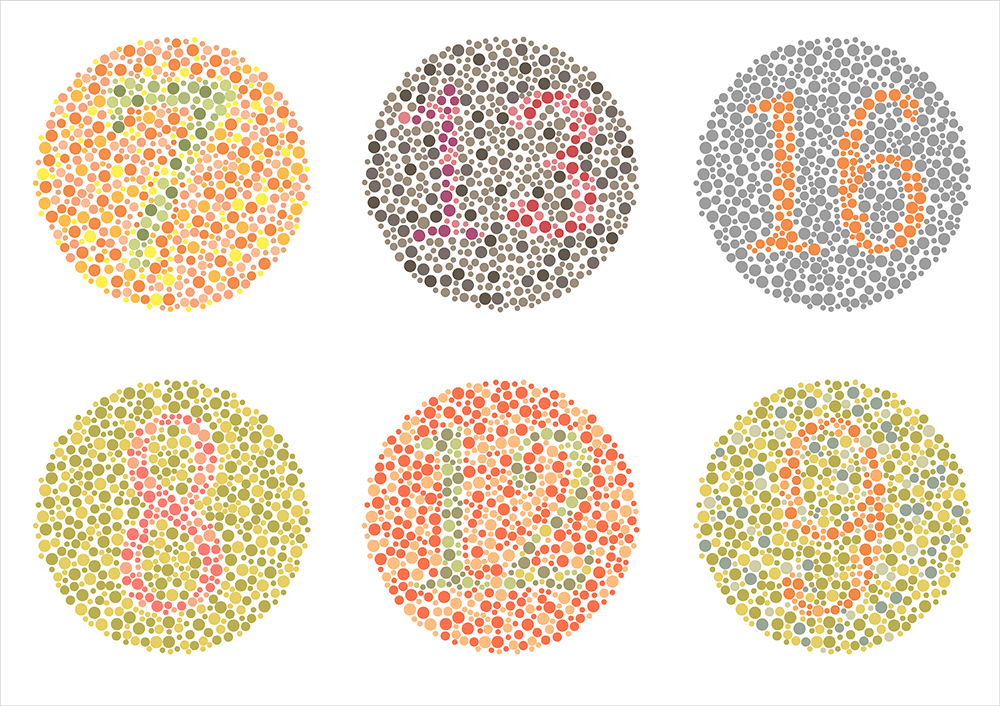
After a few more minutes of questions and answers back and forth, it came out that he was colorblind. Literally colorblind. My variations were too subtle for his eyes to detect. In that moment, I realized I had a massive blind spot. Obviously I knew that everyone sees different things within a design, but what surprised me was the realization that there things that people couldn’t see. Things that were so obvious to me could literally be invisible to another person.

Our brains are built to be biased, and this can negatively impact UX design.
How many other times had I done this — and to how many other clients — without ever realizing it? And I started to think: What other unconscious decisions have been affecting my work without me knowing? And what other limiting beliefs were manifesting in my work, holding me back from creating the kind of work that solved problems in a meaningful way?
In this article, I’ll explain why our brains are built to be biased, different types of bias, how bias can negatively impact UX design, and how UX designers can overcome their own unconscious biases in order to create meaningful experiences for their users.
The unconscious bias blind spot
Ever feel like you’re overwhelmed with information? That’s totally normal: In any given moment, we’re constantly being bombarded with incredible amounts of information at once.
According to psychology professor Timothy Wilson, our brains take in around 11 million pieces of information at any given moment — but can only process 40 of them at a time. As a result, we’ve developed filtration mechanisms to handle all of this incoming data. Using a series of mental shortcuts and handy “rules,” we’re able to make decisions and move through the world without getting overwhelmed.
Combined with learned habits and beliefs, this filtration system helps us navigate and make sense of the world around us. Through these processes, we develop a limited perspective of the world that fits in with the mental paradigms we’ve created — a perspective that we call bias.
Personal biases color the way we make decisions, form beliefs, and engage with those around us. While it can be easy to label bias as a “bad” thing, all it really means is that we have a partial perspective of the world. Our biases only become problems when we’re unconscious and unaware of them — and when we base our beliefs entirely on the assumptions and perspectives we think are true.
Biologically, biases help us process the world as efficiently as possible. With that massive barrage of stimuli entering our five senses on a moment—to—moment basis, we’d be entirely overwhelmed if we didn’t filter our experience of the world. However, because this happens unconsciously, we often forget that we’re operating within a bias — and this is where we start to develop a blind spot.
The bias blind spot in design
When it comes to UX design, identifying and confronting our unconscious bias is critical to producing better work. A designer could spend hours honing their craft, constantly learning new methodologies and software, and iterating until they get as close to pixel perfection as possible — but if they can’t see outside of their blind spot, their work could frustrate users and alienate audiences. Ultimately, their limited perspective could result in the designer creating products that only appeal to the narrowest of market segments.
So what is the thing preventing the average UX designer from doing their best work? What exists within us all, affecting everything we do, even though we’re totally unaware of it? What is that subtle block that, despite our commitment to practice and improvement, prevents us from becoming the kind of designers we aspire to be?
It’s the unconscious decisions we make, based on our limited view of our craft, the world, and ourselves. When we shed light on our unconscious bias — which we can’t see without external feedback — we free ourselves to rise to the next level of success in UX design.
Sometimes our blind spots are so huge that they have massive ramifications — and other times they’re tiny for companies, but make a big difference for certain subsets of our users.
A famous example of the former is Snapchat’s release of not one but two racially insensitive filters last year. The first one, in April, was a “Bob Marley” filter that some people likened to blackface. The second, a mere four months later in August, was supposed to be “anime—inspired” but ended up looking like a caricature of an east Asian face. With those filters, the social network managed to alienate two huge subsets of their client base and writers have posited that if Snapchat had a more diverse team, these fiascos could have been avoided altogether.
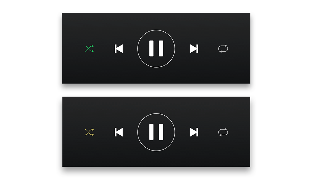
An example of the latter is a recent Reddit thread asking Spotify to change their shuffle button, which goes from green to grey to indicate whether or not it’s activated. The person posting says they are colorblind and that “adding a circle around the shuffle symbol when [it’s] on would make it easier for all of us.” I know — from personal experience — that it’s a tiny detail that a designer who isn’t colorblind wouldn’t ever consider, yet the simple update made a big difference to many designers.

Approximation of how a colorblind user with protanopia color blindness may see the Shuffle button in Spotify.
Overcoming the unconscious bias in UX design
To rise to the next level of UX design — often called universal design — we must identify and overcome our unconscious biases. Only then can we free ourselves from limited perspectives and become open to far more possibilities and ideas than we could have imagined.
Here are some steps to overcoming unconscious bias:
Identify it. If we aspire to greater levels of awareness and new perspectives, we have to identify that we have a bias in the first place. Acknowledging that we’re operating under an unconscious bias gives designers the freedom and awareness to actually do something about it.
Acknowledging your own bias can really hard, but luckily there are numerous tools available to help us.
Emi Kolawole of the Stanford D School worked with Ideo to create the Designing for Worldview framework. This framework raises unconscious bias awareness through a series of practical design—thinking exercises. It’s great for teams who are working together to expand their worldview and reach a broader audience.
Another great tool for teams comes from the AIGA, which teamed up with designer and sociologist Leyla Acaroglu of Disrupt Design to create the Gender Equity Toolkit. It’s a set of resources that includes videos and downloadable worksheets that you can use to uncover and challenge implicit gender—related bias.
For the solo designer, Harvard University’s Project Implicit gives an easy way to self—test your unconscious levels of prejudice about age, gender, and race. It can be done completely on one’s own, which is perfect for people who are trying to push past their biases but aren’t necessarily ready or able to do so in a group setting.
But identifying bias isn’t enough — we also have to take action.
Seek to broaden perspectives. We all have the innate ability to live and operate with a far vaster perspective and open mindset than we currently do. All it takes is the desire and commitment to staying open and transcending our limiting, biased mindsets.
When working on a UX design project, consciously see the work from a variety of perspectives other than your own. How will different types of users perceive this experience? I’ve created a tool that helps people do exactly that. It’s called Perspective Cards and it’s a web app that gives designers a way to figure out who we are forgetting during the design process. With every click, designers are challenged to imagine their work through the eyes of another person. The idea is that the more perspectives we embrace as we build, the more inclusive our work will become.
When working with clients, designers need to own past notions or personal agendas, and fully listen and empathize with what the person across from them is saying. For great design to happen, designers must constantly be open to learning something new, gleaning a new insight, or shifting perspectives away from what they’ve always known.
Create diverse design teams. To create globally relevant experiences for a wide spread of users, we need diverse design teams that can help counter the unconscious bias present in homogenous groups. Design teams that contain a diverse group of designers contribute to a well—rounded experience for users.
While hiring managers have the most power when it comes to the creation of teams, there are things that individual designers can do as well. One way is by suggesting qualified friends and former colleagues of color or women, for example, as candidates when your company is hiring. Another is to bring up the issue with managers: Make it clear that diversity is important to you and, ultimately, important to the success of the team. Finally, share what you’ve learned as you’ve challenged your own bias. One of the best ways we can make change is by sharing our personal stories with our peers.
Moving forward
For both individuals and design teams, broadening perspectives to bring awareness to unconscious bias is a major tool for creating more impactful user experiences. While it isn’t easy to overcome the natural, learned bias we all carry, the conscious practice of overriding it can bring an entirely new level of fulfillment to your UX design and your life.
Universal design considerations increasingly comprise a prudent approach to design and development for the web. Interaction designer Andrew Maier details some of the broader implications this has for user-centered designers.