So much of the news about technology tells us that websites, mobile apps, and social media are bad for us. Supposedly, technology makes us anxious, our smartphones take us out of the present moment, and social media ensnares us in a dopamine loop. A Google search of “happiness and technology” pulls up hundreds of articles about how technology is making us miserable. Can that be true? What if instead, the design of a favorite website or a trusted mobile app might make us happy—and influence our long-term actions?
Happy, But Not an Accident
As someone who attempts to make experiences with technology better, it makes me sad to think that my work might be making people unhappy. There has been some research to show that rising tech correlates to happiness, but most studies are designed to reinforce the idea that technology seems to erode happiness. If you look at what makes people happy rarely is an app or a website in the mix. Happiness, it seems, is not a screen.
Yet, I’ve seen first-hand that a website can provide moments of joy. I’ve observed people smiling at their smartphones. I’ve listened to stories about how an app changed someone’s life in a positive way. While there has been wise discussion about how design makes us happy or how good design demonstrates some of the principles of positive psychology, there is not a lot of data about it available.
With this in mind, two years ago I began tracking happiness and design in an online study, hoping to understand what makes people happy online. My company created a purpose-built app to capture an event stream, collect data about interactions, create opportunities for describing the experience, and ask questions – about happiness, but also ease of use, engagement, and likelihood to return to or recommend. All of these measures have helped me test my hypothesis that happiness in the short-term might influence behavior in the long-term.
But I also wanted to uncover what actually makes people happy as they are using a site or app. That meant including observational research to look for patterns that produced a smile, an “aha” moment, moments lost in the flow, or anything that contributed to the sensation of happiness. Lastly, I tracked social listening, for sentiment and conversations rather than number of fans, favorites, likes or followers. This combined approach is part UX research, part story collecting, and part data ethnography.
Happiness Is the Truth
After studying happiness on 262 desktop and mobile sites ranging from ecommerce to entertainment, health, travel, and financial with 6,640 people, I began to identify a relationship between happiness and behavior.
- The best sites make people happy. The sites that people identify as “better” than other sites, (and there aren’t many—fewer than 5% of all the sites studied), also received high happiness ratings—90% and over. Amazon, Ally, and Apple are just a few of the sites that fall into this category.
- A high happiness rating correlates to a high likelihood to return and to recommend. Of course, a happy feeling is not the only reason people return to sites, but there is a strong relationship between the feeling and the subsequent behavior. Healthcare.gov was included in the study twice, once when the site first launched and again a few months later. Happiness was one of the lowest of all the sites in our dataset the first time out with low likelihood to return (about 35% each). After changes were made, happiness improved along with likelihood to return and recommend.
- Sites that produce happiness register positive social sentiment. The brands that made it into the top 20 happiest sites in the study showed a strong positive trend in social sentiment. Yet, the brands getting a lot of love from reviewers, were not always the sites that made people feel happy. Case in point, Hipmunk delights reviewers and designers, but did not seem to make people happy after using the site.
The overall takeaway is that the happy feeling people have while using a site, translates into a happy feeling they take away after using a site. It also appears to be a predictor of future behavior. Happy people are more likely to return to a site and more likely to share that good feeling with others. Happy site use can be viral!
Extreme Happiness and Everyday Happiness
Delight is something of a holy grail for UXers. For insiders, delight is a knowing nod – clever, shiny, even a little self-referential. For regular people, delight may actually spring from anxiety.
Happiness, online or off, is not made up of extremes though. There is a happiness spectrum of comfort, contentment, joy, delight, and bliss.
After baseline requirements are met, happiness comes to us in the little moments. Smart people in the user experience field know that the little details can add up to better experience. Likewise, these principles played out in the research.
- Usability is a baseline. Without a baseline of usability, happiness ratings were low. Sites with a success rate under 90%, or with perceived success below 85%, or poor ease of use ratings, were at the bottom for happiness.
- More time can lower happiness. Most people used a site for an average of five minutes, a realistic amount of time depending on the circumstances. More time, or less time, had no correlation to happiness. But the more time spent on a site without success, the lower the happiness rating.
- Familiarity breeds happiness. The sites people use often tend to make them happy. There is probably cognitive bias in the mix, since we know that people attach to what they have, and to where they have put effort. For example, among travel sites people rated their happiness highly on sites they used often like Expedia and Kayak. Paradigm-shifters like Hipmunk and Jetsetter had low happiness scores.
- Happy now equals happy later. Happiness accrues as people interact, so that sites like Amazon where people have lots of happy moments – viewing the a product animation, learning how a product might work with something else they bought, reading the most helpful reviews – leave people with a happier takeaway.
- Greater happiness, greater engagement. While a higher happiness rating did not result in more time on a site, it did result is a slightly broader range of interactions. In other words, people explored more on the sites that made them happy.
An experience that makes people happy tends to be an experience where there are a lot of “little” positives. The site didn’t need to create a huge shift in expectations; the small details had far more impact.
Three Principles of Happy Design
Of course, the sad truth is that most online experiences are just OK, and most sites and apps don’t make people very happy. So what does make people happy? Based on the data, there were clear patterns about what makes people happy and what does not. Here are three of the key principles of happy design, that any UX designer can incorporate in their work.
1. Design to Maximize Autonomy
The sites that made it extremely easy for people to do what they wanted to do, on their own terms, always scored highly for happiness. This is especially true of sites that support difficult, anxiety-producing tasks. Sites like eHealth focus on making an intimidating task easy to master. One person summed up the feeling, “It was so much easier to get a costs for health insurance than I anticipated. I left feeling like I would be OK now.” The sense of accomplishment gained from an easy solution to a difficult problem makes people happy.

Ehealth frames the potentially complicated and anxiety-producing search for health insurance as a conversation between friends.
Autonomy can stem from mastering something that is perceived as difficult, too. A lot of the happiest moments came from a realization like the participant who said, “It wasn’t easy to figure out how to log in with my cable information (on Comedy Central), but when I did it I was really pleased with myself – I’m going to show my brother how to do this too.” Happiness grounded in mastery almost always led to sharing.
2. Design for Rich Interaction
If you want to get happier, experts say you need selectively varied experiences. Variety and play balanced by low risk are characteristic of happy sites. A site where users can interact in new and varied ways, as on the PNC Home Lending page, is gratifying because it offers new ways to think about buying a home without requiring difficult new skills for mundane tasks, such as applying for a mortgage, and without creating any real risk, such as incurring a hit to an individual’s credit score.

Each tile on the PNC Home Lending site represents a way to think more deeply about a home buying decision.
Likewise, sites that create a strong sensory experience where people are encouraged to savor the experience, score higher for happiness. The Apple site demonstrates this principle. As another participant said, “I lingered on the site, even though I can’t afford a new iPad right now, because everything was so fun to look at and think about.” A few other sites in the dataset fit this paradigm, like IKEA, WebMD, and HGTV, where people were able to savor the positive moments exploring and came away happy about the overall experience.
3. Design as if We Are Friends in Real Life
In an interview, one participant pointed to the screen and said, “you know, I think there is a real person in there somewhere.” It was a moment of truth for me. People don’t want to feel like they are interacting with a machine, or with a bland corporate entity. Indeed, the happiest sites treat people as friends, or maybe friendly acquaintances.
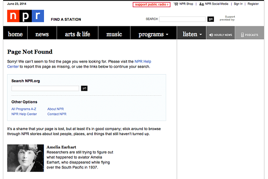
Authenticity is the starting point. People can easily sniff out customer stories that feel too produced or reviews that seem fake, and they tune out anything that comes across as overly self-important. A self-deprecating tone with a dash of humor is the right balance for online happiness—something that is often demonstrated best in error messages.

NPR strikes the right balance between fun and actionable next steps, while staying true to the brand.
In short, it’s not enough to map their journey, if we don’t have their back. Amazon came up again and again as an example here for participants. “When I’m purchasing from Amazon,” said one, “they tell me if I’ve already purchased something and when. This has prevented me from making a silly mistake and dealing with the hassle of returns.” Whether a major feature or a small touch, a thoughtful gesture makes people happy.
Finally, people want their sites to know them, but not too well. Another participant captured this sentiment. “It’s OK for Home Depot to know my location, to remember which one of the 60 shades of off-white paint I bought, and to suggest the most highly-rated paintbrushes, but I don’t want to get notices from them as I’m going about my day.” ‘Geo-locate me, track my past purchases, pull in recommendations,’ they seem to be saying, ‘but still respect my boundaries.’
There may not be a silver bullet that leads to user happiness, but as UX designers we have the unique opportunity to make technology a source of joy. All it takes is a little data, and a little effort.
To learn more about the science of happy design, and other UX topics, you can find Pamela at Madison + UX on July 9, 10, and 11!
UX research - or as it’s sometimes called, design research - informs our work, improves our understanding, and validates our decisions in the design process. In this Complete Beginner's Guide, readers will get a head start on how to use design research techniques in their work, and improve experiences for all users.