A good checkout process allows customers to quickly and easily make their purchases online without feeling overwhelmed or confused. However, it’s not uncommon for online retailers to face shopping cart abandonment rates of well over 50%. Implementing a single-page checkout is a natural first step for retailers looking to reduce their abandonment rate, but there are other factors that drive customers away from the checkout process.
If you’d like to increase your conversion rate by ensuring that your checkout process is user-friendly, here are three areas to re–examine:
Quick and easy access to customer service and shipping info
Easy access to customer service and shipping information is an often overlooked feature of checkout pages. When looking for shipping alternatives, check this link to a courier company Sydney website.
A new customer or someone not familiar with your brand will not necessarily know your shipping, returns, and various customer service policies. Once she’s hit the “checkout” button, a number of questions might arise.
How long will shipping take? Can I return these pants if they don’t fit? Do I have to pay for return shipping or will a free label be included in my order?
You might think that you’ve covered all of these questions with a comprehensive Customer Services FAQs document on your site. However, if the information isn’t clearly presented at the time of checkout, your customer may leave the page to look for answers to her questions, or she might abandon the site entirely.
Shipping Information
A prime example can be found in the checkout page of Nimli, a boutique clothing site. Shoppers are provided no indication of the following: what the shipping cost might be; if return shipping is free or something the customer pays for; or how long the customer has to make a return. In fact, there’s no visible link to shipping information at all.
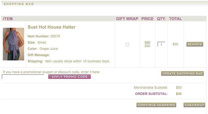
The first page of Nimli’s checkout process doesn’t offer answers to customer service and shipping questions.
If I’m getting ready to check out from Nimli, I might think there’s a chance that this information is on the next page, so I click the checkout button and continue. But there’s nothing on the next page about shipping or customer service either, just a prompt to create an account or sign in. By the third page, there is still no sign of any kind of customer service information. Instead, I’m looking at a billing form that needs to be filled out.
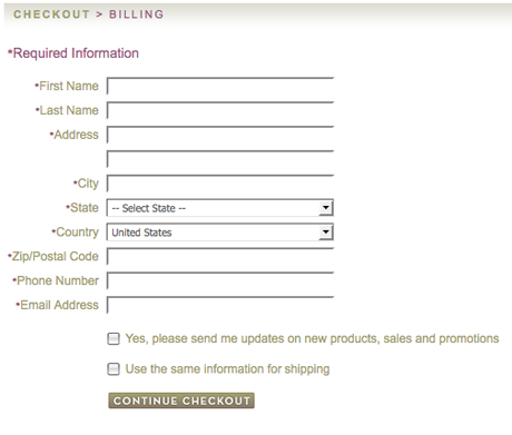
The third page of Nimli’s checkout still lacks answers to common shipping questions.
Answer Shoppers’ Questions
Let’s take a look at the checkout process of Bluefly. There’s a lot going on within their initial shopping cart page; some of the information is even a little distracting. But the key element is a box they include in the right column. It contains all the customer service and shipping information they think a shopper might need.
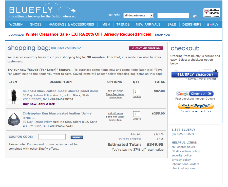
The Bluefly checkout maintains a box of links to useful customer service information throughout the entire process.
When I move on to the next page in the checkout process, all of the distracting information is removed. Still present are links to customer service information and ordering FAQs. There’s also a running calculation of what my order will cost with shipping and taxes added in. When I click the link to FAQs to look for return information, rather than taking me to a new returns page, a popup window opens, giving me quick access to information without forcing me to leave the checkout page.
See Where Your Customers Leave
How do you know if your customers are leaving their checkout in search of shipping or customer service information? Take a look at a clickstream in your analytics program. Start on your shopping cart’s initial checkout page and then look at where your customers go next. Follow the clickstream all the way through your checkout process and note which other non-checkout pages are pulling people away. You may see people going back to product pages to continue to shop or clicking on your homepage to look for more, but if your shipping, returns, or FAQs pages are getting a lot of traffic, it could be a sign that the information your customers are looking for isn’t readily accessible from the checkout pages.
The bottom line: Include easy access to your shipping, returns, and customer service information on every page of your checkout.
Coupon codes
Coupon codes or promo codes frequently hinder the checkout flow. With the rise of coupon code aggregators, there’s no shortage of places to turn when looking for discounts. However, just because customers often leave your site in search of deals does not mean coupon codes have to be the bump in your checkout process.
First, if you don’t currently offer coupons, take the discount field off your checkout pages. It can always be added back in later.
For those retailers who do use coupon codes, there are two main opinions about where to place the coupon input field. Some retailers present the coupon field at the beginning of the checkout process so that customers can see right away if their code is valid and what their order total comes to. Others move the coupon input field to the end of the checkout process, making it the last field before the customer finalizes the order.
Neither solution is foolproof. Retailers who prominently display a coupon field on the first page of their checkout run the risk of losing customers who leave the site in search of a discount.
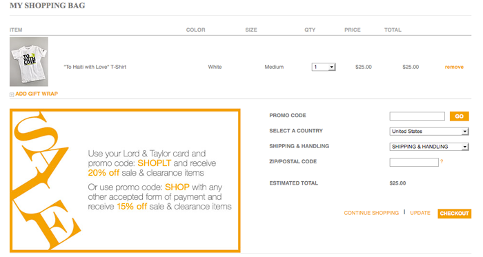
Lord and Taylor displays their coupon redemption field on the first page of their checkout.
On the flip side, retailers who move the coupon field to the end of the checkout procedure may make customers searching for the redemption field unnecessarily nervous. The shopping cart abandonment rate might also be artificially high in the final stage of the checkout flow as more customers who aren’t quite ready to complete a purchase but want to check the validity of their coupon work through the checkout stages just to find the discount field.
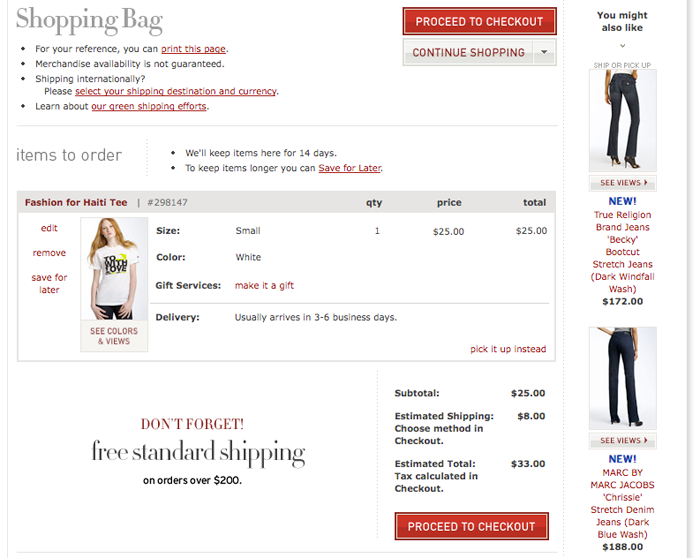
The first page of the Nordstrom checkout shows no indication of where in the process you’ll be able to enter your coupon code.
If you do experience a large number of people abandoning the checkout process to look for your coupons on other sites, you might consider a feature used by Sephora: next to your coupon field, include a link to a popup or overlay window where you list your current codes and special offers.
The bottom line: Keep customers on your site by telling them where the coupon redemption will be and linking them to your own page of coupon codes that they may be eligible to use.
Shipping and billing information
In the typical checkout process, much of the time is spent entering the billing, shipping, and payment information. The longer it takes the customer to check out, or the more confusing the process becomes, the less likely she is to complete the checkout. There are a number of places within the shipping and billing sections where a customer might get stalled depending on the layout of your forms.
Filing Out Your Address. Twice.
Not everyone will have the same bill-to and ship-to address, but those who do certainly don’t want to type in their information twice. Don’t assume your customers will use a form field auto-fill.
Require that a customer enters her billing information first, and then give her the option to check a box if the information is the same for her shipping address. If it is, let your platform duplicate the information for her. If she’s checking out as a registered user, make sure your platform is saving her billing and shipping info within her account. Next time she purchases from you, she’ll need to do even less.
Taxes
Not all States have a sales tax, so if you are charging sales taxes on an order, be sure your customer knows that before he reaches the last page of the checkout. A shipping and tax estimator (based on zip code) is an easy way to provide shoppers a heads up.
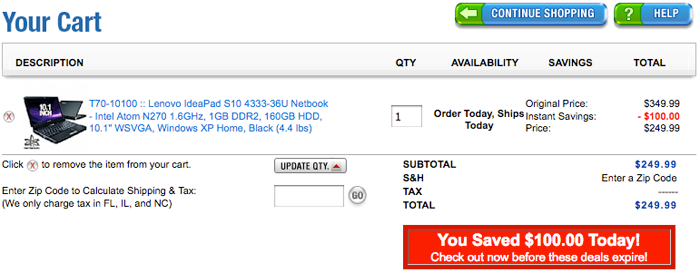
The first page of the checkout form from TigerDirect offers a tax estimator based on zip code and clearly defines who will be charged tax.
Domestic and International Orders
If you don’t do a lot of international orders, you probably don’t spend much time thinking about how your foreign customers are interacting with your checkout process. But consider this: missing or confusing elements might be keeping your store from getting more international orders.
No matter what country your business is based in, if you do accept orders from foreign customers, make that clear. Define which countries you ship to, what currencies are accepted, and how taxes and duties are handled.
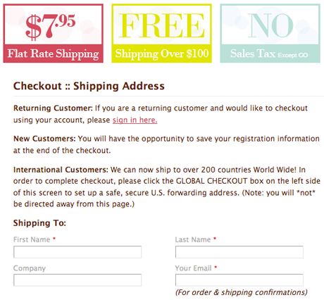
Delight.com offers a message to international customers about where they need to go to complete their shipping and billing form.
Remember the customer service links that appear throughout the checkout process in the Bluefly example above? A great way to answer these questions would be through a link or links during the checkout process like “International Orders” or “Shipping to Other Countries.” Keep the address entry fields in an order that makes sense for that country. For example, if the order of entry fields on an address form was Street Address, Zip Code, State, City, Country, many Americans might mistakenly start typing their city into the zip code box before realizing that the fields were not in the order of a typical United States address.
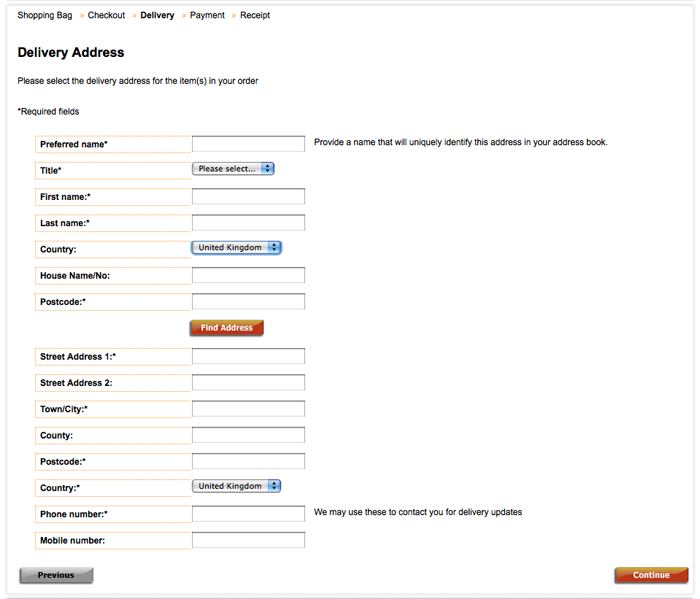
This shipping form from Ben Sherman is targeted at UK shoppers; an American would find the ordering of the address fields inconsistent with US conventions.
Maybe you’ve perfected your domestic checkout and your international checkout. You’re able to take orders from foreign customers and ship items internationally, and things seem to be going smoothly. But have you considered the people with a domestic billing address and foreign shipping address, or vice versa? Some ecommerce platforms don’t have a built-in capability for handling customers who need to direct their billing to one country and their shipping to another.
If you’re wondering whether you’re losing customers in the checkout process due to the organization of your billing and shipping forms, use your analytics tool to install event tags on the form fields to see where people are stopping or having problems filling out their information.
The bottom line: Don’t force your shoppers to spend more time than necessary filling out forms, and make sure you’ve addressed their billing and shipping questions.
Ch–check check it out
When a shopping cart checkout is well-designed, customers almost never notice. They’ll breeze through the process and quickly complete their order with few hangups or questions. The best way to determine the health of your site’s checkout is by examining your analytics and turning to user feedback.
You might get started by creating conversion funnels and clickstreams within your analytics package. You can also use programs like ClickTale or Userfly (read our review) that record session videos or screen captures to see exactly where people are making errors or getting confused when they try to checkout. If you want verbal feedback from users as well, order user sessions from UserTesting (read our review) and request that the participants go through the checkout process while describing what they find straightforward and what they find confusing.
In the end, you’ll discover what is working and what might be keeping customers from completing their orders. After all, there’s always room to improve your site’s conversion rate.