I was waiting at a bus stop when I realized that the person next to me was using sign language over FaceTime on her phone. I had never thought about how video calling benefitted communication for hearing-impaired people. There is so much that accessibility enables. As a UX developer, I try to incorporate accessibility needs as much as I can when I build websites and web applications so I always enjoy seeing everyday considerations.
According to Wikipedia, web accessibility refers to the inclusive practice of removing barriers that prevent interaction with, or access to websites by, people with disabilities. When sites are correctly designed and developed, all users have access to all of the information and functionality. In the world of the web, forms are one of the most important pieces for conversion, so striving for good user experience in forms is paramount.
Let’s take a look at how we can create better user experiences for users filling out our web forms through accessibility.
Accessibility is for everyone
There is a perception that accessibility only impacts a small percentage of people. However, products that are designed with a specific persona in mind can often provide value for other groups of users too.
For example, closed captioning was originally developed as a separate device that sat on top of a television, called a decoder, for deaf or hard of hearing viewers. However, a study by the National Captioning Institute in 1989 showed that “over half of the decoders are sold to the hearing population, and among the purchasers many are immigrant families.” It turns out that people who were learning English as a foreign or second language not only valued the close captioning feature, but also had a really big market share. Building out features with the intent to help alleviate needs of certain impairments makes a design more thoughtful, stronger, and better for all audiences.
This concept also applies to how websites and web applications are designed and implemented. It is the bare minimum to create our sites so that they are usable for people with disabilities. The fact that an accessible design benefits all users gives us a greater reason to code our sites with accessibility in mind. By designing and developing with accessibility in mind, we are making our sites more flexible for all users.
Accessibility is part of the UX process
When we think about user experience, processes such as information architecture, internal consistency, and visual aesthetics all come to mind. One may not think about implementation, but that also makes a big difference. While designers take on the responsibility of organization and customization, developers tackle technical constraints, interactions, and accessibility concerns. Developers must strike a balance between maintaining accessibility standards and implementing the visual design. Some best practices include:
- Stick to semantic HTML.
- Be careful when hiding text.
- Replace default states rather than removing them.
1. Stick to semantic HTML. No matter what.
Accessibility is baked in when developers begin with semantic HTML. Accurately implementing HTML makes websites behave as expected across devices and assistive tools. Sticking to semantic HTML does create some limitations (browsers still don’t allow full customization of some elements), but the benefits of semantic HTML far outweigh the limitations.
The greatest reason to use semantic HTML is because browsers have native ways to implement elements, which varies depending on device and operating system. To account for this, accessibility and usability specifications determine how browsers carry out elements, ensuring that all users will be able to interact with the website. While a developer could try to recreate all the functionality that is built into a browser, it’s a bad idea. Do not fight the browser to customize the style of certain things if it means deviating from semantic HTML.
What can developers do if the browser does not let CSS override some of the default native styles? For example, cross-browser styling for radio buttons and checkboxes is limited. Rather than styling the input itself, developers can use the sibling selector and style an element that they can customize since it is adjacent to the input (as seen on CSS Tricks and Lea Verou’s blog). Then the real radio button and checkbox must be visually hidden.
Unfortunately, most customization for dropdown selects cannot be done semantically. Hanserino goes over this in a great in-depth article called “A Close Look at the Select Element.” He suggests a hybrid customization design that styles the select box itself, but not the dropdown popup.
2. Be careful when hiding text.
Every UX practitioner occasionally find herself hiding text and relying on placeholders for design purposes. Even if we follow semantics, we can ruin it with certain style declarations, such as `display: none;`. If a label has `display: none;` on it, the screen reader will read it as “edit text blank.” This form has suddenly become unusable for the user.
There are many ways to hide content that maintains accessibility. Regardless of the method used, it’s always best to make sure it’s accessible by testing it with a screen reader.
3. Replace default focus states rather than removing them.

Designers may object to the look of the default focus state, but it’s important for the user to know where they are on the page. If the designer is unhappy with it, suggest replacing the default with a more customized focus style. Removing it altogether hurts usability and is never recommended.
Elements of accessible web forms
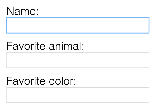
At first glance, an accessible web form, such as this example from JS Bin, doesn’t seem that unusual or special. However, if we test this form across different browsers, mobile devices, and screen readers, we can appreciate just how usable it is. Some of the elements that attribute to this are:
- Associated labels and inputs
- Keyboard shortcuts
- Assistive technology
1. Associated labels and inputs
When a label and input field is associated in the HTML, the user can click on a label to focus the correct text input, text areas, or dropdown. In this form, clicking on Tuesday, will select the corresponding box for Tuesday. By associating the label and field, the user can interact with larger target area, which is especially helpful on touch devices. Associating the label and field in a form has multiple benefits. It allows the user to interact with a larger target area, benefiting both users with motor control issues and users on touch devices. It also identifies which field is associated with a label, helpful for screen readers and for those navigating via keyboard command.
2. Keyboard shortcuts
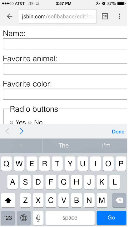
Keyboard shortcuts allow users to navigate through a web form solely using the keyboard. In the form above, the user could fill out this form by hitting the tab key to move through each form input. For desktop users, not having to use the mouse to click from one field to another saves time and effort. For mobile users, they can use the arrows above the keypad to advance through the form. But for blind users, keyboard commands are the difference between using a form and not. Sites without keyboard support are considered inaccessible for blind users and users with low-mobility.

More keyboard shortcuts include:
- Arrow keys to choose among the options for radio buttons.
- Spacebar to selects a checkbox.
- Arrow keys and typing characters to jump through the drop down selection, which is useful when selecting the right state or country for a mailing address.
3. Assistive technology
Screen readers should be able to tell the user everything they need to know to fill out the form. If it doesn’t, it would be impossible for a visually-impaired user to fill out the form. All ways of navigation via assistive technology should be covered, which includes tabbing through inputs.
One way to test how useful screen readers are is on VoiceOver with a Mac. To do this, hit `cmd + F5` and go through the form.
What else can we do?
What else can we do to make the experience of using the web better, easier, and faster?
When it comes to forms, we can experiment with newer input types, such as `type=”number”`. On desktop, this allows users to use the up and down arrows to increase or decrease incrementally. On mobile, it automatically brings up a keypad with numbers. Other input types include email, url, and tel. Not all of these types work cross-browser, but they all gracefully degrade by automatically falling back to text inputs. .
When it comes to the web at large, we should exhibit the same attention to detail and spirit of experimentation as we do with web forms. Take advantage of all new HTML5 elements when coding.
But most of all, as designers and developers trying to make our work more accessible, we must be considerate of all personas—from users on their mobile devices to users who require assistive technology. And never stop noticing the everyday ways users interact with our products.
Want to learn more about how to style forms accessibly? Hear Amanda speak at Madison + UX!