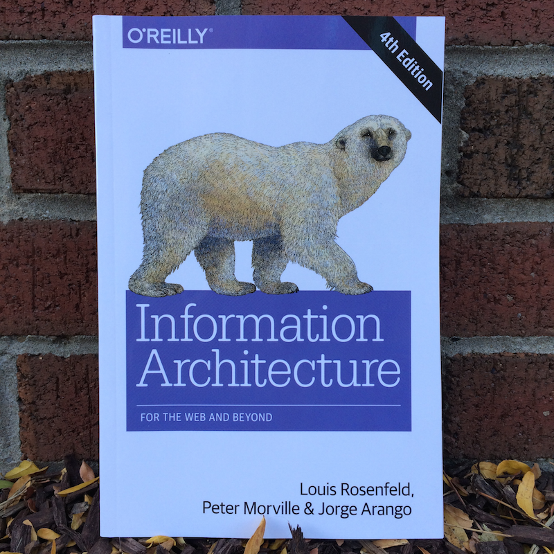
The fourth edition of the polar bear book hit me like a brick. It’s not that I didn’t see it coming. I simply failed to anticipate its emotional impact. I’d been so busy, I’d had no time to reflect, but as I held the colorful update to this classic text in my hands, I was taken back to the early days of the Web, when I began practicing what became known as “information architecture.”

In 1994, Lou Rosenfeld and I were on a mission to prove the value of librarianship in the era of the Internet. At first, we designed and built Gophers and Websites, but soon we learned to collaborate with designers and developers and focus on our skills of planning and organizing. We assumed the role of architect and used “blueprints” and “wireframes” to sketch our ideas.
Everything has changed since those early days, and yet everything remains the same. It’s this cognitive (and emotional) dissonance that’s so striking. After 20 years of learning and unlearning information architecture, it’s not easy splitting what’s new (fads and fashion) from what’s true (sustainable structures and patterns). But that’s precisely the goal of our book.
Each edition aspires to describe timeless principles within a changing context; and so offers a glimpse into the age of information architecture.
As you can imagine, we agonized over the information architecture of the polar bear book before settling on a title (Information Architecture for the World Web Web) and a table of contents built around the core concepts of organization, navigation, labeling, and search. The book is about “designing large-scale web sites” but offers medium-independent insights.
Our understanding of the world is largely determined by our ability to organize information. Where do you live? What do you do? Who are you? Our answers reveal the systems of classification that form the very foundations of our understanding. We live in towns within states within countries. We work in departments in companies in industries. We are parents, children, and siblings, each an integral part of a family tree.
We organize to understand, to explain, and to control. Our classification systems inherently reflect social and political perspectives and objectives. We live in the first world. They live in the third world. She is a freedom fighter. He is a terrorist. The way we organize, label, and relate information influences the way people comprehend that information.
As information architects, we organize information so that people can find the right answers to their questions. We strive to support casual browsing and directed searching. Our aim is to apply organization and labeling systems that make sense to users.”
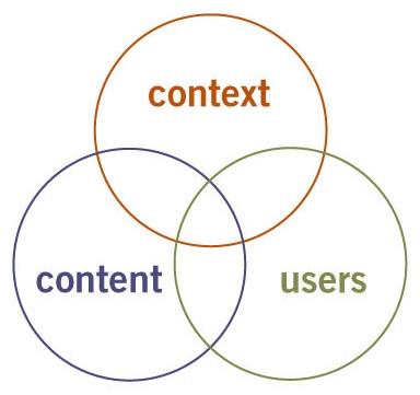
And while the description of process (research, design, build) was pre-agile waterfall, our prescription for learning about users, content, and context remains relevant today.

More than anything, screenshots date the book. In a world of pace layers, surface changes faster than structure. And there are sections that are just so 1998. For instance, we felt compelled to caution against the design community’s use of frames and Java to escape the page paradigm. Like I said, everything has changed, and everything remains the same.
Second Edition (2002)
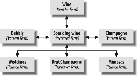
In the wake of the dot-com collapse, Lou and I had to close our firm, and so (before we forgot) we put everything we’d learned in seven years consulting into a new edition. At 476 pages, this was one fat polar bear. We dove deep into taxonomies, controlled vocabularies, and thesauri, explaining how to use semantic relationships to enhance understanding and findability.

And we covered all sorts of related topics from business strategy and competitive advantage to professional ethics and practitioner education. While the first edition was a book about information architecture, the second edition became a textbook for information architects. Not entirely by design, we made a bigger book for a smaller audience. On the bright side, it was adopted widely as the textbook for information architecture courses all around the world.
Third Edition (2006)
Over the next few years, mobile and social took center stage, and folks began predicting the death of information architecture and the end of information architects. Our publisher wanted to respond. But Lou was building Rosenfeld Media, and I was busy speaking and consulting. We compromised by adding tagging and folksonomies to a lightly revised edition in 2006.
In truth, after more than a decade of information architecture, I’d grown weary of the subject. I still enjoyed being an information architect, but I wanted to see through a new lens. My first reframe was Ambient Findability, a manifesto about the future of finding and wayfinding at the crossroads of ubiquitous computing and the Internet. Then, I used Search Patterns to dig deep into relevance, faceted navigation, interaction design, and the user experience of search.

Most recently I wrote Intertwingled as an adventure in systems thinking that connects the dots between authority, Buddhism, classification, synesthesia, quantum entanglement, and volleyball. While it wanders widely, Intertwingled does go deep into the connections between categories and culture, and explores the context of the work that we do. It’s vastly different to the polar bear book, yet its writing renewed my passion for information architecture.
Fourth Edition (2015)
In the past several years, the field of user experience has gained traction in the media and the c-suite. An unfortunate side effect of the field’s growth is that many of today’s practitioners lack a solid grasp of information architecture. Since it’s not as tangible as coding and design, educational programs in interaction design and HCI often fail to realize its value. Meanwhile, the work that we do has only grown more difficult and important. This is the context in which we decided to write a fourth edition with Jorge Arango that tackles “the web and beyond.”
Information is more abundant today than ever before. With smartphones, activity monitors, smart watches, tablets, and new Internet-enabled appliances of every kind, we also have many more ways of interacting with it than before. This abundance and pervasiveness makes our lives better in many ways, but it also introduces new challenges. With so much information available in so many places, it can sometimes be difficult to cut through the noise to find the information you need and understand it once you have found it.”
To explain design for understanding, we draw lessons from the architecture of (real-world) places such as banks, theme parks, and cathedrals. We position information architecture as a new type of placemaking: one that alters how we perceive and understand information.
Finally, it’s worth noting that the polar bear has lost weight. The fourth edition is a smaller (more colorful) book that’s intended for a broader audience. We were able to refocus as there are now quite a few good books that cover specific aspects of the field in depth. The polar bear is no longer alone. And we’ve aimed for a much wider audience because if there’s one thing we’ve learned in the last twenty years, it’s that information architecture is for everyone.
The Practice of Perspective
At the moment, I’m in the midst of a fascinating project for the Baker Library of Harvard Business School that bridges information architecture, user experience, and service design. We began with ethnographic interviews with faculty and students, so we could understand and map the whole ecosystem. Now, we’re engaged in structural design of the website and select cross-channel experiences. This work invites us to wrangle with wicked problems that can only be solved by reframing. An “issue with the website” becomes an opportunity to improve the workflow across silos. The path to getting unstuck is learning to see differently.
After two decades, I realize this art of reframing lies at the heart of information architecture. Before we get the design right, we must get the right design, and that requires the practice of perspective. Of course, our practice is more ancient than the polar bear book, and nobody knows its age. Information architecture is older than language. I think therefore IA. And, like language, information architecture is colorful, infinitely complex, and ever-changing. It’s kept me busy for twenty years; with a little luck, it’ll keep me going four score and seven more.
Author’s Note: One great thing about now versus then is that today we have a diverse, international information architecture community. If you’d like to learn more about the topic, the IA Institute, World IA Day, and the IA Summit are good places to start. As our practice continues to change, participation in these communities is a great way to keep up.