It’s common in design to discuss the “language of things,” the language expressed by physical objects and digital systems. We often consider the visual layout of a website – how it guides a user; what the hierarchy of fields in a form might suggest; or what the look and feel of a product says about a brand or company – but what about that company’s words; how do they fit into all this?
Isn’t it strange that the process of developing a project’s copy is often conducted separately from developing that project’s design? While it brings unquestionable value, Content Strategy – when seen as a discipline distinct from that of (User Experience) Design – presents a potentially troublesome divide in communication processes, in the construction of language.
A troublesome divide
Content strategy has changed the way we approach content and its relationship with quality services. It seems, however, that Content Strategy is also a bit of a red herring: the discipline’s mere existence suggests that teams can somehow mitigate their concern over verbal language – that Content Strategy has its own separate processes for this.
This is a troublesome train of thought. While it’s quite natural to assume a discipline’s place in an organization, any segregation in production has the potential to negatively impact how that organization functions as a whole.
Both CS and UX professionals pride themselves on their holistic perspectives. Anything that threatens the cogency of their work is, shall we say, spoken poorly of. So if we can all agree that inconsistent, fragmented communication lowers the overall quality of things produced (as well as the way they are presented, used, understood, etc.), how can we instigate a more cohesive, content-friendly workflow, Content Strategists included?
A lively interplay between design and content is not only fun, but is
how spectacular results are achieved. This is why content strategy should
matter a great deal to designers.
— Brad Shorr, Director of Content Strategy at Straight North
The subtle delights of Ryanair
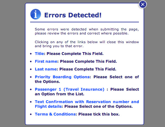
To better understand how a division between content and design can create a poor user experience, consider ryanair.com. Along with its many dark patterns comes some pretty nonsensical language. Users who prematurely submit the “flight booking form,” for example, are faced with this handsome notification:

From a purely functional perspective, it isn’t so bad: If a field in the booking form is left empty, a notification pops up to let us know we’ve missed something. The problem is it’s not well considered. What happens when several fields are left empty? and how do these lengthy instructions get used when the window is closed?
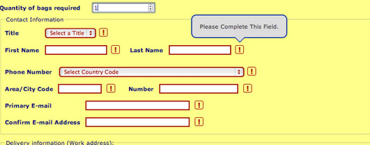
Yet when you close the window, the content is repeated. This time, though, it’s expressed in a wholly different language:

Turns out that the incredible bulk of information we were asked to consume was a waste of time as well as a waste of memory. And while this is a very particular example, it illustrates a flaw that could have been avoided by a more collaborative approach – one that considers both content and design.
Unfortunately, these kinds of clashes happen far more often than this one form might suggest. Other victims include:
- Email systems. As Jakob Nielsen recently highlighted in his research, email content is rarely considered to be a functional part of a system:
Unfortunately, most companies don’t seem to view email creation as a user interface design activity, possibly because messages are often text-only, and thus don’t seem “design-y.
Judging by many of the messages we tested, email design often seems to be a side effect of the software implementation and consists of copy written by the programmer late at night. Alternatively (and even worse), some messages are hard-hitting, written by aggressive sales people without a true understanding of Internet marketing’s emphasis on relationship building.
Jakob Nielsen
Password reset emails are a good example of a situation where an email (and it’s content) is a crucial part of a user’s flow and should be designed, developed and interrogated accordingly.
- Notifications and microcopy. Similar to email copy, the responsibility for writing microcopy can often end up falling in the hands of whoever is there at the time (I’m sure we’ve all witnessed this). This leads to inconsistency as well as, perhaps, some not-so-helpful copy:

- Navigation. Depending on the size of companies (and perhaps the presence of information architects), the copy in menus and other links can often fall short due to a lack of clear ownership. The outcome being a lack of time available to really consider the language; and labeling, used in navigation and how it relates to the rest of the system.
- External content. Platforms such as social media, help and support resources, and technical content are often not considered to be within the domain of UX (if they’re considered at all). This belief can result in extremely un-user-centered resources. If we think about the potential value that design research could bring to developing effective help and support (as well as technical content platforms) not connecting these knowledge bases is a pretty crazy waste of insight.
Specifics aside, though, it’s incredibly clear that one of the most serious ideas affecting the user experience is the notion of Content Strategy as separate from design.
Content communication
In order to encourage collaboration (and avoid contradictions), it’s important that design, business strategy, and content strategy professionals communicate as closely as possible.
There are plenty of great articles that explain how to facilitate collaboration between different roles – Bjørn Bergslien’s article on writing content in pairs includes some brilliant processes which can easily be adapted to merge and educate cross-disciplinary teams.
In the end, though, it’s important that both content and design professionals do at least four things together: synchronize, connect, consider, and, well, write content.
Synchronize
Collaboration is often as simple as agreeing upon communication times and channels. There, content, design, and strategy professionals can work through problems that require multiple input/perspectives.
Obvious nominees include Basecamp (for project management and discussion), Trello (for task management and discussion), and Google Docs (for small teams collaborating on content). Another tool, created specifically for this purpose, is GatherContent ( disclaimer: I work there!).
Connect
Synchronization also helps resolve a common problem facing content: disconnected repositories. Fragmentation makes it difficult to see how it everything works together.
A solution to this – and something that we’ve found to be incredibly useful when developing GatherContent – is to create a single repository for content. Having one place to see all the notifications, tooltips, errors, and emails sent by a website/application gives your team a better idea of how it functions and flows on an everyday basis.
In addition to sharing content, consider sharing deliverables throughout your organisation. While it’s an interesting concept to have an entirely holistic style guide for design and content; it may be more realistic to begin by simply keeping these in proximity so that they’re accessible to everyone. A brilliant example of this can be see in action at gov.uk.
There are plenty other deliverables that can – and should – be shared with anyone you can convince to have a peek. An obvious starting point being user research deliverables such as personas. You might also disperse sitemaps, content maps, content models and even wireframes. All of these can drastically help to align intentions and link understanding.
Consider flow
Next, consider the flow that your content helps facilitate. Rahel Bailie recently wrote an amazing article entitled extend usability testing to include content. There she identifies a troublesome tendency for usability considerations to end at content, pointing out that we should test and optimise content as much as we do with the steps leading up to it.
More specifically: a/b tests, bandit tests and analytics can work well for content. Larger masses of content can, however, be slightly more difficult to test. As Angela Colter points: be careful what questions you ask when testing content.
Learn to write
I’ve heard people say it’s ridiculous when a designer can’t code. It’s much worse when they can’t write well. To aid any lack of confidence in the word department, Relly Annette-Baker runs a marvellous online course on writing for the web which is specifically aimed at designers and developers. If you can’t beat them… write them a heartfelt sonnet.
This isn’t about fulfilling those “we need some copy now” situations. Honing your word-smithing ability helps grow an understanding of content’s role (and importance) within your organization.
Returning to our earlier references, Jakob Nielsen wrote a great article in which he outlines principles of writing microcontent. When it comes to larger tasks, though, it’s useful to employ hands-on information design techniques: sketching out the structure of a chunk of content, generally visualising ideas, content mapping, card sorting and stealing other processes from information architects.
Go holistic or go home
Describing content and design as two different languages within user experience is probably a bit over simplistic. Still, if we want our websites to work well and make sense, it’s clearly important for content and design to mutually understand one another, to understand their interdependence. From a designer’s perspective, we must remember that content is functional. From a content strategist’s perspective we could perhaps benefit by better understanding how content encourages flow.
As content strategy continues to grow, I would hope that it stays thoroughly merged with user experience. In doing so, we can assure that communication is clear, things are more usable and that everyone is sipping from that same brew.