The mobile app frontier is vastly un-explored; it is the wild west of the new digital media age. New boundaries are being formed, new territories are being explored and yes, people are making huge amounts of money (sometimes legitimately and sometimes, not so much). So if mobile apps are the new wild west, then multi-touch is the .41 caliber Colt pistol.
The iPhone’s special
The success of the iPhone has been associated with its ease of use and its intuitiveness despite an inevitable learning curve. Like any other gadgets on the market, it does take some time to learn the ins and outs of the iPhone. But why is the iPhone so special? Besides the rabid Apple fans who will line up for ten city blocks to buy any new Apple product, the iPhone re-branded an old technology, polished it up and told us that we needed to have it. The iPhone was the first gadget to take full advantage of the power of multi-touch.
When the first iPod was released, the MP3 player wasn’t exactly new technology either, but it was the first MP3 player that was truly usable. It was even fun to use. The iPod’s steering-wheel-like touch control made it easier and quicker for users to navigate through thousands of songs and albums. This control managed to solve the MP3 players problem. An obvious and persistent problem with smart phones has been their difficulty for the user to quickly navigate through the large amount of information, software, and features on the phone. But a cute little magic steering wheel was just not going to cut it.
Enter multi-touch
Multi-touch is not a new concept. Bell Labs experimented with multi-touch image manipulation back in the 1980s while we were watching E.T. phone home. In 1991, Pierre Weller’s idea of the Digital Desk was really the first time multi-touch editing and information manipulation was used. It was a bit different then today’s sleek touch displays; it used a camera and gesture manipulation, but the idea for a multi-touch display was nevertheless born. Check out his original Digital Desk demo video.
Today, every smart phone has touch technology just as every gunslinger in the wild West had a revolver. Harnessing and perfecting this newfound power will ultimately decide success of failure for any app designer or developer. As developers and mobile device companies explore this new multi-touch frontier, confrontations are inevitable. But for designers this new frontier is an opportunity to push boundaries, re-invent old technologies, and explore new ideas.
The big power behind touch technology is that the user can interact with the device directly, no mouse, no keyboard, no cameras, just the touch of the finger. If you need to select a button, just push it. Simple and elegant. Multi-touch simulates what each of use do everyday, we interact with things directly with the best tools we have, our hands. Because users can now directly interact with the app; this means the designer must directly design with the user in mind. Long gone are the days when a pretty design and flashy images were the only design qualities a software package needed. Now, user interaction is critical to the success of any app.
No assembly required
No extra tools needed
You don’t need tools anymore, just your hands. Hands are the best tools we have as humans. Tools make our lives easier, just as the phone or mobile device itself makes communication easier. My Macbook is a great tool, but to use it I need other tools like a trackpad and a keyboard. Devices have evolved and we are learning that we don’t need more tools, just better tools. Wouldn’t it be awesome if we could just build houses out of legos? We wouldn’t need hammers, nails, or hard hats; we could just build our houses with our hands by snapping blocks together. Essentially that is what multi-touch allows us to do: perform complex tasks directly with the device. No middle men.
Multi-touch has enabled these small mobile devices with the ability to rapidly perform complex tasks. The user can take his Droid out of his pocket, snap a picture of a friend, remove red-eye instantly and email it to her in just minutes. Many apps already have the ability for the user to perform complex tasks that once required the use of peripherals.
Guide the user
For designers, the ability to perform complex tasks without the traditional tools can be a difficult thing to design for. It requires a different thinking, a different process. Anything on the screen can be touched and manipulated so a more direct approach is needed when directing the user. For instance, if you need to gather registration information, traditionally a wizard is great easy way to go. But on a touch screen phone, there is no need to reload pages or guide the user through numbered steps. The user can simply “grab” the screen and slide it in any direction. As a designer, you are no longer telling the user where to go; you can now take them by the “hand” and guide them.
One app, one experience
Create unique experiences
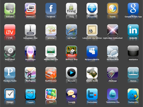
Google, Microsoft, and Apple have developed mobile UIs or boundaries that they would like app developers to use in an attempt to control and manage their products. This works for desktop applications because they are restricted to the mouse, keyboard, or any other external peripheral. But as app developers design new user interaction paradigms using multi-touch technology, theses boundaries continue to blur.
Web apps have been tested and used for many years and effective user experiences have been proven. Mobile apps, on the other hand, have new boundries to break and new interaction capabilities that have been enabled. Unlike current web driven apps that are restricted by the untouchable user paradigms, mobile apps can take full advantage of the multi-touch capabilities and thereby create the user experience outside the bounds on the mobile operating system’s UI.
Examples:
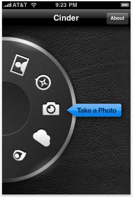
Cinder uses a selection dial, like many digital cameras do to capture, tag and title images.
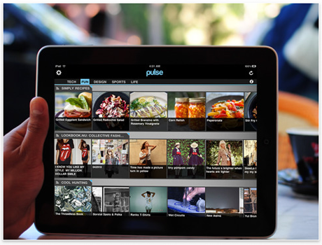
The Pulse RSS Reader uses a very unique sliding interface to easily find and read articles from you favorite RSS feeds.
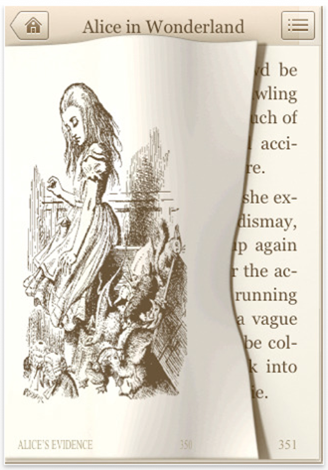
The Classics app takes the interface to another level. Instead of an app interface it models a real book with flipping pages.
Known issues
This exploration of new user interaction methods leads to some problems. Allowing each app to have its own interaction can lead to:
- New learning curves each time an app is downloaded.
- Difficulty for the user to switch between apps.
- A lack of consistency for device makers, difficulty for device branding, and unique hardware qualities.
Model life experience
Unlike user experiences that require a keyboard and mouse, multi-touch allows designers and developers to model an interface that exists in real life. Thus far, the Web’s attempt at a true real-life metaphor has lacked enthusiasm. Multi-touch mobile devices (smart phones and tablets) can take full advantage of real-life metaphors. Modeling familiar interfaces in a digital form is only capable because after all, if you can manipulate something in real-life, you can do it on a touch screen. App developers have run with this idea by re-creating familiar user interfaces like dials, steering wheels, planners, books and dashboards.
Multi-touch technology resolves many user problems because it has the uncanny ability to recreate any interface. Some apps have even simulated actual physical experiences, not just interfaces. For designers, the possibility to design an app that simulates an actual experience is huge. This allows the user to truly interact with the software, not just make it do something. With touch technology a designer can create a real experience for the user.
Examples:
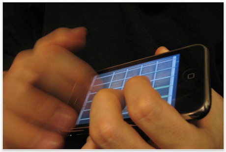
Pocket Guitar really is a pocket guitar. You can play songs on it, add effects and do all kinds of fun stuff. Not quite like playing the real guitar, but playing guitar on your phone is surprisingly awesome.
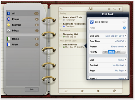
Todo for iPad is modeled after an old school planner. With this planner you can flip pages and customize your planner with different colors or themes.
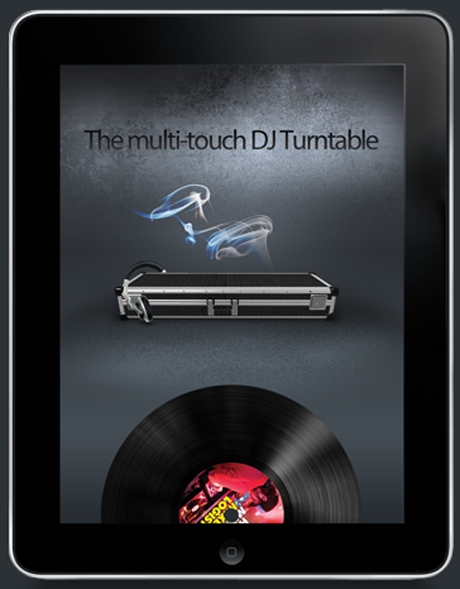
MIXR (to be released fall of 2010) is said to be a multi-touch DJ turntable for your iPad. I’m really stoked for this come out. If it is all it’s cracked up to be, this should really be great user experience.
The UX of multi-touch
When user interaction design took hold in web sites and companies started to consider the user in their designs, websites got much better, much easier to use, and the Web in general became a better place. Right now, the mobile app world is full of many wild apps that need some taming and there really aren’t any solid standards or boundaries. Understanding multi-touch and how the user actually interacts with it will allow designers to create better, more usable apps.
More than pretty pictures
Standards with touch-user interaction will eventually rise to the top just like Web apps, but as new devices are released using multi-touch, new interactions will be explored. Multi-touch is a powerful and significant tool that has opened up the can of user interaction with a multitude of possibilities. For designers, the significance of multi-touch capabilities means that the user must be taken much more seriously. Because users can now directly interact with the app and device this means the designer must directly design with the user in mind. Long gone are the days when a pretty design and flashy images were the only design qualities an app needed, now, user interaction is critical to the success of any app or device.