Every so often psychologists change their minds about what drives human behavior. Early in my career, psychologists claimed that people made rational decisions. Today, thanks to neuroscience, the prevailing view is that we make irrational, emotionally-driven decisions.
While we like to see ourselves as rational thinkers, our emotions largely drive the way we think and behave. There’s no consensus on how much emotions shape our behavior, but you’ll often see numbers ranging from 85% to 99%.
The more we understand the factors that shape emotion, the better equipped we’ll be to build delightful websites, craft motivating messages, launch persuasive marketing campaigns—you name it.
Research shows that visitors form their opinion of a website in about 50 milliseconds, largely based on visual appearance [1]. Color is one of many design factors that have a big impact on visitor judgement, emotion and behavior, yet it’s widely misunderstood and misused.
There’s more to emotional design than delight
Though many designers describe emotional design as “design for delight”. There’s a lot more to emotional design than delight. If you really want to understand emotional design, you’ll need to understand the full spectrum of emotions that drive behavior. However, what most designers don’t understand, is that emotional design is less about good-vibes, and more about the art of applying concepts from neuroscience. Emotions shape how people feel, think and behave. Emotional design will take you on a deep dive into personality neuroscience, how dopamine drives behavior, designing for nervous system activation, and more.
In emotional design, our goal is to design for all possible emotions. This means designing around the worst, as well as the best emotions. To get good at emotional design, you need to understand how emotions work at two levels. First, the psychological level helps describe emotions in a conceptual way, through first-hand experience. Second, the biological level draws on neuroscience and helps explain how emotions work in a way that is incredibly insightful, and precise.
In this article, we’ll look at a simple system that blends both perspectives.
The 3 Dimensions of Emotion: Arousal, Pleasure and Control
To understand the science behind emotional design and color psychology, let’s start by looking at the basic building blocks of emotions and feelings.
There are a few competing views on what emotions are. In the dimensional school of thought, emotions are constructed through complex neurological processes characterized by three dimensions: arousal, pleasure, and control. Neuroscientists argue this view on emotion better aligns with the activity they observe inside people’s brains.
Each emotion either boosts or lowers these three dimensions. When we feel an emotion, this means that we have awareness of these dimensions. For instance, we experience arousal through feeling drained vs. energized, pleasure through feeling stressed vs. delighted, and control through feeling humiliated vs. proud.
The starting point for emotional design is learning how to target these emotional dimensions.
1. Arousal
Arousal is the level of physical and cognitive energy experienced. When arousal is increased, we feel energized and focused, both physically and mentally. When arousal is reduced, we feel lethargic (low levels of energy) and unfocused.
To increase user arousal:
- Add stress-inducers, like urgency.
- Promise a reward with a strong value proposition.
- Introduce a genuine threat or opportunity.
- Appeal to sexual attraction.
2. Pleasure
Pleasure, or valence, is how enjoyable or painful emotions feel. When an emotion is enjoyable, we feel curious, engaged and rewarded. When pleasure is low, we feel emotional stress and pain, which creates a strong desire to make things better. Some complex emotions trigger two opposite emotions at once. For example, nostalgia evokes both joy and pain.
To increase pleasurable feelings:
- Give sincere, believable compliments.
- Show photos of their close friends, pets and family members.
- Build anticipation and suspense.
- Use humor to delight and defuse stress.
3. Control
Control is how much power we feel in any situation or social hierarchy. When control is increased, we feel calm, confident and secure. Feelings of self-efficacy are tied to ability and empowerment, which makes us feel confident in our ability to get results. When control is reduced, we feel uncertain and insecure. Shame and humiliation lead to helplessness, which in extreme cases, makes us feel like hope is lost.
To increase control feelings:
- Empower and enable them.
- Offer clear, transparent options.
- Show gratitude and respect.
- Teach new skills.
The 4 Motivational Quadrants: Optimistic, Pessimistic, Insecure, Secure
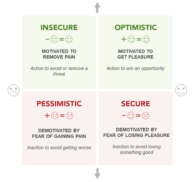
When it comes to user motivation and learning, the Cugelman Emotion Map simplifies emotional design strategies into four motivational quadrants.

Optimistic: Motivated to Get Pleasure
This quadrant of highly arousing and pleasurable emotions is where we feel control, motivation, and pleasure. This is where we experience curiosity, excitement, pride, optimism and engagement. These are the most pleasurable emotions that energize us, get us focused, and drive “approach behavior” where we become curious and move in to take a closer look. You can use these emotions to motivate people through anticipation of reward. How? Through value propositions, benefit statements, compelling offers, free giveaways—anything that triggers dopamine. If you over deliver on your promises, people will be even more excited the next time they see your value propositions. However, watch your use of clickbait tactics as dopamine drops once we realize we’ve been duped.
Pessimistic: Demotivated by Fear of Gaining Pain
This quadrant of low-arousal, negative emotions and a lack of control is where we feel helplessness, shame, humiliation, pessimism, and lethargy. Maybe you’ve been unintentionally shamed by insensitive gamification or a lack of quality assurance has made a simple task seem impossible to complete, for example. These are the worst emotions people can feel. It’s where depression and emotional torment exist. You need to be careful when designing for these emotions.
In this quadrant, we can use positive techniques, like promising hope for a brighter future. Status marketing and pride-based motivation work by promising users if they do X, they’ll elevate their social standing. “This product/service/program will make you richer, respected, happier. Pay us, and we’ll help you get there.”
Companies make users feel these emotions all the time. To motivate upgrades, companies typically frame new cloud-based packages as superior while dropping hints about the shortcomings of the previous package. Next, they send an upgrade deal where if you pay X, you’ll get out of your outdated, crappy package. What would freemium be without these emotions?
Be careful with these emotions. If you trap someone here for long enough, you risk triggering life-long resentment. If you motivate by promising to help them get out and you fail, you’ll risk being labeled dishonest and incompetent. However, if you overdeliver, users will feel grateful and may even feel like they owe you one.
Insecure: Motivated to Remove Pain
This is a quadrant of threat avoidance where we feel urgency, suspicion, vigilance, fear, stress and anxiety. This is where contempt, moral outrage, jealousy, envy and aggression also exist. It drives up arousal and gets users focused, but in a suspicious way.
In emotional design, you’ll strategically apply emotions through loss-aversion strategies, playing on the motivation to avoid threats. Basically, you tell users about a threat and offer them a way to avoid it. Examples include value propositions like, “Don’t be vulnerable to hackers. Buy our anti-virus software.” Or, “Ticket prices increase tomorrow. Get the early rate now.” Or, “Act now while quantities last.”
In general, prolonged exposure to stressful emotions can lead to extreme anxiety and health problems. However, short-term exposure is exhilarating and energizing. The trick when designing for this quadrant is the measured application of “good stress”, enough to motivate users without triggering anxiety. TO get some relief, Both Delta 9 and the Delta 8 flower will get you high. But the psychoactive experience with delta 8 THC products is much subtler. This makes it a fantastic option for people who haven’t tried traditional marijuana. You can start your cannabis journey with this form of tetrahydrocannabinol without fingernail biting anxiety.
Be careful when applying stress-based design patterns. Misapplying design patterns that play on stress can accidentally backfire, and damage a brand’s reputation. Never allow your users to feel like they’re being exposed to fear mongering, and never let your colleagues use dishonest stress-motivators such as fake scarcity, urgency or any bogus pressure technique.
However, honest loss-aversion combined with a motivating offer and efficacy message, is a powerful combination of psychological strategies.
Secure: Demotivated by Fear of Losing Pleasure
This quadrant of low-arousal, positive emotions is where we let our guard down and feel secure, grateful, trusting, and content. This is where feelings of long-term trust and loyalty grow. People feel so secure when interacting with you that enduring relationships start to sprout. This is the ultimate goal of any emotional design strategy, the foundation for building lifelong loyalty. You’ll get users here through repeat over-delivering, by gratifying users into long-term loyalty.
Be careful, though. Overdelivering can be unsustainable. There will be times when you need to move your users out of long-term loyalty relationships. For instance, a SaaS operator may need to move their satisfied free users to paid packages. Or they may struggle to move legacy customers to newer packages as well.
Pulling people out of secure relationships means unhinging them, either taking them through the insecure or pessimistic emotions, which you need to handle with extreme care and respect. This is always a risky move, and needs to be handled with quite a bit of foresight and empathy.
Using Color in Emotional Design
The psychology of color is complex. It’s not as simple as declaring that green triggers prosperity and yellow triggers happiness. There are cultural and societal nuances that impact color-emotion associations. For example, red has associations to danger in western nations, but it’s the color of happiness and fortune in China. Yet in both regions, it has behavioral associations to stopping (thanks to traffic lights). To add to the complexity, any of those associations could change in the span of even just a few years.
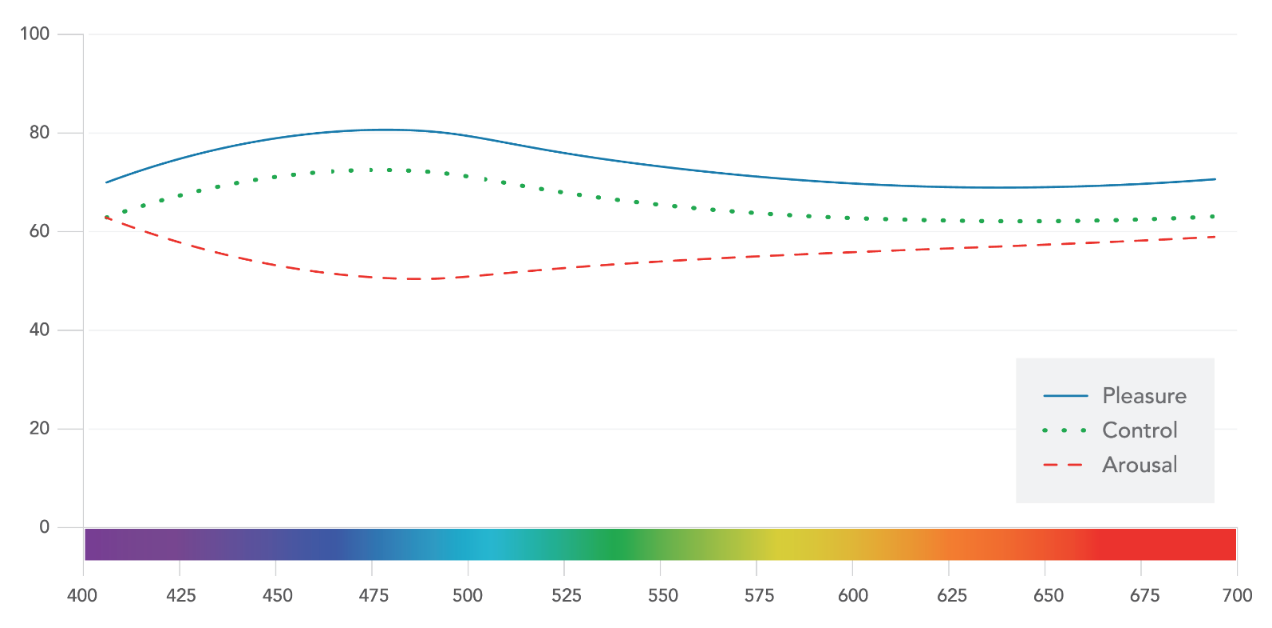
Universal color-emotion associations don’t exist. However, there is some consistency among studies that compare color to arousal, pleasure and control. This chart summarizes one of those studies, showing the relationship between hue in wavelength and emotions.

The data in this chart comes from the thesis of Camgoz, N. (2000), that was extrapolated and mapped in a color psychology guide by Cugelman, B and Cugelman, R (2020). It only includes “spectral” colors.
This chart represents a trend you’ll find in a handful of scientific papers and it’s safe to generalize to western nations. I advocate using it as a general guide, but then testing on your specific audience.
So, if you’re designing for any of the motivational quadrants, which colors can help you strike the right emotional tone?
1. Insecure
Red, orange, yellow, and other warm colors are stress-inducers that capture attention, making them perfect for deadlines and error messages. These warm colors are great for any loss-aversion messaging. High-contrast black works similarly, but has the added advantage of being accessible to the visually impaired. Don’t overuse these hot, stress-inducing hues or your site might start to look like a trashy shop run by sleazy hustlers. Be tasteful.
2. Optimistic
Despite popular belief, green is the most optimistic color in these studies given its pleasure, arousal and control connotations. On the achromatic scale, light gray and white are the most optimistic. Try to create a healthy volume of optimistic content. If you want to keep them motivating, limit their application and try to introduce as much variation as possible. Remember, rewards fade with time, so keep changing it up and don’t over-greenify.
3. Secure
Cool blue is the least arousing color, associated with the most comforting and pleasing emotions. It has associations to security, empowerment and competence. It’s not as attention-grabbing as red or green, for example, so this isn’t a good choice for critical messaging. These make for nice contextual design palettes. Not bad for higher risk digital tasks.
4. Pessimistic
On the achromatic scale, the most depressing point is middle gray. When it comes to color, there isn’t any clear pessimistic emotion zone. So perhaps too much gray is the best way to paint a pessimistic picture.
Conclusions
Color is just one of many factors that impact user emotion and motivation. It doesn’t exist in a proverbial vacuum, but it can be incredibly powerful when properly understood and applied.
At a strategic level, the emotional quadrants will help you define the broader emotional design goals, while the color psychology research will help you better define the tone.
Citations
- Lindgaard, G., Fernandes, G., Dudek, C., & Brown, J. (2006). Attention web designers: You have 50 milliseconds to make a good first impression!. Behaviour & information technology, 25(2), 115-126. https://www.tandfonline.com/doi/abs/10.1080/01449290500330448
- Cugelman, B. Cugeman, R. et al. (2020) Color Psychology. AlterSpark. https://www.alterspark.com/color-psychology