Websites provide access to all sorts of information. Whether we want to to learn more about an organization, purchase an item, donate to a cause, or access a resource, we’re dependent on site navigation to help us find what we’re looking for. However, many websites have navigation that just works “well enough,” allowing people to access what they need to – but after some struggle. A few best practices allow designers to create more effective, clearer navigation experiences.
In his article “Navigation is more important than search,” Gerry McGovern discusses how his team “did some extensive task testing with a technical audience. 70 percent started the task by clicking on a link, 30 percent used search.” McGovern states that people rely on navigation first because it’s easier and faster to click on links than to use search. He explains that when the words of the link match what people are looking for, the more likely it is that they will click on the link.
However, if there are too many links, if it’s poorly organized, or confusingly named – people are deterred from using links. He ends the article with: “Clear menus and links are the foundations upon which all great websites are built.” While this is an important rule to follow to design effective navigation, it’s not the only one. And although navigation design is always going to be an ongoing debate, there are a few best practices that every user experience designer in 2017 should adhere to for website navigation.
So what are the rules for designing great navigation? Let’s consider these rules:
- Prioritize consistency
- Design clear interactions
- Avoid deep navigation
- Design for responsive compatibility
Prioritize Consistency
Navigational inconsistencies may result from content that doesn’t fit neatly into the site’s sections, so is listed on its own. Other times, people may need to quickly access something that lives deeper within the website, so the site owner adds quick links to the nav. However, there are other solutions that avoid making inconsistent additions to the navigation.
Subpages and Landing Pages
Consistency comes down to making a choice. For example, either all navigational elements should display their subpage links, or none of them; displaying subpages for only some sections may confuse people into thinking that sections that don’t display subpages actually do not have subpages. And if subpages aren’t listed in the primary navigation, ensure that secondary navigation is used consistently across all sections.

On the Nashville Zoo website, when the user hovers over each section of the menu, the subpages for each section are displayed.
Similarly, all primary navigation items should link to landing pages, or all should be section headers for secondary navigation links. When only some of the primary navigation items are links, people will try to click on non-links, feel confused and frustrated when no page loads.
The visual design should also clearly indicate whether the primary navigation items are links or are only headers – if they’re not links, use a different font style or color. Another useful indicator is to ensure the mouse transforms to a pointer cursor above links.
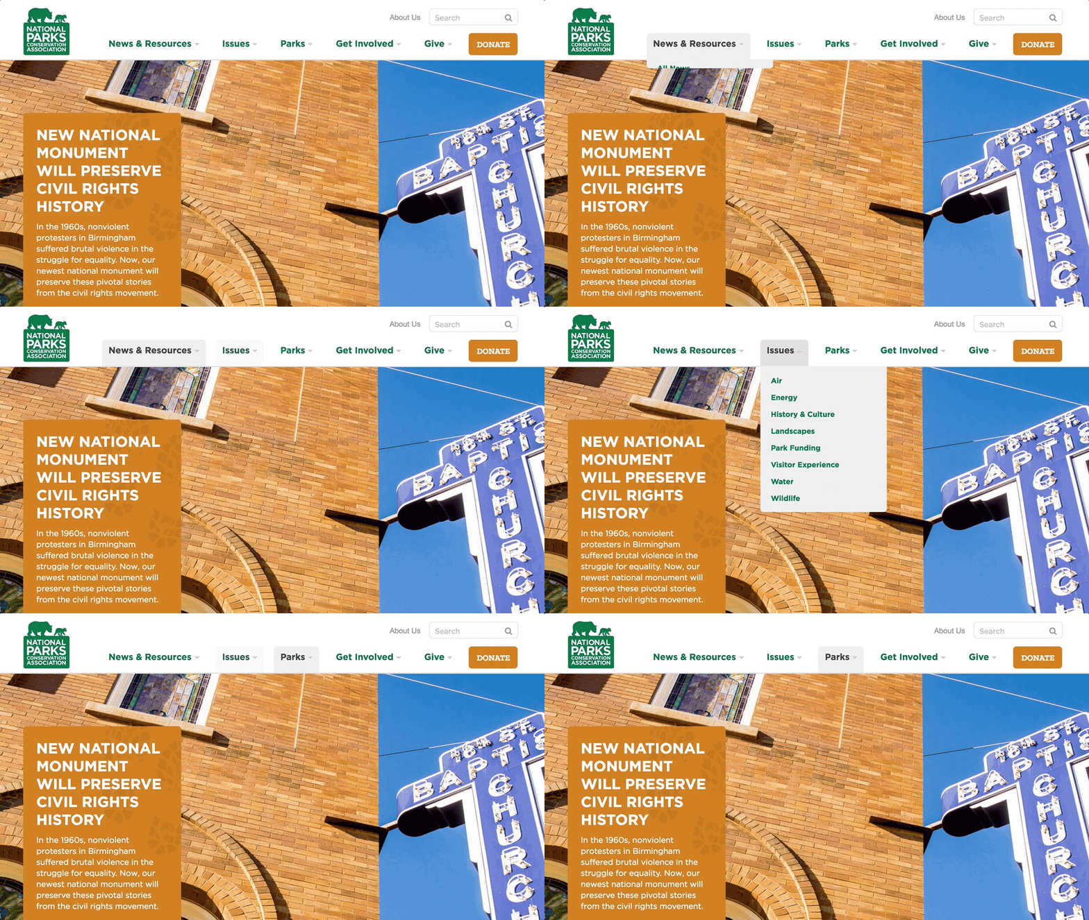
The National Parks Conservation Association website utilizes section headers as primary navigation.
Additionally, if a primary navigation item is a link, make the related action clear, either through verbiage or visual design. On the Fairfax County Public School’s full menu, for example, users access the Careers landing page by clicking on the “Careers” text, or can click on the arrow to view the subpages.
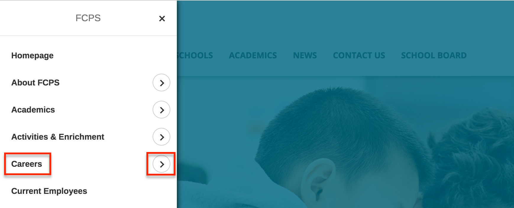
On the Fairfax County Public School’s full menu, if the user wants to access the Careers landing page they can click on the “Careers” text or they can click on the arrow to access the subpages for Careers.
If new content is being added that doesn’t fit into the site’s current sections, it may be time to rethink the site hierarchy, or reconsider why this piece of content exists on the site if it doesn’t fit in with the rest of the site content – should it be removed? Or can it be consolidated into a related page so it doesn’t live on its own?
If there’s a page that needs to be more easily accessed, consider a call-out or feature block on a homepage or section landing page. People are more likely to pay attention to these blocks – and an important, featured item shouldn’t upset the whole site’s navigation.
Breadcrumbs
Breadcrumbs are a navigation aid to help orient people within a website. This kind of orientation is especially important if people are directed to deeper pages on the site from external sources.
But breadcrumbs need to be accurate to be effective; they can’t miss levels, or misrepresent the hierarchy of pages. For small websites with only two levels, breadcrumbs aren’t necessary, but when they are required, be consistent! Check out UI-Patterns to learn more about basic breadcrumbs best practices.

Compare the breadcrumbs on Nashville Zoo to the expanded menu and see that the breadcrumbs and menu accurately reflect each other.
Design Clear Interactions
When a site visitor doesn’t know which items are interactive, or what interactions to expect, confusion results. Combat this confusion by thoughtfully designing interactions to be clear and understandable.
Clear Indicators of Functionality
Visual changes help clarify what interactions to expect on a site. For example, swapping an expand icon for a collapse icon indicates that something has changed, and how to reverse the change. When the icon doesn’t update, people may miss the result.
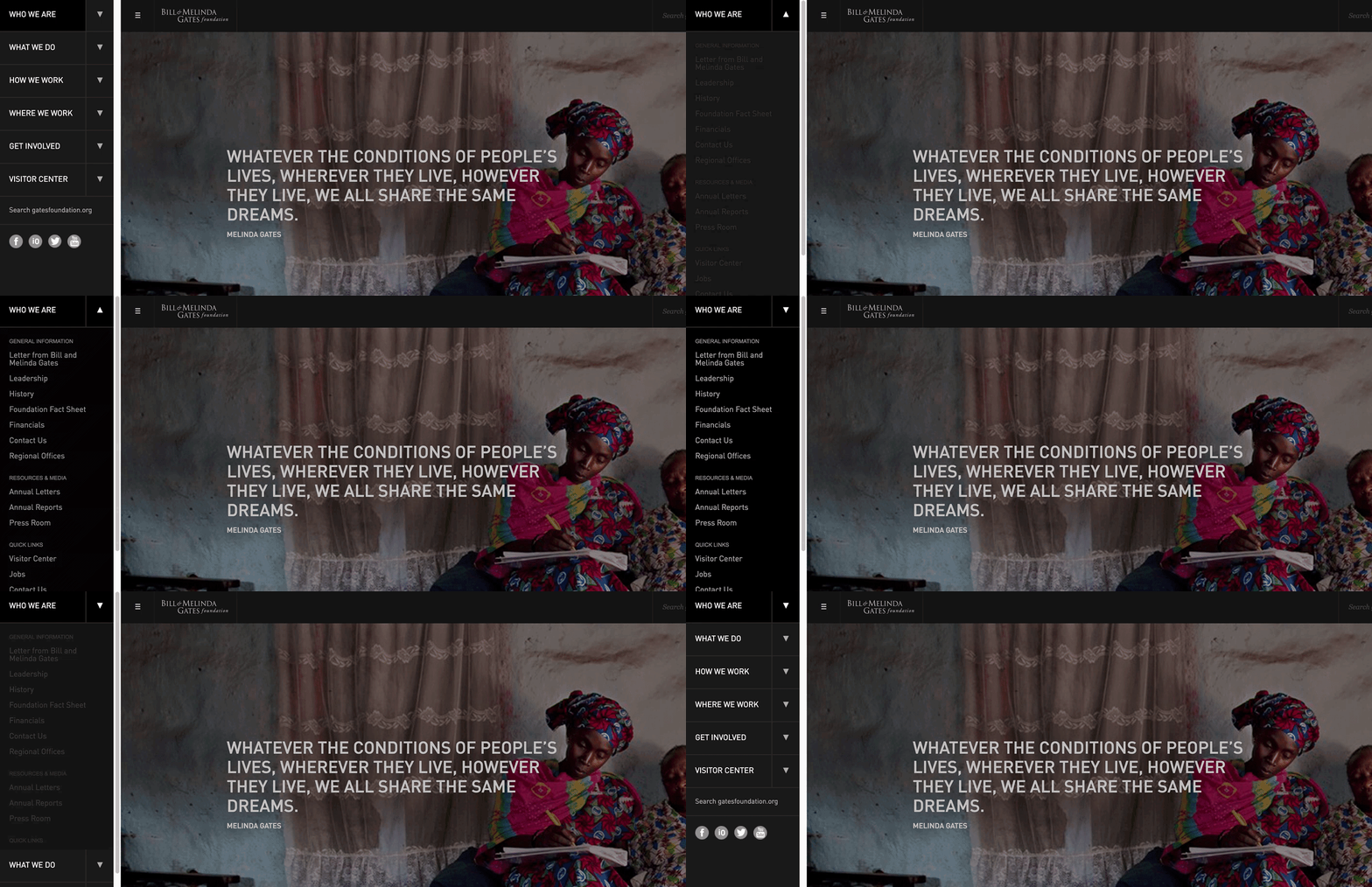
On the Bill and Melinda Gates Foundation website, note the arrow icon swapping directions in response to expanding and closing the navigation.
Use of Labels with Icons
Sometimes icons can replace text links. Including a label with an icon will reduce ambiguity. For example, instead of using the controversial hamburger icon, address the potential usability issues by providing a “Menu” label alongside it. This is also helpful with other common icons, such as “Contact” or “Log In.”

On the teehan+lax website (a now defunct UX firm), the “MENU” label is next to the hamburger icon. The label is still displayed when the hamburger icon swaps to an “X” and provides the context that the “X” icon is to close the expanded menu.
Differentiate Icon Links
Differentiate icons that are links from icons that are purely informational or categorical. For example, only use the style guide’s link color on icons that function as links, and a non-link related color for decorative icons.
According to a NNG study, “users are roughly 37% faster at finding items within a list on a web page when visual indicators vary both in color and icon compared to text alone.” Varying the color of the icons, in addition to the icon design itself will help people to more easily and quickly process that the icons serve different purposes. For example, on Twitter the icons that the user can’t interact with are colored square icons with white shapes, such as the “liked” icon and the “followed you” icon. The icons that the user can interact with are gray, and upon hover they swap colors and display a helpful label explaining the interaction.

There are two styles of icons on Twitter.
Strive for Flat Navigation
In order to create a great navigation, the information architecture (IA) and hierarchy of the website must support it. As the sitemap is developed, strive for a “flat navigation,” where the user can access the deepest nested page in the site within one to two clicks.
Although, a flat navigation is ideal, it’s also wrong to believe that due to limited short-term memory, menus must be short. The goal for a menu, as the Nielsen Norman Group states, is for people to “rely on recognition rather than recall,” so menus need to be short enough to scan, but long enough to be clear.
Limit the Number of Levels
The number of levels within a navigation is ultimately determined by the site hierarchy. Ideally, the fewer levels people need to click through, the quicker and least confusing it should be for them to access what they want. To again quote the Nielsen Norman Group: “the deeper a hierarchy becomes, the more likely visitors are to become disoriented.”

Flat Hierarchy: Note that there are only 3 vertical levels and more sections on the second level.
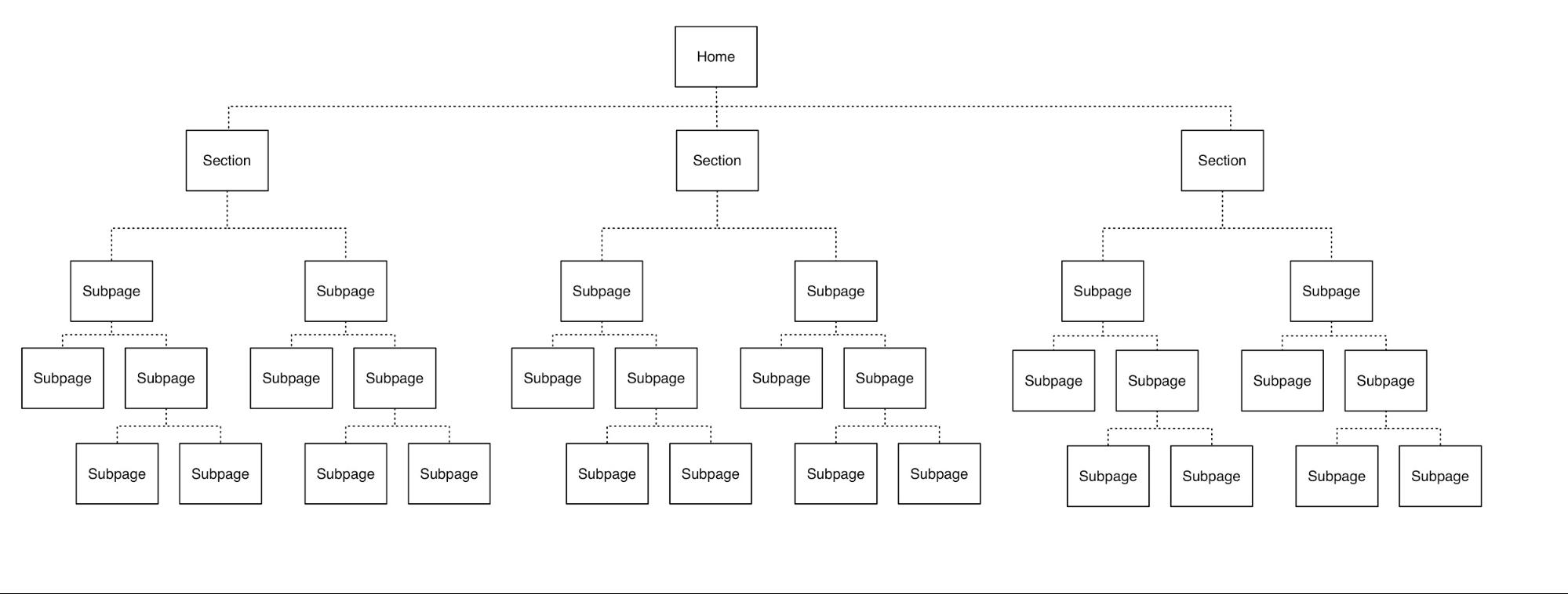
Deep Hierarchy: Note that there are up to 5 vertical levels and less sections on the second level.
Most often, there are three or four levels of hierarchy for most websites. This keeps things accessible, while making sure the site navigation isn’t too broad. To figure out the right number of levels, separate the current hierarchy into standalone, unrelated groups. Then consider each grouping of subpages and see if they can be moved next to a group that exists on a “higher” level. This may require:
- updating the section labels,
- creating a different section entirely to house groupings that originally lived across sections, or
- adjusting how the sections relate to each other – perhaps they’re grouped by action rather than topic, etc.
Consider also consolidating content or removing content, too. The “flattest’ version of a flat navigation is the currently trending full-page navigation designs in which there are no subpages and all the pages of the site live on one level.

On the Big Spaceship website, note how the navigation is just a full-page, single list of links. The agency chose to deemphasize some navigation items by using a darker font color. (This utilizes the flat hierarchy while still including some prioritization!)
Unique Visual Design for Each Level
People should be able to quickly scan the navigation and understand which links are primary, secondary, and tertiary navigation items. The placement and grouping of the links should establish this hierarchy.
The visual design—such as font styles, font sizes, font weights, and/or font colors, etc.—should all establish the different navigation levels and should be consistent across the navigation. If a secondary navigation is implemented, the design should also clearly differentiate between parent/child and sibling links and be cohesive with the primary navigation.

Note that the primary navigation on Antro’s site is white, bold, and a larger font-size and upon hover the text color swaps to gray. The secondary navigation items are blue, thin, and a smaller font-size and upon hover an underline appears. The primary and secondary levels are distinct from each other as the user moves through the navigation because of the visual design differences.
Use Location Indicators
Like with breadcrumbs, location indicators on the navigation help people orient themselves on the site, especially if they are deeper within the website. This clear visual indicator can indicate which section someone is in.

On the Audubon website, note how “Conservation” is highlighted blue in the navigation when the user is on a page in that section, such as the “Working Lands” page.
Design for Responsive Compatibility
A great navigation translates easily to mobile and tablet. Design a navigation that works across all devices, or consider two similar navigations that don’t require people to adjust to a different mental model when moving from desktop to mobile.
Remove Hover Interactions
Primary navigation often displays the secondary links on hover; however it doesn’t always work for mobile. Utilizing a hover interaction that can’t be used on mobile introduces inconsistency between the two devices. People will not know instinctively how to access something on mobile that they used a menu hover to access on desktop. If you need to provide two interactions in association with one link, consider having two distinct places to click associated with that link, like in the Fairfax County Public Schools example we looked at before. The text link itself could lead to the landing page and an icon representing “expand” such as “+” could be a button next to the link, so that users can click that instead to see secondary links.
Different Navigation for Mobile vs. Desktop
In NNG’s Mobile First is NOT Mobile Only, they recommend optimizing the navigation for each device. While it may seem like extra effort to design and develop separate designs for the devices, NNG explains that it’s a better user experience because “different devices have different capabilities of interaction and different screen sizes.”
For example, on desktop, The Japan Times navigation design utilizes the wider screen width and lists out the categories (secondary items) horizontally on a separate bar. On mobile, the same navigation uses the hamburger menu design pattern and when expanded, utilizes the longer vertical space of the phone and lists the secondary items beneath each section title, rather than splitting the primary and secondary levels across two bars. The design is not a direct translation – note how the blue lines are next to the secondary items instead of the primary items, which is an actually closer representation of the design on mobile. Still, there’s a cohesiveness between the two designs while optimizing for each view.
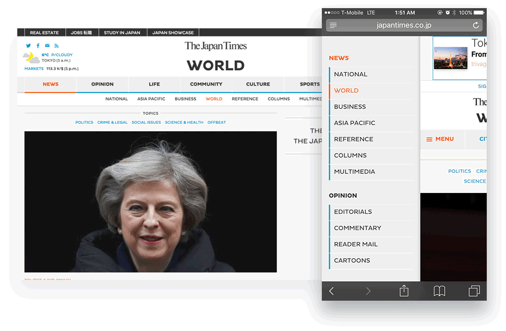
Take a look at The Japan Times on desktop and then on your phone to see how the navigation adjusts to optimize for the different devices.
Design Better Navigation
While this article covered a subset of all the navigational considerations, there’s a lot more great insight out there to utilize in designing successful navigation. Check out these other resources to further explore designing successful navigation:
- Nielsen Norman Group’s section on navigation
- User Testing Blog’s set of 37 Menu Usability Resources
- UX Pin’s article Website Navigation Trends: 16 UI Patterns Totally Deconstructed