Jaime is “creeped out” by technology. She uses her phone to get directions to her new job, only to find that the phone already knows where her office is. While shopping online, her favorite retail page already knows her gender before she’s had a chance to select it. Heck, her toaster even pops whenever she sticks out her tongue!
It’s a brave new world, to say the least. Technology teeters between seamless harmony with our lives and the Uncanny Valley—that place where everyday technology becomes just a bit too familiar, a bit too human…and a bit too uncanny. Technologies are tools created in order to serve a number of discrete functions – from the sundial (which allowed us to organize our days and our lives) to the cell processor (which allowed for faster computational speed through distributed networks). Yet, the manner in which humans react to technologies is curious: we at once celebrate their ability enhance our lives and denounce their intrusion into our “human” spaces, all while using them on a daily basis.
Consider Stanley Kubrick’s example of human-computer interaction from 2001: A Space Odyssey. For the passengers on-board Kubrick’s Discovery One, the spacecraft’s Heuristic Algorithmic computer (HAL) was designed to control all on-board systems through voice command—the crew spoke, and HAL responded with a soft and conversational tone. Science fiction audiences cheered the promise of the “hearing and feeling” computer, yet jeered the thought of a machine with human-like sentience; in this case, one that decided to ignore it’s operators (as HAL did, later in the movie).
While seen as a remarkable (albeit controversial) vision of computers, HAL would hardly be remarkable today. Don’t believe me? Pick up a smartphone, and ask it a question.
Likely, the question was met with a cheery greeting from Siri (or Cortana, or some other voice)—a nice, pleasant, and personalized answer from a decidedly human-like voice.
The Psychology of Familiar Technologies
There is a good deal of research suggesting humans respond favorably to human-like technologies. One of the seminal works on this topic was written by Byron Reeves and the late Clifford Nass—a pair of Stanford University researchers who penned The Media Equation. In their book, Reeves and Nass demonstrate the tendency for humans to engage with their technologies as if they were people: talking to, yelling,and even ascribing personality to them.

Author and researcher Andy Clark expanded this line of thinking with his work on the Natural-Born Cyborg—arguing that perhaps we shouldn’t be so surprised that we seem so familiar with technology. For Clark, technologies such as Siri or HAL can be understood as transparent technologies: they feel natural and similar to how we interact with others in real life—we talk, they listen.
One of the best examples of this from a UX perspective is the “desktop” metaphor. UX writer Steve Bromley writes about the impact this metaphor had on easing office workers into their computer workstations in the early 1980s—using familiar objects such as files, folders, and documents to represent discrete computing functions (executing programs, storing and retrieving information). Such metaphors aid in the creation of transparent technologies by allowing users to rely on previously existing mental models, rather than having to learn new models for new technologies. A similar development in video games is the use of motion-sensor and haptic controllers that allow people to act as they normally would when performing actions (rather than pressing buttons on a device) in order to increase feelings of involvement and enjoyment.
From these metaphors and studies, three themes emerge (perhaps not surprising to UX developers and researchers):
- Humans have an innate capacity to relate to technology as human.
- Technologies that are transparent in their usage remove barriers to interaction.
- Technologies that fit into our existing view of the world are the easiest to use.
On the surface, it makes sense to interpret the above themes as evidence that technology users want more natural interfaces. Surveys of iPhone users suggest that nearly 90% have used Siri to interface with their devices, and both Google and Microsoft have begun to adopt similar interfaces into their products. The movement towards wearable technologies such as Google Glass has made natural interfaces even more important, as inputs such as keyboards, touchpads, and other tangible buttons are quickly disappearing.
The Familiar Isn’t Always Natural
And yet, natural interfaces don’t always lead to natural experiences. Writing about the desktop metaphor, Bromley highlights the widespread failure of Microsoft BOB: a home computer interface that used household metaphors such as rooms and cabinets to guide users through what was assumed to be a familiar environment. The result was a confusing and foreign environment not quite “home” and not quite “computer.” Users of the infamous Apple Newton, one of the first personal data assistants that could recognize users’ hand-written input (via a stylus and touchpad), might remember the device’s inefficiency—often corrupting the user’s writing into something more akin to “egg freckles” or “Eat up Martha”. In late 2012, a group of Apple users signed on to a class-action lawsuit against the company, suggesting that the device’s inability to pick up on dialects and accents resulted in a device that was hardly representative of a program that could “do things just by talking the way [the user] talks” (note: the case was dismissed the following year).
My own research shows video game players often report that traditional video game controllers feel more natural than motion-sensor controllers, whether playing a bowling game or a first-person shooter. Virtual reality researchers have struggled with immersing audiences in virtual worlds, finding that as those worlds become more realistic, the audiences respond unfavorably to them – both physiologically, reporting bouts of motion sickness; and emotionally, reporting an emotional distance to the on-screen actors (e.g. The Polar Express).
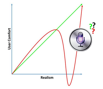
This paradox—the increased realism of an interface leading to decreased comfort and satisfaction with the experience—might be one of the more challenging hurdles for UX in the coming years. However, it is not a new problem.
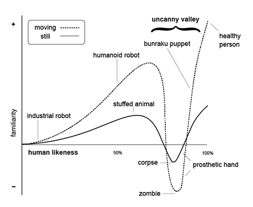
Robotics professor Masahiro Mori penned one of the most influential essays on media psychology when he wrote about the Uncanny Valley back in 1970. In this work, Mori observed advancements in robotics technologies designed to make machines appear more human. For example, Mori discusses a prosthetic hand:
“One might say that the prosthetic hand has achieved a degree of resemblance to the human form, perhaps on a par with false teeth. However, when we realize the hand, which at first sight looked real, is in fact artificial, we experience an eerie sensation. For example, we could be startled during a handshake by its limp boneless grip together with its texture and coldness. When this happens, we lose our sense of affinity, and the hand becomes uncanny.”
-Masahiro Mori
One way to explain the uncanny drop in comfort is to consider the cognitive anchors, or points of comparison, that users might have for different interfaces. For my courses at West Virginia University, I’ve always drawn on the example of Mario.

In the images above, we can trace the evolution of Mario’s on-screen portrayal from a pixelated brown-and-red graphic (whose hat and moustache covered the fact that animators at the time couldn’t draw hair or mouths using 8-bit displays) to a Mario with skin, stubble, and sorrow-filled eyes (taken from a series of fan-fiction portrayals). Reactions tend to get increasingly pleasant moving from left to right until “realistic” Mario shows up on screen— at which time, the general reaction is pretty negative. Why?
For the 8-bit pixelated Mario, the user’s comparison point is rooted in fantasy: comparing Mario to other video games and viewing the image as more functional (a digital form for interacting with on-screen puzzles) than emotional (a digital form with authentic thoughts and feelings). For the realistic Mario, the user’s comparison point is more aligned with real people. Of course, realistic Mario is hardly realistic, as his exaggerated features are more alarming than relaxing; they break our mental model of what a human is supposed to look like, and the result is an unsettling feeling.
Where does Siri fall in the Valley?
As we discussed, there is a general movement in the design of user interfaces to model interfaces after the five primal human senses, based on an assumption that these senses are our default way of interacting with our surroundings, both corporeal and digital. Audio cues direct attention, and force-feedback systems allow us to feel a greater sense of connection to our devices. But what about Siri? “Her” voice is flat and synthetic, and her humor is less elaborate and energetic than it is canned and pithy—hardly conversational traits that we value in comedians (Steven Wright serving as a notable exception).

What can UX practitioners learn from the Uncanny Valley?
- Consider the user’s point(s) of comparison. Panafold argues that Siri is a prime example of interface technologies that are making the jump out of the Valley, precisely because it borrows from, rather than perfectly emulates, human-to-human conversation. For Siri users, their comparison is not to another human (of which, Siri is hopelessly underwhelming).
- Don’t confuse familiar with real. In speaking about video game development, designer Jay Posey argued that gaming is about capturing the flavor of an experience, rather than trying to completely re-create it. Just as war games do not place gamers on latrine duty, natural interfaces should not capture all mundane aspects of a user experience. A tablet simulating the natural rhythm of handwriting can go a long way in helping computer users break their propensity to transcribe information without critically evaluating it, but requiring the user to click a button to deliver lead to digital mechanical pencil will likely frustrate, more than facilitate, the experience.
- Naturalness is a perception, not a property, of an interface. To again borrow from gaming, there is an assumption that games with naturally mapped controls will be inherently more fun and easy to play—the Nintendo Wii stands as a testament to the success of naturally mapped gameplay. Yet, almost 40% of all games sold on the Wii fall below the 50th percentile in terms of user and critic ratings. Why? For many gamers, the “natural” way to interface with a video game is by holding a controller and pressing buttons because that is what they first learned. A similar parallel can be found with the QWERTY keyboard, in use for nearly 100 years despite a number of studies demonstrating its relative inefficiency and unnaturalness. Mental models die hard.
As we try to create more meaningful and efficient digital experiences, we should carefully consider the user’s expectations of and past experiences with the digital. Creating interfaces that are too realistic can be a decidedly negative experience, and a better understanding of the psychology behind the Uncanny Valley can help UX practitioners create interfaces that leverage user’s expectations and perceptions, resulting in optimized experiences.
Or, we could just ask Siri.