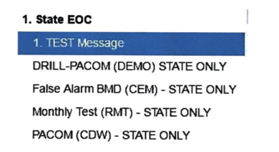
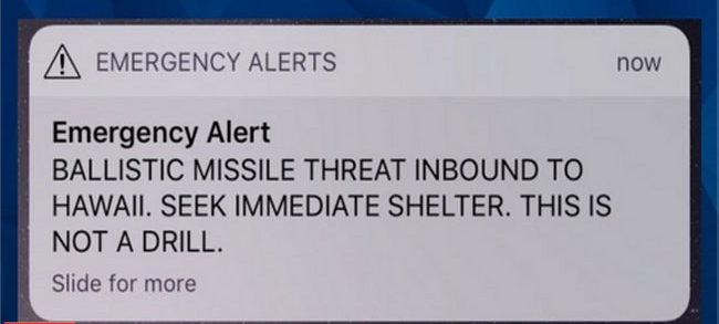
It’s not about the UI.
The dropdown was not the problem. A link-based system (which was not the interface but erroneously sent out to the media) was not the problem. A lack of a confirmation dialog wasn’t the problem.
Every single Monday morning quarterback of a designer has a solution for what happened that January morning in Hawai’i, solving the problem of an accidental missile alert in their own way. Confirmation dialogs! Sticking a post-it to the monitor edge broadcasting “DON’T CLICK THAT!” Better naming conventions! A massive design thinking exercise requiring 4,000 hours of contextual inquiry!
Much as the Academy Award for Best Picture fiasco of 2017 launched a hundred typography hot takes and Dribbbles, the Hawai’i missile warning of 2018 is leading every designer — and pretty much anyone else who’s seen a user interface and has an opinion — to tell us exactly how they would fix the problem with UI.
But it’s not the UI. And if we in the UX design world push that line of thinking, we’re saying what the product development world has been saying to us the last decade plus: that UX and UI are the same thing.
There’s plenty of UX designers who post on social media site regularly, railing about “bad design.” Their posts show images of terribly laid out, overly complex screens (or physical objects), with copy from the designer insisting they can be your salvation from said “bad design.” The images these designers shows are visceral. They provoke a reaction. But they’re focusing on the symptoms, not on the root causes. Like a patent medicine peddler’s bottle of snake oil, it’s not about solving your problem; it’s about curing the superficial.
To solve a problem like the erroneous Hawai’ian missile warning, we shouldn’t start with pattering on about dropdowns or confirmation screens. That’s solutioneering at its worst, and it does a disservice not only to the UX community as a whole but to the very people using these systems.
Good UX looks beyond the symptoms of “bad design.” It seeks the understand the problem, looking for convoluted processes, unclear outcomes, a lack of organizational advocacy for design values, and business priorities not aligning with user priorities. It asks why things are as they are, not how to quickly engineer a slapdash solution.
The primary job of the UX designer is not to solve the problem. Their primary job is to understand the problem well enough so that everyone engages in delivering the best solution. If along the way, the designer solves the problem, that’s gravy. But that solution comes from knowing, understanding, and communicating the user’s — the human’s — problem so well that the actions are deliberate and empathetic.
It’s probably about the process.
Now, we don’t have a complete picture of how the system works, other than some screenshots and newspaper articles. What’s clear is the system enabled preventable human error. But it’s not the operator’s fault. They did their job as they were supposed to.

An example of the Hawaii emergency management system. The “false alarm” option was added after the erroneous missile alert.
We know that they were betrayed by all the things designers warn about: needless complexity, the cognitive load that comes with this needless complexity, and perhaps the system being complex in the wrong ways (and perhaps too simple in the wrong ways, too). With these enterprise systems, it almost always comes back to Hick’s Law.
The blame lies not in the operator’s action. The blame lies in the intent and planning back at the start. The blame lies in the process, and the process of building software solutions in government is fraught with problems around intent and planning. Government projects nearly always involve a procurement process or a homegrown, in-house developed tool. It was recently released by “The Verge” reported that AlertSense was the vendor of the system, so it most likely was selected via a procurement process.
In a procurement process, a government agency writes a set of requirements into a Request for Proposal (RFP) like this example from the GSA. Vendors respond to the RFP trying to convince the agency they are the best and/or cheapest option. The agency then selects the winning vendor, and they all get together to verify the requirements. Here things get sticky.
Often the requesting agency hasn’t thought about the design of a system. They are confined by budget and focused on the outcome. This leaves the burden on the vendor to gather requirements, which is often the messiest part of the process. The pressure on the vendors to deliver on-time and on-budget pushes them to be to do the minimum required to satisfy the requirements.
I’ve been on both sides of the RFP process, as a state employee and design lead for vendors. Unless the agency and the vendor go into the process thinking about UX, the things we associate with UX — interaction design, information architecture, user research — get left out. Often it’s because design is seen or understood as “making it pretty,” not “making it useful.” It’s too easy for the making it useful parts to become “nice to have” instead of “need to have.”
Internally built tools face many of the same challenges. Sometimes the in-house developer or team are brilliant coders. Sometimes they have the knowledge for strong requirements gathering, product management, and elements of user experience. Usually, though, they’re underpaid, overcapacity developers, making do with few resources while dealing with organizational politics.
I’ve experienced that side as well — I designed and built internal tools while a state worker. Your resources are limited, your knowledge is limited, and you can’t run an effective design process. You might get lucky, squeeze in some user testing, find a college student looking for a design internship or a work-study job. But most of the time, you’re just trying to make it work. Design process? Contextual inquiry? Sounds great, but there’s no budget.
Things are changing slowly. 18F and USDS in the United States and the Government Digital Service in the UK have done amazing work transforming the websites of our prospective governments. People involved with 18F such as Cyd Harrell and Nikki Lee have weighed in on how procurement and project management affected the Hawai’i error. Governments and agencies are changing their procurement processes for the new, SaaS and service design-driven world of software.
In the meantime, the message of usable, functional, clear tools and applications is still moving out, slowly, to state and regional governments. To paraphrase William Gibson, the future of our governmental tools is here, but it’s unevenly distributed.
It is absolutely about people.
For nearly 40 minutes a false alarm of an incoming missile confused and panicked the people of Hawai’i. Hawai’ians were already on edge from political tensions between the US and North Korea. The ensuing consequences from the event led to, among other things, death threats sent to the civil defense officials.
In Design For Real Life, Eric Meyer and Sara Wachter-Boettcher use the term “stress cases” for measuring human-system interactions while the human is in a position of stress — say, getting information about a hospital your very sick child is in transport to or getting help because you’ve been sexually assaulted. We often design products that don’t consider the very real emotions and crises a human on the other end may be facing, and instead leaning heavily on delight in a way that is insincere at best, potentially harmful at the worst. As Wachter-Boettcher puts it in Technically Flawed, “Real friends don’t create metrics to gauge whether people think they care. They don’t try to tell you jokes when you’re in the middle of a crisis.”
In this case, the situation is reversed. By issuing the warning you are going to create stress for the people receiving it. In fact, you want to in order to save lives. The infamous Katrina Bulletin and the Oklahoma City Tornado Emergency are examples of weather alerts in the same vein. In expositing the very real dangers of a Category 5 hurricane and an EF-5 tornado, people took precautions, and they survived.
Systems like this require delivering the right information to the right people in the right way at the right time. And this is essential to any system we design, but in cases of people facing real peril, it is paramount. If we’re not deliberate in our design choices, we risk sending false information and creating panic. Take the last time we had a nuclear false alarm at this scale — February 20,1971.
At 9:33 a.m. on Saturday, February 20, 1971, the Emergency Broadcast System went off. Every TV and radio station in the United States received a teletype alert that regular programming was to cease and to await instructions from civil defense authorities.
Many broadcasters didn’t know what to do. What IS the proper practice for all of this? Confusion reigned for 40 minutes until the civil defense authorities were finally able to send out a “please disregard” message.
It was discovered the operator of the system put the wrong tape in the teletype. The message sent out, a templated alert of the end of the world or something similar, was intermingled with the other tapes that sent out only a test message.
After this event, the authorities did something really simple to prevent it from happening again. They moved the end of the world tapes away to a cabinet near the teletype, thus requiring taking a mindful action to tell America everything was going to hell. They also retrained all broadcasters in what to do when one of these messages comes through again. As a result, we went more than 45 years until the next mistaken missile alert. (That is, on the Emergency Alert System. Since 1971 we’ve had a number of early warning system and computer malfunctions false alarms on the US and Russian sides that almost triggered nuclear wars. Sleep well.)
As designers, when people are involved, we must be deliberate in our design decisions. This is more than just missile panic — this is about building any system to clearly and quickly inform, recognize the consequences of informing, and safeguard against the wrong message. It means that we should consider every roadblock needed vis-a-vis the time needed to deliver the message.
We owe it to our users — the people we serve with our designs — to take them into consideration. Whether you’re helping a distraught person through your system to get them the information they desperately need, providing the right messages and tools in the moment, or giving them the right informational and emotional guidance to a situation of grave personal danger, you must design with them clearly in mind. What’s the outcome you desire? How can you move the information to them clearly? How do you not cause undue pain or confusion in a time of crisis?
We live in a dangerous world, made all the more dangerous by volatile political and diplomatic times. Every action we take as a designer has real consequences in causing pain, grief, or confusion. It is paramount for us to design for people in a way that avoids all these. And the choices, whether it’s a cabinet for teletype tapes or a confirmation modal, together make holistic designs for people. Focusing on a UI element contradicts the true power that user experience design grants us in affecting, improving, and sometimes even saving human lives.
It’s not about UI. It is absolutely about people.
