Small things can make a big difference, and this is especially true in web content. The shortest of phrases and even single words—coupled with how they are designed and where they are or are not placed on a page—can affect a user’s experience.
This is where microcopy comes in. These small snippets of text can help guide users through a process, such as completing a form or placing an order. But, so often, this important content is an afterthought. We must have the mindset that every action created for a user is an opportunity to provide quality service, build relationships, and reinforce branding. In fact, every word a user could read on our website or within our interfaces should be considered just as important to the copywriting process as our landing page content, product descriptions, and marketing materials.

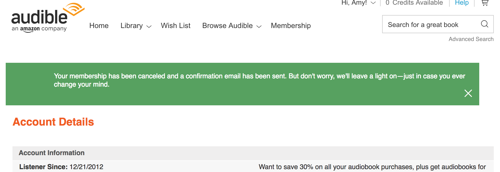
Audible demonstrates a value for microcopy through their cancellation confirmation message.
How Microcopy Helps Users
Good microcopy is good service. Like wayfinding signs in a hotel, aisle markers in a grocery store, and security reminders in an airport line, microcopy sets expectations, helps users accomplish tasks, prepares them for next steps, and lets them know they were successful.
Recently, I worked on my taxes using TurboTax. This application is a shining example of an expert, strategic approach to microcopy. The little touches of text (and sometimes images) not only help users through an often dreaded process, but these words also provide understanding of complex information and keep a user engaged, on track, and reassured.
Bad or nonexistent microcopy on the other hand can overcomplicate, prolong, or prevent actions. Shopping cart abandonment, incomplete applications, and a low mailing list sign-ups can often be pinpointed to a frustrating user experience. Adding some help along the way can build trust and increase conversions. For example, use microcopy to let someone know what is needed to complete a process, especially for items that can be tricky like an ID or PIN number. Or, if asking for potentially sensitive information such as a social security number for an application, boost user confidence and explain why with a “why we need this” tooltip.
Users aren’t mind readers, so don’t expect them to be. If form fields are required or have specific formatting requirements, say so from the get-go. An error message shouldn’t be the first and only place instructions are given. It’s never fun to exclaim in frustration, “Well why didn’t you tell me that in the first place?!”
For example, my legal name contains a hyphen. This little dash leads to much frustration and it’s not enjoyable to have a form say my name is an error. My address can cause errors as well. Sometimes, address fields don’t allow for special characters. Often, I need to change Apt. #2 to No. 2. Share these rules in well-written microcopy along with specifics on how to format a birthdate or phone number or rules for passwords.
Don’t forget the error messages. How is it worded? Is it polite? Neutral? Does it sound negative or put blame on the user? This is where passive voice works well: instead of saying, “you must have made a mistake!” you could say, as a SproutSocial error message once told me, “an error was encountered.”

This browser incompatibility error by US Bank has a human and empathetic tone.
Simply put, using clear and helpful microcopy is just good UX. Not doing so can lead to a sense of defeat, something we all tend to feel when we make mistakes. Is it really a “user error” if we didn’t properly educate our visitors?
How Microcopy Helps Brands
Microcopy can be an extension of our brand. Whether a strictly online company or one that includes physical locations, giving users a positive web experience, all the way down to microcopy, makes for a more human interaction. Each piece of content is an opportunity to deliver brand values and voice. Microcopy can help do that. Not only can it be instructional, but it also delivers a dose of personality.

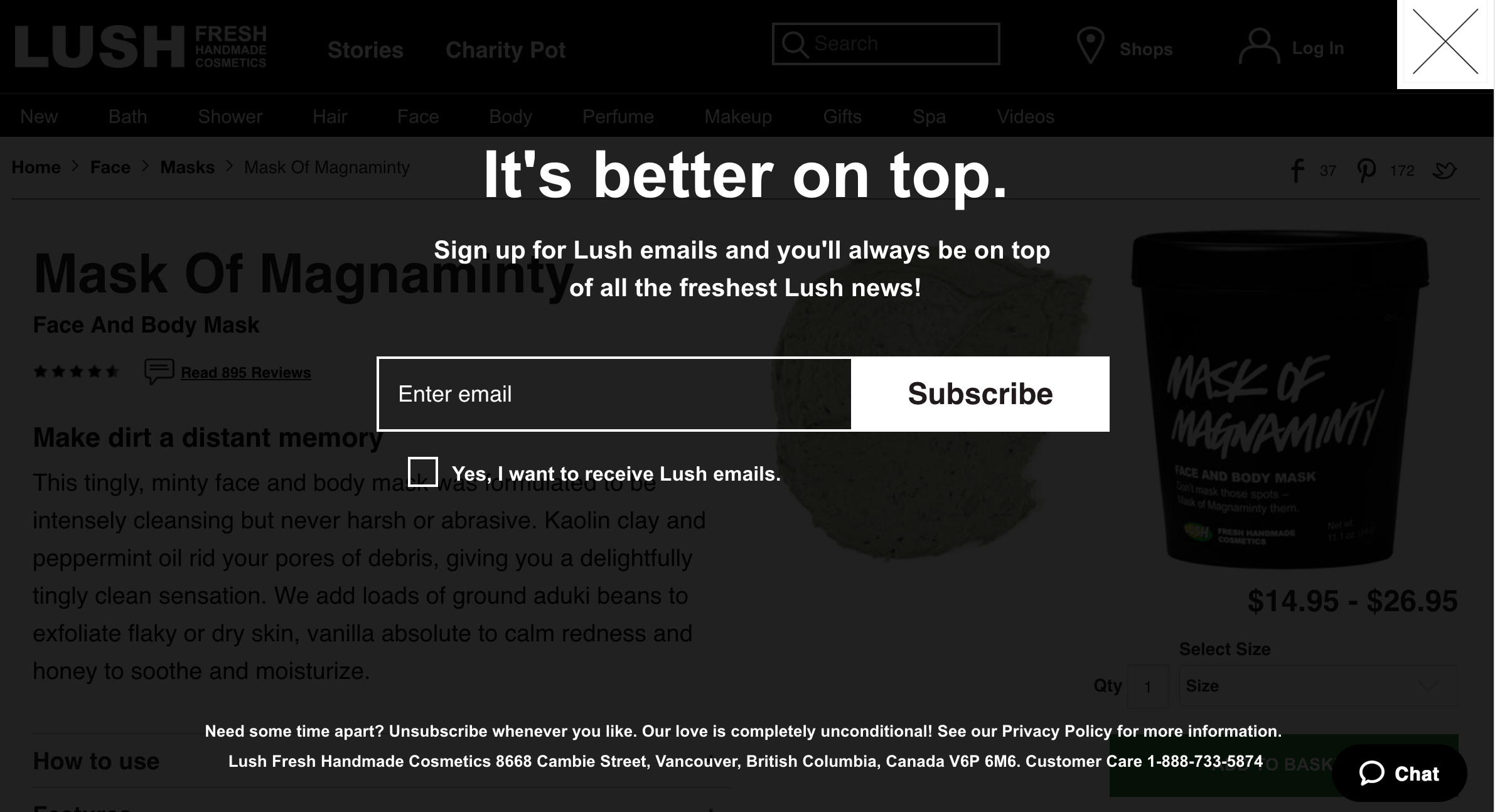
Notice the fine print on Lush’s email signup screen. It follows brand personality

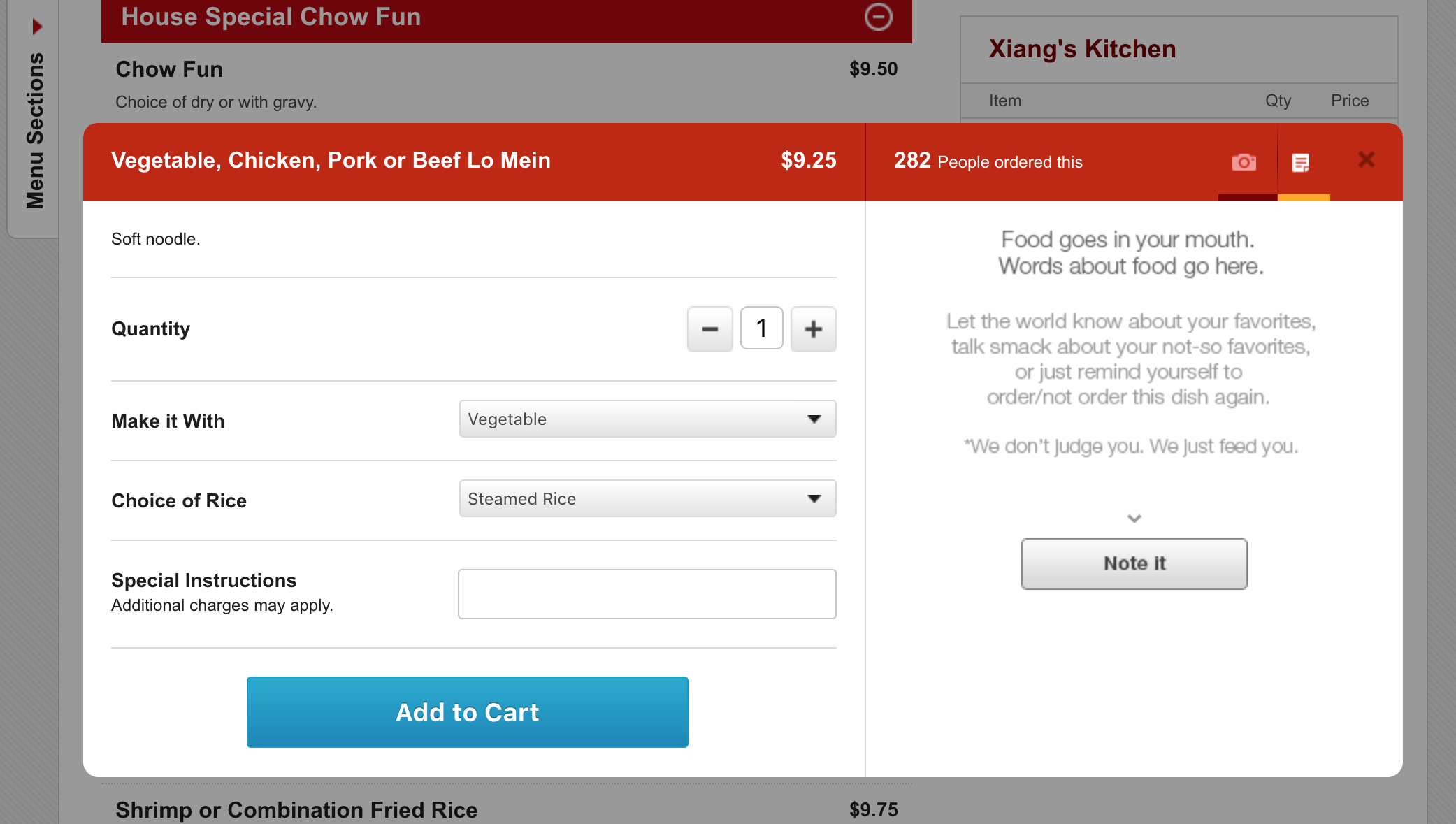
Grubhub explains its note feature through friendly and welcoming microcopy.
404 pages, for example, are known for being incredible opportunities to boost branding and even have some fun. Rather than the stark and standard “The requested page was not found,” create a page with imagery, friendly copy, and show users what to do next with an included search box and suggested links. This practice keeps users on your website.
Good microcopy can take your service above and beyond. Like a towel folded into an animal on a cruise ship, thoughtful details matter to a customer’s satisfaction. In fact, they can be quite delightful. TurboTax made me feel accomplished when I was done through a cheery, “You did it!” confirmation message.
Consider your organization’s brand, mission, core values, and personality. Does every user-facing message on that website ring true to those attributes? Users are people who are pushing these buttons. Remind them there’s a human behind the scenes, too.

This cancellation message from Orbitz is neutral, but friendly. It is supportive, yet makes no assumptions on why a user cancelled plans. This is important as a user could have cancelled because of a serious illness or other negative life event.
How Putting Your Copy Under a “Micro”scope Helps You
If users consistently report receiving errors messages, if their transactions fail, if you receive web form data with the wrong information in a specific field, the microcopy—or lack thereof—might be the culprit. Take a look at errors users report the most often. What questions are you tired of fielding? If you’re consistently seeing some negative trends in metrics, like cart abandonment, it could be time to look closely at the microcopy.
Pay attention during user testing: what barriers are people encountering? What’s making them feel tentative? Use those feelings and frustrations as a cue for microcopy. Are calls-to-actions not strong enough? So often buttons simply say “Submit.” Be more specific or make the few words more enticing and clear by focusing on the outcome rather than the process. Continue to test and analyze results after adding or making changes to microcopy.

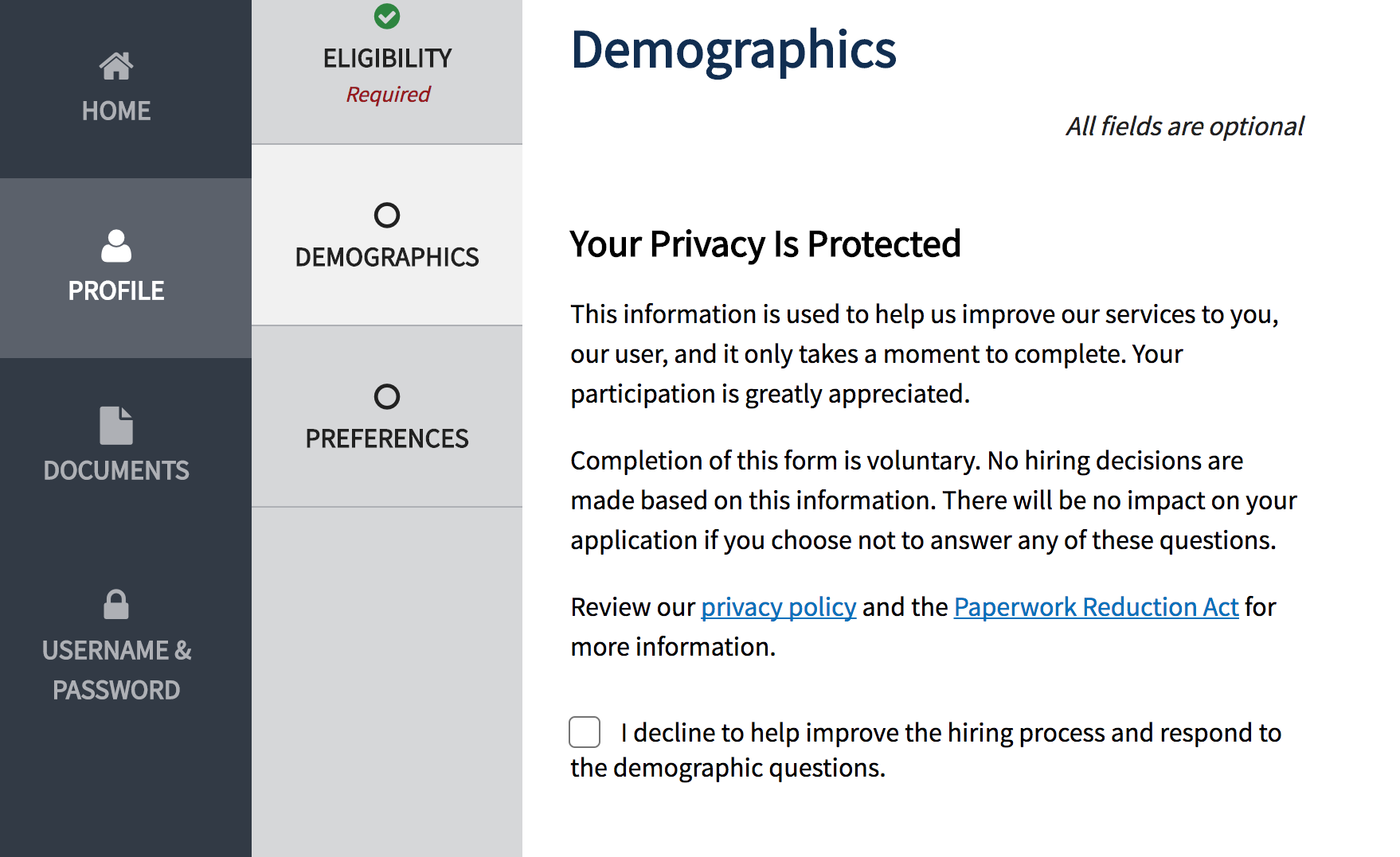
Microcopy gone wrong. Note the wording of the microcopy next to the checkbox. USAJobs is using a tone that may make the user feel insulted or negative. It appears to be using confirmation shaming for a potentially sensitive topic to the user.
Overall, microcopy adds clarity, provides context, gives next steps, promotes urgency, and sets clear expectations for users. And sometimes it can make them smile. For such tiny copy, it sure has a big impact on satisfaction and conversation. Make sure you’re paying attention to every last word!
Microcopy Cheat Sheet
There are so many ways to help and delight users through microcopy. Here are just a few areas:
- Sample content in search boxes (ex: “programs, products….”)
- Sample content in log-in boxes (ex: example username in proper format)
- Buttons
- Forms
- Form labels
- Log-in screens
- Loading messages
- Payment instructions
- Password set (or reset) prompts
- Checkout and cart pages
- Any multi-page/step process
- 404 pages
- Confirmation messages
- Error messages
- Menus
Ready to get real about your website's content? In this article, we'll take a look at Content Strategy; that amalgamation of strategic thinking, digital publishing, information architecture and editorial process. Readers will learn where and when to apply strategy, and how to start asking a lot of important questions.