If you build a house atop a solid foundation, it forgives – it allows you to try over and over again until you get the stories right. But a flawed foundation? You can hire the most brilliant architect and the poor fellow will ultimately fail.
When it comes to our websites and applications, the user interface comprises the basics. It’s what we see and come to know. It’s what we remember. This article highlights a few, key principles of user interface design, things all designers should bear in mind when designing a graphical user interface.
Visual chunking
Designers should visually separate – or “chunk” – functionality that is inherently different. This gives their interfaces a clear, tidy, and functionally consistent structure. Most importantly, it allows users to associate a kind of task with a particular area of their screen.
The first step to chunking is to determine what groups of functionality our interface provides. The four, basic groups are: Edit, Navigate, Share, and Display. Productivity applications, for example, usually consist of three chunks (they typically don’t include sharing functionality):
- A sidebar allows users to navigate to a certain point within their project, usually via thumbnails or sections.
- A toolbar allows users to edit their project, and
- A canvas displays the current state of a project.
Microsoft Word 2010 serves as a good example:
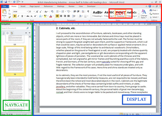
While this rule is pretty straightforward, there’s one thing to avoid: mixing areas. In Numbers, for example, some editing tools are distributed across the interface:
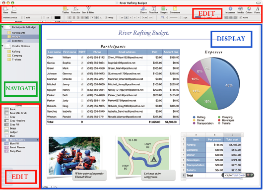
See the red areas? They break the otherwise functionally consistent structure of the interface.
But don’t stop at the big elements. Apply the same, chunking principle to the items found within areas of the page. Notice how the icons on the toolbar are sorted into small, meaningful groups, such as “Table Tools” (Tables, Functions, Sort Cells) and “Insert Tools” (Charts, Text Boxes, Shapes, Comments) – although I personally would have included the Media button with the Insert Tools.
The same, four-function-schema (navigate, display, edit, share) shown in these desktop applications applies to our web sites, too:
- To navigate, we often click links in the header or sidebar.
- The largest portion of the page is used to display content.
- Comment/feedback forms are used to edit the site, and
- Social media buttons are used to share information.
Another rule of thumb: Group areas, but don’t mix them. For example, navigational buttons and social media buttons serve different purposes and should therefore bear little resemblance to one another.
This pattern allows us to more intelligently organize the functionality in our websites/applications. In order to organize their content, though, it’s best to get acquainted with classification schemas and learn what would best suit our audience.
After having grouped both our functionality and our content, the next question is how to visually display them. Don’t answer just yet.
Respect the Device
Now more than ever, users employ a myriad of devices to create, browse, share, and consume content – each with its own shape, size, and input method. Therefore, we must strongly consider the strengths and weaknesses of our users’ device(s) before making design decisions.
When designing for a horizontal device, we should capitalize on the horizontal space it affords, placing elements next to each other rather than on top of one another. To illustrate how not adhering to the principle of custom engineering for a horizontal device can affect the user experience, consider the Microsoft Ribbon Interface.
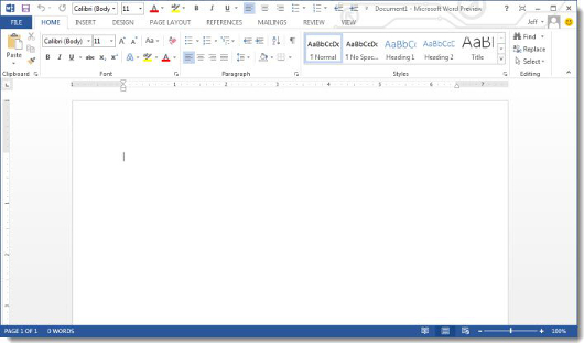
The Ribbon Interface is, at its core, a complex set of menus that is placed on top of the page view. It expands horizontally and, as a consequence, takes away vertical space. Vertical space is important as it can (and should) be used to display more lines of my current page – the most important interface element in a word processor.
By contrast, consider KWord:
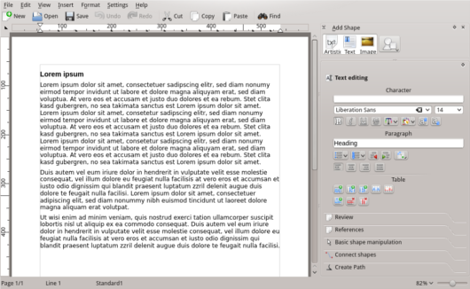
Notice how no screen real estate is wasted; users can see much more of their current page. The sidebar provides the necessary tools to help users edit without visually competing for the limelight.
Arranging interface elements on a 30-inch (wide) screen can be reasonably straightforward. However, designing for a sub-10-inch mobile device makes it tricky to integrate functionality or content without visually crowding the interface. This leads to the next tip:
Remove clutter, not features
Many user interface designers adhere to a philosophy known as KISS or “Keep it simple, stupid.” Advocates of this principle have a point, however, in my experience, users don’t choose applications because they are simple or easy to use. They choose based on whether or not they can accomplish a certain task.
Designers should integrate as many useful features as possible without cluttering the interface. To achieve this, they might employ tabs, dropdown menus, or other intelligent, context-sensitive solutions. They should interpret the users’ intent and display only the tools or information that is most likely to help.
For example: (1) Tooltips are invisible unless I hover the mouse cursor over an item and (2) fullscreen controls are often invisible unless I move the cursor. Tabs, buttons and dropdown menus also work toward this end. As a rule of thumb, be context-sensitive.
Otherwise, compromise between space-efficiency and the amount of clicks required to access a certain information:
- If a command or content (category) is likely to be accessed frequently, make it a button/link, otherwise make it a dropdown entry.
- If groups of commands are likely to be accessed frequently, store them in tabs, otherwise store the group categories in a dropdown.
- When offering mutually exclusive options, use radio buttons.
- And when offering independent choices, use check boxes.
Good design is contextual, though, so the above rules are often overridden by the following two:
- If the total amount of easily clickable tabs/buttons/links does not exceed a certain number, use tabs/buttons/links instead of dropdowns. The amount will vary with screen size, input device (touchscreens require bigger UI controls), and whether you feel you are still displaying enough actual content.
- If screen real estate is most crucial in a particular situation, use dropdowns instead of buttons/tabs/links/radio buttons.
Given enough space, use links:
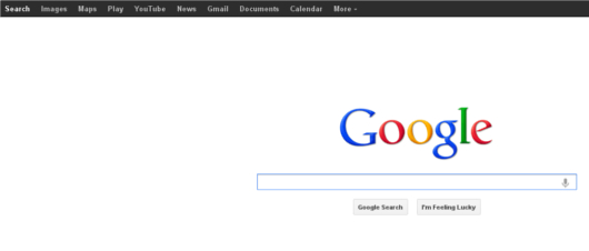
However, if space gets tight or categories are less frequently accessed, simply use dropdowns:

Apart from following basic UI principles, designers also have to pay attention to details. This leads on the last – and arguably most important – principle for good interface design.
Empathy
Many companies carry out extensive usability testing to find out why users adopt or reject their applications and how they can improve them. Sometimes they get the very dissatisfying answer that the users cannot distinctively point to what is bothering them but they just don’t feel comfortable using a particular application.
This isn’t necessarily a case of users being difficult. Instead, seemingly trivial design decisions come to affect users on a very deep, subconscious level. When Apple released Mail for OS X Lion, for example, they received good press for its three-column view:

Honestly, doesn’t it look slick? It respects the device’s orientation by placing three, big interface elements next to each other; it doesn’t waste a single pixel of screen real estate; and the arrangement of the three columns is strictly logical in that they accurately reflect the current folder hierarchy (first column: main folder, second column: subfolder, third column: the selected file inside the subfolder).
Yet many users, a few days after the release, posted inquiries as to how to revert the view mode back to the classic view, even if it was suboptimal. To find out why, one simply has to empathize with the end user.
When using Mail, most of time, I am, as the name suggests, reading mail. That means that most of the time I am looking at the mail column. However, in the new layout the mail column is placed at the right edge of the application window. This may not bother me at first but after a while I might slowly get tired of looking at the edge of my screen.
Instead, the area I look at most should be in the application’s center:
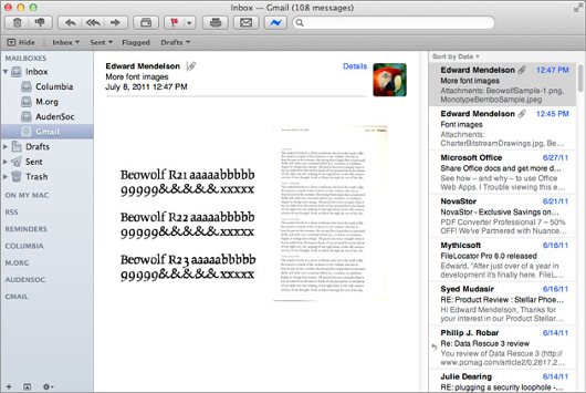
If you want to test your empathic abilities, try the following: Forget both the header column and the navigation column, and ask yourself, if you had to look only at the mail column for many consecutive hours, which interface you would prefer.
In sum
In order to provide the best possible user experience, it is important that user interface designers closely follow very basic – yet nonetheless important – principles:
First, give interfaces a clean and consistent structure by visually separating areas that represent inherently different functionality. This gives users a clear and understandable map of where to find what.
Second, respect the idiosyncrasies of the device for which you are designing. Every device has its strong and weak points. Analyze and exploit them to the users’ advantage.
Third, remove the clutter, not the features. After all, features are (ostensibly) why a user picks up your application in the first place. Use tabs, drop-down menus, and intelligent, context-sensitive solutions to provide only the tools or information the user is most likely to require in a particular situation.
Fourth, and finally, empathize with the user. Don’t make design decisions lightly. Be aware that even the smallest design decisions can affect users on a very deep, subconscious level. Put yourself in their position and try to create an interface that is not just visually slick but also usable and convenient in the long run.
Following these basic principles isn’t easy but, ultimately, it saves designers, developers, and clients alike time and money. And that’s a good thing, yes?
…see? Some basics we all agree on.