Testing real content with users is often seen as a part of final usability testing. Low-fidelity wireframe testing may include only microcopy, headlines, or call-to-actions. Treejack testing highlights organizational issues in navigation or classification. Rarely is content tested prior to design. But why is this when content is what fills the designs and leads users through interactions and flows?
Adding this step can save time, money, and effort in every stage of the design process by informing wireframes and design, providing strong guidelines for writers, and helping to settle debates with stakeholders.
Why test content before design?
The success of most products or websites depends on content used by customers. I’ve been a part of too many redesigns that begin with a bright, shiny, new front-end design and quickly blow deadlines and budgets because the content doesn’t fit the design or the content important to the user is buried. And problems with content don’t stop with trying to fit it into a visual design. Content is resource-intensive, often hard to get approved by stakeholders or legal, and expensive to revise whether in time or cost. Testing content early in a design process helps put the user first and keep the project user-focused throughout.
It helps build empathy into the design in a more actionable way than empathy mapping. It helps build better user flows with less friction or pain points because users got to have the first say in what’s important to them.
- For designers, it helps build designs that better highlight key content elements and require fewer revisions. It created a stronger understanding of key user flows so that elements like call-to-actions could be more effective.
- For writers, it provided a stronger understanding of the user’s key questions and motivations. This built stronger content spec sheets and guidelines for writers to follow. It also helped develop a more effective voice and tone. Writers got better insight into users’ voice, the terms they use, and the tone most effective to keep them advancing toward a goal.
How to complete pre-design content testing
Testing content outside of a design structure can require a bit of creativity. Most of today’s popular testing tools don’t provide a good way to both display pieces of content in a way that allows the subject to move and sort while also advancing through a top task or journey. Tools for usability testing require a basic visual design and don’t allow subjects to move content. On the other end, tools for testing content, like OptimalWorkshop, are best for navigation and categorization, not the longer form content users encounter in the completion of a task.
In a recent test, I realized Trello made an ideal platform for this type of research. For those unfamiliar, Trello is most often used for kanban-style project management and scheduling. It features boards that can be broken into columns with cards for each step or task. The cards are moveable and ideal for holding individual content chunks and the interface is easy to master for test users.

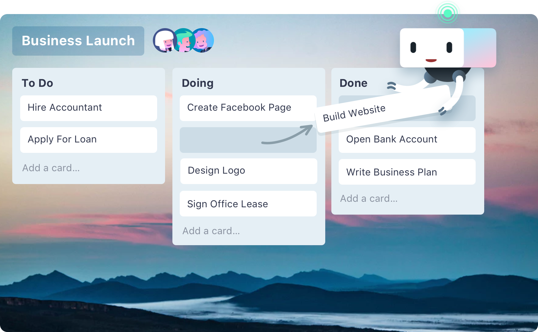
This image from Trello shows a standard kanban board and the key functionality to move cards.
Trello combined with a video conference service such as Zoom created a testing environment that married user interviews, card sorting, and usability testing and provided insights and recommendations that helped in each step of the design process. This type of content testing requires three elements:
- Moderation: It’s important to hear the user’s thought-process as they judge each content chunk and its usefulness. After explaining the goal or tasked with accomplishing, the test subjects were asked to read through each piece of content, or card, and voice their initial reaction. Is it useful to them? Is it difficult to read or understand? What emotion(s) does it invoke?
- Prioritization or ranking: The primary goal is to understand which pieces of content are most useful or important in helping users continue through a task to meet a goal, whether a user goal to plan a successful visit or a business goal to get more memberships. The Trello boards allowed users to reorder the content in the way they’d prefer to receive it. They were asked to reorder the cards by prioritizing the most important or useful content and explain their reasoning out loud. This helped us create more standardization in repeatable content like hours or location and helped build better designs to highlight and display key content elements.
- Follow-up questions: Much like a card sort, this test had no defined pass/fail measure. It was based on user perception and opinion, so it was important to have the opportunity to ask specific follow-up questions. Sometimes a user’s reasoning wasn’t voiced or described in enough detail. We also wanted to know if they felt content was missing that would be helpful in their decision making.
The first step is to identify two to four key user flows that serve your main business goals. In this case, our test featured a city park. We wanted to explore how users planned their visit and how content affected their decision to purchase a membership.

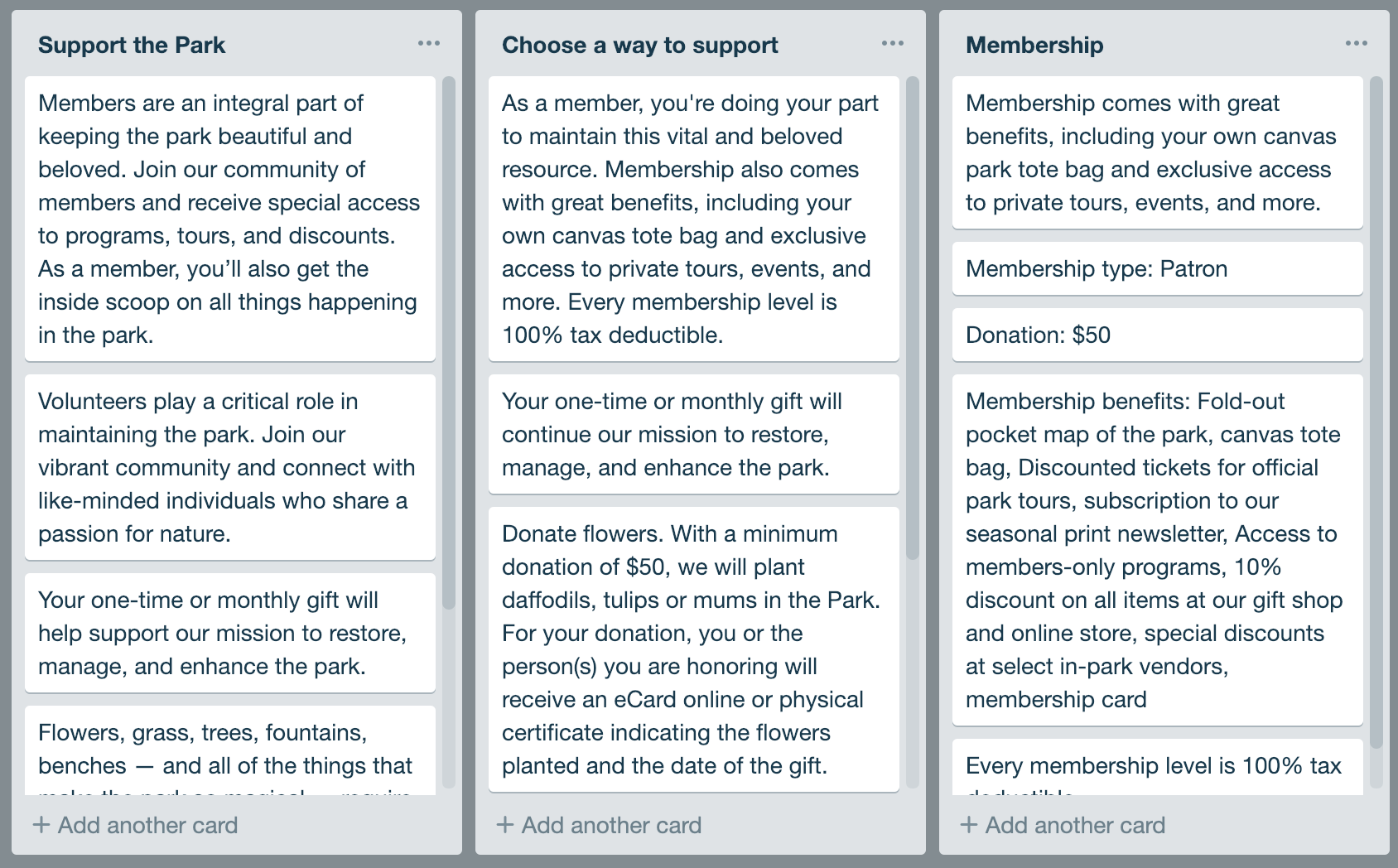
Becoming a member was a key website goal and user journey we tested. Each column represents a separate page in the user flow.
Identify the pages or screens a user will encounter and make a column for each. Keep the columns in order with the first page of the flow on the left. Try to choose tasks that use three to five columns. Next, you need to fill these columns with content.
The study referenced here was part of a website redesign so we were able to test with existing content. If you are developing a new website or product, this step will be more time-intensive. Work with your writers to develop real sample content. It doesn’t have to be finalized and approved by stakeholders. Draft content is fine as long as it is a reasonable example of what users may encounter. Plus, the testing will result in plenty of recommendations or guidelines for final copy so don’t stress too much at this point.
Next, decide how to chunk your content. Break the content into smallest pieces possible while maintaining pieces that are still understandable. For example, in a content type like event listing, your chunks would include separate cards for date, location, description, dress requirements, ticket purchasing information, etc.

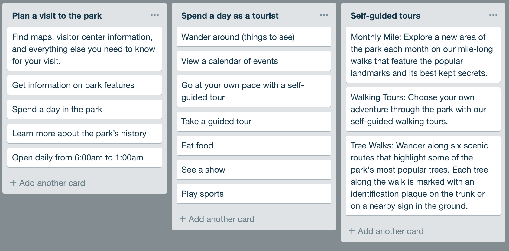
The user flow on planning a visit features short pieces of content that represent informational elements.
While Trello allows for it, we did not include any visual elements in our test. We tested only text. Adding cards for individual images may be useful if your user flow depends on visuals for explaining features, leading users through tutorials, etc.
Once you’ve created all the necessary columns and cards, you’re ready to test. (Of course you should have a recruitment screener and test script ready, but that’s another article.) Since we testing prioritization of content on individual pages, our test was more scripted than Choose Your Own Adventure. Each user was led to the next column by indicating an assumed action such as, “after reviewing the options for supporting the park, you want more information on membership levels.”
A variation on this test could allow users to reorder columns, not just cards, and/or move cards from one column to another if they feel a piece of content would be more useful at a different step.
Using the results
The Trello-based test described above didn’t have the advantage of immediately created charts and graphs like many testing products on the market today so results required a bit of elbow grease. Each test session was recorded and screenshots were filed. This provided the raw data to analyze results in numeric ways including providing a rank score to each card. Key user comments were transcribed for use in the testing report. Audio or video clips could be grabbed from recordings.
Our testing provided results that affected the structure of content types, menus, wireframes, and final visual design. It helped us settle debates on functionality or placement and we came back to it time and time again.
In one example, a late-stage discussion started around additional functionality needed for the alerts, used as time-sensitive notifications of closures or other disruptions to visitors. The template was already in production and the idea being raised would have required significant time and money to revise and add several layers of new functionality. We were able to use our test results to show what was most important to users and persuade stakeholders that the proposed changes made it needlessly complicated for the current use.
Ultimately, our pre-design content testing provided a strong ROI and helped avoid derailments at every step.