This post is part of a series authored by the speakers of the upcoming UX London conference. In case you can’t make it out, though, be sure to see Nate speak on this very topic at SXSW on March 12th.

How can we identify lies in our work before we run into serious problems?
Lies. We consider them an occupational hazard. In the course of our research at Bolt | Peters, organizations both large and small will inadvertently ask us to participate in their lies and, intentional or not, the implications are often dire. When we lie to ourselves, our users, or our team about issues at the core of a user experience project, we unwittingly accelerate the interface’s demise. It can be an uncomfortable topic, but uncovering the lies behind a product or interface can be one of the most effective ways to turn ailing projects around.
Searching for search
In 2004, our team worked with a startup that helped users find the best deals on products right in their neighborhood. To find these deals, our client’s users would utilize a newly engineered, hyper-local search engine. The only catch? The search engine wasn’t functional quite yet. Our client assured us, though, that their search engine just needed “some tweaks.”
That was a lie.
Our client’s business model was predicated on the idea that they could easily aggregate and parse local store data—an immense feat of technical engineering. What they asked us to do, then, was to study their potential problems: the structure of information, the mechanics, and the visual design they’d need once they acquired the aforementioned results.
The fact is, they never did. During our research sessions—when we sat participants down and asked them to search for specific products—the prototype did present results; they simply weren’t relevant. We had to ask users to pretend, to make-believe that the results they saw were relevant to them.
Now, we made them participate in the lie as well.
Suffice it to say that the conclusions we reached were less-than-accurate. Had we explicitly addressed the lie during our research, we could have possibly convinced our client to pull a Game Neverending, an Odeo, or a Burbn—Flickr, Twitter, and Instagram’s precursors, respectively (read their stories here, here, and here). But we didn’t. Our team didn’t clearly understand the importance of the client’s lie until it was far too late. The final report read: “The search experience represents the highest risk areas for REDACTED’s user experience.”
At last, it was our turn to lie.
In retrospect, the problem with our process is obvious. Although behavioral observation can uncover lies or errors in judgement, it takes a lot of courage to address them—especially in a project with technical, business, and organizational complexity. To help us identify future lies in our line of work, we look for signs from the following sources:
- 1) our client’s prototypes,
- 2) our user participants,
- 3) and the research itself.
Prototypes Lie.
Prototypes often lie because they have the capacity to be deceptively designed. In many cases, lying with prototypes is a good thing: mocking-up basic functionality with “smoke and mirrors” is an industry standard. But prototypes that lie about what is technically possible—as in our earlier search example—pose a significant threat.
The question becomes: how can you tell the difference? What’s okay vs. what isn’t? It all comes down to one, simple question: Is the core functionality of your prototype a “solved” problem?
Things bode well if you’re mocking up an idea that has a technical precedent. For example, there is no value in building a database for a prototype because it’s a solved problem.
But if you find yourself asking users to pretend too much, you’ll get back pretend results. Users should never have to “guess” or “imagine” your application’s core functionality. If you can’t visually articulate what it will look like or how it will act, you certainly can’t build it over the coming months.
The MIT Media Lab is famous for their focus on building and researching prototypes. David Merrill, the Co-Founder and President of Sifteo (which incidentally began as a Media Lab project), explains how closely he and his team “paid attention to the fidelity of [their] initial prototypes.” For Sifteo, that meant creating a prototype with screens that reacted to one another. Nevermind they had wires hanging out the sides. Visual perfection wasn’t critical. In fact, it almost never is.
Solution:
Prototypes should focus on function, doing justice to an idea without large assumptions. Startups especially should be very careful about building under one big premise to a prototype that everything hinges on. If the prototype flow assumes perfection, re-think it. Write down every assumption a prototype makes and be sure they’re filed in the “white lie” category. (It’s worth noting that because search is such a frequent stumbling block it deserves extra scrutiny.)
User Lie.

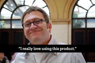
Is Dan telling us the truth?
Users often lie. Almost always, they do so inadvertently. Sure, a user might tell you about their opinions or their motivations or how well they would rate a given site except, unfortunately for us, all those things are meaningless.
In 2001, our friends at UIE conducted a study asking participants to rate the speed of different shopping sites. What they found was baffling. Respondents consistently rated Amazon among the fastest sites they visited when, in reality, it’s one of the slowest sites on the list. In other words: users’ perceived that Amazon was faster simple because it was more popular. Or, perhaps, because it had a better user experience. To be clear, no one really knows. The fact is that we are, as humans, notoriously bad at describing our behaviors (see: eyewitness accounts and this fascinating account of fathers lying about family time).
Solution:
Observe users who really care about what they’re testing – not just in the abstract but at the moment you’re working with them. Next, collaborate with your whole team in any observation that you do, even it’s super casual. We call this method time-aware research. Users may still lie, but their actions will speak for themselves. Finally, compare what users do on a case-by-case basis with analytics data from inside your application, if at all possible.
Research Lies.
In 2007, Dan Saffer gave an epic talk titled, How to Lie With Design Research. Among the many tips he offered was, “you wanna pick your research subjects like Johnny Cochran picked his jurors.” Now, without commenting on the innocence of one O.J. Simpson, Dan’s point was entirely well made. That is: researchers can easily distort their methods to suit their goals. No one is above this, not even us. Unfortunately, this causes among us one of the biggest lies affecting research studies:
“This Research is Scientific”
“Scientific” research is seldom that—especially when it comes to user experience design. Just look to Rolf Molich’s excellent CUE Usability Testing Bakeoff, now in it’s tenth year. Rolf’s contest manifests the striking lack of consistency between findings across groups of highly-skilled researchers using self-chosen methods. In other words: user research, however prudently performed, doesn’t always produce much more than the age-old adage insists: “Lies, damn lies, and statistics.”
In 1995, the Microsoft Office team was well convinced that Bayesian Logic could accurately predict user frustration. After conducting quite a bit of research to sure up their theory, the Office team shipped a product containing what would become one of the most infamous characters in modern, desktop computing–Clippy.
How could this happen? Microsoft’s research clearly indicated that Bayesian Logic could identify user frustration, so what went wrong? No one really knows. To this day, computers don’t accurately predict when users are frustrated – it’s not a solved problem. Senior Microsoft researcher Dr. Eric Horvitz maintained that engineers stripped out the advanced logic from the final shipment of Office ’97, which led to Clippy popping up all the time. Apparently they ran out of disk space accommodating all those toolbars. Seriously.
Solution:
Beware applying academic research to commercial products without context. Ignore opinions; focus on behavior. Mix your research methods. Observe users. Be honest with your stakeholders about what you know and don’t know, and don’t hide behind corporate language to make your research appear more valid. Use data like task completion rates or survey results as ancillary support to qualitative research or what you should identify as genius expertise. Always ask why.
Take an ethnographic approach to the people on your team and to the stakeholders as well. What does a harried project manager actually do with personas? Maybe nothing. Spending time collaborating with that project manager is a better strategy than dumping a report on their hands.
Turn the lies around
If you’re upset at our continued use of the term “lies” to describe misconceptions, here’s where we hope to help. Being realistic about the type of lies that go on in large-scale UX research has to do with improving the project based on their discovery. Here are four, quick steps to oust lies during your next project:
- 1) Don’t call them lies. Really, it just pisses people off.
-
2) Admit that there are lies. This is incredibly difficult. Just like in “real life,” admitting that a lie exists is extremely difficult (see: political careers). Eventually, though, that lie can take on a life of its own and pose a bigger problem than it initially posed (see: politics).
Of the four steps, this is really the show stopper. It’s not a big team exercise; this is for 1-2 people max. This is not a deliverable. If you possess the diplomatic finesse of Kofi Annan then you can ask in a kick-off meeting if the team/client/ stakeholders feel there are any false premises in the project. After this one, the other steps are icing on the cake.
-
3) Write down the lies. Even if it’s out of scope or not relevant, simply writing it down can spark new ways to approach design, research, or architecture tasks. Warning–it can be really awkward or uncomfortable for anyone that has a vested interest in maintaining the lie to view them so, again, don’t share these. For example, while developing personas recently for a large international corporation, these were the two big lies we realized we were all participating in:
- Customers care about this brand
- Personas are automatically useful
-
4) Collaborate. There is a reason folks like Adaptive Path and Ideo do so much on-site time with clients and stakeholders. It builds understanding and consensus within a team, making it harder for lies to survive. The more stakeholders that participate in the process, the easier it is for false premises to be exposed, and for research to inspire significant change.
If nothing else, these steps will bring stakeholders into a deeper dialogue on the nature of truth and value in their application. Merely speculating as to how and why users perform certain tasks means that their team is better prepared to face the challenges that lie ahead.
All we ask is that you learn from our mistakes to prevent your own. Hey, we wouldn’t lie to you.
About the Author
![]()
Cyd is Director of UX Research at Bolt | Peters, where she has led more than 150 studies, assisting clients such as Sony, Best Buy, and Zynga in understanding and better serving their users. She coaches BP’s research staff and teaches workshops on remote research techniques. She received her formal training from Yale University, where she studied Linguistics with a focus on socio-linguistics. Cyd was also co-founder of SF Women on the Web. You can follow her on twitter, here.