Designing, creating, and managing an online platform is no easy task, much less so in the ever-changing digital scape. Continuously improving UX designs that satisfy the needs and desires of customers is an essential part of attracting and keeping clients.
Creating an online platform that is accessible to people with disabilities, for instance, gives customers a pleasant and effortless experience. A website that works across all devices is also key to having a high conversion rate and building loyalty. For those striving for success, effectively enhancing UX micro-interactions—which are often overlooked—can make the difference between a customer that stays and a customer that hits the X button on their browser.
Introduction
When starting an e-commerce business, people usually focus on the big picture—that is, covering all bases and analyzing all e-commerce-related aspects of the business. Of course, having a good product and making a profit is fundamental, as is finding the right marketing strategy. But all of these are pointless if customers bounce right off the platform and move towards competitors.
That said, a good UX design will go a long way in converting visitors into customers. It may be cliché, but it is true—the little things really do matter. Micro-interactions are such an integral part of everyday digital life that they usually go unnoticed until they prove to have massive repercussions on a site’s conversion rate.
What Are Micro-interactions?
Micro-interactions are instances where the user and the website’s design cross paths.
Among the many micro-interactions that people encounter every day include moving or dragging an item to a virtual shopping cart, clicking a ‘sign in’ button and seeing the button ‘push back’, or toggling between the wide array of ‘like/love’ buttons found on Facebook. The typing indicator on messaging apps is also a micro-interaction.
In UX design, micro-interactions serve as a way to actively interact with the customer in a delightful and engaging manner. These interactions not only guide the user and provide immediate feedback on the task that they are accomplishing; they also serve as a reminder to that they aren’t just engaging with a machine.
The Four Parts of Micro-interactions

Source: Microinteractions.com
Micro-interactions are made up of four parts, each as important as the next. Remember, it’s all about the minute details so keep these parts running smoothly:
Trigger
The first part is what initiates the interaction. The trigger occurs when the user or the system activates the interaction. In the case of system triggers, certain requirements need to be met for activation. Take, for instance, a user that typed in a wrong password. A website’s prompt then asks if the password was forgotten and if the user wants to recover it. In this case, typing in the wrong password is the trigger.
Rules
The second part determines what happens when the micro-interaction has been activated. In the previous scenario, the rule is when the system must automatically ask whether the password was forgotten and if the user wishes to recover it. Rules should be invisible, only known to the designer, and molded to fit the needs of the customers.
Feedback
The third part is when the system lets the user know what’s happening. This can happen visually, audibly, or by feel. Feedback notifies the visitor that the micro-interaction has been initiated. In the password example, the feedback would be the prompt stating that the password was typed wrong and that it needs to be typed again (or that the forgotten password needs to be replaced).
Loops & Modes
The fourth part determines the meta-rules of the micro-interaction, i.e. what happens when the conditions or requirements change. A loop determines the length and repetition of a micro-transaction—in our example, the number of times a person can type in a wrong password. Modes, on the other hand, determine what happens over time—that is, three wrong password inputs will block the account.
Why Micro-interactions Matter
So why do micro-interactions matter?
For one, they make navigation easier, which should be the goal of all designers and developers. Better navigation means users stay, buy, and visit again.
They also improve the rate of interactions, provide real-time information, and make users feel that their experience matters. They also help guide the customers by giving them tips and instructions wherever they are in the buying process.
Micro-interactions can be considered as the little things a digital store clerk does to meet the customers’ every need. If the digital clerks take good care of the users, they will feel good and want to come back. Micro-interactions help improve the chances of leaving a good impression.
What Makes Micro-Interactions Successful?
There is no universal key when it comes to designing successful micro-interactions for all websites. However, most designers agree that there are five main principles to creating one that works:
- Less is more. Micro-interactions are supposed to be just that—micro. So keep them simple. Users encounter countless micro-interactions a day seamlessly; don’t be the website that tires them out.
- Keep it constant. Micro-interactions should go unnoticed, so make sure that it is in harmony with the rest of the website. Don’t make it a source of distraction.
- Know your why. Why is a particular micro-interaction made? Why is it necessary? Why would the user interact with it? Having sound answers to these why’s is key to a successful micro-interaction.
- Run tests. Try a micro-interaction various times and perfect it, before it’s set to go live. Micro-interactions that have been tested will likely be more effective.
- Don’t forget the basics. Be careful in developing a micro-interaction, so make sure that a website has all these four basic parts down. The optimization of each part will determine its success.
When To Use Micro-interactions
Just because micro-interactions are great doesn’t mean each UX interaction must contain one. Overusing it will saturate the design and create confusion in the hierarchy of information (think: presentations that overuse clip-art and GIFs). It’s important to know when to use them.
Below are a number of micro-interactions that can aid in humanizing user experience:
- Swipe feature. Made famous by Tinder, swiping is easier than clicking and selecting on mobile devices.
- Current system status. People like to know what is happening, so they won’t get confused or run out of patience. For instance, an upload/download status bar that keeps visitors updated and aware of their current action will help.
- Tutorials. Nowadays, writing an actionable and easy-to-follow blog post remains useful, but it is not enough in this fast-paced cyber age. Micro-interactions can help create fun and interactive step-by-step tutorials for users to easily learn and engage with a product or service.
- Calls-to-Action. People love to feel a sense of accomplishment, and CTAs gives them that opportunity. As they near the last step of a purchase, create CTAs that entice them to act and feel good.
- Animated input fields. Animations will make simple processes interesting and clearer—such as highlighting and zooming in fields when inputting data on sign up forms, credit card details, and the like.
- Animated buttons. These buttons guide users, showing them the way around the sites. Make sure these are well-identified, whether in font, size, shape, color, placement, and their corresponding animations when hovered on or clicked.
- Notifications. Folks who have short attention spans and might forget a product or a pending transaction. A simple micro-interaction via a notification can reel them back in to start or finish a transaction.
Humans, and even more the tech generations, want things instantly. Whenever a micro-interaction can provide that immediate gratification to end users, develop a good strategy around it and design to use it.
Tips On Designing Micro-Interactions
Micro-interactions are not an overnight success. For these to be effective, designers and web developers need to pay attention to details and keep the following tips in mind:
- Keep it micro and effective. A micro-interaction shouldn’t be seen until it’s needed. And when it’s needed, make sure it works. It shouldn’t be the focal point of a website nor should it be a source of error or take too much time to complete.
- Make them age well. A micro-interaction should be as pleasant the first and tenth time the user interacts with it.
- Build on knowledge. Use the information available on user behavior to apply micro-interactions that cater to them.
- Create harmony. Make sure that micro-interactions not only look and react well but also don’t disturb other UI elements.
- Lead their eyes. Physical principles dictate UX principles. Since humans are keen to follow lines, give them horizontal and vertical elements. Avoid oblique lines and circles.
Brands That Are Killing It With Micro-Interactions
With e-commerce allowing for the sale of goods and services at the convenience of a click, more than 1.3 million e-commerce companies in North America alone are vying for customer attention. UX and design with smart micro-interactions can make or break any online business.
Below are some brands that are winning at micro-interactions:
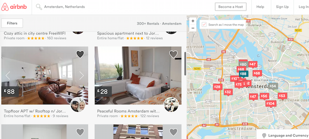
Airbnb
Aside from the success Airbnb has derived from its disruptive business model, its widespread adoption has also largely been fueled by the effortless user experience it provides on its platform.
While the website utilizes a variety of UX features, one micro-interaction that stands out for prospective renters is how price tags for previously viewed locations are automatically greyed-out, saving the user time and effort of listing options or going back to already clicked ones.

Amazon
Touted as the world’s number one e-commerce retailer, Amazon has continued to dominate the e-commerce industry. In fact, it accounts for 44 percent of all e-commerce sales in the United States, in part thanks to its easy-to-use website and app.
One of the key features its users have grown accustomed to is the ‘hover-to-zoom’ functionality of its product photos. This micro-interaction provides users a level of detail that they would only have if they were buying in a physical store.

Google Chrome
Google Chrome, Google’s web browser that has more than 1 billion active users, has taken micro UX up a notch by placing a game on their 404 page. This shows that error pages don’t have to be a source of pain.
By hitting the spacebar (or tapping on a mobile device’s screen), a user can guide a little T-Rex to successfully jump over cacti and flying birds. This helps frustrated users feel entertained while trying to troubleshoot their internet connection.

Takeaway
When used effectively, micro-interactions prove to be an invaluable tool in enhancing UX design. At the end of the day, they serve as a go-between for customers and a system that can elicit joy and provide a memorable experience, which will then encourage users to keep coming back and buying from that website.