the product
Uber Eats checkout flow
the experience
I try to be smart about how I spend my money, and Uber Eats perfectly represents all of my failures to do so. It isn’t quicker than going to pick up my food myself, and it’s certainly not cheaper, yet time and again I find myself tapping that green-on-black logo whenever I’m feeling too lazy to put on pants and go outside.
As a shameful power user, I keep a close eye out for promo codes both in and out of the app, using them to make me feel slightly less guilty about ordering Uber Eats for the fourth time this week:
- I select my nutritious, non-bacon-laden food item.
- Then I add a shocking number of appetizers because I might get peckish later.
- Satisfied, I tap View Cart to observe the damage.
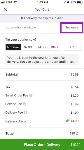
- Scrolling down to my order total, I see a line item that says 1 promotion available…See more.
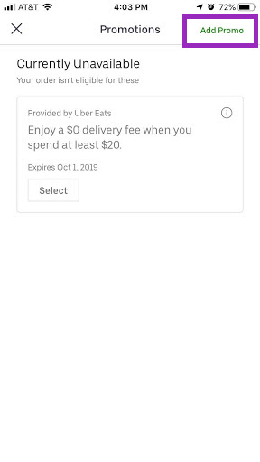
- I tap See more, which takes me to the Promotions page (naturally).
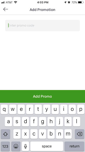
- In the upper right hand corner of the screen, I tap Add Promo, which takes me to a new screen where I can enter my promo code.

Uber Eats checkout screen, with a promotional “See more” banner at the top.

The 1 promotion available offer turns out to be a joke, but the “Add Promo” button is now visible.

Why was this so far removed from the original checkout flow?
the problem
Simply put, it’s difficult and confusing to find where I can enter my promo code. The promo code functionality is hidden behind an advertisement for the app’s promoted discounts of the day. I basically only found it by randomly tapping buttons on the checkout screen.
the solution
The functionality for adding a promo code should always be visible in any online checkout. When you’re dealing with people’s money, it’s important to be open and up front with all related information – taxes, shipping charges, and promo codes.
This is especially important for Uber Eats, which advertises promo codes heavily in its marketing efforts. Therefore, the function for adding a promo code should be its own line item that doesn’t take people away from the checkout page. Advertising promotions should occur elsewhere in the product.
the lesson
Even as a frequent user, the Uber Eats app is a bit scary. Once you hit Place Order, that’s it — there’s no going back, no changing or cancelling your order. A promo code function that feels more like an easter egg than a feature only heightens my anxiety.
Key touchpoints in a product should be clear and reassuring, especially when there are real dollars on the line. (If, heaven forbid, a product owner mandates that certain features like promo codes are hard to find because they aren’t a desired behavior, my only advice is: Stop it! Just stop it! Or, y’know, quit marketing promo codes.)
In this instance, Uber Eats failed because it strayed from its own established standards in the first half of the experience. Each button throughout my ordering process followed the same pattern: [Verb + Specific Object].
Place Order, View Cart, Add Promo — all of these perform a very specific action.
Then in the last step, we come to 1 promotion available…See more. Beyond being written unclearly, this button serves two different actions: showing the day’s promo codes and allowing users to add other codes (in yet another page).
One of the easiest ways to find this type of problem is by using what I call a breadcrumb test. Write the steps for a process out as breadcrumbs, say the steps out loud, and see if something jumps out or doesn’t make sense. For adding a promo code in Uber Eats, it would look like this:
Add to Cart > Place Order > View Cart > 1 promotion available…See more > Add Promo > [user enters promo code] > Add Promo
The promotional step jumps out immediately, which, coincidentally is the root of the problem. It breaks Uber Eats’ internal rhythm and frankly feels like a piece added to make the marketing department happy.
Here are some tips to avoid a “crumby” checkout experience:
- Don’t hide key functionality within other processes.
- Be cautious and transparent when dealing with people’s money.
- Use a breadcrumb test as a quick sanity check for workflows.