There are plenty of online courses available for anyone looking. They come from both educational institutions like Stanford and MIT, and from those looking to disrupt the education industry, like Udemy and Khan Academy. Although these efforts have all achieved a fair amount of popularity, they suffer from regular shortcomings, ranging from certifications that don’t prove their value, to lack of engagement, to lack of curricular direction.
In the design and tech industry there is an eager community of students, willing to pay and interested in learning. As a result, a number of organizations specialize in the tech industry, including the casual Treehouse, more institutionalized General Assembly, and our topic for today, Designlab.
Designlab focuses on user experience, visual design, and branding courses, and has a few big names on its advisory board. Designlab looks impressive. But rather than compare it to other online courseware, we thought we’d take a look at a simple question: how does Designlab’s UX Research & Strategy course stack up as a standalone approach to the topics it addresses? What sort of UX practitioner will benefit from it?
Take a peak at Designlab before we dive in
Below, we look at at the straight-up facts about the course, what makes it something special, where they’re working out the kinks, and ultimately, a final verdict.
Straight Facts
First, the basics. Designlab’s UX Research & Strategy covers user experience research, design thinking, and product ideation. The coursework is set up to be reviewed and completed over 4 weeks, costs $300, and demands about 40 hours of the student’s time, all in all.
Before getting started, students are encouraged (but not required) to check out the following toolset:
- Adobe Photoshop and Illustrator
- Balsamiq Mockups
- Sketch
- Keynote
- Macaw
According to Designlab, coursework is broken up as 30% reading time, 50% project time, and 20% communications.
As for structure, the course is divided into 6 “units.” Each unit comprises an introduction, some descriptions and then “Lectures,” which are separate from the main interface, and provide a distraction-free clickthrough experience. The Lectures are brief, and often link to further recommended reading or watching. The 6 units are:
- Introduction
- Empathize
- Define
- Ideate
- Prototype
- Test
This list might look familiar — the curriculum is modeled off of the Stanford design thinking methodology (also seen all over the place at IDEO’s Design Kit). For the more seasoned UXers and designers, there are probably no surprises hidden within these lectures and exercises. However, for those new to user experience research and design, this is a solid overview.
What makes Designlab stand out is their mentorships. All students are assigned a real human mentor, who reviews exercises, answers questions, and checks in on a weekly basis. Mentor meetings are built into the requirements, and count toward course completion. In addition, the course encourages students to bring their own real-world projects to work on and workshop with their mentor.
Finally, upon course completion, students are given a certificate for all their hard work. But that’s enough of the facts. Let’s jump into the the good stuff, the minor gripes, and other qualitative bits.
The Good
My overall experience in this course was positive. Although I’m an experienced UX designer, I enjoyed a few “aha” moments while working through the exercises. Designlab’s web app for the online coursework is simple but nice, and it was neat to see other students’ work in the community showcase area (but more on that later).
There were a few things that stood out, though.
The Curriculum
Make no mistake—this is certainly an introductory course, and it’s nothing novel. For students who have any project experience (agency or in-house), this course is likely not worth the cost. But for beginners, this is one of the best overview courses I’ve seen.
The folks who designed Designlab’s course very much subscribe to the Stanford D-School style of design thinking—and that’s a very good thing. By providing students with a respected and useful framework for design ideation, the course does a good job setting the stage for those “aha!” moments. It also serves as a good introduction into the field’s jargon; those new to UX will walk away from the course ready to throw down “storyboard” or “empathy map” into a conversation.
I could certainly understand any criticism that the curriculum is a mile wide and an inch deep, but the point of this work isn’t so much in the lectures—it’s in the application and exercises. And those, for the most part, are well structured. Interspersed within each of the units are “projects,” which require students to apply what they’ve just learned. Projects range from storyboards to landing page mockups to landing page testing. Once projects are completed, the student uploads the work (in various formats—there’s a lot of flexibility) and then, come time for the weekly mentor meeting, student and mentor are prepared to discuss. This process makes the course curriculum a knock-out.
The Web App
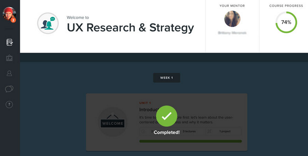
As web apps go, this is a nice app. It does what it needs to do, which is allow me to complete my coursework and submit it. The collapsible vertical navigation is usable and yet stays out of the student’s way while she works through the units. A progress wheel on the dashboard vibrantly displays the amount of work done, and what’s remaining. The mentor’s happy face is on that dashboard too, welcoming the student to ask questions, should questions arise.

I feel real, real good about those check marks.
Units are broken out by vertically stacked cards, which ensures each unit is clearly separate. When activated, the unit takes over the whole screen, further ensuring that visual distractions are a minimum.
While it’s not perfect (for example, there are surveys that pop up at the end of each and every lecture) , it’s certainly an environment conducive to learning, and one that allowed me to understand my overall position in the course. And perhaps more importantly, the bright colors, soft shadows, and plethora of icons is friendly. It just feels nice to interact with.
The (Well, My) Mentor
Still, what sets Designlab apart is their mentor program, and having been through a course, I can understand why. My mentor had no business being as patient as she was. She was fantastic. Always prompt, always firm with her requests or suggestions, and always fully present. When a pretty severe personal crisis interfered with the course (I actually was unable to finish in 4 weeks, extending the course to 6), she was thoughtful, accommodating, and understanding.
Our sessions were over Skype (though Skype can be finicky), and were scheduled to be an hour long, once a week. We’d go over the exercises I’d completed, discuss them and the choices I’d made, and just generally talked design.
The value may be self evident, but having someone available to talk through a design or an idea — this might have been what made or broke the course as a whole. The conversations really drive a need to justify decisions and choices, which is an invaluable skill and requisite in a UX professional’s day-to-day. Without having a real person to go over things with, driving things, it would have been a very different beast.
Be Forewarned
While Designlab is doing a great job with their mentorship opportunities and course offerings, there are always areas for growth and opportunity. And, to be honest, there are some things that prospective students should just know ahead of time, so that they might avoid frustration or mishap..
The Time Constraints
Students are expected to finish their Designlab coursework in a month. I’m a firm believer in deadlines, and the Designlab folks are not afraid to tell us “the design process requires a lot of time and effort.” Good on them.
And yet… while boundaries are awesome and, arguably, essential for maintaining momentum, it really turned into a primary source of stress. Yes I committed to it, and yes I was told up front it would be a lot of work. Still, most people taking a course have full time jobs (as I do) and after-work activities (guilty as well). As a result, I was left feeling guilty for having to reschedule with my mentor a number of times.
Again, this isn’t on Designlab; it’s on me. But it’s worth pointing out to prospective students—with accountability measures in place, this can certainly be a point of stress. Designlab is not as casual as other online learning tools: be prepared, and clear your schedule!
The Community
This is where Designlab has the most work ahead of them. Social pressure, interaction, obligation, etc—these are important elements in the success and efficacy of any online learning experience (and an ongoing challenge online learning environments). Designlab attempts to address this in two ways.
First, the Discussions tab; essentially a message board. A rather empty one at that, or at least it was in this particular course. It would have been really nice if students were more eager to communicate in the discussion section; I’m not convinced, however, there’s a solution to this, particularly given the amount of attention required for the actual project work. Students may not have time to contribute to the message board, which decreases the sense of community.
Next, the Explore section. This is where all students currently enrolled in the course showcase their work—which, as I mentioned earlier, was extremely valuable. Sharing is automated—there’s no opt out available. It’s like a collective portfolio. And since we’re all working on the same exercises, it’s both educational and feels supportive to be able to scroll around and see what else folks have done.
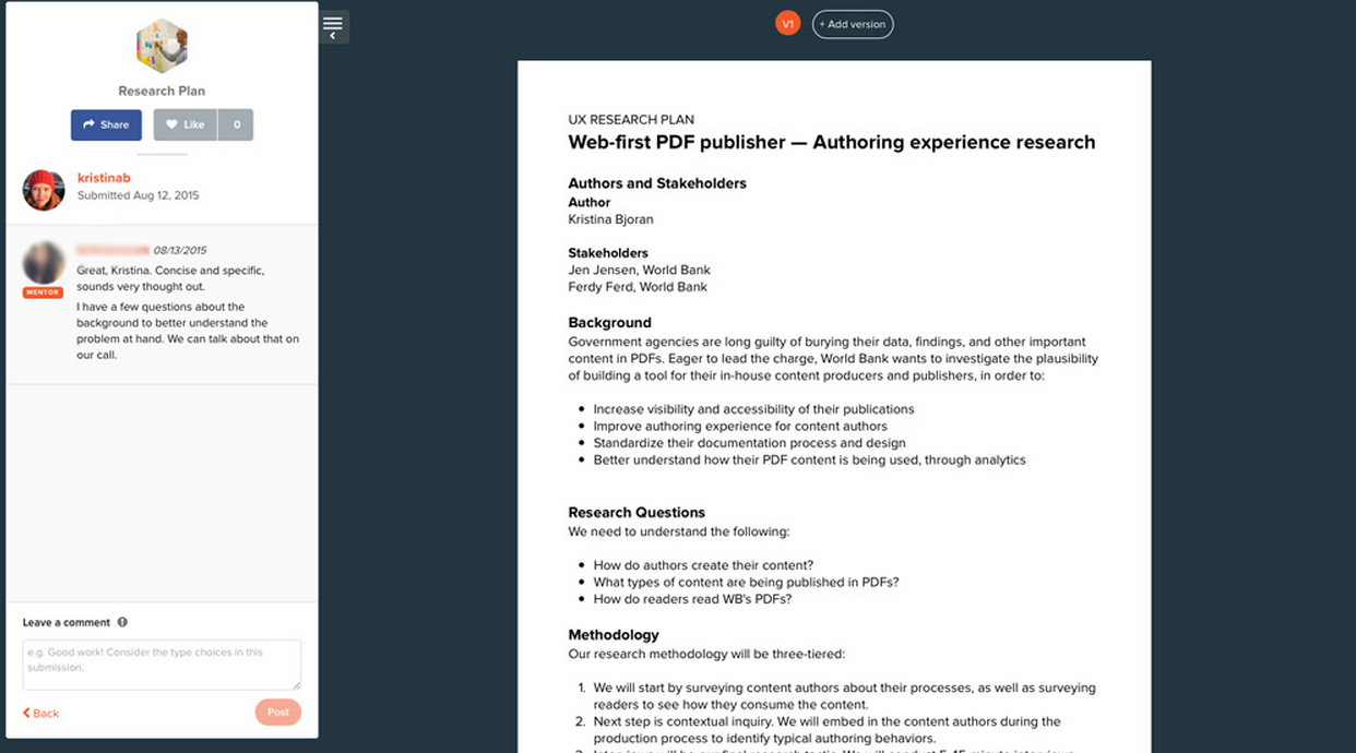
That said, it’s just not fleshed out well enough yet. For instance, I am able to see another student’s “Research Methodology” exercise, along with the comments from his mentor. I don’t mind having my critiques public, but I imagine for new designers, this might be mildly intimidating, especially because not a lot of other interaction seems to happen there.

One of my projects—A UX research plan—which everyone else in the course can see.
This feature can be improved by building more of a sense of community in the course, which as we’ve noted, is tough to do. That’s not for want of trying though; Harish, one of the cofounders of Designlab, actively posts in the Discussion section, even though there’s not a lot of response.
Granted, this stuff is tough to get right, and I’m not convinced anyone has done it yet. They’re trying, and given their product so far, I have high hopes.
The Final Verdict
Designlab provides a solid learning tool, with a vetted curriculum, and a 1-on-1 element missing in many other online learning platforms. The UX Research & Strategy course in particular is good for those who are new to user experience and design thinking. The course teaches a well respected methodology, and does so without getting too weighed down in the philosophy, which can scare away the greener folks.
The value is clear:
- As an experienced designer, I had new moments of insight when working on old concepts, like playing with “How Might We” statements—questions that guide the quest for solutions based on insights gained in research—for the first time in ages. Awesome.
- Mentors are invaluable. My mentor in particular—once again—she rocked.
- Though it’s rocky at the moment, I applaud Designlab’s efforts in starting community interaction. It is really, really tough, and I imagine with time they’ll be going strong.
- I’m left wondering how the other courses are, which is a good sign!
For confident, disciplined self learners there are plenty of free alternatives to this Designlab course out there. But anyone looking for a directed learning experience and some 1-on-1 time with a UX professional should definitely give this course a shot.