Welcome to our UX101 series on building user experience artifacts. These in-depth articles are intentionally crafted with beginners in mind. Each is accompanied by a custom-built deep-dive email series that we encourage you to sign up for if you’re interested in step-by-step directions on how to create your own UX artifacts.
In user experience, the user journey (sometimes known as a customer journey or the process of journey mapping) is the visualization of how real humans perceive and interact with your organization. This document or diagram shows key interactions a person can have with your brand or product, from the user’s perspective.
What: Behavior Mapping
A user journey shows the highest level of movement across a brand’s properties and presence, the common paths people take as they encounter the brand. They can be aspirational: the paths a brand would rather see users take. Or they can be data-driven: the paths a user converts from most often or abandons from most often.
Imagine an ant farm when building user journeys: picture all the ways and places a person could experience or interact with your brand. Now contain them all in one box, and start drawing lines through them in the order that person might encounter your brand. It’s essentially pressing your nose to the glass of an ant farm, tracing the pathways the ants have built, and trying to determine the use cases for each.
User journeys are broader and more general than user flows. User flows could very well be called task flows instead, since they map the steps a person takes to complete one specific task within a website, app, or process. User journeys, on the other hand, are an aggregated look at the paths leading people to the brand, the tasks they accomplish, and their follow-up paths.
A user journey is often depicted in a flow diagram, but can be shared in a written format or even sketched on a whiteboard for quick context. User journeys apply to online and offline brand presence, whether it’s a website, application, phone process, in-store walk through, or even a life experience like taking a plane cross-country or having dinner in a restaurant. The journey map can depict stories from new users, returning customers, or even partners, vendors, and third parties.
Learn User Journeys in Three Weeks
Ready to get started? Our 3-week email course will guide you through each step. You’ll receive one how-to email each week and our weekly newsletter that features a roundup of the best UX articles. We never share your information and you may unsubscribe at any time.
Why: Providing Context
But why bother with a user journey in the first place?
A user journey stitches together all the departments or teams behind a brand and helps provide a cohesive picture of that brand as it exists externally to consumers. User journeys can help highlight the entire scope of a brand’s potential experience. This level of context is vital for identifying where users come from, where they go, how they get there, and what pieces of the experience they are routinely missing.
User journey pathing information often informs key details of an experience; the map can
- highlight breaks in site structure or information trails
- suggest opportunities for new content and page creation
- identify gaps in branding and marketing consistency
- show slow-downs and disconnects in customer service responses
- or surface friction in an overlooked step of a process
Rather than making assumptions about how users interact with a site or brand, a user journey map gives teams a visual trail to inform assumptions and correctly identify opportunities. Imagine, too, how many website pages have been created in the name of “better content” or “a richer experience” that might already exist — users just need to be nudged in a different direction to discover them.
Where and Who: In the Beginning
User journeys generally fall in the research phase of any project, whether it’s a new brand or experience, or an audit of an existing brand, or an overhaul of an old process. Customer personas, competitive research, and a sitemap are about the only things that are vital before a user journey can be drafted. However, in legacy brands, any kind of data available on the user experience can be added to the map to help deepen teams’ understanding of what’s actually going on.
User journeys are most often the responsibility of the UX team or the user research team or the optimization team or the team closest to the “people data” – data teams that can help track users through an experience from end to end. Often when these teams are small or new, user journeys fall to content strategy, the next team closest to a user’s needs and pathways. It’s not often that a content strategist has the depth of data and wealth of time to research the way a UX expert would, but that doesn’t detract value from journey mapping – even the highest level attempt to piece together a user’s experience and resolve any barriers is good for users. And what’s good for users is good for business.
How: Gathering Data
The best prescription for a user journey map is one that works for the organization building it and one that is honest. A sound user journey map should highlight entry points, pathways, end points, and any barriers or friction within that process. Teams can also dig up data on a customer’s time-to-task, completion rates, customer service phone call needs, and so on.
Start by collecting any existing customer personas, competitive research, and the sitemap. Review and update these artifacts as needed, then tie them loosely into the sitemap. This step can be as simple as handwriting in which personas respond best to which pages. Identifying pages that don’t have persona matches, or that don’t appear to carry much value helps outline where to start the next several steps.
To build a new user journey map, gather user data from Google Analytics and heatmapping tools, or user research if the quantitative data isn’t available. Look for data around entry points, user paths through the site or process, barriers (like high bounce rates or aggravated click patterns), traffic sources, and exit points. Record your findings and start highlighting patterns.
Record your findings page-by-page and at a mile-high view – this can be done in columns and rows or in flowcharts. I like to start with a whiteboard or paper draft, which leaves room for identifying data gaps or fuzzy parts of the experience. When the team is clear on where users come in, where they go, and what barriers are in their way, start building out the full journey map.
Learn User Journeys in Three Weeks
Ready to get started? Our 3-week email course will guide you through each step. You’ll receive one how-to email each week and our weekly newsletter that features a roundup of the best UX articles. We never share your information and you may unsubscribe at any time.
Examples from the Web
While user journeys can range in complexity from a quick sketch of emojis to a seven-level, data-driven visual analysis, remember that user journeys are only as useful as the information they convey. If a team is interested in reducing friction across a website experience, they may not need to go into the deepest levels of data available – a step by step analysis of how a user is feeling through the experience may be enough.
Here are some examples of user journeys from around the web, starting with the simplest:
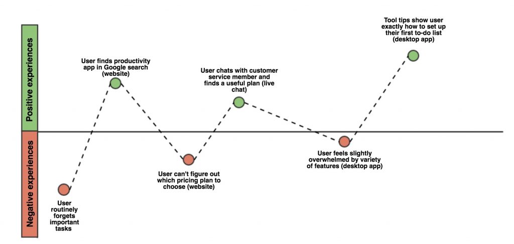
This map is helpful in that it quickly shows positive and negative feelings and the ease of key steps as relative to each other.
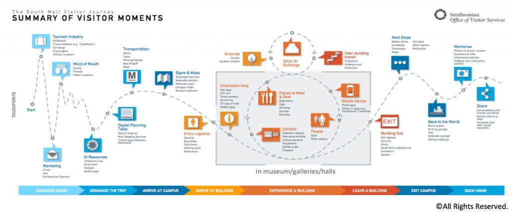
This user journey map from the Smithsonian is a simple walkthrough of a person’s experience with a museum, but adds an extra layer with the conversion steps highlighted below the map.
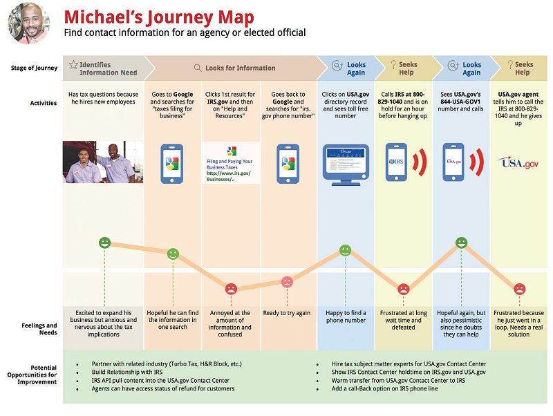
The customer journey map of Michael’s experience with a government website is a good example of layering invaluable information. In a single image, the designer expertly conveyed the number of steps to task completion, what device he was using, how the experience felt to him at each step, and opportunities for improvement.
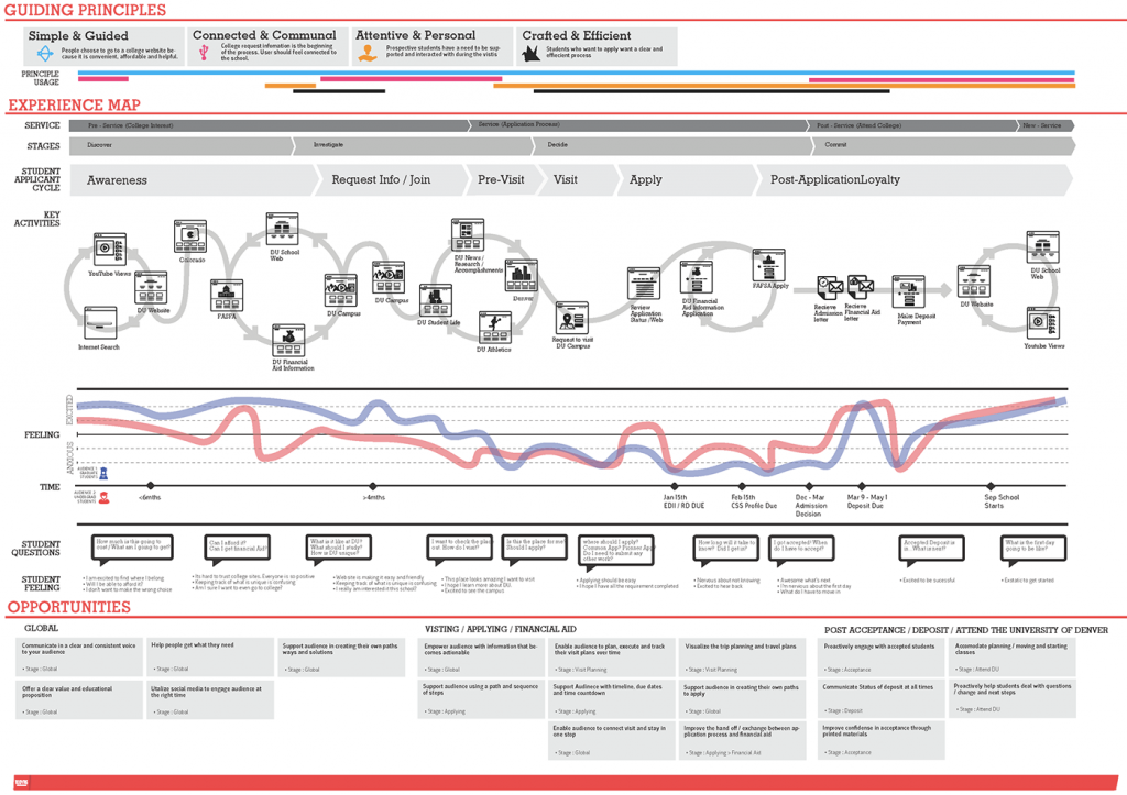
On the complex end of the spectrum, user journeys like this college experience map can contain many layers of information. The usability of a map like this, though, is much lower – viewers have to work very hard to parse the information being presented, and then continue to work to identify barriers or opportunities to improve the process.
[Note: While “Opportunities” are called out at the bottom, the map itself does not immediately help surface these opportunities through color or visual cues, which limits a team’s feeling of participation — if everything needs to go through a translator before it’s useful, this user journey map may actually be harming the optimization process.]
Building Your Own Map
And now comes the fun part: diagramming!
A note: A common discovery in this research process is there are more than one journey maps that need to be created (new user, returning customer, etc.) That’s great! Try to start with the most common and most obviously broken parts first.
A second note: I recommend whiteboarding this a couple times before committing to software. I prefer Lucidchart, but tools like draw.io and Gliffy work well, too. Design tools like Sketch and InDesign are also options, and I believe InVision (the prototyping tool) now offers wireframing functionality that could be useful in journey diagramming. There are also services like UXPressia that have templated and customizable user journeys to start from.
Draw. Note down each of the major steps a user takes to interact with your brand, maybe starting from responding to an ad campaign, all the way through the final touchpoint you discovered in your research.
Layer. In context to each major step, fill in common entry points, common exit points, barriers or areas of friction, device, user sentiment, time to task, and the other pieces you’ve uncovered in all that research that help color the kind of experience people are having with your brand.
Iterate. This is the hardest step – pulling out the key experiences and most common feelings in a way that will make sense to anyone looking at the map. Maybe step away and get a coffee, and come back to it in a couple hours.
Gut check. Have a colleague who isn’t completely familiar with what you’ve been doing look at the whiteboard with you. See if it makes sense to them. See if they can start thinking about solutions from the data you’re displaying.
Commit. Write that monster down! Put it in digital form in whatever way makes sense for you and your teams.
Find solutions. Drag a couple more people in and start fixing the problems your user journey map has highlighted.
Next Steps: Sharing with Stakeholders
Remember, no matter who views the user journey map, they should be able to readily see entry points, pathways, end points, and any barriers or points of friction. User sentiment, devices, time to task, and deeper details can also help color the path any one user is taking through an organization’s experience. The end goal of a user journey exercise is to highlight places a team can improve the experience, raise customer sentiment, or reduce steps to task completion.