In video games, the user interface (UI) is everything. It helps foster an experience that looks and behaves in a convincing way and keeps players immersed in the game. Over the years, games have continued to innovate in their approach to UI, experimenting and iterating on how they present vital information to users without breaking their belief in the experience.
Well before I started working in UX, I knew all about UI because I was used to reading about it in game reviews. And although most web and software designers would argue that their product is the furthest thing from a video game, there is still much to learn about UI design from video games.
Learn User Journeys in Three Weeks
Ready to get started? Our 3-week email course will guide you through each step. You’ll receive one how-to email each week and our weekly newsletter that features a roundup of the best UX articles. We never share your information and you may unsubscribe at any time.
Why Video Game Designers Are Obsessed with UI
UI is an essential part of any video game. Game designers need to balance how they display information in a way that moves the player forward, but doesn’t disrupt the game – too little can leave players confused while too much can overwhelm or frustrate them.
From ammo counters in first person shooters to health bars in fighting games, the way games display information is essential to how players play the game. In Call of Duty titles, for example, if a player takes too much damage, the edges of their screen become bloodstained as the player’s character pants in pain. Other games typically display a health bar for players either at the top or bottom of the screen, but Call of Duty’s approach lets players remain focused on everything else going on around them, which adds to the frenetic nature of the game.

While most websites feature very similar user interfaces — navigation menus, search bars, breadcrumbs — video games distinguish themselves by creating UI elements that truly serve their users.
“Good design, when it’s done well, becomes invisible. It’s only when it’s done poorly that we notice it.”-Jared Spool
Let’s look at three key ways video game designers are shaping UI trends and how they might be used for web experiences.
Menus
Many video games require players to conduct a variety of actions (like maintaining their in-game inventory or upgrading their character) through menus. However, instead of simple lists or folders, game designers take pride in crafting unique experiences in their menus.
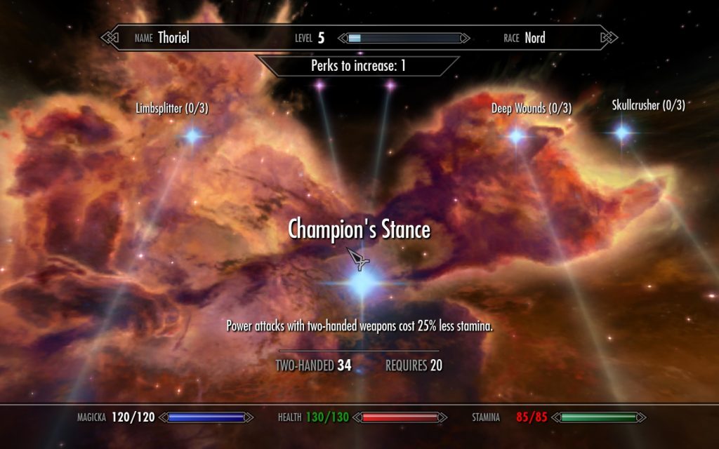
In some role-playing games, players can upgrade their characters through a skill tree, which allows them to follow one or more “branches” to build their character in a certain way. While this is a common gaming mechanic often displayed as lines connecting skills, in Skyrim, designers opted to display the tree as constellations to match the fantasy theme of the game. When opening their skill tree, the player character literally looks up to the sky, lending further immersion to the gameplay. While the function of the skill tree remains unchanged from any other game, the elegant approach to opening and using it is just one of many details that made Skyrim stand out from other games.

Points of Interest
Just as a marketing website may want to grab a user’s attention with a call to action (CTA) button, game developers often try to grab a player’s attention with points of interest. A healthkit lying on the ground is of no use to a player if they don’t notice it.
Take for example The Legend of Zelda: Breath of the Wild, an immersive, open-world game in which the player can engage in countless activities – like hunting, cooking, and taming wild horses. Frogs, an essential ingredient in certain recipes, are easy to miss in the wild unless you’re looking for them; if you focus on a frog, the type of frog will display above it as a small line of text.

If frogs in the game were too easy to spot, it would pull players out of the world. If they were too difficult to spot, they wouldn’t be fun to hunt. If you had to click on it to see more details, it would quickly become tedious. Immersion in Breath of the Wild is dependent on the UI to be there when you need it and gone when you don’t.
Simplifying with Customization
Some video games make even the most complex software look simple by comparison. Instead of trying to create a comprehensive solution that suits everyone, game designers sometimes opt to hand the UI over to their players.
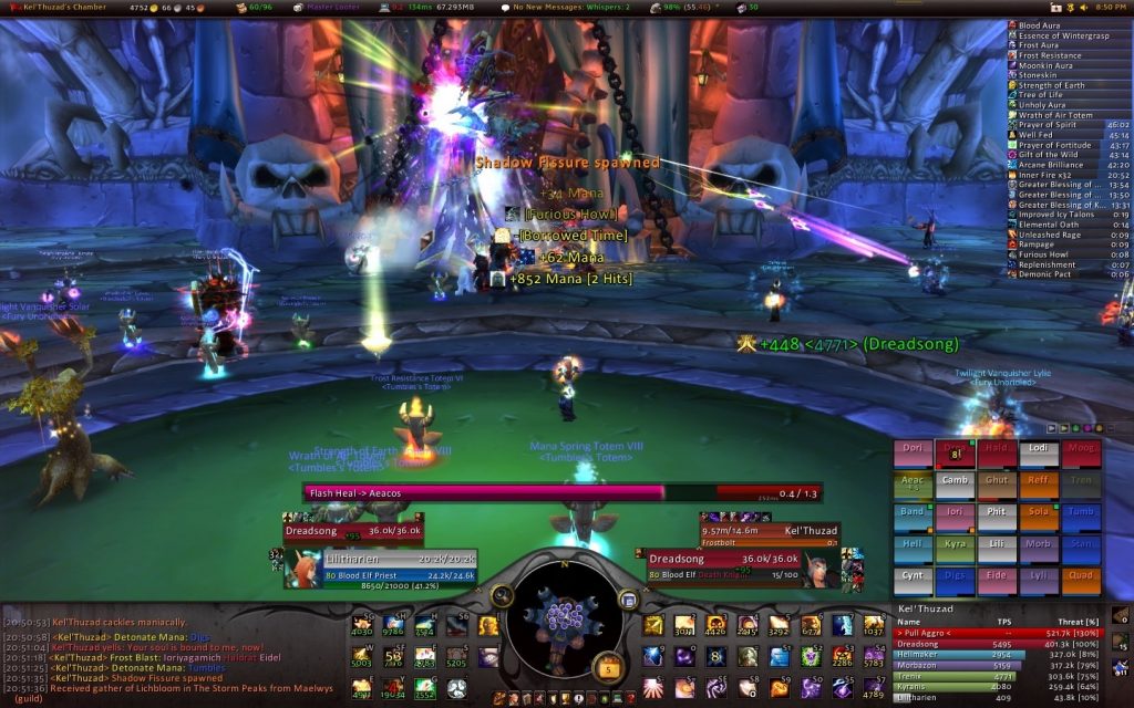
In World of Warcraft, user interface customization is an essential part of the game due to its incredible depth and complexity. Players can add a slew of modifications to help them manage the hundreds of things they can do in the game, and the game’s developer encourages and empowers them to do so. Many other complicated games feature similar customizability, which allows players to display information in the way that makes the most sense to them.

What UI Designers Can Learn from Video Games
Web and software designers can learn much from the innovative nature of video game UIs by asking themselves a variety of questions when designing their UI.
Does this UI truly represent our product? Or just an industry standard?
Whether you’re helping users find their way or pushing them in a certain direction, you should always be considering whether your UI truly represents your product.
When the hamburger menu reemerged in 2009, it quickly became the gold standard for minimalist, mobile-friendly design. Yet, now as it faces criticism for its awkward UX, certain products have found menus that better suit their product. Soundcloud for instance, takes the familiar hamburger menu design, flips it on its side, and tilts one bar – you can almost see a stack of records or CDs. This is perfect for where this icon takes you: your collection, where you’ll find liked tracks, playlists, and recently played songs. Almost like all your records stacked on a shelf.

Are there better ways to call attention to points of interest we want users to notice?
Go beyond coloring and placement for your CTAs and ask yourself if there are other UI elements you can use to call out points of interest.
GoDaddy.com features a traditional, front and center CTA button, which makes sense because they want to appeal to a wide audience. But for someone who may not be ready to “Start for Free,” the other place your eyes naturally go is up to the friendly placeholder message in the search bar, which tells people they can simply search for a domain name they may want. What’s more, the search delivers — offering clear results and pricing so users will remember GoDaddy is somewhere they can quickly search domain names.

Are there issues with our UI that could be solved by offering user customization?
Never forget that everyone uses your product differently. Instead of trying to design a one-size-fits-all UI, allowing users to customize the way they use your product’s features can be the best UX.
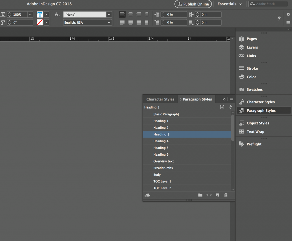
Adobe products are famous for their variety of use cases and are well-versed in customizable UIs. InDesign is a great example. A publishing software with vast functionality, InDesign lets users organize function shortcuts in their sidebar and group similar shortcuts together. Once you have a function open, you can simply drag it into either a sidebar or group, and your sidebar quickly and easily becomes personal.

Gamers Love UIs – Your Users Should Too
It’s not uncommon to see game reviews, forum posts, and even marketing materials discussing the user interface of a video game. As the main way you navigate a game, and something you’re staring at for hours, a game’s UI is essential to its function.
Great UIs can help users not simply use a product, but enjoy it. Typically, websites and software are designed to help someone accomplish a task – games are designed to get someone to come back for more. The gaming industry’s decades-long fixation on user-friendly interfaces has made it a breeding ground for innovative UI that offers many lessons to those willing to learn. And if nothing else, now you have an excuse to play video games “for work.”