Have you heard “mobile first” recently? It was a buzzword, back… six or seven years ago. And now it’s coming around again, almost like we’ve been through a full wash and rinse cycle with design theories – mobile first to responsive web design, and now back to mobile first. But that can’t be right.
With all the immense change we’ve seen in mobile technologies, I don’t believe we’ve returned to “mobile first” design. Rather, when you hear that buzzword today, it’s a misnomer for a new phase in the philosophy of mobile design. Something I prefer to call user first design.
Let’s unravel how mobile design theory has evolved, consider each movement in the context of its time, and how we can move towards user first design.
A brief history of mobile design theory
Mobile first design
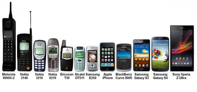
Given how ubiquitous and essential smartphones are today, it’s hard to remember how futuristic they seemed just a decade ago. It was a time where tiny flip phones screens were common and users didn’t expect fast, full, and unfettered access to the web. I mean, remember dial-up?! In the mobile phone world of 2007, even Steve Jobs was excited – calling this shiny, flat brick a “revolutionary and magical product.”
By 2009, smart phones were just creeping out of the “novelty” phase, but hadn’t yet eclipsed flip phones. And then Luke Wroblewski gave his talk on mobile first design. Essentially, Luke suggested that designers should design for the tiniest screen size available, with the intention of adding more detailed experiences for larger screen sizes. The concept may seem simple, but it was revolutionary. Luke codified what designers and developers were beginning to experience: users now had access to wildly different sized devices. How were they to morph the site’s content to accommodate everything from little pocket screens up to desktops?
As time went by, this problem of scale became more and more apparent. In April of 2013, smartphones reached a tipping point: sales hit record highs and flip phones had lost all hope of ever catching up. While this was interesting to stock market hawks, it was revolutionary to the average mobile phone user. The internet was suddenly accessible to them from a multitude of screens. What Luke observed in 2009 was gaining traction. Website owners, marketers, and agencies saw people visiting their websites from different-sized portals and that their predetermined, fixed width designs were broken and unusable on these smaller screens. Luke’s recommendation of a mobile first design approach to website building was taking off.

Photo from Neil Hughes.
Responsive design
How did designers and developers tackle the “many-sized screens, one website” problem? One option was building mobile-only sites—the famous m.website.com. While this provided a different experience from desktop to mobile for return visitors, it was a pretty good stop-gap. But it was a nightmare to maintain. Imagine having to create and serve a wide variety of weirdly sized versions of your website, or host and maintain two totally different versions. Pretty soon, mobile-only sites were falling out of compliance or rarely getting the updates their desktop partners were seeing. And web development teams were strapped under not just the daily load of code building, but also having to build for what felt like multiple versions of the same site. It wasn’t tenable.
In March 2010, Ethan Marcotte introduced us to a new methodology: responsive design (though it’s worth noting that the concept has been around since 2007). Responsive web design (RWD) operates on a desktop-to-mobile principle, taking all the chunks or pieces of a desktop-sized webpage and essentially rearranging them to stack neatly in a mobile viewport. Developers only had to set breakpoints where screen sizes changed and tell each chunk where to go to get a responsive design. No more “visit desktop site” on your pocket-sized computer phone.

Gif by Karol Podleśny
This was a genius solution: only one code base to maintain and the same experience for users regardless of what device they were using. But much like mobile first design, RWD had some drawbacks. Namely, how do you fit a desktop’s worth of content onto a mobile screen? As we saw the growth of content strategy, mobile sites were becoming cumbersome – users had to eternally scroll to find relevant information. Taking an entire desktop website and transmogrifying it to fit on a tiny screen just wasn’t the right solution for a content-rich site.
User first design
In 2015, Google announced they’d hit a tipping point: more searchers accessed their site from a mobile phone than from a desktop device. The search giant began pushing tweaks to their algorithms that favored “good” mobile experiences and mobile traffic rankings over those of desktop or laptop. And in 2016, they offered their list of 25 tips for making your mobile experience a better one for users.
Since this announcement, people have returned to Team Mobile First Design. But I think we’re missing a key point: Google isn’t just recommending mobile first. Yes, they are re-gearing their search index to be mobile first, but with an eye towards tailoring the experience to the user’s needs. This is something new; it’s user first.
A shift towards context
Building a mobile friendly site isn’t just done by breaking the site into tiny pieces that rearrange nicely on a small screen. User first requires a shift in thinking. We need to start by thinking about a user’s context and how to meet their immediate needs on the device or platform that is readily available at that time. Essentially, as designers and developers, we should make the most of the context clues available and give the user our best guess of what they need, when they need it.
A driving force behind user first design is something called micro-moments (Google keeps mentioning it). The idea is that while people use their phones for a number of things, mobile search is fantastic for on the spot, quick reference – your dentist’s phone number or address, for example. These micro-moments are intent-heavy; users want information quickly, so that they can buy, learn, see, show, or find. In this interaction, they’re not lazily browsing Facebook or playing games, they’re trying to accomplish a goal. They expect quick and accurate information, with a high quality experience. Remember the fiasco when Apple Maps first launched? That was the complete opposite of a successful micro-moment.
With ease of use, brand loyalty seems to be going out the window. (How many iPhone users prefer Google Maps or Waze?) Mobile users don’t care if you are the sole authority on your product or subject. If your answer or site doesn’t come up first on mobile search, it’s not valuable. The first to answer or fulfill a need wins. And Google is boosting the sites that are quickest to answer users’ needs.
Putting it into practice
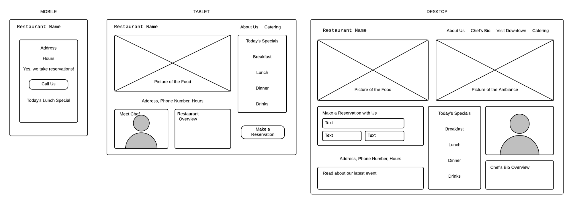
So, how can a team implement user first design well? Here is my favorite example (ask my team how often I whiteboard it as an illustration of this context shift):

This is an image caption.
You own a restaurant and are building your website. From a mobile device, what are the handful of things a person will need to see? They’re probably in their car, on the way to your establishment, and need hours, the address, and a phone number (or a click-to-call button since it is a mobile phone).
On a tablet, they have more space and probably time to explore—provide a feel for the ambiance, a feel for the menu, the ability to make a reservation, and details of interest.
On desktop, where you have all the real estate to work with, provide pictures, bios, blog posts with photos of the most recent event hosted at your restaurant. Provide seasonal menus with local vendors and suppliers. Offer catering options, details on the party rooms, and so on.
I’m not advocating for a lesser experience on the mobile device than what you would find on a desktop site. We need to build for where a user is and for their specific needs at that time. By all means, add catering information in the drop-out menu. But on a mobile device, time is of the essence. Don’t cost your site visitor precious time by making them search for answers to their questions.
Know your users
All this context and mobile first talk comes back to a central tenet of web development: know your users. Just like Aristotle taught in his rhetoric lessons, your audience still dictates your presentation.
In Google Analytics, we can see everything from device type and operating system to which page a user visited first on our website. This information provides a scent trail of desirable information—it’s our job to surface that trail and get users onto it more quickly, helping them achieve their goals more easily.
A great example that came up recently is the healthcare industry. Marli Mesibov and Jason Levin explain that in the healthcare industry, 50% of smartphone users download healthcare apps. But that means that 50% do not. How are we designing for half the population that prefers to use a desktop- or tablet-based browser to access their healthcare information? Suddenly, for them, the mobile first conversation isn’t very relevant. Marli’s recommendation, journey-driven design, is very similar to what I am calling user first design.
Where we go from here
Design and technology will always be learning from and pushing again what came before. Mobile first design and responsive web design aren’t opposite forces, but rather steps along the way. I think Google has it right: a mobile-heavy focus with the underlying intent of providing the best experience possible for users. Users are still the heart and key to how we build—and they always will be.
Research your users. Know their needs, wants, patterns, and barriers to success. Then assess your team’s abilities and build a site that you can maintain. It’s not the theory of web design you subscribe to that matters—it’s the user-centered details. From site load times to menu options and interactive elements—everything on a site depends on that site’s users. Build the experience, not the technology. There’s no wrong answer here, as long as your users are getting the best experience, when they need it, and getting their answers fast.
Additional resources:
- Google’s Mobile-Friendly Test
- How to Create a Better Mobile User Experience
- Ethan Marcotte’s original article on Responsive Web Design
- Luke Wroblewski’s original presentations on Mobile First
- UX Myth’s Guide to Knowing Your Users (and UX)
Ready to get your feet wet in Interaction Design? In this article we touch briefly on all aspects of Interaction Design: the deliverables, guiding principles, noted designers, their tools and more. Even if you're an interaction designer yourself, give the article a read and share your thoughts.