User-centered designers aren’t just professional learners; they’re teachers, too. Our job is to reflect what we know while adopting the language of our end-users. This changes our team’s perspective which, in turn, affects its ability to solve design problems. Four ways that I’ve found effective to that end include: learning, brainstorming, (shifts in) perspective, and momentum.
When I was 11, my mother petitioned the local school board to advance my twin brother and me two numbered grades – sixth to eighth – in the middle of the school year. After months of discussion and debate, the board eventually acquiesced. One week we studied with our usual cohort and the next we were thrust into an environment wholly unfamiliar to us.

History and English were the easiest to “get:” they were essentially classes in rote memorization. Science proved more difficult. Our eighth grade teachers introduced us to biology, geology, and chemistry. Hard sciences, indeed.
Mathematics was most the formidable, though. In my sixth-grade Arithmetics class, we reduced fractions and solved elementary functions. In Algebra, we sought answers.
Learning
I joined my eighth grade classmates at the precise moment when our Algebra teacher introduced Linear Equations. With it, we met a number of different concepts:

- Cause and effect. In Algebra, X and Y were “variables” that could be related by something called a “function.” Any change in X resulted in a change in Y.
- Change over time. The mathematical unit for change was called “slope” or “rise over run.”
- Line graphs. Graphs facilitated spatial reasoning and reminded me of the old adage about a picture’s worth.
I’ll be honest: Algebra was really difficult for me. Not only because it was part of the “advanced” math program at my school (adding insult to injury) – it was an entirely new way of looking at the world. Variables? Functions? Change? I lost a lot of sleep.

As a class project, students were asked to prepare a “book of linear equations.” The idea was that, in creating and presenting their various books to the class, students would become better acquainted with the material it contained. It was a concept I was quite familiar with after several years of public schooling. The strange thing is this time it actually worked. After interpreting the material in my own words, I better understood what Linear Equations – what Algebra – was all about.
Learning is, almost by definition, a humbling experience. When we learn, we admit to ourselves that we aren’t “right” and that we don’t comprehend something as well as we could. Learning can apply to social systems (a.k.a “groups of people united with a purpose,” a.k.a your team), too. However, unlike conferences or classrooms – where people come together in order to learn – learning in the context of a social system can have unexpected consequences. Political scientist and thinker Donald Schon explains these in his book Beyond the Stable State:
The power of social systems over individuals becomes understandable, I think, only if we see that social systems provide for their members not only sources of livelihood, protection against outside threat and the promise of economic security, but a framework of theory, values, and related technology which enables individuals to make sense of their lives. Threats to the social system threaten this framework.
Donald Schon, Beyond the Stable State
Anything that challenges the values of a social system – teaching, for example – can incite what Schon calls dynamic conservatism. In other words, it’s difficult to get groups of people to change their mind.
If my entire undergraduate career in Mathematics taught me one thing, it was that although change is easy to model, it’s incredibly difficult to affect. Numbers are a great tool for modelling things, for measurement, but they tell us nothing about the ways in which (groups of) people think or act, nothing about how we might change their frame of mind.
Brainstorming
But things are always in flux, right? Time inevitably passes so that the only constant we have is change. Design is simply the actions we take in preparation for change.
Brainstorming is a creative exercise that encourages people to suspend their judgement in order to conjure up solutions to a particular problem. It’s a technique often employed throughout a design project that bears much in common with improvisational theatre.

Say you’re Wufoo; you’ve got over 11 links in your header. During a brainstorming session, someone on your team suggests removing the Blog link. This person explains that users of Wufoo click the footer’s Blog link five-times-more often than the header’s. While it’s easy to see the fruits of this kind of labor – if you remove a link, it’ll make things cleaner – it’s what you don’t see, the assumptions guiding the exercise, that are arguably more important.
It’s quite possible, for example, that your team ignores a fundamentally better design. This happens because of what an ex-colleague of mine calls “being pickled in the brine.” After months and months of working together, team members form shared value systems. They see the world through the eyes of their peers so often that the suggestions they make today are not only informed by the suggestions their team made yesterday; they’re valued against them. If someone’s unspoken proposal seems superfluous when valued against the shared value system in which they reside, they’ll often (subconsciously) stifle it.
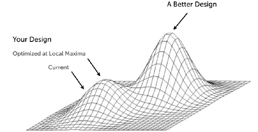
It’s an oft-misunderstood dynamic. While brainstorming provides a perceived “freedom of choice” to its participants, it’s likely not the same breadth of choice visible to someone outside of the system. This simple fact makes consulting possible.
In order to yield a better design, user-centered designers must facilitate new, shared experiences that form the basis of new value systems.
Perspectives
Artifacts of design carry with them an amazing capacity to impact the way we think and reason. Inventions such as Facebook, Twitter and Google – and, before them, Television, Radio, and Print – provided new ways for us to communicate with one another and, as a consequence, new ways to see the world. This might seem obvious, but that’s only because value systems are difficult to unlearn. For those of us who’ve grown up accustomed to modern communication technology, it’s difficult to imagine a time before these technologies existed.
Despite this, author James Gleick attempts to do so. In his latest book, The Information, Gleick tells the story of the human race as it’s adopted and adapted new communication technologies. Regarding the invention of writing Gleick says:
In our world of ingrained literacy, thinking and writing seem scarcely related activities. We can imagine the latter depending on the former, but surely not the other way around: everyone thinks, whether or not they write. But Havelock was right. The written word – the persistent word – was a prerequisite for conscious thought as we understand it.
James Gleick, The Information
This is an important point: before writing, thoughts could only be verbalized if they were to be shared. The invention of writing afforded us a prodigious capacity to capture and document; to share and scrutinize not only own own ideas, but the ideas of others as well. Things that aren’t documented – say a hallway meeting or a Skype chat – lack weight if they aren’t written down. It’s the same reason why my Algebra teacher asked us to create a book of Linear Equations: to facilitate conscious thought.
I began work with a startup early last year on a particularly thorny design problem. Before hiring nGen Works, their team had collaboratively designed and developed two different approaches to their application over the course of nearly 18 months. None of them worked. Carl Smith discussed the project at length with the stakeholders and, having decided that they had the capacity to learn, we agreed to work together.
In the usual user-centered design way, I began the project by listening. What expectations did everyone on the team have? What’s considered valuable? or not-so-valuable? Every time I had a conversation with a member of the team, I added it to an ongoing project journal:
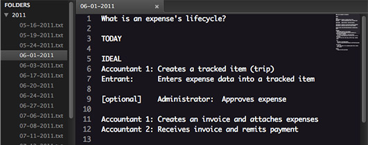
For the first month of the project, I took 45 minutes each Friday to review what was said, what was implied, and where the team thought the project was going. What I learned was this:
- Everyone had different assumptions.
- Everyone had different priorities.
- Everyone had a different idea of what we were building.
The first two issues were easily remedied: more communication (more of the same) would shed light on people’s assumptions and motivations. But the third? How could everyone have a different idea of the system being built, especially after 18 months? I began work on a concept map (something different) that pieced everything together:
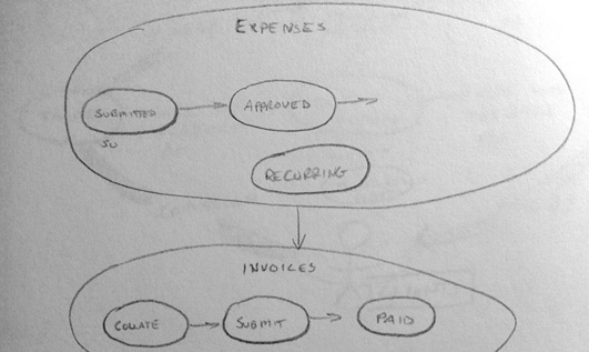
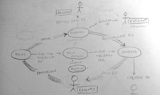
It evolved over time into this:
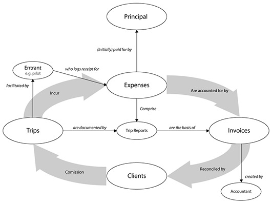
I claim no talent as an illustrator and, thankfully, aesthetic appeal is not the point. Concept maps facilitate visual thinking. After presenting this diagram to the team, we began a new kind of conversation about the models behind the system, how things fit together, and what individual screens of the application really meant in concert with one another. This wasn’t the first time a diagram has helped me clarify things: a line graph was infinitely more intuitive to me than a pair of variables for learning linear equations, for example.
As user-centered designers, it’s our responsibility to constantly learn, assess, and represent (literally re-present) the context in which we’re designing.
At their core, designers are learners as well as teachers. The design process, for example, is something that’s been intensely scrutinized by designers in our field. We learn from ourselves. We’ve given a ton of thought to the various ways in which we collect and present data, and call them by a whole host of names:
- Stakeholder Interview
- Experiential Themes
- User Story
- Usability Testing
- Analytics
- Remote Research
- Persona
- Content Survey
- Sitemap
- Page Description Diagram
- Card Sort
- Design Dictionary
- Mental Model
- User Flow
- Quick-hit List
- Design Lab
- Wireframes
- User Flows
- Storyboards
- Prototypes
- Photoshop comps
The goal of any of these activities or documents is to facilitate shared understanding: to clarify the solution to a design problem. But many people – especially clients who are new to the world of design – don’t understand how everything fits together. What good is our process if we can’t explain it in a way our clients will understand? To that end, I worked with my friend David Leggett to prototype an online documentation system:
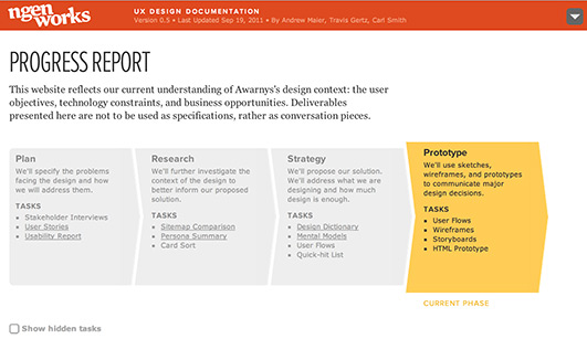
The best part is there’s no boilerplate material here when it comes to “deliverables;” each bucket of deliverables is uniquely tailored to a client’s project. Further, each deliverable is linked to others in a way that helps clients see their relationships with one another. This is much more intuitive than, say, a 36-page PDF that presents deliverables in a linear fashion.
If a user is looking at a mental model:
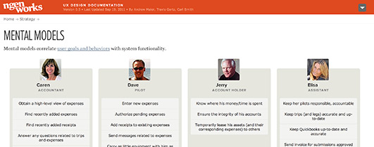
and clicks one of the user personas at the top:
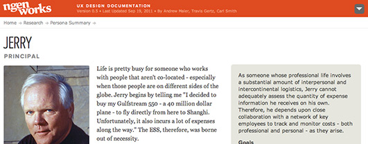
They’re taken to a screen that helps them better understand that user’s context. To practitioners, this web-based version of deliverables may seem redundant. To clients, it can be much more self-evident. Regardless of how you communicate with your team it’s essential that you do so – with both regularity and variety.
Momentum
All projects have momentum, the rate at which they progress an idea. In classical mechanics, linear momentum is defined as:
p = m × v
Where p is momentum, m is mass, and v is velocity. I’d like to suggest that this definition can also apply to a creative endeavor. In the world of bits, mass is meaning. As the saying goes, “ideas carry weight.” Because developers call the-rate-of-speed-with-which-they-develop code their code velocity, a project’s momentum could be thought of as the product of its core idea(s) and the team’s code velocity.
Technical definitions aside, if a project “has” momentum, its team works well. A shared set of values pervade every decision. Conversely, if a project lacks momentum, either it’s being coded slowly or the idea(s) behind that project are in flux (or worse, both). Because clients pay for forward momentum, it’s critical that designers help determine the weight of ideas. To that end I recommend a combination of techniques I’ve discussed throughout this article: discovery, documentation, naming things, and availability. Let’s look at each.
Discovery
Not everyone appreciates healthy discussion. Call it dynamic conservatism or just plain ego, some people have a fixed perspective. This is the bane of consulting. Therefore, an integral part of any design process is a discovery phase, which essentially centers around the following questions:
- Am I / Are we capable of learning the client’s language? Their business? Their value system(s)?
- Am I / Are we capable of explaining (teaching) my / our design process?
- Am I / Are we willing and able to forego certain aspects of the project? my /our process?
- Is the client willing to explain their value systems in a way that makes sense?
- Is the client willing to learn more about their design’s context? In other words: are they willing to admit they don’t know everything about their problem?
Answers to these questions are never binary. Instead, they manifest themselves over a period of time. Before committing to any sizeable design project, set aside a small period of time to feel the client out. Ask the client what they’re looking for, make some progress towards that goal, but also explain to the client that you’ll approach their project in an exploratory way. After a month or so, re-assess these questions and see if this project feels like the right fit. For more information on this subject, I also highly recommend Andy Rutledge’s cost of services calculator.
Documentation
As mentioned earlier, writing affords reflection. Although it’s tempting – and easy to forget – always ensure that conversation comes first. A great rule of thumb is this: don’t speak for people, speak with people. Because writing provides a sense of permanence, people often (incorrectly) believe that just because something is written or published it’s somehow more correct. Baloney. Whenever possible, ensure that documentation reflects the latest conversations you’ve had with your team. Documentation is never specification, just a point of reference.
Naming things
Similar to the concepts discussed in the Brainstorming and Perspective sections, naming gives us the power of distilling something’s essence. One example of this comes from the same startup I mentioned earlier. There, the client had a number of different visions for the mobile component of their application. Carl had the great idea to just call it “snap and send.” Effectively, the mobile app would take a picture and upload it to the website. Easy. After giving it a name, the mobile component of this application carried much more weight. The initiative gained momentum.
Another example of this comes from the movie Fight Club:

It was right in everyone’s face, Tyler and I just made it visible. It was on the tip of everyone’s tongue, Tyler and I just gave it a name.
Chuck Palahniuk, Fight Club
Those of you who’ve seen the movie might recall that, at this point, Fight Club is in full swing (no pun intended). Everyone wants to join. The movement had been around the whole movie, portrayed in counterculture snapshots and Palahniuk’s penchant for violence. After giving it the name Fight Club, though, Tyler Durden’s idea crystallizes and takes on a life of its own.
Make it available
Availability is empowering. Because Google, for example, provides a gateway to a vast amount of information in a fast, intuitive interface, people are empowered to learn new things. In a perfect world, our team’s design environment allows for that same feeling. To that end, consider:
- Basecamp – If all conversations, deliverables, etc. are documented in one location, it allows your team to access the team’s collective knowledge, instantly.
- Google Docs – Collaborative editing and commenting, in addition to notification settings, ensures that teams can come together around a particular idea.
- Office hours – If possible, set aside an hour or two a week to just answer emails and be available for questions. Holding office hours empowers your team to answer design questions.
- Roll your own – David Leggett and I prototyped a documentation system to explain our perspective on our client’s design problem. This makes a large body of knowledge accessible to a team and facilitates self learning.
- Sketchboarding – This is essentially the physical analog of the digital documentation that David and I created. Being a tangible artifact gives it permanence and prominence within your office.
Be a good study buddy
Learning is an essential skill for any knowledge worker and, increasingly, we’re all knowledge workers. Designers have a unique skillset that allows them to work within their teams to facilitate both a self-learning and a shared-learning environment. This ensures that the projects they work on move towards the “weightiest” ideas in the fastest manner possible.