We work for a company that builds enterprise tooling for technical developers or admins to build and manage large applications like shopping or HR websites, in addition to many other things. As UX Researchers working on cloud products, we aim to make our products easier to use for enterprise users i.e. technical developers and admin-esque users. A large component of learning their behavior is understanding how they navigate surfaces i.e. the devices or programs when using our products to complete a goal (see below for definition)
When you shop for a new basketball, you might use multiple surfaces i.e. the phone to quickly browse the best basketball, the website to view details, and the store to eventually purchase. Similarly, enterprise users building or managing applications or services like a shopping website – also use multiple surfaces to complete their goal of building the site.
We learned early on that switching between multiple surfaces is a natural behavior for enterprise users however, the key question we wanted to answer was when and why do users choose between these surfaces. So we performed research to learn about user behavior and also created a framework to help teams across the company prioritize which surfaces to build for. The following outlines our research process and lessons learned along the way.
What do we mean when we say “surfaces”?
Graphical User Interface (GUI)
Users interact with the system or application via visualizations, icons, and graphics rather than code. Your desktop is a form of a GUI. For example, if you need to create a folder on your desktop, it includes a series of button clicks on the desktop to search the options, ‘Add folder’ and lastly enter a new name for the folder. GUI is ideal for learning a new environment as it’s easy to walk users through complex workflows and it’s great to provide visual cues for task completion. Furthermore, GUI enables visualization of graphs, metrics and reports, making it a great UI for monitoring tasks.
Command Line Interfaces (CLI)
Users use a terminal or a script that contains lines of short commands to use a system or an application. CLIs are incredibly useful when you need to run the same command multiple times. Taking the previous example if you needed to create 100 folders on your desktop, it might take you a long time to repeat the actions on a GUI 100 times whereas a CLI makes it easier as you can quickly write a script where a command for creating a folder is called 100 times by the system thereby automating the process for you. As a result, you will find that development environments typically consist of CLIs.
Application Programming Interfaces (API)
It’s software that allows two applications to talk to each other through code. If you have used a car ride service like Lyft or Uber, you must have come across the maps features that are rendered through a bunch of API calls made to map rendering services like Google Maps or OpenStreetMaps.
Infrastructure as Code (IaC)
Lastly, IaC consists of tooling that allows users to write configurations (a.k.a config files) that automate infrastructure operations. For example, a growing startup that is running its services on Google Cloud, and after a year due to the growing user base they want to expand to Amazon Web Services (AWS) in which case, they have to rewrite all their infrastructure operations to work on AWS. This requires a huge manual effort and this is where IaC makes their life simpler. It helps users to use templates to automate a lot of the functions from API and CLI’s such that the code can easily be made to work across different infrastructure platforms thereby making it easy to handle operations across multiple platforms. Terraform and Ansible are examples of such configs written in a domain-specific language.
The research question
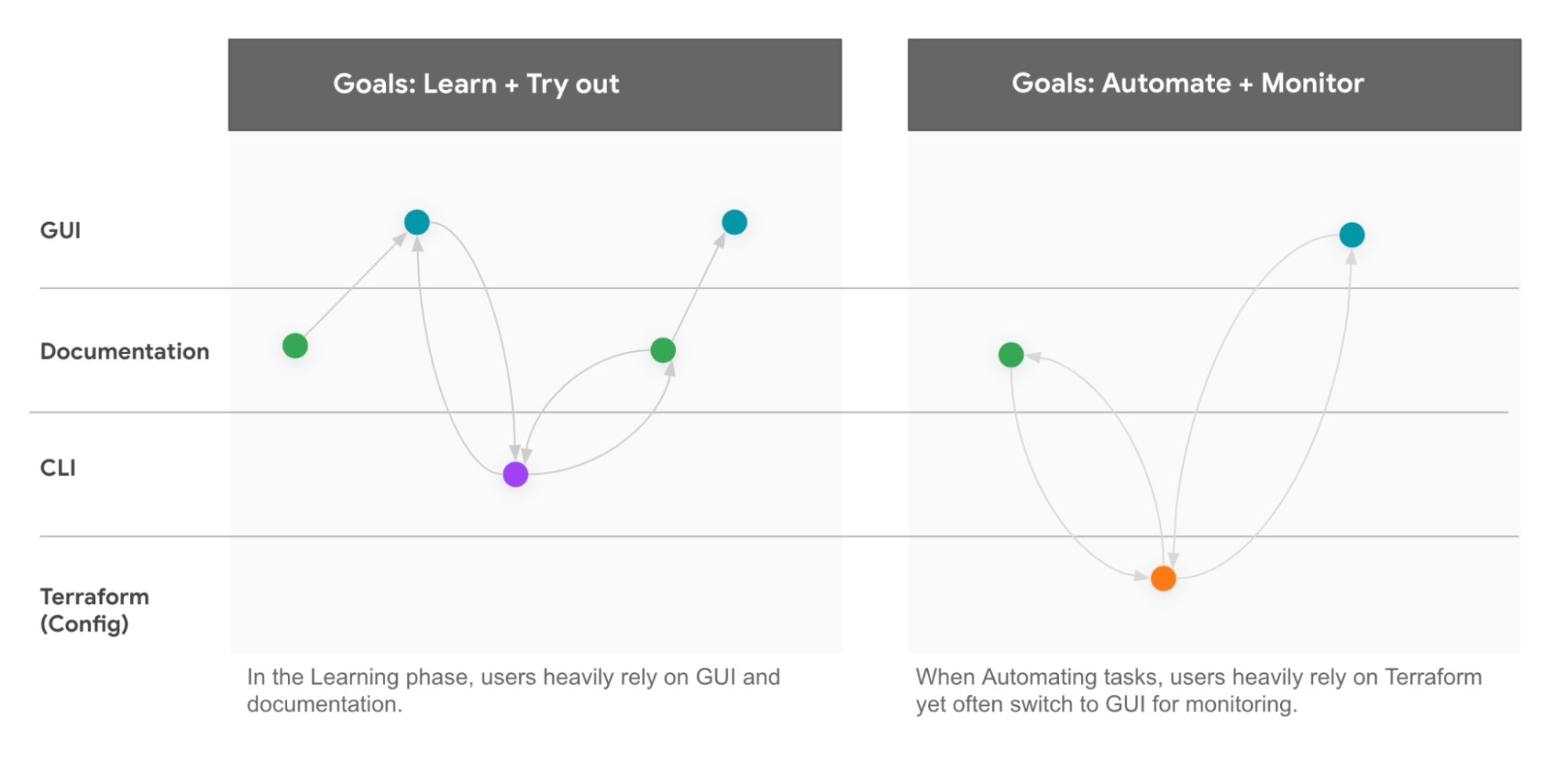
While building user experiences for users, we want to provide the users a “happy path” i.e. reduce the number of steps taken on an interface to complete a goal. As a result, we might consider context switches between interfaces as a suboptimal experience, however, our research on enterprise users using cloud products found that it is natural for our users to switch between multiple surfaces to complete a single goal (as shown in the diagram below).
The important question we wanted to answer through our research is when and why do users choose to use different surfaces and understand how we can provide a seamless experience between the surfaces for our users.
Fig 1: An example of a UX Research participant navigating through different surfaces to complete a goal in one of the Cloud products. Each number is a click towards the surface.
UX Research Process
To understand how users use these surfaces to complete goals, we analyzed dozens of research to develop insights and a framework.
Step 1: Literature review
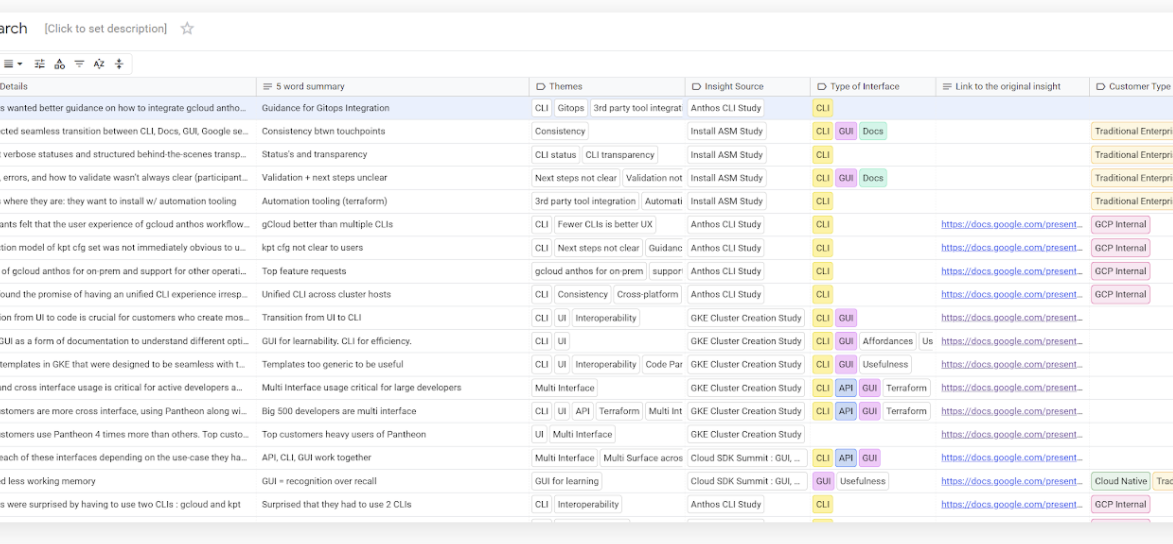
This work is built on 30 internal studies conducted by UX researchers, across 8 different cloud products (GKE, GCP, Anthos, Rancher, Terraform, etc) involving methodologies like user interview, usability test, cognitive walkthrough, survey, CUJ analysis, and quantitative data analysis. In addition to consolidating their work, we also analyzed external articles & academic papers on HCI theory to generate initial insights.
Step 2: Task mapping
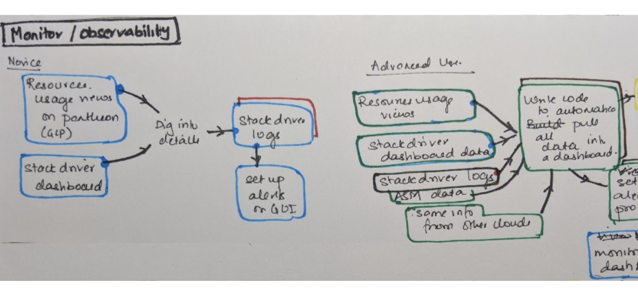
The next step was to better understand how users traverse surfaces in the real world. We each examined a few common user journeys which helped us distinguish between how users use surfaces to complete different goals
Step 3: Develop the framework
Using the insights from the above steps, we created a decision tree to highlight the factors that influence users to decide on surfaces to use. By using this method, we were able to operationalize and test our insights. This map was the foundation of our framework.
The output: A scalable framework
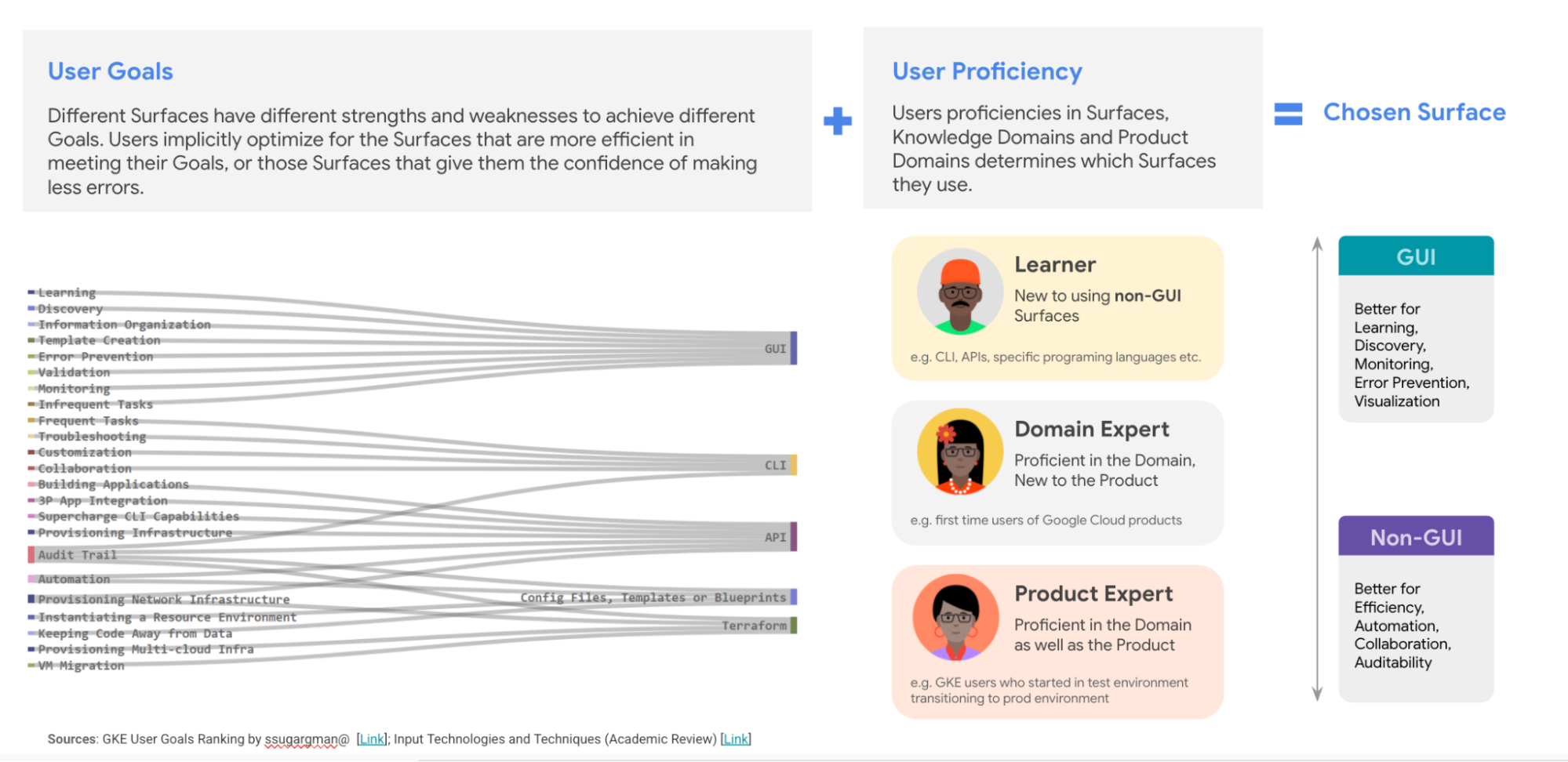
We started this work to demystify how our users use different surfaces to reach a goal. We launched this research to understand how users use surfaces today and to help teams figure out which ones to use – and at what point – when building their products. As a result, we created a framework that provides guidance to help any team make a decision on which surfaces to focus on for their products.
The framework has three parts:
- User goals
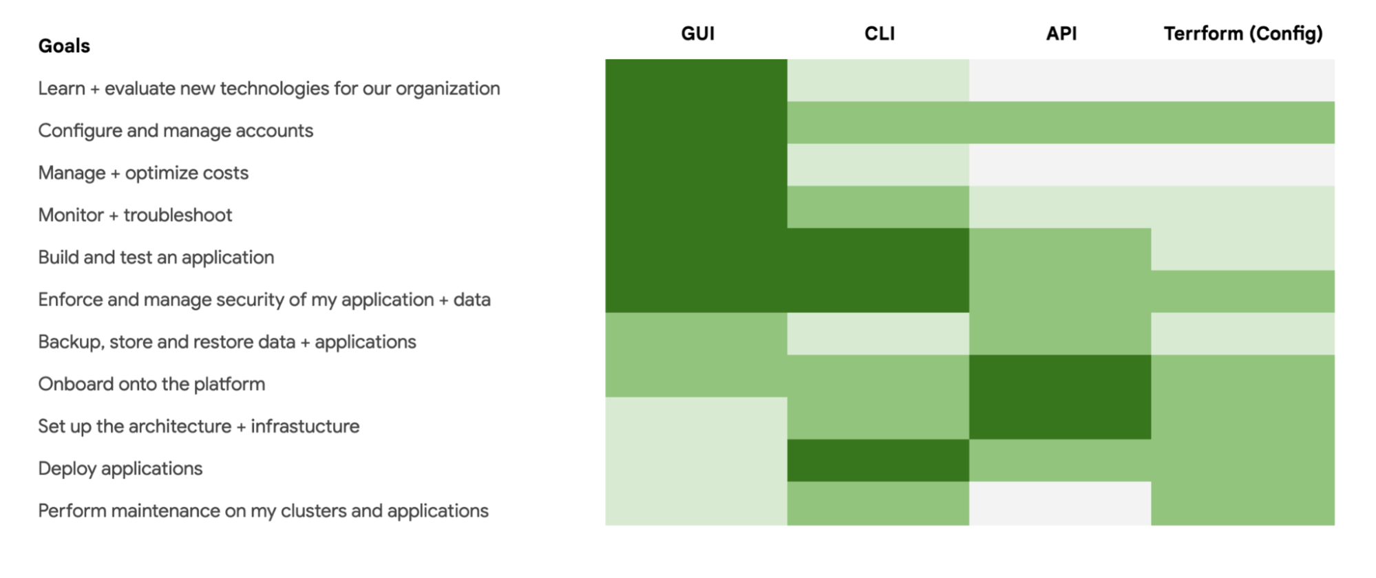
There are 11 goals that we identified for when our users use our product. They included generic goals like learning, discovering, onboarding, automating, etc. We matched goals to common surfaces used when completing the goal.
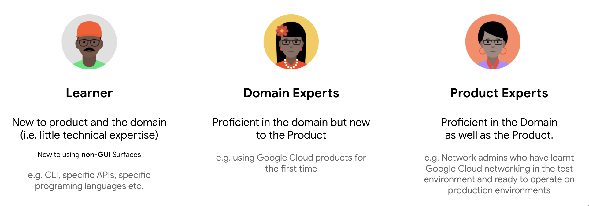
- User proficiency
Determines the level of the domain (technical knowledge) and product expertise of users. We categorized user expertise into 3 segments.
- Product maturity
Depending on the product’s maturity (Beta, Private Preview, General Availability), different surfaces might be prioritized. If it’s a new product, there is more of a need to build surfaces such as GUI that help people learn, versus more mature products where users might want more automation capabilities such as API or IaaC.
Insights
From this research, we learned a bit about enterprise user behavior:
Surfaces complement each other: It is natural for Enterprises customers to rely on suite of surfaces to accomplish their goals
Similar to how you might use a phone, laptop, and go into the store to buy an item, enterprise customers similarly use multiple touchpoints to complete a goal. The difference is they rely on multiple surfaces in small time frames to complete a goal. This could include a CLI to write a command and then validate it in a GUI. If users have trouble accessing one from the other – or if they are too different – or if the terminology is different, this could mean a frustrating experience for the customer
Users choice of the suite of surfaces is dependent on their goal (i.e. type of task they intend to do), user proficiency, and product maturity
These 3 variables help determine which surface to prioritize building. For example, if a new product is for a new user who is an expert, then it would be worth prioritizing GUI, but providing an avenue for the user to learn more advanced, automated surfaces to grow into. On the other hand, if you have an existing product for existing and expert users, then you’ll need to prioritize automation technologies like CLI and API.
Expert users when using a new tool/software rely on extra guidance or a GUI interface
When we started this work, there was an assumption that expert users would only use automation technologies. Through this research, we debunked that myth. It turns out expert users use GUI heavily to learn about a new product and validate even if they are using automated tools to complete actions. We also found that while expert users decrease their usage of GUI as time goes on, many still use it for day-to-day tasks. Therefore, making sure you have a GUI interface to pair with your CLI or API is important – and it may be worth discovering what users like about GUI and factoring that into non-GUI surfaces.
Best practices and lessons learned from this project
If you work on a product that offers multiple surfaces for its users, here are some things we learned from our experience, which could be helpful for you or your team:
| No. | Best Practices | Reason for recommendation |
| 1 | Talk to different stakeholders early on and consolidate relevant research to learn about different use cases | This will help ensure you don’t start from square one and can help triangulate data to create more powerful conclusions |
| 2 | Identify the assumptions and myths that are being used by different teams for product decision making | Doing this early on will help better understand the expectations of team members and align your insights with cross-functional team members |
| 3 | Triangulate qualitative and quantitative data to strengthen insights | Don’t just look at one or the other – bringing insights at scale and depth together will make your insights bullet proof |
| 4 | Create a framework that product owners can leverage to make decisions. Evangelize and educate the team on how to use the framework | Your work is only so good as how well you communicate it. In addition to consolidating insights, spending the time to create an easy-to-use artifact will help many more teams use your great work! |
Conclusion
By conducting this research, we were able to understand how enterprise users use different surfaces to complete their goals and influence internal teams to apply this knowledge to their product areas. As outlined above, it is natural for our users to switch between surfaces. Ultimately the user is trying to decrease the effort & risk associated with a task and will choose a ‘suite of surfaces’ that help them complete their goal faster. As a result, researchers, designers, or product owners ought to understand user behaviors across surfaces and enable seamless transitions between the surfaces to improve the overall user experience. We hope the insights and approaches we shared, helped you understand the factors motivating users to choose multiple surfaces and piqued your interest in understanding cross-interface usage for your products.
Acknowledgments
Sarah D’Angelo, Spencer Sugarman, Marc Fong, Andy Quin, Jason Dong, Brian Grant, Anna Wu, Jason Schwarz, Mackenzie Sunday, Alec Scharff, Hadar Scharff, Ekaterina Koroleva, Andy Qin, Julie Zhuying Li, , Santosh Mathan, Yann Riche, Jess Tsimeris , Arunima Kashyap, Andrew Macvean, Kelli Kludt, Monica Caraway, Maks Osowski, Marian Kędzierski, Marina Masaki, Julianne Bryant
