Google’s long been known for its April Fool’s hoaxes—from Google Paper, which purported to send you a printed archive of all your email, to Google Gulp, a fake beverage. They’re usually good for a laugh or two.
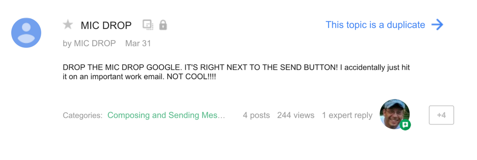
This month? Not so much. On April 1, Google launched “Gmail Mic Drop,” a feature which added a GIF of the Minion Emperor dropping a mic after your message, and then muted the thread so you wouldn’t see any replies. But Google didn’t just add this feature to Gmail. It replaced the “Send+Archive” button with the Mic Drop button—which just said “Send+” and an icon of a microphone.
Thus, people’s long-ingrained instincts to click the “Send+Archive” button led them to “mic drop” instead. More than one user claimed to have lost a job because they “mic dropped” a humorless boss. Others reported being mortified to realize they’d “mic dropped” work email or prayer circles.

Imagine how it would feel if someone accidentally sent this in a condolence email to a friend. Worst of all, because Mic Drop muted all replies, you might never even realize you’d hurt someone’s feelings.
By the time we woke up, the joke was over—removed “due to a bug,” according to Crystal Cee, a community manager at Google. But the real bug wasn’t in the software, it was in Google’s design process.
Plan for the worst
Problems like this aren’t limited to pranks. They come up whenever we set our sights on “delight” over thinking through the consequences of our decisions.
Microsoft learned this recently with its Twitter chatbot, Tay, which was meant to interact with and learn from teens. Instead, within hours of launch, trolls had trained Tay to tweet like a shockingly racist Holocaust denier that insulted people who’d never talked with it.
"Tay" went from "humans are super cool" to full nazi in <24 hrs and I'm not at all concerned about the future of AI pic.twitter.com/xuGi1u9S1A
— Gerry (@geraldmellor) March 24, 2016
Like Google, Microsoft hadn’t planned for the worst. Instead, it had tested Tay “specifically to make interacting with Tay a positive experience,” wrote Peter Lee of Microsoft Research.
This can happen to any of us. When we get laser-focused on positive outcomes, we often fail to notice how things might go terribly wrong. But whether you’re working on something as complex as artificial intelligence or as simple as a line of microcopy, you’ll create the best products when you intentionally set aside your goals of “delight” or “engagement,” and make time to think critically about where your product might break.
Stress cases, not edge cases
This is a concept we tackle in our recent book, Design for Real Life, imploring designers to think harder about failure modes and what we call stress cases (using a term we first heard from Jared Spool). As Zoe Quinn, one of Tay’s targets, tweeted, “It’s 2016. If you’re not asking yourself ‘how could this be used to hurt someone’ in your design/engineering process, you’ve failed.”
At the same time, Microsoft is doing fantastic work around stress cases with what they term “inclusive design.” Following in the footsteps of Pat Moore and Smart Design, the company that created OXO’s kitchen products, Microsoft is doing things like studying how visually impaired people use their smartphones to figure out how to make the phones more usable for everyone—the blind and the sighted. As Cliff Kuang wrote:
[Inclusive design] begins with studying overlooked communities, ranging from dyslexics to the deaf. By learning about how they adapt to their world, the hope is that you can actually build better new products for everyone else.
This focus on what have historically been marginalized users—the sorts of users that we refer to, and all too often dismiss, as “edge cases”—has the potential to catapult Microsoft into a whole new realm. It’s a profoundly human, and humane, way of thinking about design.
Getting started with compassionate UX
We can extend this thinking to all sorts of design challenges, from chatbots like Tay to everyday UX problems like designing form fields, onboarding flows, and new features. Here are a few ways to build more compassionate practices into your process.
1. Challenge your vision
Every project needs a strong vision—a clear direction to guide each and every decision. But if you want to find the fractures in your design, you also need to challenge that vision.
For example, let’s look at Flickr’s major redesign from last year. The company’s vision was clear: to become “the one place where you upload every photo and video you take, and then easily find, organize, edit, and share them,” according to Flickr’s official help thread. One feature Flickr created to aid in that goal was automatic image-tagging—so users uploading thousands of smartphone pics wouldn’t need to manually tag them in order to find them later.
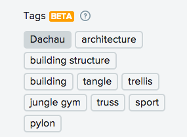
The tagging system works by looking for patterns commonly found in a specific type of photo and automatically label the photo’s contents, like identifying a stand of trees, or a plate of cookies. Only sometimes, the system gets it wrong—way wrong. Like when Flickr tagged a photo of the concentration camp Dachau with the labels “jungle gym” and “sport.”

Flickr also tagged a photo of a black man with “ape”—and, not long after, Google’s Photos app made similar headlines for labeling black people as “gorillas.”
While Flickr had done extensive testing before launching the autotagging, that effort was focused on training the system to be right more often—rather than also identifying places where being wrong was a big deal.
We’ve all done this. We get so fixated on creating a “perfect” experience that we just stop thinking about possible failure modes.
But we can outsmart ourselves here by simply identifying all the assumptions in our vision, and then asking, “what happens if we’re wrong?” For example, Flickr assumed that an incorrect tag would be no big deal—a user would simply remove it, and the algorithm would learn as a result. But in sensitive situations, it clearly was a big deal for users—and Flickr felt the pain of a PR nightmare.
2. Test the edges, not just the averages
Just like testing a page template with both very long and very short content will help you identify places where the design needs work, testing your product against extreme circumstances will help you strengthen its performance in the wild. For Flickr, that might mean testing how well auto-tagging works not just with common images, like pictures of cats or kids, but with sensitive images as well—those depicting, say, sites of atrocities, natural disasters, or injury. This would have helped Flickr improve its tags before launch in ways that really matter, and also would have helped put the system’s failure rate into perspective.
The same is true back at Microsoft. It’s not hard to imagine the most extreme things someone might say on the internet—just spend two minutes on 4chan (or, um, don’t). If the Tay team had done this, they likely would have thought twice about setting Tay up to repeat things random strangers said to her.
3. Build an “outside view” into your process
You know those websites where the navigation options match the company’s internal departments, not users’ tasks? Those are the result of an “inside view”—getting mired in your organization, rather than being able to see your choices from an external perspective. That lack of an “outside view” often results in what bias researchers Jack B. Soll, Katherine L. Milkman, and John W. Payne call the “planning fallacy”—“spinning a narrative of total success and managing for that, even though your odds of failure are actually pretty high.”
To avoid this, you’ll need to build systematic checks into your process—such as holding a postmortem: an exercise where you start by imagining that your project has failed spectacularly, and have everyone in the room write down as many reasons this might happen as possible. For example, Google’s April Fool’s Day team could have asked, “Imagine Mic Drop has received terrible press and tons of complaints. Why?” Team members might have noted a range of reasons: people didn’t think it was funny, the code broke and the gifs didn’t load, users clicked the button by accident or without understanding it. Each of these potentialities could then have been talked about in terms of risk and reward—leading to, we suspect, some different choices.
Another approach to building an outside view is to assign every project a “designated dissenter”—one member of the team who is explicitly asked to push back on the group’s decisions and ensure “groupthink” hasn’t happened.
Even if your team is good at critique, this role has real value—because it ensures every choice is thought through, from those high-level questions like “what assumptions are we making?” to little details like, “In which contexts might this copy come off as ridiculous, insensitive, insulting, or just plain hurtful?” And by making this an explicit role from the start, it also prevents the rest of the team—a team that’s understandably excited—from writing off a single team member’s concerns.
Design to include
It’s easy to see this as an uncomfortable restriction on the creative process, and that’s actually a pretty accurate description. Of course thinking about users’ varied identities and emotional states creates limiting factors. But that’s what design is: it is a creative solution to a set of constraints.
Thinking about all the ways things can go wrong, as they did with Mic Drop and Tay, is uncomfortable—but it’s still crucial that we try, and keep trying. As our designs get closer to people’s inner lives, the risk of doing harm increases exponentially. Challenging our assumptions, as Microsoft is beginning to do with its efforts toward inclusive design, will help us serve more of our users more of the time. There will be stumbles and missteps, but as long as we learn from them, our work will continue to get better, more compassionate, and more human.
Sara and Eric’s book, Design for Real Life, is now available in paperback and ebook.