Back in July, in the picturesque city of Madison, WI, a group of enthusiastic and dedicated UX professionals got together for a conference known as UXMad. One of the speakers, Hampton Catlin, gave a talk outlining the “6 Rules of Mobile Design.” I’d like to share his original six with you, along with some modifications of my own, as a Loose Heuristic for Mobile Design.
Hampton’s list of design principles for the mobile web is based on his experience designing Wikipedia Mobile as well as his work over at Moovweb. Here’s a brief summary:
I. Simplicity is a requirement
Given the constraints of mobile design – screen size, bandwidth, processor speed, etc. – cluttered pages are not an option. Each element, image, or option on the page adds to the number of resources required on page load as well as the number of things a user has to process.
II. Balance brevity and comprehension
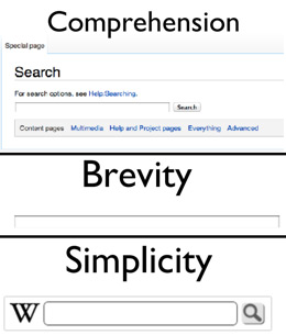
Oftentimes the gut reaction to “get rid of everything non-essential” is actualized as “get rid of everything.” The obvious problem with this approach is lack of context – something that’s required for comprehension. Simplicity, then, is the delicate art of taking away while leaving just enough for comprehension. Hampton’s example, taken from his iterations of Wikipedia Mobile, displays this concept beautifully:

III. Understand, then optimize, your core value proposition
The better we understand our users, the better we can provide them with access to the features and/or content they desire. That much is obvious; however, mobile users may want different features and/or content than desktop users. For example, when working on Wikipedia Mobile, Hampton optimized data retrieval. He eliminated the ability to edit and create content, two things readily available on the desktop version of the site.
IV. “Where” is more important than “who”
Environmental Psychology studies how our surroundings influence us. This could not be more true for mobile. Instead of tailoring things to users it’s better to focus on their context – what they’re trying to do right now and what we can do to facilitate that.
V. Assume terrible dexterity
Designing interfaces with (small) elements placed close together is a recipe for disaster. Hampton suggests to give it to a young/drunk/old person and see how they do. Apple’s Human-computer Interaction Guidelines suggest that touch targets, at a minimum, be 44px by 44px.
VI. The footer is a dead zone
When’s the last time you actually scrolled all the way to the bottom of a mobile site? Was there anything worthwhile down there? If your answers were “I don’t remember” and “No,” congratulations! You’re a typical mobile web user. Catlin argues against putting content in the footer for this exact reason. Why waste time on content that will never be seen?
My edits and additions
Hearing Hampton’s talk served as a catalyst for ideas I’ve had floating around my head for months now. I’ve always known there were serious differences in mobile design. Here’s my take:
Combine rules I and II
Hampton’s 2nd rule (brevity vs. comprehension) isn’t much of a rule. While rule #1 suggests simplicity as a requirement, rule 2 simply explores simplicity as a design principle. Keeping these separate feels superfluous.
Mobile users want one thing
Emphasizing our core value proposition gives us a better experience overall, but I suggest taking this one step further. Mobile users often want one “thing” as soon as possible. My corollary to rule III? By making the path to that one thing as clear and efficient as possible we save users time.
Assume distracted, disrupted, and intermittent use
Mobile users spend about 70 minutes/day on the mobile web; Hampton suggests these are in tiny doses of 3-5 minutes at a time. They’re almost always doing something else, meaning their attention is divided, and, at any moment, an urgent matter can distract them. We need to take these into consideration in our design and ensure things are easily recognizable.

The state of our websites/applications should be immediately apparent. Operations shouldn’t rely on things that might be easily disrupted by connectivity issues, such as session variables.
Good experience is a subset of performance
Performance is absolutely crucial to a good user experience. The most elegantly designed website is useless if the user has to wait several seconds for each page load. There are several other posts with further details on how to improve mobile performance.
Provide access to the “desktop” version
Regardless of how many hours we’ve poured into our mobile designs, some users will have a knee-jerk reaction. Others may locate things faster using the conventional (read: not mobile-optimized) solution. Failure to provide a link back to the full versions of our sites may lead to frustration, and nobody likes frustration.
Test on as many devices as possible
Unfortunately, the mobile device market is intensely fragmented. My experience shows that all devices have their quirks and that means some users may be left out to dry. There is, of course, a limiting factor of how many can feasibly be tested, but some is always better than none. Use market data to guide your testing decisions.
Conclusion
There you have it. Think of these guidelines like you would think of a Heuristic Evaluation – put your design up on the wall next to it and weigh the pros and cons of each suggestion. But please, don’t take this as canon – the world of mobile web is diverse and full of interesting use cases. Adapt, amend, maul, and destroy as appropriate.